


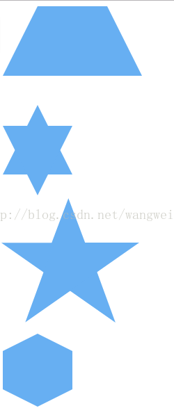
效果如图:
代码如下:
<!DOCTYPE html>
<html>
<head>
	<meta charset="utf-8">
	<meta http-equiv="X-UA-Compatible" content="IE=edge">
	<title></title>
	<link rel="stylesheet" href="shape.css">
</head>
<body>
	 <div class="tix"></div><br><br>
    <div class="liuj"></div><br><br>
    <div class="wuj"></div><br><br>
    <div class="liubianx"></div><br><br>
    <div class="yin-yang"></div><br><br>
    <div class="cut-diamond"></div><br><br>
    <div class="burst-8"></div><br><br>
    <div class="burst-12"></div><br><br>
    <div class="talkbubble"></div><br><br>
    <div class="pacman"></div><br><br>
    <div class="egg"></div><br><br>
    <div class="infinity"></div><br><br>
    <div class="heart"></div><br><br>
    <div id="octagon"></div><br><br>
    <div id="pentagon"></div><br><br>
    <div id="parallelogram"></div><br><br>
    <div id="triangle-bottomright"></div><br><br>
    <div id="triangle-bottomleft"></div><br><br>
    <div id="triangle-topright"></div><br><br>
    <div id="triangle-topleft"></div><br><br>
    <div id="triangle-right"></div><br><br>
    <div id="triangle-left"></div><br><br>
    <div id="triangle-up"></div><br><br>
    <div id="triangle-down"></div><br><br>


</body>
</html>
CSS代码:
  .tix {
        border-bottom: 100px solid #67AFF2;
        border-left: 50px solid transparent;
        border-right: 50px solid transparent;
        height: 0;
        width: 100px;
    }
    .liuj{

    width: 0;
    height: 0;
    border-left: 50px solid transparent;
    border-right: 50px solid transparent;
    border-bottom: 100px solid #67AFF2;
    position: relative;
}

.liuj:after {
    width: 0;
    height: 0;
    border-left: 50px solid transparent;
    border-right: 50px solid transparent;
    border-top: 100px solid #67AFF2;
    position: absolute;
    content: "";
    top: 30px;
    left: -50px;
}
    .wuj{
    margin: 50px 0;
    position: relative;
    display: block;
    color: #67AFF2;
    width: 0px;
    height: 0px;
    border-right:  100px solid transparent;
    border-bottom: 70px  solid #67AFF2;
    border-left:   100px solid transparent;
    -moz-transform:    rotate(35deg);
    -webkit-transform: rotate(35deg);
    -ms-transform:     rotate(35deg);
    -o-transform:      rotate(35deg);
}

.wuj:before {
    border-bottom: 80px solid #67AFF2;
    border-left: 30px solid transparent;
    border-right: 30px solid transparent;
    position: absolute;
    height: 0;
    width: 0;
    top: -45px;
    left: -65px;
    display: block;
    content: '';
    -webkit-transform: rotate(-35deg);
    -moz-transform:    rotate(-35deg);
    -ms-transform:     rotate(-35deg);
    -o-transform:      rotate(-35deg);
}

.wuj:after {
    position: absolute;
    display: block;
    color: #67AFF2;
    top: 3px;
    left: -105px;
    width: 0px;
    height: 0px;
    border-right: 100px solid transparent;
    border-bottom: 70px solid #67AFF2;
    border-left: 100px solid transparent;
    -webkit-transform: rotate(-70deg);
    -moz-transform:    rotate(-70deg);
    -ms-transform:     rotate(-70deg);
    -o-transform:      rotate(-70deg);
    content: '';
}
.liubianx{
    width: 100px;
    height: 55px;
    background: #67AFF2;
    position: relative;
}

.liubianx:before {
    content: "";
    position: absolute;
    top: -25px;
    left: 0;
    width: 0;
    height: 0;
    border-left: 50px solid transparent;
    border-right: 50px solid transparent;
    border-bottom: 25px solid #67AFF2;
}

.liubianx:after {
    content: "";
    position: absolute;
    bottom: -25px;
    left: 0;
    width: 0;
    height: 0;
    border-left: 50px solid transparent;
    border-right: 50px solid transparent;
    border-top: 25px solid #67AFF2;
}
.yin-yang {
width: 96px;
height: 48px;
background: #eee;
border-color: #67AFF2;
border-style: solid;
border-width: 2px 2px 50px 2px;
border-radius: 100%;
position: relative;
}
.yin-yang:before {
content: "";
position: absolute;
top: 50%;
left: 0;
background: #eee;
border: 18px solid #67AFF2;
border-radius: 100%;
width: 12px;
height: 12px;
}
.yin-yang:after {
content: "";
position: absolute;
top: 50%;
left: 50%;
background: #67AFF2;
border: 18px solid #eee;
border-radius:100%;
width: 12px;
height: 12px;
}
.cut-diamond {
border-style: solid;
border-color: transparent transparent #67AFF2 transparent;
border-width: 0 25px 25px 25px;
height: 0;
width: 50px;
position: relative;
margin: 20px 0 50px 0;
}
.cut-diamond:after {
content: "";
position: absolute;
top: 25px;
left: -25px;
width: 0;
height: 0;
border-style: solid;
border-color: #67AFF2 transparent transparent transparent;
border-width: 70px 50px 0 50px;
}
.burst-8 {
background: #67AFF2;
width: 80px;
height: 80px;
position: relative;
text-align: center;
-webkit-transform: rotate(20deg);
-moz-transform: rotate(20deg);
-ms-transform: rotate(20deg);
-o-transform: rotate(20eg);
transform: rotate(20deg);
}
.burst-8:before {
content: "";
position: absolute;
top: 0;
left: 0;
height: 80px;
width: 80px;
background: #67AFF2;
-webkit-transform: rotate(135deg);
-moz-transform: rotate(135deg);
-ms-transform: rotate(135deg);
-o-transform: rotate(135deg);
transform: rotate(135deg);
}
.burst-12 {
background: #67AFF2;
width: 80px;
height: 80px;
position: relative;
text-align: center;
}
.burst-12:before, .burst-12:after {
content: "";
position: absolute;
top: 0;
left: 0;
height: 80px;
width: 80px;
background: #67AFF2;
}
.burst-12:before {
-webkit-transform: rotate(30deg);
-moz-transform: rotate(30deg);
-ms-transform: rotate(30deg);
-o-transform: rotate(30deg);
transform: rotate(30deg);
}
.burst-12:after {
-webkit-transform: rotate(60deg);
-moz-transform: rotate(60deg);
-ms-transform: rotate(60deg);
-o-transform: rotate(60deg);
transform: rotate(60deg);
}
.talkbubble {
width: 120px;
height: 80px;
background: #67AFF2;
position: relative;
-moz-border-radius: 10px;
-webkit-border-radius: 10px;
border-radius: 10px;
}
.talkbubble:before {
content:"";
position: absolute;
right: 100%;
top: 26px;
width: 0;
height: 0;
border-top: 13px solid transparent;
border-right: 26px solid #67AFF2;
border-bottom: 13px solid transparent;
}
.pacman {
width: 0px;
height: 0px;
border-right: 60px solid transparent;
border-top: 60px solid #67AFF2;
border-left: 60px solid #67AFF2;
border-bottom: 60px solid #67AFF2;
border-top-left-radius: 60px;
border-top-right-radius: 60px;
border-bottom-left-radius: 60px;
border-bottom-right-radius: 60px;
}
.egg {
display:block;
width: 126px;
height: 180px;
background-color: #67AFF2;
-webkit-border-radius: 63px 63px 63px 63px / 108px 108px 72px 72px;
border-radius: 50% 50% 50% 50% / 60% 60% 40% 40%;
}
.infinity {
position: relative;
width: 212px;
height: 100px;
}
.infinity:before,
.infinity:after {
content: "";
position: absolute;
top: 0;
left: 0;
width: 60px;
height: 60px;
border: 20px solid #67AFF2;
-moz-border-radius: 50px 50px 0 50px;
border-radius: 50px 50px 0 50px;
-webkit-transform: rotate(-45deg);
-moz-transform: rotate(-45deg);
-ms-transform: rotate(-45deg);
-o-transform: rotate(-45deg);
transform: rotate(-45deg);
}
.infinity:after {
left: auto;
right: 0;
-moz-border-radius: 50px 50px 50px 0;
border-radius: 50px 50px 50px 0;
-webkit-transform: rotate(45deg);
-moz-transform: rotate(45deg);
-ms-transform: rotate(45deg);
-o-transform: rotate(45deg);
transform: rotate(45deg);
}
.heart {
position: relative;
width: 100px;
height: 90px;
}
.heart:before,
.heart:after {
position: absolute;
content: "";
left: 50px;
top: 0;
width: 50px;
height: 80px;
background: #67AFF2;
-moz-border-radius: 50px 50px 0 0;
border-radius: 50px 50px 0 0;
-webkit-transform: rotate(-45deg);
-moz-transform: rotate(-45deg);
-ms-transform: rotate(-45deg);
-o-transform: rotate(-45deg);
transform: rotate(-45deg);
-webkit-transform-origin: 0 100%;
-moz-transform-origin: 0 100%;
-ms-transform-origin: 0 100%;
-o-transform-origin: 0 100%;
transform-origin: 0 100%;
}
.heart:after {
left: 0;
-webkit-transform: rotate(45deg);
-moz-transform: rotate(45deg);
-ms-transform: rotate(45deg);
-o-transform: rotate(45deg);
transform: rotate(45deg);
-webkit-transform-origin: 100% 100%;
-moz-transform-origin: 100% 100%;
-ms-transform-origin: 100% 100%;
-o-transform-origin: 100% 100%;
transform-origin :100% 100%;
}
#octagon {
width: 100px;
height: 100px;
background: #67AFF2;
position: relative;
}
#octagon:before {
content: "";
position: absolute;
top: 0;
left: 0;
border-bottom: 29px solid #67AFF2;
border-left: 29px solid #eee;
border-right: 29px solid #eee;
width: 42px;
height: 0;
}
#octagon:after {
content: "";
position: absolute;
bottom: 0;
left: 0;
border-top: 29px solid #67AFF2;
border-left: 29px solid #eee;
border-right: 29px solid #eee;
width: 42px;
height: 0;
}

#pentagon {
position: relative;
width: 54px;
border-width: 50px 18px 0;
border-style: solid;
border-color: #67AFF2 transparent;
}
#pentagon:before {
content: "";
position: absolute;
height: 0;
width: 0;
top: -85px;
left: -18px;
border-width: 0 45px 35px;
border-style: solid;
border-color: transparent transparent #67AFF2;
}
#parallelogram {
width: 150px;
height: 100px;
margin-left:20px;
-webkit-transform: skew(20deg);
-moz-transform: skew(20deg);
-o-transform: skew(20deg);
background: #67AFF2;
}
#triangle-bottomright {
width: 0;
height: 0;
border-bottom: 100px solid #67AFF2;
border-left: 100px solid transparent;
}
#triangle-bottomleft {
width: 0;
height: 0;
border-bottom: 100px solid #67AFF2;
border-right: 100px solid transparent;
}
#triangle-topright {
width: 0;
height: 0;
border-top: 100px solid #67AFF2;
border-left: 100px solid transparent;
}
#triangle-topleft {
width: 0;
height: 0;
border-top: 100px solid #67AFF2;
border-right: 100px solid transparent;
}
#triangle-right {
width: 0;
height: 0;
border-top: 50px solid transparent;
border-left: 100px solid #67AFF2;
border-bottom: 50px solid transparent;
}
#triangle-left {
width: 0;
height: 0;
border-top: 50px solid transparent;
border-right: 100px solid #67AFF2;
border-bottom: 50px solid transparent;
}
#triangle-down {
width: 0;
height: 0;
border-left: 50px solid transparent;
border-right: 50px solid transparent;
border-top: 100px solid #67AFF2;
}
#triangle-up {
width: 0;
height: 0;
border-left: 50px solid transparent;
border-right: 50px solid transparent;
border-bottom: 100px solid #67AFF2;
}


 1054
1054

 被折叠的 条评论
为什么被折叠?
被折叠的 条评论
为什么被折叠?
 到【灌水乐园】发言


