


python预测时间序列
Prophet is a open source time series forecasting algorithm designed by facebook for ease of use without any expert knowledge in statistics or time series forecasting. Prophet builds a model by finding a best smooth line which can be represented as a sum of the following components:
Prophet是Facebook设计的一种开放源代码时间序列预测算法,易于使用,无需任何统计或时间序列预测方面的专业知识。 先知通过找到一条最佳的平滑线来构建模型,该线可以表示为以下各部分的总和:
y(t) = g(t) + s(t) + h(t) + ϵₜ
y(t)= g(t)+ s(t)+ h(t)+ ϵₜ
- Overall growth trend. g(t) 总体增长趋势。 克(吨)
- Yearly seasonality. s(t) 每年的季节性。 s(t)
- Weekly seasonality. s(t) 每周的季节性。 s(t)
- Holidays effects h(t) 假期效应h(t)
In this series of blog posts we will see some of the useful functions present in the library fbprophet listed below with an example.
在这一系列博客文章中,我们将看到库fbprophet提供的一些有用功能 下面列出了一个示例。
Prophet.fitProphet.fitProphet.predictProphet.predictProphet.plotProphet.plotProphet.plot_componentsProphet.plot_componentsProphet.add_seasonalityProphet.add_seasonalityProphet.add_regressorsProphet.add_regressorsProphet.seasonalitiesProphet.seasonalitiesProphet.predictive_samplesProphet.predictive_samplesProphet.predict_seasonal_componentsProphet.predict_seasonal_components
In Part1 we will see how to install fbprophet, generate a forecast on a sample data and visualize the generated forecast. Let’s start by describing the sample data set that we will be using for our demonstration.
在第1 部分中,我们将看到如何安装fbprophet ,如何对样本数据生成预测以及如何可视化所生成的预测。 让我们开始描述将用于演示的样本数据集。
资料说明 (Data Description)
We will be using a synthetic daily time series data(shown below) with columns (date, target, regr1, regr2) for 180 days, where target is a value which we want to be predict for each day and regr1, regr2 are external factor which effect the target value.
我们将使用180天的列( date , target , regr1 , regr2 )的合成每日时间序列数据(如下所示),其中target是我们希望每天预测的值,而regr1 , regr2是外部因素这会影响目标值。
# Importing Libraries
import pandas as pd
# loading the time series data into a dataframe
df = pd.read_csv('ts_with_2regressors.csv')
df['date'] = pd.to_datetime(df['date'], format='%Y-%m-%d')
# plotting the time series data
df.plot(x='date', y='target', figsize=(20, 5), title='Time series Data')
先知的安装: (Installation of Prophet:)
As with every python library you can install fbprophet using pip. The major dependency that Prophet has is pystan.
与每个python库一样,您可以使用pip安装fbprophet 。 先知的主要依赖者是pystan 。
# Install pystan with pip before using pip to install fbprophet>>> pip install pystan
>>> pip install fbprophet
Let us now see how to use the above functions:
现在让我们看看如何使用以上功能:
生成预测: (Generating a Forecast:)
Prophet follows the sklearn model API. We create an instance of the Prophet class and then call its fit(
Prophet.fit) and predict(Prophet.predict) methods.先知遵循sklearn模型API。 我们创建Prophet类的实例,然后调用其fit(
Prophet.fit)和predict(Prophet.predict)方法。The input to Prophet is always a data frame with two columns:
dsandy. Theds(date stamp) column should be of a format expected by Pandas, ideallyYYYY-MM-DDfor a date orYYYY-MM-DD HH:MM:SSfor a time stamp. Theycolumn must be numeric, and represents the measurement we wish to forecast.先知的输入始终是具有两列的数据框:
ds和y。 的ds(日期戳)列应该是由熊猫预期的格式的,理想地YYYY-MM-DD的日期或YYYY-MM-DD HH:MM:SS的时间印记。y列必须是数字,代表我们希望预测的度量。For demonstration we will use the
targetvalues for first 150 days as training data and predict target for all 180 days.为了演示,我们将 前150天 的
target用作训练数据并预测所有180天的目标。
Note : For this step we will be considering only the date and target columns
注意 :在此步骤中,我们将仅考虑date和target列
# Creating train and predict dataframe
df = df.rename(columns={'date':'ds', 'target':'y'})
df_train = df[['ds', 'y']].iloc[:150]
df_predict = df[['ds']]
# Fitting a Prophet model
model = Prophet()
model.fit(df_train)
forecast = model.predict(df_predict)forecast.head()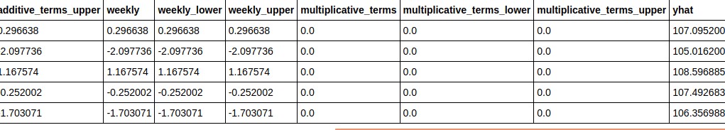
# plotting the actual and forecast values
ax = (df.plot(x='ds',y='y',figsize=(20,5),title='Actual Vs Forecast'))
forecast.plot(x='ds',y='yhat',figsize=(20,5),title='Actual vs Forecast', ax=ax)
From the above output we can see that prophet pretty much gave a good fit on the data, but still it is unable to capture the sudden jumps in the data. These jumps are basically caused by the external regressors which prophet is unable to detect by default. We will see how to model Prophet to capture these external factors in the coming sections.
从上面的输出中,我们可以看到先知非常适合数据,但是仍然无法捕获数据中的突然跳跃。 这些跳跃基本上是由先知默认情况下无法检测到的外部回归器引起的。 在接下来的部分中,我们将看到如何为先知建模以捕获这些外部因素。
绘制预测: (Plotting the Forecast :)
We can plot the forecast and the components by calling the
Prophet.plot&Prophet.plot_componentsmethod and passing in the forecast dataframe as shown below我们可以通过调用
Prophet.plot和Prophet.plot_components方法并传递预测数据帧来绘制预测和组成部分,如下所示- The forecast plot is a single graph containing a scatter plot of historical data points indicated by black dots and the forecast/fitted curve indicated by a blue line. The graph also contains a light blue shaded region which corresponds to the uncertainty bands. 预测图是单个图,其中包含由黑点表示的历史数据点的散点图和由蓝线表示的预测/拟合曲线。 该图还包含一个浅蓝色阴影区域,它对应于不确定带。
The components plot is a group of plots corresponding to various time series components(
trend,seasoanilities) and external effects.成分图是一组与各种时间序列成分(
trend,seasoanilities和外部影响)相对应的图。
# Plotting the generated forecast
fig1 = model.plot(forecast, uncertainty=True)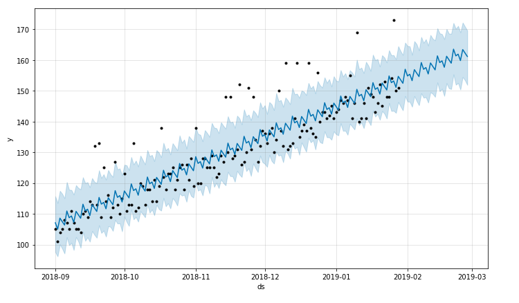
# Plotting the forecast components.
fig2 = model.plot_components(forecast)
As mentioned in the starting Prophet estimates the trend and weekly_seasonality based on the training data.
如weekly_seasonality所述, Prophet根据训练数据估算trend和weekly_seasonality 。
Let us now understand the above 2 Plots:
现在让我们了解以上2个图:
预测输出图: (Forecast Output Plot:)
X-axis represents the date values (
ds) for both history and future dates.X轴代表历史日期和将来日期的日期值(
ds) 。Y-axis represents the target values(
y,yhat)for both history and future dates.Y轴代表历史和未来日期的目标值(
y,yhat)。In the graph the
black dotted pointsrepresent the historical training data points.在图中,
black dotted points表示历史训练数据点。The
blue linerepresents the forecasts generated for both history and future.blue line代表针对历史和未来生成的预测。Along with there is
light blue regionwhich represents the uncertainty bands(We will see more about this in the coming sections.)伴随着
light blue region它代表了不确定性范围(我们将在接下来的部分中对此进行更多了解。)
预测成分图: (Forecast Component Plot:)
X-axis represents the date values (
ds) for both history and future dates.X轴代表历史日期和将来日期的日期值(
ds) 。Y-axis represents the prophet estimate for respective forecast compoent (
trend,seasonality)Y轴代表各个预测成分(
trend,seasonality)的先知估计Graph1:
trendvalue for all dates(history and future).图1:
trend所有日期(历史和未来)的值。Graph2:
weekly_seasonalitya weekly profile for each day in a week based on the training data.图2:
weekly_seasonality基于训练数据的一周中每一天的每周资料。
As we can see it is very easy to start and get a reasonable forecast model on your time series data using prophet. In the next part we will see how to use the remaining functions.
正如我们所看到的,使用先知可以很容易地开始并对您的时间序列数据获取合理的预测模型。 在下一部分中,我们将看到如何使用其余功能。
You can find the data and notebook used in the below repository:
您可以在以下存储库中找到使用的数据和笔记本:
https://github.com/upraneelnihar/ML-Projects/tree/master/Time_series
https://github.com/upraneelnihar/ML-Projects/tree/master/Time_series
python预测时间序列


 1099
1099


 被折叠的 条评论
为什么被折叠?
被折叠的 条评论
为什么被折叠?
 到【灌水乐园】发言


