


css盒子模型
CSS, being the part of our code that is responsible for all the styling and positioning of content, has a basic model for defining content within it, known as the Box Model. As part of the box model, every element on our page, be it text, images, articles etc, are all thought of as individual boxes, as illustrated below:
CSS是我们代码的一部分,负责内容的所有样式和位置,它具有用于定义其中内容的基本模型,称为Box Model。 作为盒子模型的一部分,我们页面上的每个元素(包括文本,图像,文章等)都被视为单独的盒子,如下图所示:
These boxes all have a set of properties that we must understand in order to gain complete mastery over the positioning of content using CSS.
这些框都有一组属性,我们必须了解这些属性,以便完全掌握使用CSS进行内容的定位。
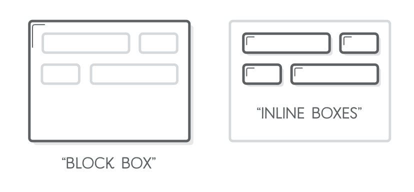
Among these properties, the first property we must know of is the Display property. Simply put, there are broadly two types of elements that we can define in HTML/CSS:
在这些属性中,我们必须知道的第一个属性是Display属性。 简而言之,我们可以在HTML / CSS中定义两种类型的元素:
内联和块级元素。 (Inline and Block level elements.)
By default, each element that we specify in HTML has is either a block level element or an inline element. As the name suggests, inline elements are contained within a line, and take up only as much space as the content they wrap around.
默认情况下,我们在HTML中指定的每个元素都是块级元素或内联元素。 顾名思义,内联元素包含在一行中,并且仅占用其所环绕内容的空间。
Block elements, on the other hand, are full-sized blocks that take up all the available horizontal space on a page, regardless of the content they contain. Even if a block level element contains only one character of text, it will expand to fill up all available horizontal space. In general, a box level element is usually structural while inline elements are usually text based. We can have one or more inline elements inside of a block level element, but a block element cannot be nested inside of an inline element.
另一方面,块元素是全尺寸块,它们占据页面上所有可用的水平空间,无论它们包含的内容是什么。 即使块级元素仅包含一个字符的文本,它也会扩展以填充所有可用的水平空间。 通常,框级元素通常是结构性的,而内联元素通常是基于文本的。 我们可以在一个块级元素内包含一个或多个内联元素,但是一个块元素不能嵌套在一个内联元素内。
Both, inline and block elements have certain characteristics and properties that depend on their display setting. For example, inline level elements like paragraphs of text cannot be given margin-top or margin-bottom properties, as these properties are reserved for box-level elements.
内联元素和块元素均具有取决于其显示设置的某些特性和属性。 例如,不能为行内级别元素(如文本段落)赋予margin-top或margin-bottom属性,因为这些属性是为框级元素保留的。
CSS allows us to override the default display property of an element and set it as a block or inline level element depending on the requirement. Say we need to apply certain styles to an img element, to give it a border. img, being an inline element, does not allow us to apply these properties to it. In order to make it work, we can change the display property of the img element to display:block. Doing so allows us to use the border property as well as other block level properties on inline level elements.
CSS允许我们根据需要覆盖元素的默认显示属性,并将其设置为块或内联级别元素。 假设我们需要对img元素应用某些样式,以为其添加边框。 作为内联元素的img不允许我们对其应用这些属性。 为了使其工作,我们可以将img元素的显示属性更改为display:block。 这样做允许我们在内联级别的元素上使用border属性以及其他块级别的属性。
As mentioned before, block level elements cannot be listed inside of inline elements. To allow for more flexibility in our styling, CSS also allows a third value setting for the display property, namely the “inline-block” property. Applying display:inline-block to any inline level element allows us to use block level properties on it, while also letting it continue to behave as an inline element. Simply put, it allows us to use block level properties on inline level elements.
如前所述,块级元素不能在内联元素内列出。 为了使我们的样式更具灵活性,CSS还允许对display属性(即“ inline-block”属性)进行第三个值设置。 将display:inline-block应用于任何内联级别元素可以使我们在其上使用块级属性,同时还可以使其继续充当内联元素。 简而言之,它允许我们在内联级别的元素上使用块级别的属性。
每个框的组成部分:内容,填充以及边框和边距 (Components of each box : content, padding, and border and margin)
So far, we have seen that all elements are considered in CSS as individual boxes which have certain properties.
到目前为止,我们已经看到,所有元素在CSS中都被视为具有特定属性的单独盒子。
Each box can be broken down into it’s content, padding, border and margin.
每个框都可以细分为内容,填充,边框和边距。

Understanding these properties and how they behave is essential in order to know the size of each box and have complete control over the sizing and positioning of different elements on our page.
为了了解每个框的大小并完全控制页面上不同元素的大小和位置,了解这些属性及其行为方式至关重要。
The content makes up the innermost part of the box, and the content of our element is restricted to this area. Then comes the padding, which is the blank space between the content of a box and it’s border. Padding gives some breathing room to the content inside the box, and can be changed to suit our styling requirement. The border of a box, as suggested by the name, is the outer boundary of our box, and can be styled as needed. We can choose whether or not to show a border, and if we do, how thick it would be, what colour, style etc.
内容构成了框的最内部,而我们元素的内容仅限于此区域。 然后是填充,它是盒子内容与其边界之间的空白。 填充为盒子内的内容提供了一定的喘息空间,可以更改以适应我们的样式要求。 顾名思义,盒子的边界是我们盒子的外边界,可以根据需要设置样式。 我们可以选择是否显示边框,如果选择边框,边框的厚度,颜色,样式等。
Outside of the border lies the margin of the box. The margin is the space between the element and it’s surrounding elements. This margin can be adjusted to increase or decrease the empty space between adjoining elements.
边框之外是框的边缘。 边距是元素与其周围元素之间的空间。 可以调整此边距以增加或减少相邻元素之间的空白空间。
内容和边框的差异 (Content and border box differences)
Another property that we work with, with regards to the box model, is the box-sizing property. This property accepts two values, namely “content-box” and “border-box”, depending on how we want to calculate the dimensions of our box.
关于盒子模型,我们使用的另一个属性是盒子大小属性。 此属性接受两个值,即“ content-box”和“ border-box”,具体取决于我们要如何计算框的尺寸。
With Content Box, the height and width we specify is applied to the part of the box that has our content, with everything else adding on to the outside, including padding, border and margin dimensions. If we specify a box as having a height and width of 500px and 1000px each, respectively, and set it’s box-sizing to content box, the content part of our box would be set to 1000px width and 500px height, and any padding, border or margin we add to this box would be added on top of our existing dimensions thereby expanding the box outwards. If we apply a padding of 10px, border width 10px and margin 10px to each side, the final size of the box would be 1060 px by 560px.
使用“内容框”,我们指定的高度和宽度将应用于包含我们内容的框的一部分,其他所有内容都添加到外部,包括填充,边框和边距尺寸。 如果我们指定一个框的高度和宽度分别为500px和1000px,并将其框大小设置为内容框,则框的内容部分将设置为1000px宽度和500px高度,以及任何填充,边框或我们添加到此框的边距将被添加到现有尺寸的顶部,从而向外扩展框。 如果我们在每一侧应用10px的填充,边框宽度10px和边距10px,则框的最终大小将是1060 px x 560px。

Similarly, if we use the border-box property, the size we set is applied to the part of the box up to, and including, the border. In this case, the padding and border dimensions are included in our box-sizing, with the margin still being extra and added on top of our specified box size.
同样,如果使用border-box属性,则我们设置的大小将应用于框的直到边界(包括边界)的部分。 在这种情况下,填充和边框尺寸包含在我们的框大小中,边距仍然是多余的,并在我们指定的框大小之上添加。
As such, we can use this knowledge to get a clear picture of the exact sizes of different boxes on our page, and be more exact and efficient while creating designs and layouts for our websites.
因此,我们可以利用这些知识来清楚地了解页面上不同框的确切大小,并在为我们的网站创建设计和布局时更加精确和高效。
css盒子模型


 扫一扫
扫一扫
 4168
4168

 被折叠的 条评论
为什么被折叠?
被折叠的 条评论
为什么被折叠?
 到【灌水乐园】发言


