


 本文介绍了如何在React应用中利用Material UI库进行主题定制,详细讲解了主题化的实现过程,帮助开发者理解如何为React项目创建自定义UI风格。
react前端ui的使用
Material UI:2020年获奖的React UX库(Material UI: The winning React UX library in 2020)
Material UI is currently the most popular UI framework for React, with the library providing a range of ready-to-use components out of the box. The library consists of components for layout, navigation, input, feedback and more. Material UI is based on Material Design, a design language that Google fore-fronted originally but is now widely adopted throughout the front-end developer community.
Material UI是当前最受欢迎的React UI框架,该库提供了一系列现成的现成组件。 该库由布局,导航,输入,反馈等组件组成。 Material UI是基于Material Design的, Material Design是Google最初倡导的一种设计语言,但现在已在整个前端开发人员社区中广泛采用。
Material Design was originally announced in 2014 and built upon the previous card-based design of Google Now. Material Design is a battle tested design language that comes with support for modern front-end development standards such as responsiveness, theming, mobile-first, and built to be very customisable.
材料设计最初宣布 在2014年并以以前的基于卡片的Google即时设计为基础。 Material Design是经过实战检验的设计语言,它支持现代的前端开发标准,例如响应性,主题化,移动优先和易于定制。
Material UI takes what Material Design has evolved into and provides a library of React components that can be used to build React UX from the ground up. To get a feel of what is possible with Material UI, there are a range of premium themes on the Material UI store that cater for common use cases like admin panels and landing page designs.
Material UI继承了Material Design的发展,并提供了一个React组件库,可用于从头开始构建React UX。 为了感受Material UI的可能,Material UI存储中有一系列高级主题,可以满足管理面板和登录页面设计等常见用例。
This piece acts as an introduction to Material UI for those interested in adopting it in their React projects, and will be heavily focused on theming and the customisability of themes within Material UI.
对于那些有兴趣在自己的React项目中采用它的人来说,这篇文章是对其材料UI的介绍,并将重点关注材料UI中主题的可定制性。
Theming is the main bottleneck when getting started using the library for the newcomer, but there are a few good tools online to kick start your theming configuration that will be covered further down. The Material UI documentation also has a dedicated section on theming that describes the theming process in depth. This piece however acts as a more tailored approach that will talk through the major concepts along with snippets to quickly set up a theming and styling solution.
主题化是开始使用新手库的主要瓶颈,但是在线上有一些不错的工具可以启动主题化配置,下面将进一步介绍。 Material UI文档中还有一个专门的主题章节,详细介绍了主题过程。 但是,这是一种更具针对性的方法,它将讨论主要概念以及代码片段,以快速建立主题和样式解决方案。
考虑采用Material UI? (Thinking about adopting Material UI?)
If you’ve recently come across Material UI and are wondering whether its worth taking the time to familiarise yourself with the library and ultimately adopt it, there may well be major benefits for doing so. If you fall into the following categories, then Material UI will be very attractive for you:
如果您最近遇到过Material UI,并且想知道是否值得花时间熟悉该库并最终采用它,那么这样做可能会带来很多好处。 如果您属于以下类别,那么材料用户界面将对您非常有吸引力:
- If you have developed ad-hoc React apps that are time consuming to maintain, migrating to Material UI will take away a lot of that maintenance for you. If you have complex input types for example, or a verbose range of breakpoints to manage to get your responsive behaviour just right, or your theme is becoming more complex and harder to maintain, Material UI will abstract those problems and make them a lot easier to manage through their polished APIs and range of useful props provided for each component. 如果您开发的临时React应用程序维护很费时,那么迁移到Material UI将为您节省很多维护工作。 例如,如果您有复杂的输入类型,或者要设法使响应行为恰到好处的冗长范围的断点,或者您的主题变得越来越复杂且难以维护,那么Material UI将抽象这些问题并使它们更容易处理通过完善的API和为每个组件提供的一系列有用道具进行管理。
Material UI supports a range of CSS solutions including styled components out of the box, making it easy to migrate existing styles to the library. Although this aids in the migration process, it will become apparent that Material UI’s own styling solution built on top of JSS will be more intuitive and capable to use alongside the library.
Material UI支持一系列CSS解决方案,包括开箱即用的样式化组件,可轻松将现有样式迁移到库中。 尽管这有助于迁移过程,但是很明显,基于JSS构建的Material UI自己的样式解决方案将更加直观,并且能够与库一起使用。
- If your project has gone from an individually managed project to a team based project and you are looking for conformity, Material UI will provide strict conventions that your team will likely already be familiar with, decreasing the learning curve and onboarding process of your project. 如果您的项目已经从一个单独管理的项目变成了一个基于团队的项目,并且您正在寻找一致性,那么Material UI将提供您的团队可能已经熟悉的严格约定,从而减少项目的学习曲线和启动过程。
- If you need to prototype new app designs and layouts, Material UIs grid system will more than suffice to play with a flexbox centric layout and responsive behaviour. 如果您需要对新的应用程序设计和布局进行原型设计,那么Material UI网格系统将足以满足以Flexbox为中心的布局和响应行为。
To get a feel of the component library at this stage, check out the Components documentation that starts with the Box component (that is essentially a wrapped <div>). There are a range of code snippets for each of the components and live previews for the reader to play with.
要在此阶段了解组件库,请查看以Box组件(实际上是包装好的<div> )开头的Components文档。 每个组件都有一系列代码片段,以及供读者使用的实时预览。
You can even plug in own theme configuration into the documentation pages to see how it looks on the live docs. Visit this section to play with primary and secondary colour selections for a live preview courtesy of the docs. We’ll dive into theming much more in the next section.
您甚至可以将自己的主题配置插入文档页面,以查看其在实时文档中的外观。 访问此部分可使用主要和辅助颜色选择,以进行文档的实时预览。 在下一节中,我们将深入探讨主题。
安装与设定 (Installation and Setup)
It’s very simple to get started with Material UI, only requiring the core module to be installed into your project. Along with the core module, I also recommend installing Material UI’s icons package, that make it extremely simple to import and embed SVG icons in your components. Install the packages using yarn:
使用Material UI入门非常简单,只需要将core模块安装到您的项目中即可。 除了core模块之外,我还建议安装Material UI的icons包,这样可以非常轻松地将SVG图标导入和嵌入到组件中。 使用yarn安装软件包:
yarn add @material-ui/core @material-ui/iconsFrom here, importing Material UI components can be done either by destructuring syntax or by using the full import statement. Consider the following for importing the Grid component:
从这里开始,可以通过分解语法或使用完整的import语句来导入Material UI组件。 考虑以下导入网格组件的方法:
import { Grid } from '@material-ui/core' // okimport Grid from '@material-ui/core/Grid' // also okThe former approach is more favoured, especially when it comes to importing a whole range of Material UI components for use:
前一种方法更受青睐,尤其是在导入整个Material UI组件以供使用时:
import { Button, Divider Grid, Typography } from '@material-ui/core'Click the above components to visit their official documentation. Typography is a text wrapper that handles text variants, such as headers, paragraphs and captions.
单击上述组件以访问其官方文档。 Typography是处理文本变体(如标题,段落和标题)的文本包装器。
Icons can also be imported and embedded with ease:
图标也可以轻松导入和嵌入:
// embedding material ui icons import AccessAlarmIcon from '@material-ui/icons/AccessAlarm'const AlarmComponent = () =>
  <AccessAlarmIcon />
Material UI host a comprehensive range of icons that come in a range of styles, ranging from outlined, filled, rounded, sharp and two-tone.
Material UI包含各种图标,这些图标具有各种样式,包括轮廓,填充,圆形,尖锐和两色调。
Although Material UI does offer an Icon component that is designed to handle SVGs and a range of external libraries including Font Awesome, for added ease of development material-ui/icons should be the developer’s first port of call. Check out the Icons Demo to get a feel of how the Icon component supports external libraries.
尽管Material UI确实提供了一个旨在处理SVG的Icon组件以及包括Font Awesome在内的一系列外部库,但为使开发更加容易, material-ui/icons应该是开发人员的第一个调用端口。 查看Icon演示,以了解Icon组件如何支持外部库。
With this setup in mind, you can now import Material UI components and embed them within your app — but it is most likely that you do not want your React app to feel just like another Google website! This is where theming becomes important. Material UI is fully customisable — you can even disable the trademark ripple effect upon clicking buttons with a disableRipple prop.
考虑到此设置,您现在可以导入Material UI组件并将其嵌入到您的应用程序中-但很可能您不希望自己的React应用程序像另一个Google网站一样! 这是主题变得重要的地方。 Material UI是完全可自定义的-您甚至可以通过使用disableRipple道具单击按钮来禁用商标波纹效果。
The next section dives into the theming solution Material UI offers and walk through the setup process.
下一节将深入探讨Material UI提供的主题解决方案,并逐步完成设置过程。
Along with the main Material UI components, the documentation also offers a Component API section that references every component used in the Material UI library, along with all props and supported values, starting with the Accordion component. It’s encouraged that the reader familiarise themselves with this section to fully grasp a component’s capabilities, as well as uncover other utility components that may be useful for particular use cases during development.
除了主要的Material UI组件之外,文档还提供了一个Component API部分,该部分引用了Material UI库中使用的每个组件,以及从Accordion组件开始的所有支持和支持的值。 鼓励读者熟悉本节,以充分掌握组件的功能,并发现可能对开发过程中的特定用例有用的其他实用程序组件。
材质用户界面中的主题 (Theming in Material UI)
Ok, let’s now get theming set up in your app in quick-time. Just like a custom React theming solution I have discussed in previous pieces, Material UI relies on React Context to provide a theming object throughout your component hierarchy. This context is provided by the ThemeProvider component of Material UI’s styles:
好的,现在让我们快速在您的应用程序中设置主题。 就像我在前面的文章中讨论过的自定义React主题解决方案一样,Material UI依靠React Context在整个组件层次结构中提供主题对象。 此上下文由Material UI样式的ThemeProvider组件提供:
import { ThemeProvider } from '@material-ui/core/styles'export const App = () =>
  <ThemeProvider theme={theme}>
    ...
  </ThemeProvider>
A ThemeProvider naturally can wrap your entire component tree, but the component can also be nested within other ThemeProvider components, overwriting the theme for that subset of components.
一个ThemeProvider自然可以换你的整个组件树,但是组件也可以嵌套在其他内ThemeProvider组件,重写组件的子集的主题。
A ThemeProvider allows a custom theme object to be provided via the theme prop. If a theme is not provided then ThemeProvider will fall back to the default theme. But what exactly does the default theme entail? Well, the entirety of the default theme is documented here, that outlines the structure of the default theme and everything it is made up of.
ThemeProvider允许通过theme道具提供自定义主题对象。 如果未提供主题,则ThemeProvider将回退到默认主题。 但是默认主题到底需要什么呢? 好了,这里记录了默认主题的全部内容,概述了默认主题的结构及其组成的所有内容。
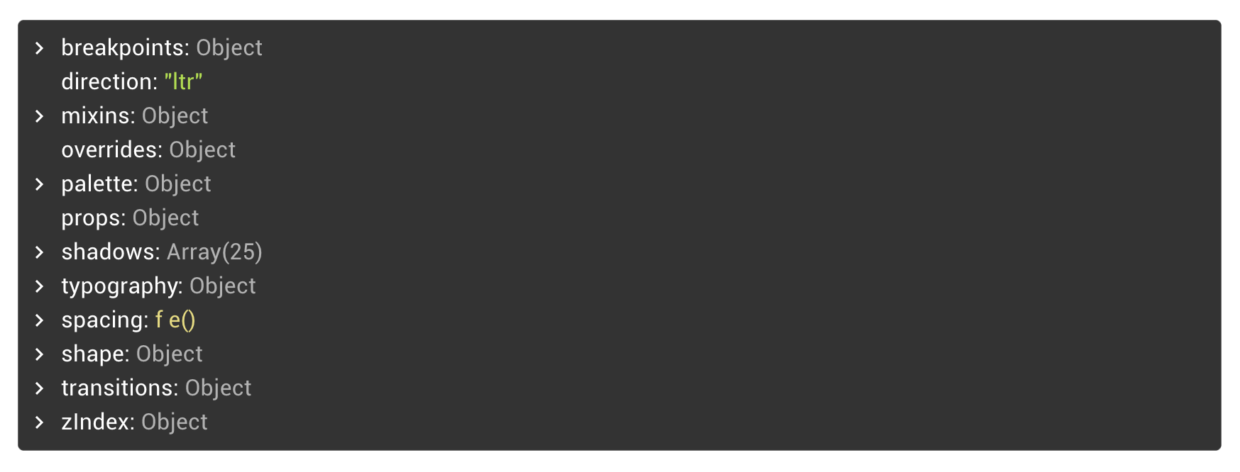
Here is a screenshot of the top-level properties of the default theme object:
这是默认主题对象的顶级属性的屏幕截图:
With ThemeProvider, this object becomes accessible throughout your React components, and as we will see further down, within styles also. Let’s run through some of the more important and ambiguous values of this default theme:
使用ThemeProvider ,可以在您的整个React组件中访问该对象,并且正如我们将在样式中看到的那样。 让我们来看一下该默认主题的一些更重要和模棱两可的值:
The
breakpointsproperty stores keys and values of various widths that define how responsive your app will be, and are similar to Bootstrap’s Layout breakpoints that exist for the same purpose. By default thexs,sm,md,lgandxlkeys are provided along with their corresponding minimum widths in the values property. These values can be accessed throughout your components and styles to conform to the same rules when creating responsive behaviour.breakpoints属性存储各种宽度的键和值,这些键和值定义应用程序的响应速度,并且类似于出于相同目的而存在的Bootstrap的Layout断点。 默认情况下,在values属性中提供xs,sm,md,lg和xl键以及它们相应的最小宽度。 在创建响应行为时,可以在整个组件和样式中访问这些值,以遵循相同的规则。mixinsprovide additional rules for classes that you can inject directly into your styles. Thetoolbarmixin injects a minimum height to a style for the purpose of headers and toolbars (as the name suggests). Thegutters()mixin provides spacing properties.mixins为类提供了其他规则,您可以将它们直接注入样式中。toolbarmixin为样式添加最小高度,以用于标题和工具栏(顾名思义)。gutters()mixin提供间距属性。paletteis where all your colours are defined. The main colours are the primary and secondary colours, that the majority of Material UI components rely on. Beyond these keys, a subset oflight,darkandmaincolours exist.palette是定义所有颜色的地方。 主要颜色是大多数Material UI组件所依赖的原色和辅助色。 除了这些键之外,还存在light,dark和main色的子集。
You may have noticed properties such as contrastThreshold and tonalOffset within palette. These properties are used to automatically generate a theme based on the main colours provided. For example, given a main primary and secondary colour, the light and dark properties will then be automatically generated along with text colours, that will conform to these thresholds.
您可能已经注意到调色板中的一些属性,例如contrastThreshold tonalOffset和tonalOffset 。 这些属性用于根据提供的主要颜色自动生成主题。 例如,给定的主主要和次要颜色, light及dark属性将然后用文本颜色一起被自动生成,其将符合这些阈值。
Initially you will want to focus on the primary and secondary colour palette. There are a range of tools online to generate a theme object based on these colours. We’ll visit how to automatically generate a theme in the next section.
最初,您将需要关注primary和secondary调色板。 在线上有很多工具可以根据这些颜色生成主题对象。 在下一节中,我们将介绍如何自动生成主题。
shadowsprovides an array of shadow configurations of varying intensity.shadows提供了一系列强度变化的阴影配置。typographyconfigures your fonts, weights, sizes, line heights and letter spacings for all text-based DOM elements, including headers, paragraphs and buttons. TheTypographycomponent in-particularly will rely heavily on these values.typography为所有基于文本的DOM元素(包括标题,段落和按钮)配置字体,粗细,大小,行高和字母间距。Typography部分尤其会严重依赖这些值。spacingcomes in handy when providingmarginandpaddingvalues when using Material UIs provided styling solution. spacing is actually a function, denoted by thef e()labelling in the default theme notation. We’ll cover defining styling further down, but this is how you would access spacing in a Material UI styles object:在使用Material UI提供的样式解决方案时,在提供
margin和padding值时,spacing会派上用场。 间隔实际上是一个函数,由默认主题符号中的fe()标签表示。 我们将在后面进一步定义样式,但这是您如何在Material UI样式对象中访问间距的方法:
// padding a `container` style by 2 spacing unitsimport {
  createStyles,
  makeStyles,
  Theme
} from '@material-ui/core/styles'const useStyles = makeStyles((theme: Theme) =>
  createStyles({
    container: {
      padding: theme.spacing(2)    },
  });
The 3 imports will become very familiar as you build styles for your components.
在为组件构建样式时,这3种导入将变得非常熟悉。
shape.borderRadiusis a key value to make your components look less Google-like. Making your shapes more round or more rectangular adds a distinctive feel to your design language, making this value worth playing with.shape.borderRadius是使您的组件看起来不像Google一样重要的关键值。 使您的形状更圆或更矩形可以为您的设计语言增添独特的感觉,使这一价值值得一试。
We’ve now talked about quite a few of the default theme objects, and have built up some key intuition about the range of values that Material UI components rely on. In the next section some key tools will be covered to aid in creating your own theme.
现在,我们讨论了许多默认主题对象,并建立了一些关于材质UI组件所依赖的值范围的关键直觉。 在下一部分中,将介绍一些关键工具以帮助创建您自己的主题。
Let’s address some common questions that arise from this stage before moving on:
在继续之前,让我们解决一些在此阶段出现的常见问题:
Are we limited to the default theme structure? Absolutely not. More properties of your choosing can be added to the default theme object. although the standard Material UI components will not recognise any ad-hoc theming you may introduce,
ThemeProviderwill still serve these configurations that you could then leverage in your own components.是否仅限于默认主题结构? 绝对不。 您可以将更多选择的属性添加到默认主题对象中。 尽管标准的Material UI组件无法识别您可能引入的任何临时主题,但是
ThemeProvider仍将提供这些配置,您可以在自己的组件中利用这些配置。Do we need to re-define the entire theme when creating an app-specific theme? No, Material UI fills all the missing default values of a given theme object. If you only defined a subset of palette — perhaps only the
primaryandsecondarycolours — the rest of the default theme palette will be added (along with the rest of the missing values). This is done by thecreateMuiThemewe’ll use in the next section.创建特定于应用程序的主题时,我们是否需要重新定义整个主题? 否,Material UI会填充给定主题对象的所有缺少的默认值。 如果仅定义调色板的一个子集(可能仅是
primary和secondary色),则将添加默认主题调色板的其余部分(以及其余的缺失值)。 这由下一节将使用的createMuiTheme完成。
创建自己的主题 (Creating your Own Theme)
Generating your own theme object can be fun, and there are a range of tools available online to aid in the process. This section will document those tools and how to effectively generate primary and secondary colours for your theme. That theme can then be exported as a JSON object and copied into your ThemeProvider’s theme prop.
生成自己的主题对象可能很有趣,并且在线提供了一系列工具来帮助您完成此过程。 本节将记录这些工具以及如何有效生成主题的原色和副色。 然后可以将该主题导出为JSON对象,然后将其复制到ThemeProvider的theme道具中。
材质UI颜色工具 (Material UI Color Tool)
The official MUI Color Tool is a good starting point for choosing your primary and secondary theme colours. The tool can be found here and documentation here. The Color Tool is easy and intuitive to use, and displays your colours applied to a range of interface elements and text styling.
官方的MUI颜色工具是选择主要和辅助主题颜色的良好起点。 可以在此处找到该工具,并在此处找到文档。 “颜色工具”易于使用且直观,可显示应用于各种界面元素和文本样式的颜色。
The following screenshot is of a theme I configured for an administration panel project, with a focus on pastel like colours:
以下屏幕快照是我为管理面板项目配置的主题,重点是柔和的颜色:
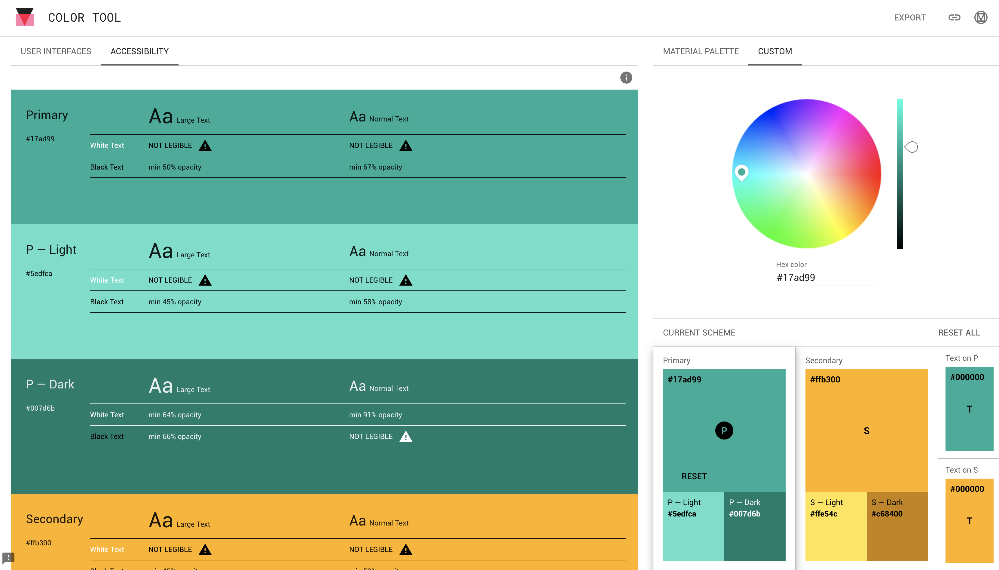
Themes can also be shared via the top right link icon. Check out my theme here.
也可以通过右上方的链接图标共享主题。 在这里查看我的主题。
The light and dark variants of this theme were automatically generated based on the two main colours. Because of the ambiguity of these auto-generated colours, the GUI presents every text-to-background-colour pair and flags which are incompatible via the “Not Legible” label.
该主题的明暗变体是根据两种主要颜色自动生成的。 由于这些自动生成的颜色含混不清,因此GUI会显示每个“文本到背景”颜色对和标记,这些标记和标记通过“不清晰”标签不兼容。
I have found that these warnings can be over strict — take the primary green colour with the white text variation above. Ultimately you’re the artist of your app and you should make the final call to which colours are suitable for your needs.
我发现这些警告可能过于严格-采取主要的绿色和上面带有白色文本的形式。 最终,您是应用程序的艺术家,您应该最终确定哪种颜色适合您的需求。
主题编辑器和JSON下载 (Theme Editor and JSON Download)
Another useful tool is called the Theme Editor tool — an open source tool external from the official Material UI maintained resources. This tool is extremely useful; it displays more Material UI components with your theme applied to them, and allows more granular control of the colours used in the left sidebar.
另一个有用的工具称为主题编辑器工具-官方Material UI维护的资源外部的开源工具。 这个工具非常有用。 它显示了更多的Material UI组件,并将您的主题应用于它们,并允许更精细地控制左侧边栏中使用的颜色。
Here is the same theme from above applied to the tool:
这是从上方应用于该工具的同一主题:
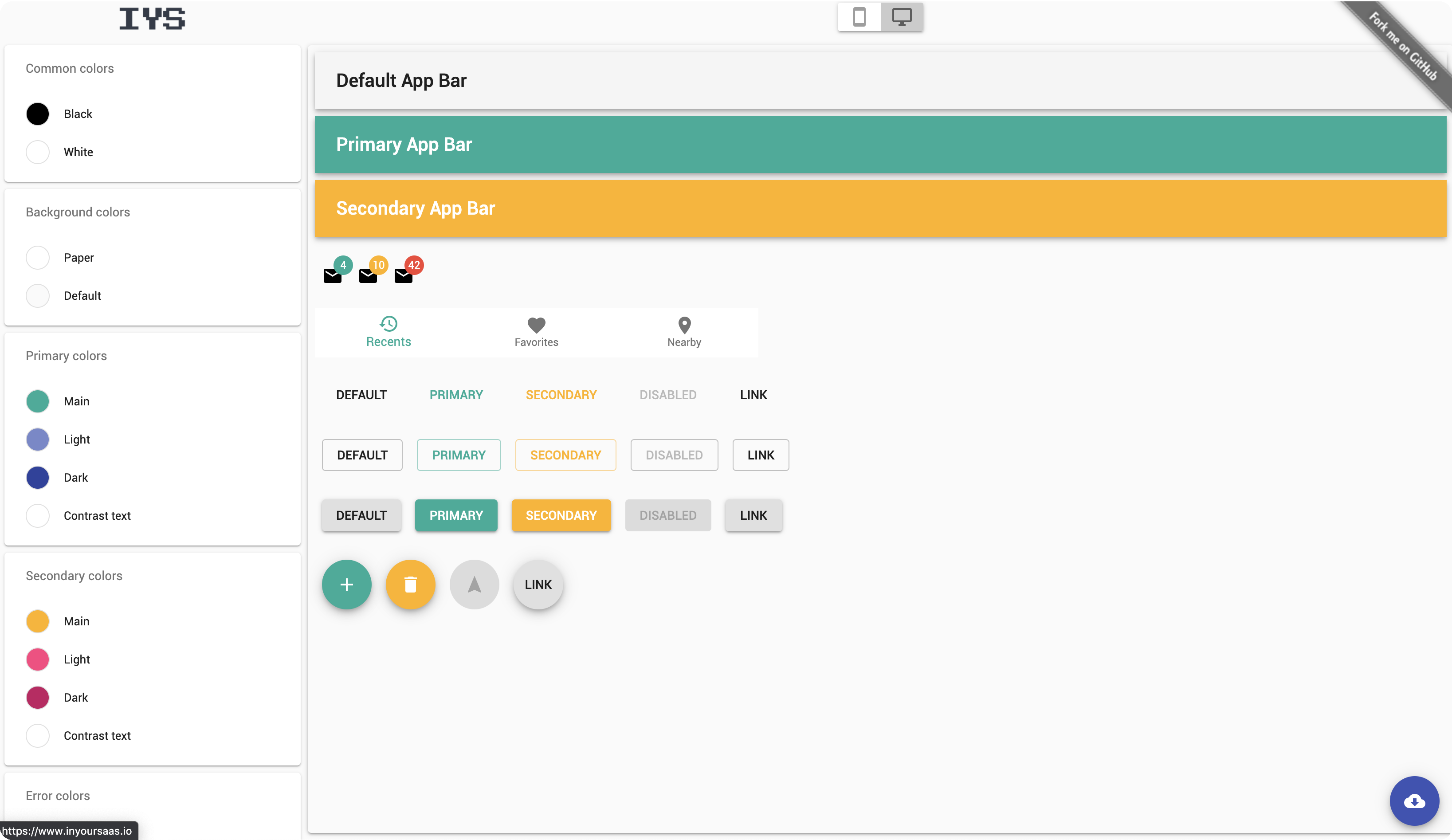
Notice the button in the bottom right corner — click this button to export a JSON object of your theme, formatted in the same way the default Material UI theme was from earlier.
请注意右下角的按钮-单击此按钮可以导出主题的JSON对象,其格式与默认Material UI主题的格式相同。
在React中插入主题 (Plugging in your theme in React)
From here it is straight forward to apply the generated theme. Create a theme.js file to host the theme, and use Material UI’s createMuiTheme utility function to fill in the gaps:
从这里开始,直接应用生成的主题。 创建一个theme.js文件来托管主题,并使用Material UI的createMuiTheme实用工具功能来填补空白:
// theme.jsimport { createMuiTheme } from '@material-ui/core/styles'export const theme = createMuiTheme({
  "palette": {
    "common": {
      "black": "#000",
      "white": "#fff"
    },
    "background": {
      "paper": "#fff",
      "default": "#fafafa"
    },
    "primary": {
      "light": "rgba(89, 210, 188, 1)",
      "main": "rgba(20, 160, 140, 1)",
      "dark": "rgba(0, 113, 95, 1)",
      "contrastText": "#fff"
    },
    ...
  }
});export default theme;
Read more on defining your own themes at the official docs here, or see a more complex example on GitHub here.
了解更多关于在官方文档定义自己的主题在这里,或在Github上查看一个更复杂的例子在这里。
With this object now in place, you are free to apply it to ThemeProvider, in your top level <App /> component for instance:
有了此对象后,您就可以将其自由应用于例如顶层<App />组件中的ThemeProvider :
import { ThemeProvider } from '@material-ui/core/styles'
import { theme } from './theme'const AppWrapped: React.FC = (props: any) => (
   <ThemeProvider theme={theme}>
      ...
   </ThemeProvider>
)export default App;
With your theme now applied to your entire component tree, any Material UI component you plug into your app will now adhere to that customisation.
现在,您的主题已应用于整个组件树,插入到应用程序中的任何Material UI组件现在都将遵循该自定义设置。
The last section of this piece will briefly introduce the styling solution of Material UI and how to access your theme properties directly within those styles.
本文的最后一部分将简要介绍Material UI的样式解决方案,以及如何直接在这些样式中访问主题属性。
材质用户界面中的样式 (Styling in Material UI)
Material UI’s styling solution is available from the @material-ui/styles package. Although Material UI is interoperable with other styling solutions, their solution does appear to be the preferred one with over 1 million weekly downloads at the time of writing.
可从@material-ui/styles包中获取Material UI的样式解决方案。 尽管Material UI可与其他样式解决方案互操作,但在撰写本文时,他们的解决方案确实是每周下载超过100万次的首选方案。
Three imports will become very familiar to you as you define styles for your components:
在为组件定义样式时,您将非常熟悉三种导入:
import { createStyles, makeStyles, Theme } from '@material-ui/core/styles'The third import, Theme, is for TypeScript based projects and is not needed if you are opting to use JavaScript instead.
第三次导入Theme ,用于基于TypeScript的项目,如果您选择使用JavaScript,则不需要。
As per the documentation, createStyles does not really do anything, simply acting as an identity function to pass your styles into. makeStyles on the other hand links a stylesheet to a function component utilising the hooks pattern in React.
根据文档, createStyles实际上并没有做任何事情,只是充当将样式传递给您的标识函数。 另一方面, makeStyles利用React中的钩子模式将样式表链接到功能组件。
These three imports can be put together to define a stylesheet that can then be used in a component, like so:
这三个导入可以放在一起定义一个样式表,然后可以在组件中使用它,如下所示:
// defining and using a Material UI stylesheetconst useStyles = makeStyles((theme: Theme) =>
  createStyles({    container: {
      display: 'flex',
      flexDirection: 'row',
      justifyContent: 'center',
      paddingBottom: theme.spacing(1.5)
    }
  }),
);export const MyComponent = (props: any) => {

  const classes = useStyles();  return (
    <Container className={classes.container}>
      ...
    </Container>
  );
}
Notice that the entire theme (provided by ThemeProvider) is accessible via the theme argument of makeStyle’s function (we’re defining the stylesheet within an anonymous function). Various theme properties can then be included directly into your classes. theme.spacing has been used in the above example to provide padding to the element.
注意,整个主题(由ThemeProvider提供)可通过makeStyle函数的theme参数(我们在匿名函数中定义样式表)进行访问。 然后,可以将各种主题属性直接包含在您的班级中。 上面的示例中使用theme.spacing为元素提供填充。
As another example, the palette object can be accessed to assign a primary or secondary color to a class:
再举一个例子,可以访问调色板对象以为一个类分配主要或辅助颜色:
const useStyles = makeStyles((theme: Theme) =>
  createStyles({paper: {
      padding: theme.spacing(2),
      textAlign: 'center',
      color: theme.palette.text.secondary,      flex: '1 0 auto',
      margin: theme.spacing(1),
    },
  }),
);
The light or dark variant will be determined based on your current assigned theme.
亮或暗变体将根据您当前分配的主题确定。
综上所述 (In Summary)
This piece has introduced Material UI in the context of theming your React app, with the aim of being able to style the library of Material UI components to your own requirements.
本文在主题化您的React应用程序的上下文中介绍了Material UI,旨在能够根据您自己的需求来设计Material UI组件库。
We’ve covered the default theme object and the range of properties that can be configured, as well as the means of providing a theme to your React component hierarchy via the ThemeProvider context. We then looked into how to effectively create your own palette of theme colours using online tools provided by the open source community. Also briefly visited was Material UIs styling solution and how to access your theme config from directly within a stylesheet.
我们已经介绍了默认主题对象和可以配置的属性范围,以及通过ThemeProvider上下文为React组件层次结构提供主题的方法。 然后,我们研究了如何使用开源社区提供的在线工具有效地创建自己的主题色调色板。 还简要介绍了Material UI样式解决方案,以及如何直接从样式表中访问主题配置。
More advanced Material UI articles will be embedded here as they are published!
发布时将在此处嵌入更多高级Material UI文章!
翻译自: https://medium.com/@rossbulat/theming-with-material-ui-in-react-49cc767dfc86
react前端ui的使用


 652
652

 被折叠的 条评论
为什么被折叠?
被折叠的 条评论
为什么被折叠?
 到【灌水乐园】发言


