


axure rp 创建弹框
Axure is a well-known prototyping tool with a lot of history, it has been around for years. You can create almost any kind of prototypes from simple ones to more complex ones with variables and logic without writing a single line of code (well, when dealing with the complexity you will need to write some expressions).
Axure是著名的原型制作工具,已有很长的历史了,已经存在了很多年。 您可以创建几乎所有类型的原型,从简单的原型到具有变量和逻辑的更复杂的原型,而无需编写任何代码(嗯,当处理复杂性时,您将需要编写一些表达式)。
先决条件 (Prerequisites)
First, you need to have Axure installed, if you don’t have it then simply head over axure.com and download the latest (trial) version.
首先,您需要安装Axure ,如果没有,请直接访问axure.com并下载最新(试用)版本。
Axure is available for Windows and Mac, so choose the appropriate version to download.
Axure可用于Windows和Mac,因此请选择适当的版本进行下载。
If you are a little bit familiar with Axure (even with older versions) you know about widgets, interactions and cases then you are on the right track, if not, you should still be able to follow the steps in this tutorial.
如果您对Axure(甚至是较旧的版本)有点了解,那么您会了解小部件,交互和用例,那么您就走对了 ,否则,您仍然可以按照本教程中的步骤进行操作。
我们将创造什么 (What we will create)

In this tutorial, we will see how we can put together a simple switch (a very well known input control pattern) used in mobile or desktop UI. The important part to this component is the interaction (the on/off toggle interaction).
在本教程中,我们将看到如何将用于移动或桌面UI的简单开关 (众所周知的输入控制模式)组合在一起。 该组件的重要部分是交互(打开/关闭切换交互)。
If you want to learn more about this control type you can take a look at the Apple HIG here: https://developer.apple.com/design/human-interface-guidelines/ios/controls/switches/
如果您想了解有关此控件类型的更多信息,可以在这里查看Apple HIG: https : //developer.apple.com/design/human-interface-guidelines/ios/controls/switches/
To make everything work(on the interaction part), we will use a little bit of logic to respond to the click(or tap) event in order to toggle the switch (but we will not gonna use variables for this).
为了使一切正常(在交互部分上),我们将使用一些逻辑来响应click(或tap)事件,以切换开关(但我们不会为此使用变量)。
The reason for not using a variable to handle the toggle state is because we want this component to be self contained (without dependencies) to be easily reused across projects.
不使用变量来处理切换状态的原因是因为我们希望该组件是自包含的(没有依赖项),以便可以在项目中轻松重用。
分步说明 (Step by step instructions)
This tutorial is quite simple and it has only 2 steps.
本教程非常简单,只有两个步骤。
步骤1 —建立必要的形状 (Step 1 — Building the necessary shapes)
First things first. Let’s create the basic shapes by dragging 1 rectangle and 1 ellipse on the canvas area. The rectangle will be the background (so we can also rename it to background) and the ellipse will be the knob (also rename it to knob).
首先是第一件事。 让我们通过在画布区域上拖动1个矩形和1个椭圆来创建基本形状。 矩形将是背景 (因此我们也可以将其重命名为背景),而椭圆将是旋钮 (也将其重命名为旋钮)。
For these to shape I’ve used the following settings (see below) and at the end I’ve grouped them (and renamed the group to switch).
为了使它们成形,我使用了以下设置(请参见下文),最后将它们分组(并重命名了要切换的组)。

If you don’t have too much experience with Axure shape widgets then you can read more about them here: https://docs.axure.com/axure-rp/reference/shapes/.
如果您对Axure形状小部件没有太多经验,则可以在这里阅读有关它们的更多信息: https : //docs.axure.com/axure-rp/reference/shapes/ 。
Shape properties:
形状属性:
Knob:
旋钮 :
- Width/Height: 27 宽/高:27
- Fill: #FFFFFF 填写:#FFFFFF
- Shadow: fill: #000000, opacity: 6%, x: 0, y: 3 阴影:填充:#000000,不透明度:6%,x:0,y:3
Background:
背景 :
- Width: 51 宽:51
- Height: 31 高度:31
- Fill: #D7D7D7 填写:#D7D7D7
For the background shape I’ve also set up 2 style effects (selected and disabled) using the Interactions tab.
对于背景形状,我还使用“ 交互”选项卡设置了2种样式效果( 选中和禁用 )。

第2步-添加互动 (Step 2 — Adding interactivity)
Now, that we have done the basic setup and have all the shapes we can move to the interactivity.
现在,我们已经完成了基本设置,并拥有了可以移至交互性的所有形状。
We will add the interactivity on the group object (this way we can respond to the group events) on the click(tap) event.
我们将在click(tap)事件上将交互性添加到组对象上(通过这种方式,我们可以响应组事件)。
See the image below (with the Interaction Editor) where I’ve added the interactivity (don’t worry if it looks complex, I’ll explain what is happening).
参见下图(使用“交互编辑器”),其中添加了交互性(不要担心它看起来是否复杂,我将解释发生了什么)。

So let’s break this down.
因此,让我们分解一下。
I’ve added an interaction on the Click(tap) trigger (so this is the click/tap event). To add an interaction make sure that you have the switch group selected and on the Interaction panel click on the New Interaction button and select the Click or Tap trigger.
我在Click(tap)触发器上添加了一个交互(因此这是click / tap事件)。 要添加交互,请确保已选择开关组,然后在“ 交互”面板上单击“ 新建交互”按钮,然后选择“ 单击”或“点击”触发器。
If you are not really familiar with events, actions, cases you can read more about them on the Axure website https://docs.axure.com/axure-rp/reference/events-cases-actions/.
如果您不太熟悉事件,操作和案例,则可以在Axure网站https://docs.axure.com/axure-rp/reference/events-cases-actions/上阅读有关它们的更多信息。
Now, as you can see on the image, we have 2 cases named SwitchOn and SwitchOff and each of these steps have some actions.
现在,你可以在图像上看到的,我们有2箱子命名合闸合闸和关机和每个步骤都有一些动作。
1.打开机箱。 (1. SwitchOn case.)
To add a case just click on the Enable Cases button for the Click(Tap) trigger in the Interaction panel. Clicking on the Enable Cases will open the Condition Builder dialog, this is where we can build our condition and run a set of actions if this condition is evaluated as true.
要添加案例,只需在“交互”面板中单击Click(Tap)触发器的“ 启用案例”按钮。 单击“ 启用案例”将打开“ 条件构建器”对话框,在此条件下,如果此条件被评估为true ,我们可以在其中构建条件并运行一组操作。
See the image below with the set up for the condition.
请参阅下面的图片,其中包含针对该条件的设置。
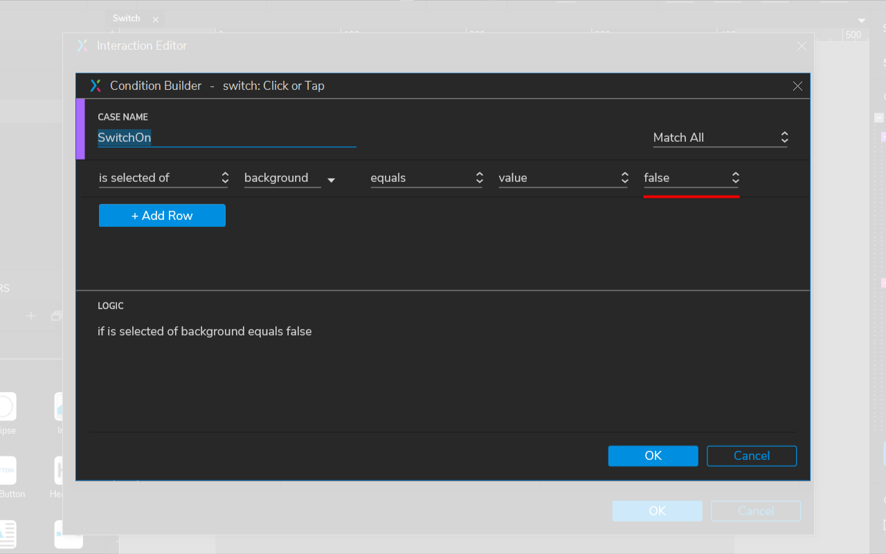
As you can see we will check if the background selected value is false. If this happens it will run a series of actions (see my previous image).
如您所见,我们将检查背景选定值是否为false 。 如果发生这种情况,它将执行一系列操作(请参阅我的上一张图像)。
Here are the actions:
操作如下:
Action Move (basically we will move the knob on the horizontal axis from left to right by 20):
动作移动 (基本上,我们将水平轴上的旋钮从左向右移动20):
- Target: knob 目标:旋钮
- Move: by x: 20, y:0 移动:x:20,y:0
- Animate: ease in cubic: 200ms 动画:立体感缓解:200ms
2. Action Set Selected/Checked (we set the background selected value to true):
2. Action Set Selected / Checked ( 将选中/选中的动作设置为背景 (我们将背景选择值设置为true ):
- Target: background 目标:背景
- Set: value 设定值
- To: true 至:正确
This is it, let’s now move to the SwitchOff case.
就是这样,让我们现在转到“关闭”案例。
2. 关机情况 (2. SwitchOff case)
The SwitchOff case will be quite similar with the SwitchOn case with 2 small changes.
在关机的情况下将与合闸合闸情况下用2个小的变化非常相似。
One change will be on the condition, see the image below.
条件将发生变化,请参见下图。

As you can see the condition is the same, except we check if it is true.
如您所见,条件相同,只是我们检查它是否为true 。
So if the condition is met then we will execute the same steps as on our previous condition with small changes.
因此,如果满足条件,则我们将执行与先前条件相同的步骤,并进行少量更改。
Here are the actions:
操作如下:
Action Move (this is where we move the knob from left to right with a negative value by -20):
动作移动(这是我们将旋钮从左向右移动负值-20的位置):
- Target: knob 目标:旋钮
Move: by x: -20, y:0
移动:x: -20 ,y:0
- Animate: ease in cubic: 200ms 动画:立体感缓解:200ms
2. Action Set Selected/Checked (we set the background selected value to false):
2. Action Set Selected / Checked(设置选定/选中操作)(我们将选定的背景值设置为false ):
- Target: background 目标:背景
- Set: value 设定值
To: false
收件人: 假
This is it.
就是这个。
Creating a switch UI component in Axure is relatively easy with just one simple interaction in a group. Now, we can enjoy our new switch component in future projects. You can also download the Axure file from here: https://hi.switchy.io/1O4f
在一个组中只有一个简单的交互,在Axure中创建一个Switch UI组件相对容易。 现在,我们可以在将来的项目中使用我们的新开关组件。 您也可以从此处下载Axure文件: https ://hi.switchy.io/1O4f
翻译自: https://uxdesign.cc/how-to-create-a-switch-in-axure-rp-9-f42060d99b1a
axure rp 创建弹框


 818
818


 被折叠的 条评论
为什么被折叠?
被折叠的 条评论
为什么被折叠?
 到【灌水乐园】发言


