


插图 引用 同一行两个插图
Every creative person has probably already been in this situation: A project, be it a website, an app — or as far as I am concerned: often a news story would benefit from an appealing side visual. But neither budget nor time makes it possible to hire an illustrator. Yeah, know this situation, been there and would like to show you a way out in this article. Today you will learn how to conjure a simple but effective illustration from a simplistic icon in only five steps. In Sketch, Illustrator, Figma or literally any design software you can imagine.
每个有创造力的人都可能已经处于这种情况:一个项目,无论是网站,应用程序,或者就我而言:新闻故事通常都可以从吸引人的视觉效果中受益。 但是预算和时间都无法聘请插图画家。 是的,知道这种情况,并希望在本文中为您指明出路。 今天,您将学习仅用五个步骤就可以从一个简单的图标中提取出一个简单而有效的插图。 在Sketch,Illustrator,Figma或您可以想象的任何设计软件中。
Let’s go!
我们走吧!
步骤1:选取图示 (Step 1: Pick your Icon)
First, you want to make sure to pick an icon that fits your visual and semantic needs. It’s best to choose a suitable icon from any open source — I usually use the outline icons from material.io. Of course, you can also stick to any other resource you might have access to. For this tutorial, I chose the “subscription” icon of Material Design in the duo-tone variant.
首先,您要确保选择适合您视觉和语义需求的图标。 最好从任何开源中选择合适的图标-我通常使用material.io中的轮廓图标。 当然,您也可以坚持使用任何其他可能具有访问权限的资源。 在本教程中,我选择了双色调变体中的Material Design的“订阅”图标。
Pro tip: Make sure to download your icon as an SVG to be able to scale it efficiently. Because that is also the first step we are going to perform in order to create our illustration:
专家提示:请确保将图标下载为SVG,以便能够有效缩放。 因为这也是我们为了创建插图而要执行的第一步:

The first step is to make your icon big enough to be the star in your illustration later. You can also make some minor tweaks to it at this stage if you like. For instance, in the case of my icon, the two lines in the upper section had some strange offsets to them, so I changed the spacing a little bit after resizing. Beyond that I also wasn’t satisfied with the harsh edges of the two upper bars, so I gave them rounded corners to match the visual style of the bottom window.
第一步是使图标足够大,以便稍后成为插图中的星星。 如果愿意,您也可以在此阶段对其进行一些细微调整。 例如,对于我的图标,上半部分的两行有一些奇怪的偏移,因此在调整大小后我更改了一点间距。 除此之外,我也对两个上部条形的粗糙边缘不满意,所以我给了它们圆角以匹配底部窗口的视觉样式。
If you have more than one element for your icon, make sure that the stroke size is the same throughout your composition, otherwise, it will look unbalanced in the end.
如果您的图标有多个元素,请确保整个构图的笔触大小相同,否则最终看起来会不平衡。
第2步:选择颜色 (Step 2: Select your Colours)
Next, you should choose a colour for your main icon. Vibrant ones are best suited for this. If you work for a company with an existing style guide, you should, of course, use the colours according to the given CI. Otherwise, you can get inspiration from the logo or other design elements of the company. Now, paint the most important elements in your design with this colour. I have chosen a bright red as my main colour for the composition. As a secondary colour, I like to use complementary ones, because it gives the whole piece more vividness. For this project, I’ve chosen a shade of medium blue as an alternative colour.
接下来,您应该为主图标选择一种颜色。 充满活力的最适合于此。 如果您在使用现有样式指南的公司工作,则应根据给定的CI使用颜色。 否则,您可以从公司的徽标或其他设计元素中获得灵感。 现在,用这种颜色绘制设计中最重要的元素。 我选择了鲜艳的红色作为合成的主要颜色。 作为第二种颜色,我喜欢使用互补色,因为它使整件作品更加生动。 对于这个项目,我选择了中等蓝色的阴影作为替代颜色。

If your customer really doesn’t give you any instructions for colour selection or you start a completely new and standalone project, you can use a colour palette generator like this one from Coolors. Smash the Space Bar until you really love a combination and paint your icon accordingly.
如果您的客户确实没有为您提供任何颜色选择说明,或者您启动了一个全新的独立项目,则可以使用Coolors中的此类调色板生成器。 粉碎空格键,直到您真的喜欢组合并相应地绘制图标。
步骤3:为您的构图添加形状 (Step 3: Add Shapes to your composition)
Our icon already looks good now, but for an illustration, there is still a lot of stuff missing. In order to prevent it from floating in a vacuum, we add some shape to our layout. Let’s insert an abstract background shape. I often use simple rectangular or oval forms as a starting point and change them with my pen tool just so that a visually appealing bubble is created.
现在,我们的图标已经看起来不错,但是作为示例,仍然缺少很多东西。 为了防止它在真空中漂浮,我们在布局中添加了一些形状。 让我们插入一个抽象的背景形状。 我经常以简单的矩形或椭圆形为起点,并使用钢笔工具对其进行更改,以创建一个视觉上吸引人的气泡。
To make the whole composition even more interesting, we add two floating bubbles and colour them in our two previously chosen shades. To make the whole thing a bit more interesting, I give the two elements an opacity of 60% to let the form that lies behind shine through just slightly. This gives us an adorable, almost glass-like look and adds even more character to the plain icon from the beginning.
为了使整个构图更加有趣,我们添加了两个浮动气泡,并用之前选择的两个阴影为其着色。 为了使整个事情变得更加有趣,我为两个元素提供了60%的不透明度,以使后面的形式略微闪耀。 这给了我们一种可爱的,几乎像玻璃的外观,并从一开始就为纯图标添加了更多特征。
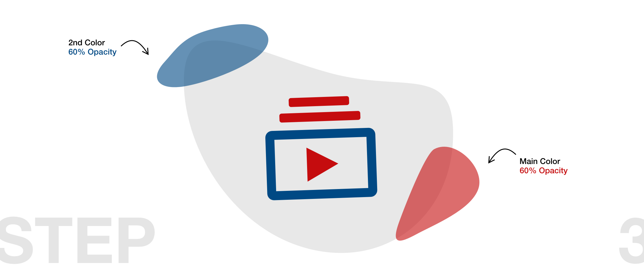
At this stage, it already helps to know where you are going to make use of your gorgeous illustration later on. For example, If you put it in front of a dark background, you may paint the rear bubble in a brighter tone now — if your background is on the lighter side, I would advise you to use a dark colour as the backmost layer. The reason for this is visual contrast, which can never be high enough. Usually, this makes your layouts more striking and visually appealing to your audience.
在此阶段,知道以后将在哪里使用华丽的插图已经很有帮助。 例如,如果将其放置在深色背景之前,则可以现在以较亮的色调绘制后气泡-如果背景较浅,我建议您使用深色作为最后一层。 原因是视觉对比度,它永远不会足够高。 通常,这会使您的布局更加醒目,并在视觉上吸引观众。
步骤4:深入了解主要元素 (Step 4: Give your main elements depth)
In the fourth step, we add more depth to the elements we already have by creating some shadows. However, we don’t just use drop shadows but take advantage of the fact that we work on vector graphics and can therefore not only change the border size of the elements but also give them different fills. To get a shadow with extra depth, we duplicate our entire icon and re-colour it. But instead of using a regular fill for our duplicate, we use linear gradients to do so.
在第四步中,我们通过创建一些阴影来增加已有元素的深度。 但是,我们不仅使用阴影,还利用了我们在矢量图形上工作的事实,因此不仅可以更改元素的边框大小,还可以为其填充不同的填充。 为了获得更深的阴影,我们复制了整个图标并重新着色。 但是,我们不是使用常规填充来填充副本,而是使用线性渐变来做到这一点。
Give the red elements a red linear gradient leading into transparency and the blue elements a blue gradient leading into transparency. In order to achieve the effect of a physical shadow, we give both the blue and the red colour in the gradient transparency of 40%.
为红色元素提供一个导致透明度的红色线性渐变,为蓝色元素提供一个导致透明度的蓝色渐变。 为了获得物理阴影的效果,我们将蓝色和红色都设置为40%的渐变透明度。
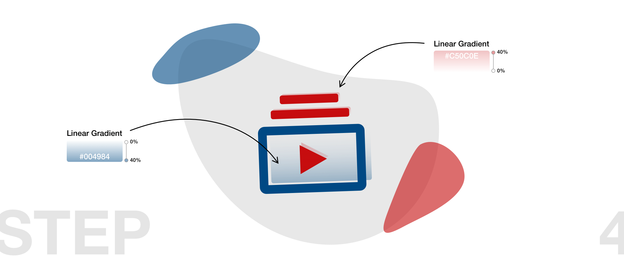
In this step, you can play with the positioning of the shadow element as you like. There is only one rule you should follow: as humans, we are used to the fact that the shadow of objects always goes in the same direction. This is because of a big global light source called “the sun”. In general, we consider everything else to be unusual and strange. So don’t make your audience think and deliver all shadow elements in the same distance to their parent elements.
在此步骤中,您可以随意调整阴影元素的位置。 您只应遵循一条规则:作为人类,我们已经习惯了这样一个事实,即物体的阴影总是朝同一方向前进。 这是因为有一个巨大的全球性光源称为“太阳”。 总的来说,我们认为其他所有事情都是异常和奇怪的。 因此,请不要让您的听众思考并向所有阴影元素提供与其父元素相同的距离。
If you want to do something fancy, try inverting the gradient for one of the two colours, as I did in the example above. This will create the effect as if the eye line of the observer is exactly at the middle height of the icon. With this little technique, you can achieve even more visual depth.
如果您想做一些花哨的操作,请尝试反转两种颜色之一的渐变,就像我在上面的示例中所做的那样。 这将产生一种效果,就好像观察者的视线正好在图标的中间高度一样。 使用这种小技巧,您可以获得更大的视觉深度。
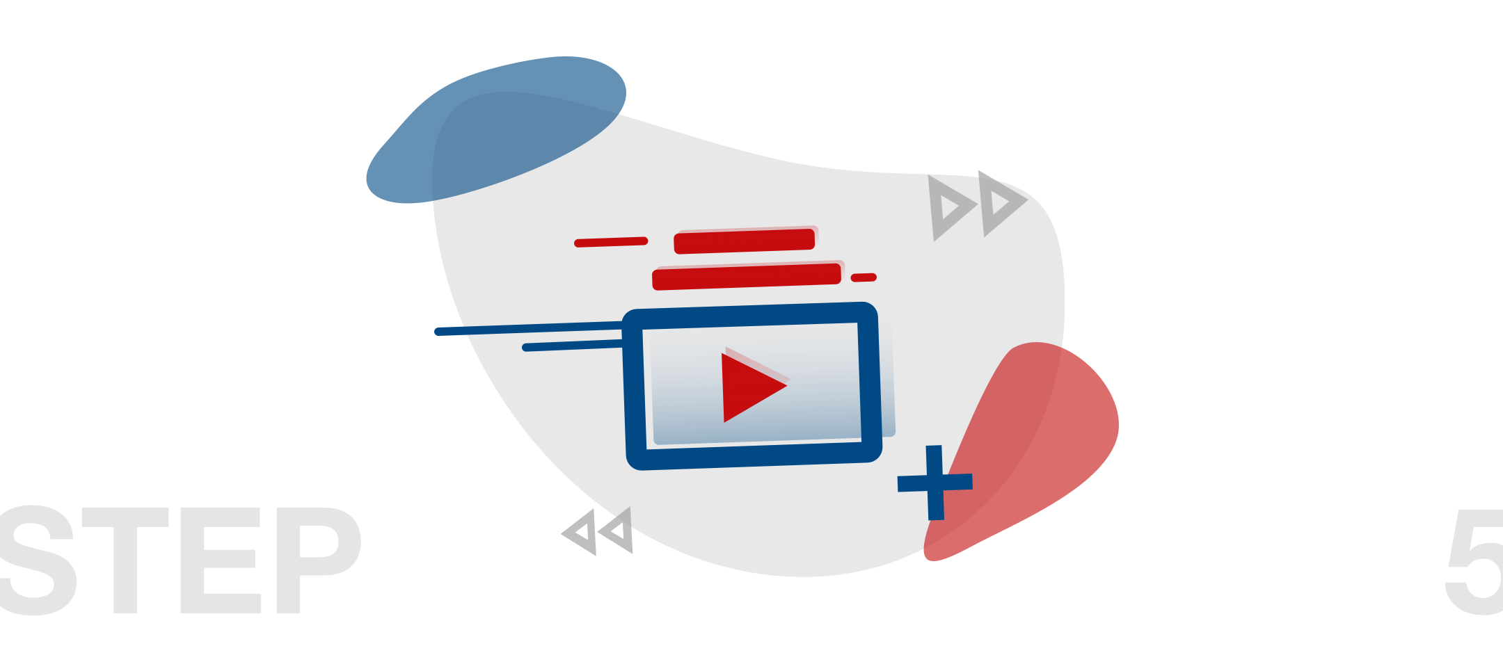
步骤5:添加与内容相关的设计元素 (Step 5: Add content-related design elements)
Last but not least, you can give free rein to your creativity. Add a few content-related design elements in suitable places within your illustration. I decided to use forward and backward buttons and plus and minus symbols to do so. I tinted them with the help of my already established colour palette and some darker shades of grey matching the background. If that’s not enough, we can use our pencil tool and draw some vertical or horizontal lines and abstract our original icon even more. Even though it’s tempting, don’t go crazy with colouring at this point because otherwise, you will lose your already established visual hierarchy.
最后但并非最不重要的一点是,您可以自由发挥自己的创造力。 在插图中的适当位置添加一些与内容相关的设计元素。 我决定使用前进和后退按钮以及加号和减号来执行此操作。 我借助已经建立的调色板和与背景匹配的一些较深的灰色阴影为它们着色。 如果这还不够,我们可以使用铅笔工具绘制一些垂直或水平线,并进一步抽象原始图标。 即使很诱人,也请不要为着色而疯狂,因为否则,您将失去已经建立的视觉层次。
E voilà: Our icon is ready and we can finally use it in our projects:
Evoilà:我们的图标已经准备好,我们终于可以在项目中使用它了:
增强您的项目 (Enhance your project)
Now that we have created an illustration from a simple icon in five easy steps, you can use your creation in your layout. To do this, it is best to export it in SVG or PNG format in order to really take advantage of the transparent areas of your illustration and not have to accept any loss of quality.
现在,我们已经通过五个简单的步骤从一个简单的图标创建了一个插图,您可以在布局中使用您的作品。 为此,最好以SVG或PNG格式导出它,以便真正利用插图的透明区域而不必承担任何质量损失。
I hope you enjoy the final result of your artwork and I hope you can incorporate this technique into your projects more often in the future.
我希望您喜欢艺术品的最终结果,并希望将来您可以将这种技术更多地应用于您的项目中。

翻译自: https://medium.com/swlh/five-easy-steps-to-turn-an-icon-into-an-illustration-b69af96e9df
插图 引用 同一行两个插图


 246
246

 被折叠的 条评论
为什么被折叠?
被折叠的 条评论
为什么被折叠?
 到【灌水乐园】发言


