


 本文介绍了如何在R语言中使用ggplot2包进行图形的合并,详细解析了相关步骤和技巧。
r语言ggplot合并图形
介绍 (Introduction)
R is known to be a really powerful programming language when it comes to graphics and visualizations (in addition to statistics and data science of course!).
当涉及图形和可视化时(当然,除了统计和数据科学!), R是一种非常强大的编程语言。
To keep it short, graphics in R can be done in two ways, via the:
为了简短起见,R中的图形可以通过以下两种方式完成:
{graphics}package (the base graphics in R, loaded by default){graphics}软件包(R中的基本图形,默认情况下加载){ggplot2}package (which needs to be installed and loaded beforehand){ggplot2}软件包(需要预先安装和加载 )
The {graphics} package comes with a large choice of plots (such as plot, hist, barplot, boxplot, pie, mosaicplot, etc.) and additional related features (e.g., abline, lines, legend, mtext, rect, etc.). It is often the preferred way to draw plots for most R users, and in particular for beginners to intermediate users.
的{graphics}包带有一个大的选择重复(如plot , hist , barplot , boxplot , pie , mosaicplot等)和其他相关特征(例如, abline , lines , legend , mtext , rect等) 。 对于大多数R用户,尤其是初学者到中级用户,这通常是绘制图的首选方法。
Since its creation in 2005 by Hadley Wickham, {ggplot2} has grown in use to become one of the most popular R packages and the most popular package for graphics and data visualizations. The {ggplot2} package is a much more modern approach to creating professional-quality graphics. More information about the package can be found at ggplot2.tidyverse.org.
自从Hadley Wickham于2005年创建以来, {ggplot2}使用量逐渐增长,已成为最受欢迎的R软件包之一以及用于图形和数据可视化的最受欢迎的软件包之一 。 {ggplot2}软件包是创建专业品质图形的一种更为现代的方法。 有关该软件包的更多信息,请参见ggplot2.tidyverse.org 。
In this article, we will see how to create common plots such as scatter plots, line plots, histograms, boxplots, barplots, density plots in R with this package. If you are unfamiliar with any of these types of graph, you will find more information about each one (when to use it, its purpose, what does it show, etc.) in my article about descriptive statistics in R.
在本文中,我们将看到如何使用此程序包在R中创建常见图,例如散点图,线图,直方图,箱线图,条形图,密度图。 如果您不熟悉这些类型的图形,则可以在我有关R中描述性统计的文章中找到有关每个图形的更多信息(何时使用它,其目的,显示什么等)。
数据 (Data)
To illustrate plots with the {ggplot2} package we will use the mpg dataset available in the package. The dataset contains observations collected by the US Environmental Protection Agency on fuel economy from 1999 to 2008 for 38 popular models of cars (run ?mpg for more information about the data):
为了说明{ggplot2}软件包的绘图,我们将使用软件包中提供的mpg数据集。 该数据集包含美国环境保护署从1999年到2008年收集的关于38种流行车型的燃油经济性的观察结果(运行?mpg以获取有关数据的更多信息):
library(ggplot2)
dat <- ggplot2::mpg
Before going further, let’s transform the cyl, drv, fl, year and class variables in factor with the transform() function:
在继续之前,让我们使用transform()函数对cyl , drv , fl , year和class变量进行因子 transform() :
dat <- transform(dat,
  cyl = factor(cyl),
  drv = factor(drv),
  fl = factor(fl),
  year = factor(year),
  class = factor(class)
) {ggplot2}基本原理 (Basic principles of {ggplot2})
The {ggplot2} package is based on the principles of “The Grammar of Graphics” (hence “gg” in the name of {ggplot2}), that is, a coherent system for describing and building graphs. The main idea is to design a graphic as a succession of layers.
{ggplot2}软件包基于“图形语法”的原理(因此以{ggplot2}的名称命名为“ gg”),即描述和构建图形的连贯系统。 主要思想是将图形设计为一系列图层 。
The main layers are:
主要层是:
The dataset that contains the variables that we want to represent. This is done with the
ggplot()function and comes first.包含我们要表示的变量的数据集 。 这是通过
ggplot()函数完成的,并且是第一个。The variable(s) to represent on the x and/or y-axis, and the aesthetic elements (such as color, size, fill, shape and transparency) of the objects to be represented. This is done with the
aes()function (abbreviation of aesthetic).要在x和/或y轴上表示的变量 ,以及要表示的对象的美学元素(例如颜色,大小,填充,形状和透明度)。 这是通过
aes()函数(美学的缩写)完成的。The type of graphical representation (scatter plot, line plot, barplot, histogram, boxplot, etc.). This is done with the functions
geom_point(),geom_line(),geom_bar(),geom_histogram(),geom_boxplot(), etc.图形表示的类型 (散点图,折线图,条形图,直方图,箱形图等)。 这是通过函数
geom_point(),geom_line(),geom_bar(),geom_histogram(),geom_boxplot()等完成的。- If needed, additional layers (such as labels, annotations, scales, axis ticks, legends, themes, facets, etc.) can be added to personalize the plot. 如果需要,可以添加其他图层(例如标签,注释,比例,轴刻度,图例,主题,构面等)来个性化绘图。
To create a plot, we thus first need to specify the data in the ggplot() function and then add the required layers such as the variables, the aesthetic elements and the type of plot:
因此,要创建绘图,我们首先需要在ggplot()函数中指定数据,然后添加所需的图层,例如变量,美观元素和绘图类型:
ggplot(data) +
  aes(x = var_x, y = var_y) +
geom_x()datainggplot()is the name of the data frame which contains the variablesvar_xandvar_y.data在ggplot()是其中包含变量的数据帧的名称var_x和var_y。The
+symbol is used to indicate the different layers that will be added to the plot. Make sure to write the+symbol at the end of the line of code and not at the beginning of the line, otherwise R throws an error.+符号用于指示将添加到绘图中的不同图层。 确保在代码行的末尾而不是在行的开头写+,否则R会引发错误。The layer
aes()indicates what variables will be used in the plot and more generally, the aesthetic elements of the plot.图层
aes()指示将在情节中使用哪些变量,更普遍地指示情节的美学元素。Finally,
xingeom_x()represents the type of plot.最后,
geom_x()x表示图的类型。- Other layers are usually not required unless we want to personalize the plot further. 除非我们想进一步个性化绘图,否则通常不需要其他图层。
Note that it is a good practice to write one line of code per layer to improve code readability.
请注意,优良作法是每层编写一行代码以提高代码的可读性。
使用{ggplot2}创建图 (Create plots with {ggplot2})
In the following sections we will show how to draw the following plots:
在以下各节中,我们将显示如何绘制以下图:
- scatter plot 散点图
- line plot 线图
- histogram 直方图
- density plot 密度图
- boxplot 箱形图
- barplot 条形图
In order to focus on the construction of the different plots and the use of {ggplot2}, we will restrict ourselves to drawing basic (yet beautiful) plots without unnecessary layers. For the sake of completeness, we will briefly discuss and illustrate different layers to further personalize a plot at the end of the article (see this section).
为了专注于不同图的构建和{ggplot2}的使用,我们将限制自己绘制基本(至今很漂亮)的图而没有不必要的图层。 为了完整起见,我们将在文章末尾简要讨论和说明不同的层次,以进一步个性化情节(请参阅本节 )。
Note that if you still struggle to create plots with {ggplot2} after reading this tutorial, you may find the {esquisse} addin useful. This addin allows you to interactively (that is, by dragging and dropping variables) create plots with the {ggplot2} package. Give it a try!
请注意,如果在阅读完本教程后仍然{ggplot2}创建图,则可能会发现{esquisse}插件很有用。 这个插件允许您使用{ggplot2}软件包以交互方式 (即,通过拖放变量)创建图。 试试看!
散点图 (Scatter plot)
We start by creating a scatter plot using geom_point. Remember that a scatter plot is used to visualize the relation between two quantitative variables.
我们首先使用geom_point创建散点图 。 请记住,散点图用于可视化两个定量变量之间的关系。
- We start by specifying the data: 我们首先指定数据:
ggplot(dat) # data
2. Then we add the variables to be represented with the aes() function:
2.然后,添加要使用aes()函数表示的变量:
ggplot(dat) + # data
  aes(x = displ, y = hwy) # variables
3. Finally, we indicate the type of plot:
3.最后,我们指出情节的类型:
ggplot(dat) + # data
  aes(x = displ, y = hwy) + # variables
  geom_point() # type of plot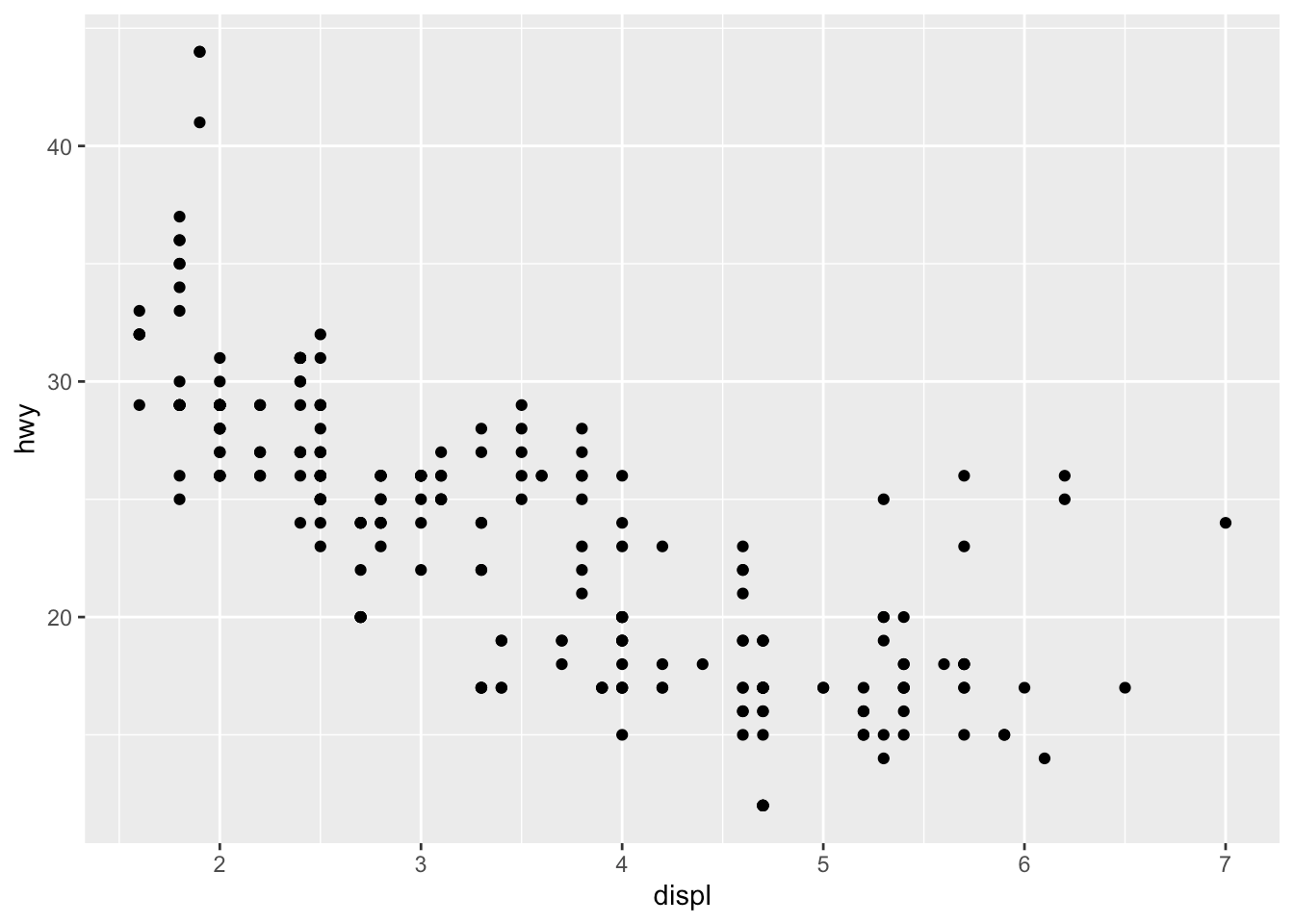
You will also sometimes see the aesthetic elements (aes() with the variables) inside the ggplot() function in addition to the dataset:
除了数据集,有时您还会在ggplot()函数中看到美学元素(带有变量的aes() ):
ggplot(mpg, aes(x = displ, y = hwy)) +
  geom_point()
最低0.47元/天 解锁文章


 被折叠的 条评论
为什么被折叠?
被折叠的 条评论
为什么被折叠?
 到【灌水乐园】发言


