


【温馨提示】源码包解压密码:www.youhutong.com
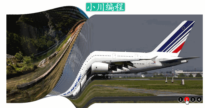
效果图:
部分源码及使用说明:
1、html部分源码:
- 1
- 2
- 3
- 4
2、CSS源码部分:
*{ margin:0; padding:0;}
#nnh{
width:350px; height:50px; margin:50px auto; position:absolute; top:-70px;
left:-15px; border:0px solid red;
}
#nnh h1{ text-align:center; color:red;}
#wrap{ width:800px; height:360px; margin:150px auto; position:relative;}
#up{ width:808px; height:360px; -webkit-perspective:800px;}
#up li{ list-style-type:none; height:360px; cellpadding="0" cellspacing="0"
border:1px solid #ff0000; float:left; position:relative;
-webkit-transform-style:preserve-3d;-webkit-transform:translateZ(-180px);
}
#up li span{ height:360px; display:block; position:absolute;}
#up li span:nth-child(1){ background:url(img/1.png);
-webkit-transform:translateZ(180px);
}
#up li span:nth-child(2){ background:url(img/2.png);
-webkit-transform:translateZ(-180px) rotatex(180deg);
}
#up li span:nth-child(3){ background:url(img/3.png); top:-360px;
-webkit-transform-origin:bottom;
-webkit-transform:translateZ(180px) rotateX(90deg);
}
#up li span:nth-child(4){ background:url(img/4.png); top:360px;
-webkit-transform-origin:top;
-webkit-transform:translateZ(180px) rotateX(-90deg);
}
#an_niu{position:absolute; right:5px; bottom:5px;}
#an_niu li{ list-style-type:none; width:20px; height:20px; background:#000;
color:#fff; border-radius:10px;/*画圆按钮*/
box-shadow:0 2px 5px #fff;/*给圆按钮加阴影*/
font-size:12px; line-height:20px; text-align:center;
float:left; margin-left:5px;
}
#an_niu li:hover{background:red; cursor:pointer;}
3、JS源码部分:
function zc(lien){
var lwid = 800/lien;
var htmlDM = "";
var cssDM = "";
var timeDM = "";
var z = 0;
for(var i=0;i
if(i>lien/2){z--}
htmlDM += "
";cssDM += "#up li:nth-child("+(i+1)+") span{background-position:"+(i*-lwid)+"px;}";
timeDM += "#up li:nth-child("+(i+1)+"){-webkit-transition:0.4s "+((i*0.1)/20)+"s;}"
};
$("#up").append(htmlDM);
$("#yang").append("#up li{width:"+lwid+"px;}#up li span{width:"+lwid+"px;}"+cssDM+timeDM)
};
zc(200);
$("#an_niu li").click(function(){
var a = $(this).index();
var b = -a*90;
$("#up li").css("-webkit-transform","translateZ(-180px) rotateX("+b+"deg)")
});
源码中有详细的使用说明及备注等
浏览器启用弹出窗口过滤功能,将无法跳转到下载页。在浏览器地址栏右边符号提示处点击允许就可以了!
【温馨提示】源码包解压密码:www.youhutong.com
郑重声明:
1、本站源码仅供个人学习研究和交流使用,请于下载后二十四小时内删除
2、本站大多资源来源于互联网、用户分享,仅供学习交流使用,本站不提供任何技术支持
3、本站联系方式Email:admin@youhutong.com ,收到邮件会第一时间处理。
4、如侵犯到任何版权问题,请立即告知本站(立即在线告知),本站将及时删除并致以最深的歉意


 2万+
2万+


 被折叠的 条评论
为什么被折叠?
被折叠的 条评论
为什么被折叠?
 到【灌水乐园】发言


