


* {margin: 0; padding: 0;}
.clearfix{zoom:1;/*为IE6,7的兼容性设置*/}
.clearfix:after {
content: '.';
display: block;
height: 0;
clear: both;
visibility: hidden;
}
ul li {
list-style: none;
float: left;
margin: 50px 0 50px 20px;
text-align: center;
}
li {
background: red;
}
h2 {
margin-top: 20px;
}
.circle1 {
width: 100px;
height: 50px;
border-radius: 50px 50px 0 0;
line-height: 50px;
}
.circle2 {
width: 50px;
height: 100px;
border-radius: 0 50px 50px 0;
line-height: 100px;
}
.circle3 {
width: 100px;
height: 50px;
border-radius: 0 0px 50px 50px;
line-height: 50px;
}
.circle4 {
width: 50px;
height: 100px;
border-radius: 50px 0 0 50px;
line-height: 100px;
}
.circle5 {
width: 100px;
height: 100px;
border-radius: 50px;
line-height: 100px;
}
.demo { /*左半圆*/
position:absolute; /*clip 属性剪裁绝对定位元素。也就是说,只有 position:absolute 的时候才是生效的。*/
width: 100px;
height: 100px;
border-radius: 50px;
/* line-height: 50px; */
clip: rect(0px 50px 100px 0px); /*唯一合法的形状值是:rect (top, right, bottom, left)*/
}
.right-circle { /*右半圆*/
left: 200px;
clip: rect(0px 100px 100px 50px); /*唯一合法的形状值是:rect (top, right, bottom, left)*/
}
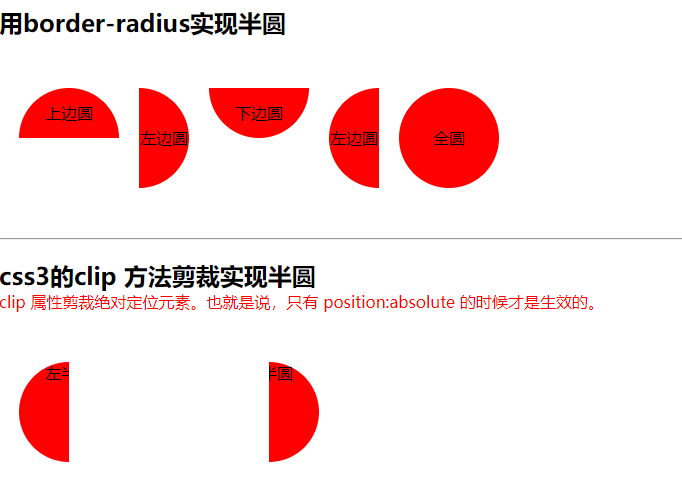
用border-radius实现半圆
- 上边圆
- 左边圆
- 下边圆
- 左边圆
- 全圆
css3的clip 方法剪裁实现半圆
clip 属性剪裁绝对定位元素。也就是说,只有 position:absolute 的时候才是生效的。唯一合法的形状值是:rect (top, right, bottom, left)
- 左半圆
- 右半圆
效果图:
感兴趣的朋友可以去熟试下!!!
标签:css3,两种,50px,100px,height,radius,半圆,border
来源: https://www.cnblogs.com/mmzuo-798/p/11691194.html


 1458
1458


 被折叠的 条评论
为什么被折叠?
被折叠的 条评论
为什么被折叠?
 到【灌水乐园】发言


