


一、导航菜单
1.横向导航
代码如下:
横向导航菜单body{
margin:0;
}
ul{
list-style-type:none;
background-color: #f3f3f3;
position: fixed;
overflow:hidden;
margin:0;
padding:0;
width:100%;
position:fixed;
border-bottom:1px solid #e7e7e7;
}
ul li{
float:left;
text-align: center;
}
ul li a{
color:#666;
text-decoration:none;
padding:8px 16px;
display:block;
width:60px;
}
ul li a:hover{
background-color:#ddd;
}
ul li:last-child{
float:right;
border-right:none;
}
li:last-child {
border-bottom: none;
}
.active {
background-color: #4CAF50;
color: white;
}
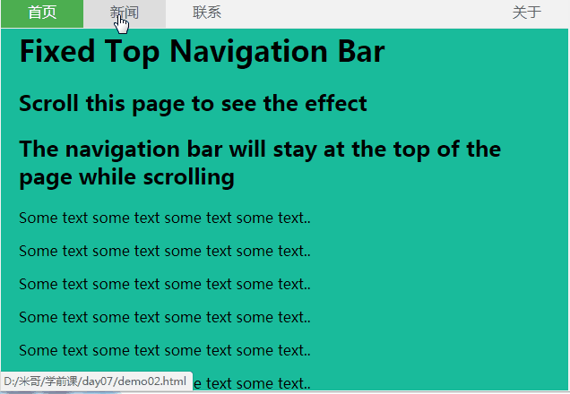
Fixed Top Navigation Bar
Scroll this page to see the effect
The navigation bar will stay at the top of the page while scrolling
Some text some text some text some text..
Some text some text some text some text..
Some text some text some text some text..
Some text some text some text some text..
Some text some text some text some text..
Some text some text some text some text..
Some text some text some text some text..
Some text some text some text some text..
Some text some text some text some text..
Some text some text some text some text..
Some text some text some text some text..
Some text some text some text some text..
Some text some text some text some text..
Some text some text some text some text..
Some text some text some text some text..
Some text some text some text some text..
Some text some text some text some text..
Some text some text some text some text..
Some text some text some text some text..
Some text some text some text some text..
效果图:
2.竖向导航
代码如下:
body{
margin:0;
}
ul{
list-style-type:none;
background-color: #f1f1f1;
width: 25%;
height: 100%;
position: fixed;
overflow: auto;
margin:0;
padding:0;
}
ul li{
text-align: center;
}
ul li a{
color:#000;
text-decoration:none;
padding:8px 16px;
display:block;
}
li:last-child {
border-bottom: none;
}
.active {
background-color: #4CAF50;
color: white;
}
div{
margin-left:25%;
padding:1px 16px;
height:1000px;
}
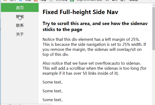
Fixed Full-height Side Nav
Try to scroll this area, and see how the sidenav sticks to the page
Notice that this div element has a left margin of 25%. This is because the side navigation is set to 25% width. If you remove the margin, the sidenav will overlay/sit on top of this div.
Also notice that we have set overflow:auto to sidenav. This will add a scrollbar when the sidenav is too long (for example if it has over 50 links inside of it).
Some text..
Some text..
Some text..
Some text..
Some text..
Some text..
Some text..
效果图:
二、下拉菜单
display:none和display:block切换实现
代码如下:
body{
margin:0;
text-align:center;
}
.dropdown{
background-color:green;
text-align:center;
padding:20px;
display:inline-block;
cursor:pointer;
position:relative;
}
.di{
display:none;
position:absolute;
top:61px;
left:0;
}
.di ul{
list-style:none;
padding:0;
margin:0;
background-color: #f9f9f9;
}
.di ul li{
min-width:104px;
padding:10px 15px;
}
.dropdown:hover{
background-color:#3e8e41
}
.dropdown:hover .di{
display:block;
}
.di ul li:hover{
background-color: #f1f1f1
}
下拉菜单
- 你好!
- 我好!
- 大家好!
效果图:

持续更新,欢迎各位指教!


 3524
3524


 被折叠的 条评论
为什么被折叠?
被折叠的 条评论
为什么被折叠?
 到【灌水乐园】发言


