


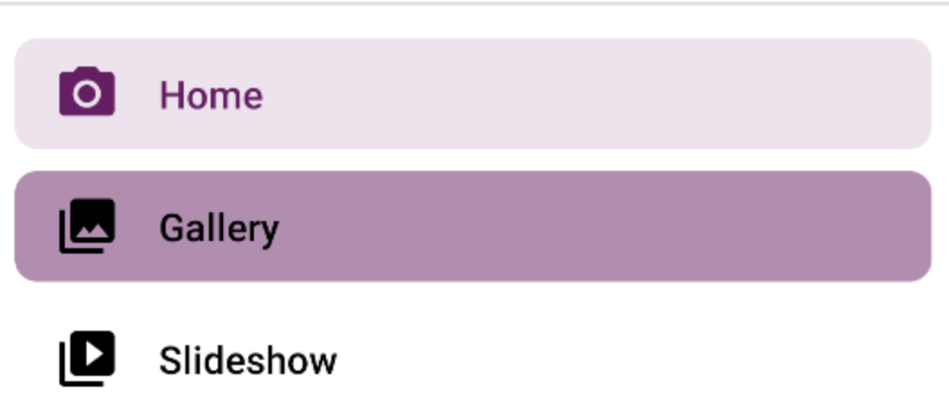
我想要实现Material Design Docs中显示的类似内容。
colorControlHighlight用于选中项目的背景。
我需要自定义:
背景未选中
文本颜色选中
文本颜色未选中
最佳答案
app:itemShapeFillColor:背景项目颜色
app:itemIconTint:图标色调
app:itemTextColor:文本颜色
在布局中:
app:itemShapeFillColor="@color/shape_selector"
app:itemIconTint="@color/icon_tint_selector"
app:itemTextColor="@color/text_color_selector"
../>
在自定义样式中:
@color/shape_selector
@color/icon_tint_selector
@color/text_color_selector
对于itemIconTint和itemTextColor,您可以使用如下选择器:
对于itemShapeFillColor,您可以使用类似以下的选择器:
只是最后的注释。
注意使用itemBackground。
设置为@null和/或NavigationView时,将其设置为itemShapeAppearance以使用由itemShapeAppearanceOverlay程序生成的成形背景(默认行为)。
使用itemShape*属性设置背景的样式。
设置itemBackground将覆盖编程背景,并导致忽略itemShape *属性中设置的值。


 588
588


 被折叠的 条评论
为什么被折叠?
被折叠的 条评论
为什么被折叠?
 到【灌水乐园】发言


