


【实例简介】
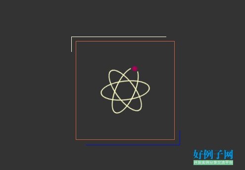
【实例截图】
【核心代码】
Documentbody {
margin: 0;
background: #333;
}
.box {
width: 200px;
height: 200px;
box-sizing: border-box;
border: 1px solid #cb6341;
position: fixed;
left: 50%;
top: 50%;
margin-top: -100px;
margin-left: -100px;
}
.box:after,
.box:before {
content: '';
width: 220px;
height: 220px;
box-sizing: border-box;
border: 1px solid;
position: absolute;
top: -5%;
left: -5%;
animation: boxBorder 6s linear infinite;
}
.box:before {
animation-delay: -3s;
}
.box .icon {
position: absolute;
top: 50%;
left: 50%;
width: 100px;
height: 100px;
margin-top: -50px;
margin-left: -50px;
animation: iconBox 3s linear infinite;
}
.box .icon:after,
.box .icon:before {
content: "";
width: 40%;
height: 100%;
box-sizing: border-box;
border-radius: 50%;
border: 2px solid #fff;
position: absolute;
top: 0;
left: 30px;
animation: iconBorder 3s linear infinite;
}
.box .icon:after {
transform: rotate(60deg);
}
.box .icon:before {
transform: rotate(-60deg);
}
.box .icon2:before {
transform: rotate(0deg);
}
.box .icon2:after {
height: 10px;
width: 10px;
background-color: #fff;
transform: translate(12px, -6px);
border: 3px solid #333;
box-sizing: content-box;
animation: iconYuan 3s linear infinite 0.6s;
}
@keyframes iconBox {
0% {
transform: rotate(0deg);
}
100% {
transform: rotate(360deg);
}
}
@keyframes iconBorder {
0% {
border-color: #fff;
}
30% {
border-color: yellow;
}
60% {
border-color: blue;
}
100% {
border-color: red;
}
}
@keyframes iconYuan {
0% {
background-color: #fff;
}
30% {
background-color: yellow;
}
60% {
background-color: blue;
}
100% {
background-color: red;
}
}
@keyframes boxBorder {
0% {
border-color: #fff;
clip: rect(0, 220px, 2px, 0);
}
25% {
border-color: yellow;
clip: rect(0px, 2px, 220px, 0)
}
50% {
border-color: blue;
clip: rect(218px, 220px, 220px, 0)
}
75% {
border-color: green;
clip: rect(0, 220px, 220px, 218px)
}
100% {
border-color: #fff;
clip: rect(0, 220px, 2px, 0)
}
}


 2905
2905


 被折叠的 条评论
为什么被折叠?
被折叠的 条评论
为什么被折叠?
 到【灌水乐园】发言


