


背景透明度:
opacity:0~1( 每次变换0.1)
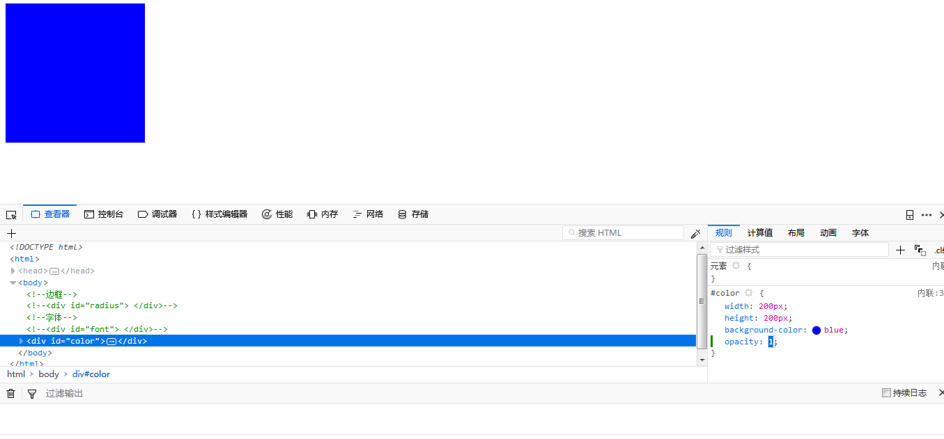
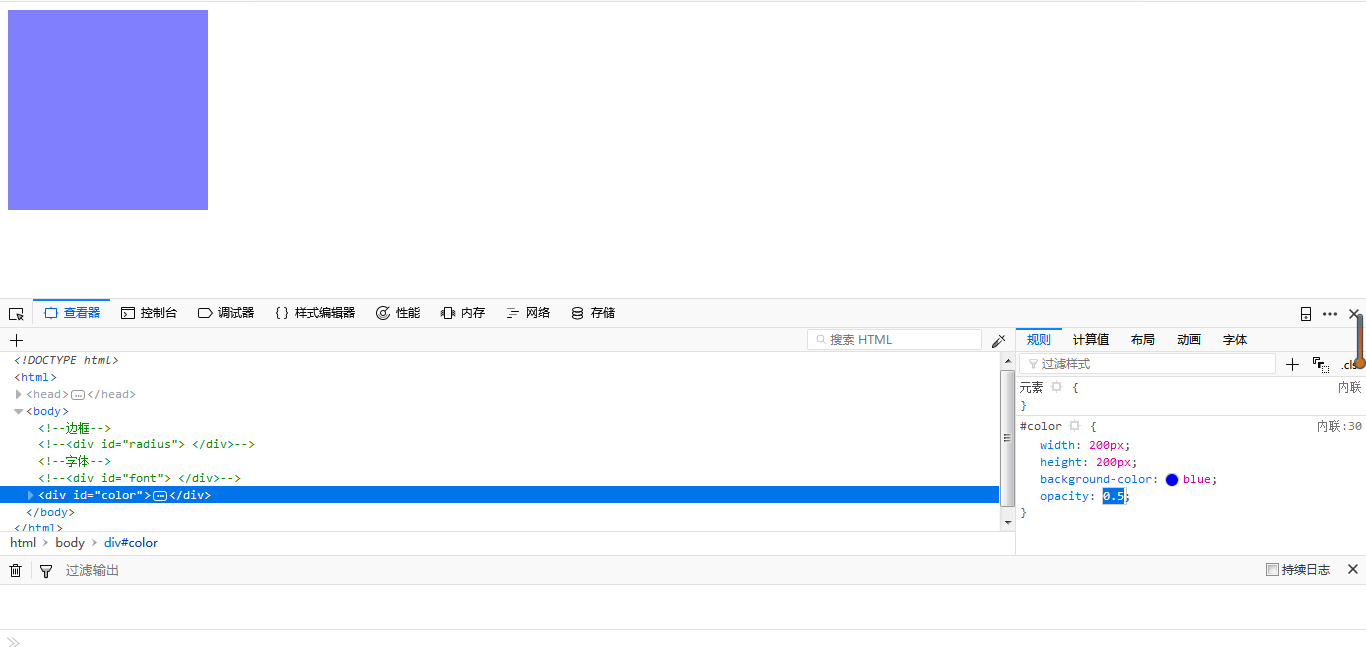
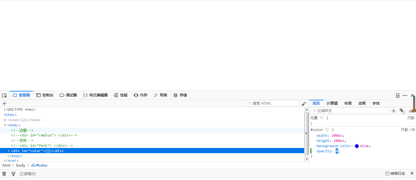
#color{width:200px;height:200px;background-color:blue;opacity:1;/*透明度*/
效果如下:
opacity:1时
opacity:0.5时
opacity:0时
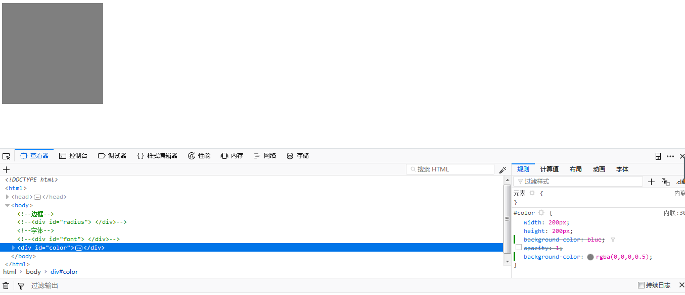
背景颜色:
RGBA
R:红 G:绿 B:蓝 alpha:透明度的参数
RGB的取值范围是0~255/0~100% alpha的取值范围是0~1 不可为负值
#color{width:200px;height:200px;background-color:rgba(0,0,0,0.5);
}
效果如下:
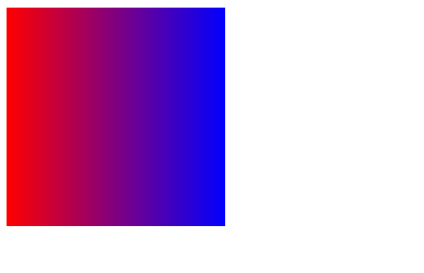
渐变颜色:
background-image: linear-gradient(to bottom,#fff,red); 备注一下{linear-gradient 线性渐变}
参数说明:第一个参数指定渐变方向 to top,to bottom,to right,to left,to top left......
第二和第三个参数:是指定开始与结束的颜色值 可以有多个颜色background-image: linear-gradient(to bottom,#fff,black,red);
#color{width:200px;height:200px;background-image:linear-gradient(to right,red,blue);
}
效果如下:
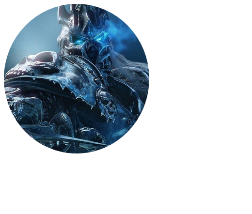
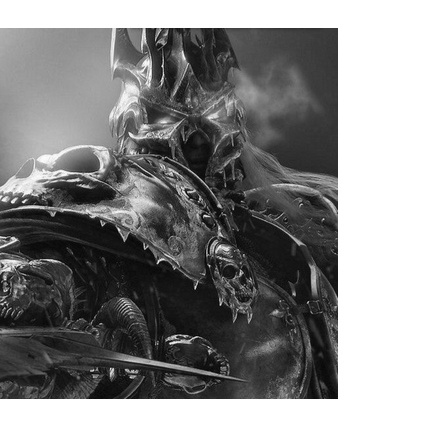
图片:
1图片圆角与盒子圆角类似 border-radius
#tupian{width:300px;height:400px;
}#tupian img{border-radius:50%; /*图片圆角*/
}
效果如下:
2图片响应式: max-width: 100%;height: auto;
#tupian{width:300px;height:400px;
}#tupian img{
max-width: 100%;
height: auto;
}
效果如下:
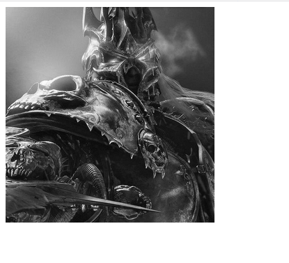
图片滤镜:
filter: 备注{ 灰色效果为例}
模糊效果
.blur {
-webkit-filter: blur(4px);
filter: blur(4px);
}
高亮效果
.brightness {
-webkit-filter: brightness(0.30);
filter: brightness(0.30);
}
对比度
.contrast {
-webkit-filter: contrast(180%);
filter: contrast(180%);
}
灰色图像
.grayscale {
-webkit-filter: grayscale(100%);
filter: grayscale(100%);
}
色相旋转
.huerotate {
-webkit-filter: hue-rotate(180deg);
filter: hue-rotate(180deg);
}
反转输入图像
.invert {
-webkit-filter: invert(100%);
filter: invert(100%);
}
透明度
.opacity {
-webkit-filter: opacity(50%);
filter: opacity(50%);
}
饱和度
.saturate {
-webkit-filter: saturate(7);
filter: saturate(7);
}
深褐色
.sepia {
-webkit-filter: sepia(100%);
filter: sepia(100%);
}
阴影效果
.shadow {
-webkit-filter: drop-shadow(8px 8px 10px green);
filter: drop-shadow(8px 8px 10px green);
}
#tupian{width:300px;height:400px;
}#tupian img{filter:grayscale(100%);
}
效果如下:
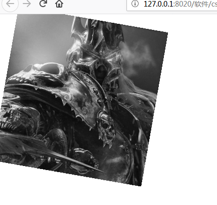
旋转和过渡:transform transition
1rotate( deg)
#tupian img:hover{transform:rotate(30deg);/*旋转*/
}#tupian img{filter:grayscale(100%);transition:5s;
}
效果如下:
translate:( px, px)
#tupian img:hover{transform:translate(30px,50px);
}
scale:(1.2)
#tupian img:hover{transform:scale(1.2);
}
效果如下:
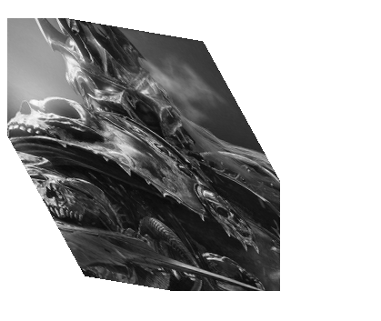
skew:
#tupian img:hover{transform:skew(30deg,10deg);
}
效果如下:
rotateX:(30deg) 备注 rotateY:( deg) 类似
#tupian img:hover{transform:rotateX(30deg);/*沿X轴翻转*/
}
效果如下:


 2337
2337


 被折叠的 条评论
为什么被折叠?
被折叠的 条评论
为什么被折叠?
 到【灌水乐园】发言


