


 本文介绍如何使用CSS中的display:flex属性来实现两栏及三栏布局。通过设置不同的flex属性值,可以轻松调整各栏目宽度,实现响应式网页设计。文中提供了具体代码示例。
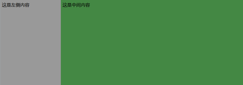
一、使用display:flex;实现两栏布局
body,div{margin:0px;padding:0px;}
.flex-container{display:flex;height:300px;}
.item{padding:6px;}
.item1{flex:0 0 auto;background-color:#999;width:200px;}
.item2{flex:1 1 auto;background-color:#484;}
<div class="flex-container">
        <div class="item item1">这是左侧内容</div>
        <div class="item item2">这是右侧内容</div>
</div>
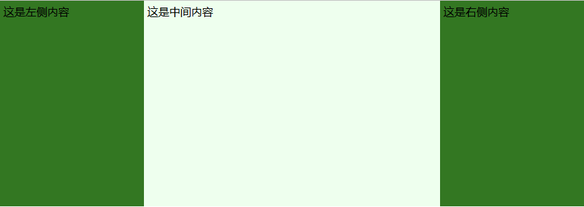
二、使用display:flex;实现三栏布局
body,div{margin:0;padding:0;}
.flex-container{display:flex;height:300px;}
.item{padding:5px;width:200px;}
.item1,.item3{flex:0 0 auto;background-color:#372;}
.item2{flex:1 1 auto;background-color:#efe;}
<div class="flex-container">
        <div class="item item1">这是左侧内容</div>
        <div class="item item2">这是中间内容</div>
        <div class="item item3">这是右侧内容</div>
</div>


 扫一扫
扫一扫


 1167
1167

 被折叠的 条评论
为什么被折叠?
被折叠的 条评论
为什么被折叠?
 到【灌水乐园】发言


