


什么是媒体查询
媒体查询由媒体类型和一个或多个检测媒体特性的条件表达式组成。媒体查询中可用于检测的媒体特性有:width、height和color(等)。使用媒体查询可以在不改变页面内容的情况下,为特性的一些输出设备定制显示效果。
媒体查询语法
CSS3中的媒体查询:根据浏览器窗口大小的改变,页面颜色就会改变。
<!DOCTYPE html>
<html\>
<head>
<title>无标题文档</title>
</head>
<style>
body{
    background-color:#0033FF;
}
@media screen and (max-width: 960px){
    body{
    background-color:#FF6699
    }
}

@media screen and (max-width: 768px){
    body{
    background-color:#00FF66;
    }
}

@media screen and (max-width: 550px){
    body{
    background-color:#6633FF;
    }
}

@media screen and (max-width: 320px){
    body{
    background-color:#FFFF00;
    }
}
</style>
<body>
<p>my  first @media</p>
</body>
</html>
CSS2中media:通过<link>标签的media属性为样式表指定设备类型:
<link rel="stylesheet" media="screen" href="portrait-screen.css"/>
媒体查询则能使我们根据设备的各种功能特性来设定响应的样式,而不仅仅只针对设备类型,在媒体查询的开头追加not会颠倒该查询的逻辑:
<link rel+"stylesheet" media="screen and (orientation: portrait)" href="portrait-screen.css"/>
//设置了媒体类型和媒体特性(显示屏, 纵向放置)


<link rel="stylesheet" media="not screen and (orientation: portrait)" href="portrait-
screen.css" />
//非纵向放置的显示屏

<link rel="stylesheet" media="screen and (orientation: portrait) and (min-width:800px)" href="800wide-portrait-screen.css" />
//限制只有视口宽度大于800px像素的显示屏设备才能加载此文件
媒体查询列表(需要用逗号隔开):
<link rel="stylesheet" media="screen and (orientation: portrait) and (min-width:800px), projection" href="800wide-portrait-screen.css" />
除了以上方法还可以使用CSS中的@import指令在当前样式表中按条件引入其他样式表。(使用@import方法会增加HTTP请求影响加载速度)
@import url("phone.css") screen and (max-width:360px);
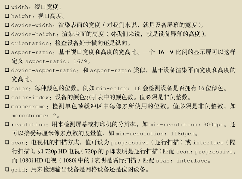
媒体查询可以检测的特性:
一个例子:
<!DOCTYPE html>
<html>
<head>
    <meta name="viewport" content="width=device-width,initial-scale=1.0">
<title>无标题文档</title>
</head>
<style>
@media (max-width:5000px)
{
    body{
        margin:0 auto;
        width:1000Px;
    }

    .left{
        float:left;
        width:450px;
        height:1200px;
        margin-left:25px;
        margin-right:25px;
        background-color:#99FFCC;
    }

    .right{
        float:right;
        width:450px;
        height:1200px;
        margin-left:25px;
        margin-right:25px;
        background-color:#FFFF99;
    }
    .rtop{
        width:450px;
        height:150px;
        background-color:#CCFFFF;
        padding:0;
        position:absolute;
        left:auto;
        top:250px;
        font-size:14px;
        line-height:21px;
        text-align:center;
        overflow:hidden;
    }


    .rcenter{
        width:450px;
        height:150px;
        background-color:#CCFFFF;
        position:absolute;ss
        left:auto;
        top:650px;
        text-align:center;
        overflow:hidden;
    }


    .rbottom{
        width:450px;
        height:150px;
        background-color:#CCFFFF;
        padding:0;
        position:absolute;
        left:auto;
        top:1050px;
        font-size:20px;
        line-height:30px;
        text-align:center;
        overflow:hidden;
    }


}

@media screen and(min-width:750px) and (max-width:1000px)
{
    body{
        margin:0 auto;
        width:750Px;
    }

    .left{
        float:left;
        width:350px;
        height:900px;
        margin-right:25px;
        background-color:#99FFCC;
    }

    .right{
        float:right;
        width:350px;
        height:900px;
        margin-left:25px;
        background-color:#FFFF99;
    }
    .rtop{
        width:350px;
        height:100px;
        background-color:#CCFFFF;
        padding:0;
        position:absolute;
        left:auto;
        top:200px;
        font-size:14px;
        line-height:21px;
        text-align:center;
        overflow:hidden;
    }


    .rcenter{
        width:350px;
        height:100px;
        background-color:#CCFFFF;
        position:absolute;
        left:auto;
        top:500px;
        text-align:center;
        overflow:hidden;
    }


    .rbottom{
        width:350px;
        height:100px;
        background-color:#CCFFFF;
        position:absolute;
        left:auto;
        top:800px;
        font-size:20px;
        line-height:30px;
        text-align:center;
        overflow:hidden;
    }
}

@media screen and (min-width: 320px) and (max-width: 750px)
{
    body{
        margin:0 auto;
        width:320Px;
    }

    .left{
        margin:0 auto;
        width:320px;
        height:300px;
        background-color:#99FFCC;
    }

    .right{
        margin:0 auto;
        width:320px;
        height:900px;
        background-color:#FFFF99;
    }
    .rtop{
        width:320px;
        height:100px;
        background-color:#CCFFFF;
        padding:0;
        position:absolute;
        left:auto;
        top:500px;
        font-size:14px;
        line-height:21px;
        text-align:center;
        overflow:hidden;
    }


    .rcenter{
        width:320px;
        height:100px;
        background-color:#CCFFFF;
        position:absolute;
        left:auto;
        top:800px;
        text-align:center;
        overflow:hidden;
    }


    .rbottom{
        width:320px;
        height:100px;
        background-color:#CCFFFF;
        position:absolute;
        left:auto;
        top:1100px;
        font-size:20px;
        line-height:30px;
        text-align:center;
        overflow:hidden;
    }
}

</style>


<body>
    <div class="left">

    </div>


    <div class="right">
        <div class="rtop">
        <p>这是第一段文字这是第一段文字这是第一段文字
        这是第一段文字这是第一段文字这是第一段文字
        这是第一段文字这是第一段文字这是第一段文字
        这是第一段文字这是第一段文字这是第一段文字</p>
        </div>

        <div class="rcenter">
        <p>这是第二段文字这是第二段文字这是第二段文字
        这是第二段文字这是第二段文字这是第二段文字
        这是第二段文字这是第二段文字这是第二段文字
        这是第二段文字这是第二段文字这是第二段文字</p>
        </div>

        <div class="rbottom">
        <p>这是第三段文字这是第三段文字这是第三段文字
        这是第三段文字这是第三段文字这是第三段文字
        这是第三段文字这是第三段文字这是第三段文字
        这是第三段文字这是第三段文字这是第三段文字</p>
        </div>

    </div>


</body>
</html>


 134
134


 被折叠的 条评论
为什么被折叠?
被折叠的 条评论
为什么被折叠?
 到【灌水乐园】发言


