


Overview
The HTML5/JavaScript DatePicker is a lightweight and mobile-friendly control that allows end users to enter or select a date value. It has month, year, and decade view options to quickly navigate to the desired date. It supports minimum dates, maximum dates, and disabled dates to restrict the date selection.
Month or year picker
Select only the month or year as a value (Month Picker or Year Picker) from a pop-up calendar.
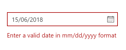
Custom date format
Change the default culture’s specific date format in the text box to improve readability or to enter the date properly.
Date selection within a date range
You can restrict the HTML5/JavaScript DatePicker so that only a date value within a specific range of dates can be entered or selected by specifying the min and max date options.
Disabled dates
Disable any date in DatePicker to show it as an inactive date. Easily prevent weekends and holidays from selection by disabling them in the pop-up calendar.
Form support and date validation
Date values are validated within a min and max range. Strict mode behavior is used to enforce entering only a valid
date value.
In a form component, integrate the form validation plugin to perform custom validation in the date text box.
DatePicker with multiple language
Update the culture-specific date format and first day of the week, and translate the names of months, days, and today button text to any supported language with our globalization features.
Custom DatePicker
Apart from the standard, built-in theme, DatePicker provides you with complete control over the appearance of the component to customize the style to suit your application.
Highlight weekends
Highlight any date in a year or every weekend in a month as special days using custom styling.
Change first day of week
Auto-update the first day of the week based on the specified culture or change it based on your application.
Week number
Show the week number of the selected day in the pop-up calendar by enabling the week number option.
Islamic DatePicker
In addition to the Gregorian DatePicker, the DatePicker control supports displaying the Islamic DatePicker (Hijri DatePicker).
Other supported frameworks
The DatePicker component is also available in Blazor, React, Angular, and Vue frameworks. Check out the different DatePicker platforms from the links below,
Web accessibility
Fully supports WAI-ARIA accessibility that helps the DatePicker be accessed by on screen readers and assistive devices.
Follows WAI-ARIA best practices for implementing keyboard interaction.
Uses WCAG 2.0-based design for UI element visuals such as foreground color, background color, line spacing, text and images
Supports right-to-left (RTL) direction for users working in right-to-left languages like Hebrew and Arabic.
Mobile-friendly responsive DatePicker UI
The HTML5/JavaScript Date Picker provides a responsive mode that gives an adaptive, redesigned UI appearance for mobile devices.
Developer-friendly API’s
You have control over all the UI elements and behaviors of the components with a rich set of developer-friendly APIs so that you can provide the best experience to your end users.
Built-in themes
The HTML5/JavaScript DatePicker supports several built-in themes such as material, bootstrap, fabric (Office 365), and high contrast.
Users can customize any one of these built-in themes or create new themes to achieve their own desired look and feel either by simply overriding SASS variables or using our Theme Studio application.


 3万+
3万+


 被折叠的 条评论
为什么被折叠?
被折叠的 条评论
为什么被折叠?
 到【灌水乐园】发言


