


兼容css3新属性
在css3中,我们可以使用prefixfree.min.js这个插件来自动为css3的相关属性加上兼容浏览器属性,使我们不用为每个css3新属性再加上属性(需要用到大量css3的项目时再引入)
content布局
当h5内嵌在app里面的时候,在iso手机下,底部(头部)固定按钮会跟着一起滚动,需要使用content布局,然后使用padding-bottom或者padding-top,把相应的位置空出来!!!
当需要在content里面滚动的时候,需要将body和html设置height:100%;然后content也需要设置height:100%,这样才可以实现在content里面里面滚动,当需要在body里面滚动的时候,需要将html、body中的height:100%;设置去掉!!不然body会被限制住,内容只显示一半不能滚动!!!
还有一种解决弹窗遮罩层底部出现滚动的方法就是,当出现弹窗的时候,通过js控制底下的内容为body{height:100%;overflow:hidden;},然后关闭弹窗的时候移除掉这个样式!!!
<body>
     <header></header>
     <div class="content"></div>
     <footer></footer>
</body>
.content {
    padding-top: .88rem;
    -webkit-box-sizing: border-box;
    -moz-box-sizing: border-box;
    box-sizing: border-box;
    max-width: 750px;
    width: 100%;
    margin: 0 auto;
    overflow-x: hidden;
    height: 100%;
    overflow-y: auto;
    -webkit-overflow-scrolling: touch;
使用这种布局方式可以解决,单页面滚动的时候,点击弹窗,弹窗会被遮住滚动问题!!!
注意:当需要计算body的高度的时候,不能使用,还有当页面中,有表单,需要使用position:relative时,来使安卓键盘不被挡住!!!!但是为解决弹窗不滚动问题,可以通过,弹窗的时候,增加content布局,关闭弹窗的是移除content布局!!!
        //点击领取
        $(".reward-btn").click(function(){
            $(".reward-page").wrap("<div class='contentS'></div>");
            $(".insurance-box").show();
            $(".dialog2").show();

        });
        //点击关闭大弹窗按钮
        $(".closeDia").click(function(){
            $(this).parent().parent().hide();
            $(".dialog2").hide();
            $(".reward-page").unwrap("<div class='contentS'></div>");
        });
场景二:在content布局下,需要给页面设置背景图,可以在content下面在包裹一层大的div,然后对这个div进行全页面背景图设置,这样背景图才会随着内容超出一屏幕而滚动,而不是直接在content这个容器上设置背景图,如果直接在这个容器上设置背景图,那背景图不会滚动!!!
常见头部布局
两边有时候有文字或者图标,但是中间的标题固定居中,大概位置如下,就是内容会变化!!

布局如下
<div  class="head"> <a class="head-left">设置</a>个人中心<a class="head-right">更多</a></div>

css:
.head{
    position:relative;
    width:100%;
    height:88px;
    line-height:88px;
    text-align:center;
}
.head-left, .head-right{
    position:absolute;
    height:88px;
    line-height:88px;
}
.head-left {
    left:30px;
}
.head-right {
    right:30px;
}
模拟上拉加载
            $(window).scroll(function() {
                var winH = $(window).height();
                var scrH = $(window).scrollTop();
                var htmH = $(document).height();
                //解决滚动到下面,遮罩层一半
                $(".fixed").height(htmH);

                if(winH + scrH >= htmH) {
                    console.info(tabActive);
                    if(tabActive==0){
                        console.info(1111);
                        if(next_page){
                            if(ajax_lock == true)
                            {
                                ajax_lock = false;
                                page++;
                                getRecord(page,0);

                            }
                        }
                    }
});
1.美化复选框
效果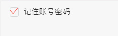
html代码
<label>
<input id="rememberPwdCheck" class="checkbox hidden" type="checkbox" checked="checked">
<i class="icon icon-checkbox"></i>
<span class="rememberPwdtxt">记住账号密码</span>
</label>
css代码
.hidden {
     display: none;
}
.checkbox:checked ~.icon-checkbox {
    background: url(../images/yes_15.png) no-repeat;
    background-size: 0.3rem 0.25rem;
}
.icon-checkbox {
    width: 0.3rem;
    height: 0.3rem;
    margin-right: 0.1rem;
    border: 0.02rem solid #d7d7d7;
    border-radius: 0.06rem;
}
.icon {
    display: inline-block;
    vertical-align: middle;
}
js

if(!$('#agreeTerm').is(":checked")){
$.alert('请勾选同意《保险条款》和《重要告知与申明》');
return;
};
<div class="allCheck">
       <input type="checkbox" id="allCheck" class="check hidden">
       <label for="allCheck" class="check-icon">全选</label>
</div>
.allCheck {
padding:0 .1rem 0 .3rem;
}
.check-icon {
display: inline-block;
width:1.5rem;
padding-left:.5rem;
background:url("../../assets/select-no.png")no-repeat left center;
background-size:.42rem .42rem ;
}
.check:checked ~ .check-icon {
background:url("../../assets/selected.png")no-repeat left center;
background-size:.42rem .42rem ;
}
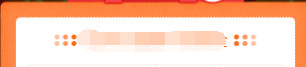
2.模拟单选按钮
类似效果

html代码
<dl id="" class="money">
    <dt>选择补偿金额<span class="p_help help">补偿金说明</span></dt>
    <dd>
        <span>
            <input id="money_type_0" name="money_type" class="selection-rd hidden" type="radio" value="1" checked="">
            <label class="selection-lb" for="money_type_0">10元</label>
        </span>
        <span>
            <input id="money_type_1" name="money_type" class="selection-rd hidden" type="radio" value="2">
            <label class="selection-lb" for="money_type_1">20元</label>
        </span>
        <span>
            <input id="money_type_2" name="money_type" class="selection-rd hidden" type="radio" value="3">
            <label class="selection-lb" for="money_type_2">50元</label>
        </span>
    </dd>
</dl>
css代码
.selection-rd:checked ~ .selection-lb {
    color: #e44;
    border:1px solid #e44;
}
.selection-lb {
    display: inline-block;
    margin:33px 30px 30px 0;
    width:150px;
    height: 64px;
    line-height: 64px;
    white-space: nowrap;
    background-color: #fff;
    border:1px solid #bbc;
    border-radius: 5px;
    text-align: center;
    font-size: 32px;
}
jq代码
var payLevel=$("input[name='money_type']:checked").val();
3.中间文字,两边横线居中
效果

代码
<div class="title-center"><div>学生信息</div></div>
/*中间文字两边横线效果*/
.title-center {
position:relative;
width:100%;
text-align: center;
height: 100px;
line-height: 100px;
font-size: 28px;
color: #4d72e2;
}
.title-center div{
display: inline-block;
padding:0 20px;
}
.title-center:before ,.title-center:after{
display: inline-block;
position: relative;
content:"";
height:2px;
width:48px;
top:-6px;
background-color:#4d72e2;
}
当设置rem为单位时,1px,会显示偏大,将.title-center:before ,.title-center:after修改为如下:
.title-center:before, .title-center:after {
display: inline-block;
position: relative;
content: "";
height: 1px;
width: 1.88rem;
top: -.1rem;
background-color: #fd734f;
-webkit-transform: scaleY(0.5);
transform: scaleY(0.5);
-webkit-transform-origin: 0 0;
transform-origin: 0 0;
}
终极版,rem单位,横线自适应长度!!!!
<div class="flexbox flexbox-middle">
<span class="flexchild border-center"></span>
<span style="padding:0 .2rem;">我要居中,两边横线对齐</span>
<span class="flexchild border-center"></span>
</div>
.border-center{
/*display:inline-block; 使用flexchild布局的时候,不能给元素设置这个属性,不然, -webkit-box-flex: 1;会失效*/
height: 1px;
background-color: #fd734f;
-webkit-transform: scaleY(0.5);
transform: scaleY(0.5);
-webkit-transform-origin: 0 0;
transform-origin: 0 0;
}
中间文字,两边横线居中方法2
效果图
<div class="card-title"><span class="text">不辜负你比较快糖果盒如果好</span></div>
css
.card-title {
padding-top: .4rem;
font-size: .34rem;
color: #3c3c3c;
text-align: center;
font-weight: bold;
}
.card-title .text {
position: relative;
}
.card-title .text:before ,.card-title .text:after {
content: "";
display: inline-block;
position: absolute;
width: .4rem;
height: .32rem;
background: url('../images/card-title.png')no-repeat;
background-size: 100% 100%;
top: 50%;
margin-top: -.16rem;
}
.card-title .text:before{
left: -.51rem;
}
.card-title .text:after{
transform: rotateY(180deg);
-webkit-transform: rotateY(180deg);
right: -.51rem;
}
4.怎么实现图标水平垂直居中(rem单位)
利用background-size来设置背景图的本身大小尺寸,然后利用background-position:center center;来设置背景图相对元素的水平垂直居中,其中元素的宽是背景图的宽,高就是原来的高
sass的写法

@mixin headerIcon($width,$height,$url,$position) {
position: absolute;
$position: .3rem;
top: 0;
width: $width; //图标的宽度
height: .88rem; //头部的高度
background: url($url) no-repeat;
background-position:left center;
background-size:$width $height;
font-size: .3rem;
text-align: left;
}
方法二,

html:

<a>
     <i class="foot-nav1 icon"></i>
     <span>首页</span>
</a>

css:

a{display:inline-block;}
.foot-nav1{
   width: .66rem;
    height: .66rem;
    display: block;
    margin: 0 auto;
    background:url();
}
span {
   display: block;
    line-height: .24rem;
    text-align: center;
    font-size: .24rem;
    height: .24rem;
    margin-bottom: .8rem;
    color: #666;
}
5.头部常用样式设置
<div class="header flexbox flexbox-middle bg-white"><a class="left-icon"></a><h1>我是标题</h1><a class="right-icon"></a></div>
.header{
      width: 100%;
      height: .88rem;
      position: absolute;
      left: 0;
      top: 0;
      z-index: 998;
      border-bottom: 1px solid #f1f1f1;
      text-align: center;
      h1{
          font-size: .36rem;
          font-family: PingFangSC-Medium, sans-serif;
      }
      .left-icon{
        position: absolute;
        width: .88rem;
        height: .88rem;
        left: .3rem;
        top: 0;
        background: url('../../assets/back-icon.png') no-repeat;
        background-size:.17rem .35rem;
        background-position: left center;
        }
 .right-icon{
        position: absolute;
        width: .88rem;
        height: .88rem;
        right: .3rem;
        top: 0;
        background: url('../../assets/back-icon.png') no-repeat;
        background-size:.17rem .35rem;
        background-position: left center;
        }
6.常用表单布局
效果:
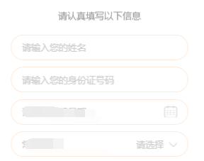
代码:
<div class="section2">
               <div class="des-title"><span class="text">请认真填写以下信息</span></div>
                <ul>
                    <li class="flexbox">
                        <input type="text" placeholder="请输入您的姓名" class="flexchild fill-content" id="tbName2">
                    </li>
                    <li class="flexbox flexbox-middle">
                        <span class="fill-label">收货地址:</span>
                        <span class="adress" style="overflow: hidden;">
                            <input id="provinceCity2" name="rec_address_select" class="txt" placeholder="请选择" readonly="readonly">
                            <input id="detailssq2" type="hidden" readonly="readonly">
                            <i class="ui-icon Rmore-icon noborder"></i>
                         </span>
                    </li>
                    <li class="flexbox">
                        <input type="text" placeholder="请填写详细地址" class="flexchild fill-content " id="adressDetail">
                    </li>
                </ul>
            </div>
css:
.section2 li {
    list-style: none;
    position: relative;
    width: 500px;
    margin: 0 auto;
    border: 1px solid #ffd6b9;
    box-sizing: border-box;
    padding: 17px 30px;
    background-color: #fff;
    margin-top: 20px;
    border-radius: 40px;
}

.section2 li input {
    background-color: transparent;
    border: 0 none;
    color: #333;
    outline: none;
    position: relative;
    font-size: 26px;
    width: 435px;
    z-index: 102;
}
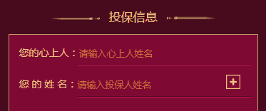
html:
<li class="flexbox">
     <label>您的心上人:</label>
     <input type="text" placeholder="请输入心上人姓名" class="flexchild" id="loveName">
</li>
css:
.sec3 li {
    position: relative;
    height: .88rem;
    -webkit-box-align: end;
    -moz-box-align: end;
    -ms-flex-align: end;
    -webkit-align-items: flex-end;
    align-items: flex-end;
    box-sizing: border-box;
}
.sec3 li label {
    padding-bottom: .2rem;
}
.sec3 li input {
    position: relative;
    width: 4.86rem;
    background: transparent;
    border: 0 none;
    border-bottom: 1px solid #dc115b;
    padding-bottom: .2rem;
    color: #efc283;
    font-size: .28rem;
    border-radius: 0;
}
7、上方图片下方文文字,水平居中布局
效果


css样式
.mall .details-foot .details-kefu {
    width: 1.56rem;
    height: .99rem;
    border-right: 1px solid #f1f1f1;
}
.mall .details-foot .details-kefu i {
    display: block;
    width: .42rem;
    height: .42rem;
    margin: .12rem auto .06rem;
    background: url(data:image/png;base64,iVBORw0KGgoAAAANSUhEUgAAACoAAAAqCAYAAADFw8lbAAAAGXRFW…7oxfKRixjo4VSJhW/sUYi1M9kR4RNoUZHpQEuX+Z/pXwEGAHRzn0c9HGr7AAAAAElFTkSuQmCC) no-repeat;
    background-size: 100% 100%;
}
.mall .details-foot .details-kefu-name {
    text-align: center;
}
8、答题进度条
就是用来展示答题进度的进度条,效果如下
其中img是形状底色(小圆圈是透明的)。而recommend-jd-bg是进度条背景色,recommend-jd-ks是控制进度的颜色!!,其中img的z-index>recommend-jd-bg>recommend-jd-ks

html:
<div class="recommend-jd">
<div class="recommend-jd-bg"></div>
<div class="recommend-jd-ks" style="width: 37.5%;"></div>
<img src="/src/m7.0/images/recommend/jd.png">
</div>
css:
.recommend-jd {
    width: 6.43rem;
    position: absolute;
    top: 1.59rem;
    left: .54rem;
}
.recommend-jd-bg {
    width: 100%;
    height: .31rem;
    background: #fff;
    position: absolute;
    top: 0;
    z-index: 97;
}
.recommend-jd-ks {
    width: 12.5%;  //这个是js控制,根据题数的进度来控制!
    height: .31rem;
    background: #4a90ff;
    position: absolute;
    top: 0;
    z-index: 98;
}
.recommend-jd img {
    width: 100%;
    display: block;
    position: absolute;
    top: 0;
    z-index: 99;
    height: .31rem;
}
进度条2

<div class="progressBar">
    <span class="progressPer" style="width: 2rem;">
        <span class="moneyBox">
           <span class="moneyText">¥0.01</span>
        </span>
   </span>
</div>
.progressBar {
    margin: .3rem auto .1rem;
    width: 6.3rem;
    height: .1rem;
    background-color: rgb(72, 11, 29);
}

.progressPer {
    position: relative;
    top: 0;
    left: 0;
    display: inline-block;
    width: 0;
    height: .1rem;
    background-color: #efc283;
}
.moneyBox {
    position: absolute;
    right: -.53rem;
    top: .3rem;
    display: inline-block;
    width: 1.06rem;
    height: .4rem;
    background: url(../images/moneyBox.png)no-repeat;
    background-size: 100% 100%;
}
.moneyBox .moneyText {
    position: absolute;
    bottom: 0;
    left: 0;
    width: 1.04rem;
    height: .34rem;
    line-height: .34rem;
    text-align: center;
    color: #efc283;
    font-size: .26rem;
}
9.答题测试1-10题都在同一个页面
10、去掉selected自带的下拉框标识,增加如下属性
select {
    background: transparent;
        border: 0 none;
        outline:none;
       appearance:none;
    -moz-appearance:none;
    -webkit-appearance:none;

}
11、修改input的placeholder样式
.detail-page input::-webkit-input-placeholder { /* WebKit, Blink, Edge */
    font-size: .26rem;
    color:#b2b2b2;
    opacity:  1;
}
.detail-page input:-moz-placeholder { /* Mozilla Firefox 4 to 18 */
   font-size: .26rem;
   color:#b2b2b2;
   opacity:  1;
}
.detail-page input::-moz-placeholder { /* Mozilla Firefox 19+ */
   font-size: .26rem;
   color:#b2b2b2;
   opacity:  1;
}
.detail-page input:-ms-input-placeholder { /* Internet Explorer 10-11 */
   font-size: .26rem;
   color:#b2b2b2;
   opacity:  1;
}
12.input中增加disabled会自带灰色,修改颜色如下
input:disabled{
      border:1px solid #DDD;
      background-color:#F5F5F5;
      color:#ACA899;
}
13、多行文字左右对齐:
p {
text-align: justify;
text-justify: inter-ideograph;
}
效果

14、实现单行文字两端对齐,例如要实现下列单行文字对齐
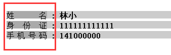
方法一,使用伪类:
html:
<div class="line">
    <div class="public">姓名</div>
    <b>:</b>
    <b>林小</b>
</div>
<div class="line">
    <div class="public">身份证</div>
    <b>:</b>
    <b>111111111111</b>
</div>
<div class="line">
    <div class="public">手机号码</div>
    <b>:</b>
    <b>141000000</b>
</div>
css:
.line{
 width:100%;
 height:15px;
 margin:5px;
}
.public{
 width:80px;
 height:100%;
 display:inline-block;
 text-align: justify;
 vertical-align:top;
}
.public::after{
 content:"";
 display: inline-block;
 width:100%;
 overflow:hidden;
 height:0;
}
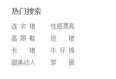
方法二使用letter-spacing来解决:
html:
<span style="font-size:12px;"><dl class="hotsearch" style="width:300px;">
<dt>热门搜索</dt>
<dd><a href="#" target="_blank" ref="nav" class="w3">电视机</a></dd>
<dd><a href="#" target="_blank" ref="nav" class="w4">性感漂亮</a></dd>
<dd><a href="#" target="_blank" ref="nav" class="w3">高跟鞋</a></dd>
<dd><a href="#" target="_blank" ref="nav" class="w2">手机</a></dd>
<dd><a href="#" target="_blank" ref="nav" class="w2">对齐</a></dd>
<dd><a href="#" target="_blank" ref="nav" class="w3">牛仔裤</a></dd>
<dd><a href="#" target="_blank" ref="nav" class="w4">小家碧玉</a></dd>
<dd><a href="#" target="_blank" ref="nav" class="w2">家居</a></dd>
</dl></span>
css:
.hotsearch dd{
float: left;
line-height: 24px;
margin-right: 30px;
overflow: hidden;
text-align: center;
width: 4em; /*这个值是看最长能显示几个文字,如x,则为x em*/
}
.hotsearch dd a{
display:block;
}
.w2{
letter-spacing:2em; /*如果需要y个字两端对齐,则为(x-y)/(y-1),这里是(4-2)/(2-1)=2em */
margin-right:-2em; /*同上*/
}
.w3{
letter-spacing:0.5em; /*如果需要y个字两端对齐,则为(x-y)/(y-1),这里是(4-3)/(3-1)=0.5em */
margin-right:-0.5em; /*同上*/
}
效果
15、实现图片加载过程高度自适应
应用情景:在页面布局过程中,遇到轮播图或者大张图片,当图片下面还有其它块内容,在图片加载过程中,由于高度是0,下面的元素会往上跑,图片加载完。元素会往下跑,给用户感觉抖动。
解决方法:在图片最外层设置一个div,给这个div设置如下样式
.img-box {
        overflow: hidden;
        width: 100%;
        height: 0;
        padding-bottom: 52%;
        /*方法二*/
        width:100%;
        /*高度相对父级宽度比例*/
        height: 52%vw;
        background:#eee;
}
16、实现文字超出省略...(需要设置宽度,当父级元素使用flex布局时,需要在display:flex;这边设置min-width:0;不然ellipsis会失效!!)
.ellipsis {
    overflow: hidden;
    text-overflow: ellipsis;
    white-space: nowrap;
}
.ellipsis-2l {
    display: -webkit-box;
    overflow: hidden;
    text-overflow: ellipsis;
    -webkit-box-orient: vertical;
    -webkit-line-clamp: 2; //第几行
}
17、竖向滚动条
效果,每次点都要与时间对齐,可以把小圆点放在跟日期同一个div上,然后横线做成整个记录的背景图
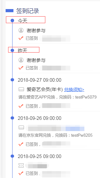
html:
<div class="list">
    <div class="list-item">
        <div class="list-item-time flexbox flexbox-middle"><span class="progres2-item"></span><span>今天</span></div>
        <div class="list-item-award yhj">2元优惠券,无门槛可用<a class="go">去使用></a></div>
        <div class="list-item-text">已签到,获得1个白鸽币</div>
    </div>
    <div class="list-item">
        <div class="list-item-time flexbox flexbox-middle"><span class="progres2-item"></span><span>今天</span></div>
        <div class="list-item-award yhj">2元优惠券,无门槛可用<a class="list-btn">去使用></a></div>
        <div class="excode">请在爱奇艺APP兑换,兑换码:testPw5079</div>
        <div class="list-item-text">已签到,获得1个白鸽币</div>
    </div>
    <div class="list-item">
        <div class="list-item-time flexbox flexbox-middle"><span class="progres2-item"></span><span>2018-09-28</span></div>
        <div class="list-item-text">已签到,获得1个白鸽币</div>
    </div>
    <div class="list-item">
        <div class="list-item-time flexbox flexbox-middle"><span class="progres2-item"></span><span>今天</span></div>
        <div class="list-item-award yhj">2元优惠券,无门槛可用<a class="list-btn">去使用></a></div>
        <div class="excode">请在爱奇艺APP兑换,兑换码:testPw5079</div>
        <div class="list-item-text">已签到,获得1个白鸽币</div>
    </div>
</div>
css:
.list {
    padding-top: .1rem;
    padding-bottom: .1rem;
    font-size: .3rem;
    color: #333;
    background-color: #fff;
}
.list-item {
    width: 100%;
    margin-left: .32rem;
    margin-top: -.15rem;
    padding-bottom: .4rem;
    background: url("../images/border.png") no-repeat .1rem .21rem;
    background-size: 1px 100%;
}
.progres2-item {
display: inline-block;
margin-right: .25rem;
width: .21rem;
height: .21rem;
background-color: #4d72e2;
border-radius: 50%;
}
/*最后一个没有直线也就是没有背景,只有一个的时候也没有*/
.list-item:last-of-type{
    background:transparent;
}
.list-item-award,.list-item-text {
    margin-left: .5rem;
}
.list-item-award{
    padding-left: .53rem;
    margin-bottom: .12rem;
    margin-top: .22rem;

}
.list-item-text {
    width: 100%;
    padding-left: .46rem;
    padding-bottom: .16rem;
    background: url("../images/sign-icon.png") no-repeat left .05rem;
    background-size: .32rem .25rem;
    font-size: .26rem;
    color: #808080;
    box-sizing: border-box;
    border-bottom: 1px solid #f4f4f4;
}
.list-item:last-of-type .list-item-text {
    border-bottom: 0 none;
}
.list-item .list-btn {
    padding-left: .1rem;
    text-decoration: underline;
    font-size: .28rem;
    color: #316cec;
}
18、文字底部横线背景
<div class="login-title">让小白鸽知道您不是机器人哦!</div>

.login-title {
    position: relative;
    height: .39rem;
    margin-top: .4rem;
    font-size: .34rem;
    color: #fff;
    text-align: center;
}
.login-title:after {
    content: "";
    position: absolute;
    width: 5.05rem;
    height: .21rem;
    background-color: #fe923f;
    z-index: -1;
    left: 0;
    right: 0;
    margin: 0 auto;
    bottom: 0;
}


 1万+
1万+


 被折叠的 条评论
为什么被折叠?
被折叠的 条评论
为什么被折叠?
 到【灌水乐园】发言


