


 本文旨在探讨如何使用CSS实现一个响应式页面,页面包含一个左侧内容div.left-top和一个右侧边栏div.right-bottom。当窗口宽度大于700px时,右侧边栏固定,左侧内容自适应;窗口小于700px时,两者上下排列。通过四种方案的分析和代码展示,最终提供了一个满足需求的解决方案。
一、目的
要创建一个响应式页面:
右侧边栏为div.right-bottom,左侧内容为div.left-top。
当窗口宽度大于700px时,随着窗口大小的变化,div.right-bottom的width与height固定不变,div.left-top的width与height自动调整。
当窗口宽度小于700px时,上述div.left-top在上,div.right-bottom在下,随着窗口大小的变化,二者的width与height自动调整。
效果如下图:
二、代码与分析
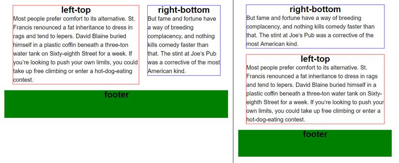
2.1 第一种方案
left-top
Most people prefer comfort to its alternative. St. Francis renounced a fat inheritance to dress in rags and tend to lepers. David Blaine buried himself in a plastic coffin beneath a three-ton water tank on Sixty-eighth Street for a week. If you’re looking to push your own limits, you could take up free climbing or enter a hot-dog-eating contest.
right-bottom
But fame and fortune have a way of breeding complacency, and nothing kills comedy faster than that. The stint at Joe’s Pub was a corrective of the most American kind.
@media (min-width: 700px) {
.section { /* 清浮动 */
zoom: 1;
}
.section:after { /* 清浮动 */
content: '';
display: block;
clear: both;
}
.left-top {
margin-right: 280px;
}
.right-bottom {
float: right;
width: 250px;
}
}
实现的效果如下图:
显然是不合格的。
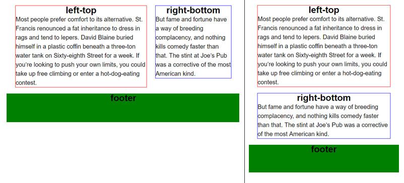
2.2 第二种方案
我们在html代码中,把div.right-bottom移到div.left-top上方。CSS样式不变。
right-bottom
But fame and fortune have a way of breeding complacency, and nothing kills comedy faster than that. The stint at Joe’s Pub was a corrective of the most American kind.
left-top
Most people prefer comfort to its alternative. St. Francis renounced a fat inheritance to dress in rags and tend to lepers. David Blaine buried himself in a plastic coffin beneath a three-ton water tank on Sixty-eighth Street for a week. If you’re looking to push your own limits, you could take up free climbing or enter a hot-dog-eating contest.
实现的效果如下图:
在窗口宽度小于700px时,右侧边栏内容在网页上方显示,不合格。
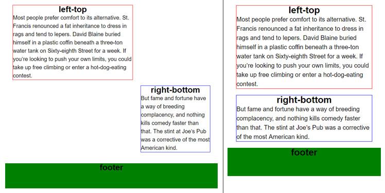
2.3 第三种方案
我们在html代码中,将div.right-bottom重新移到div.left-bottom下方,并改变div.right-bottom的样式。CSS代码如下:
@media (min-width: 700px) {
.section {
position: relative; /* 为了配合 div.right-bottom 的绝对定位 */
zoom: 1; /* 清浮动 */
}
.section:after { /* 清浮动 */
content: '';
display: block;
clear: both;
}
.left-top {
margin-right: 280px;
}
.right-bottom {
position: absolute; /* 绝对定位 */
top: 0;
right: 0;
width: 250px;
}
}
实现效果如下:
乍一看,已经符合要求,但是,在窗口宽度大于700px条件下,调整窗口宽度大小,当div.left-top高度小于div.right-bottom时,问题出现了:
由于div.right-bottom采用了绝对定位,脱离了标准文档流,所以div.section的height就等于div.left-top的height。div.footer与div.right-bottom重叠。
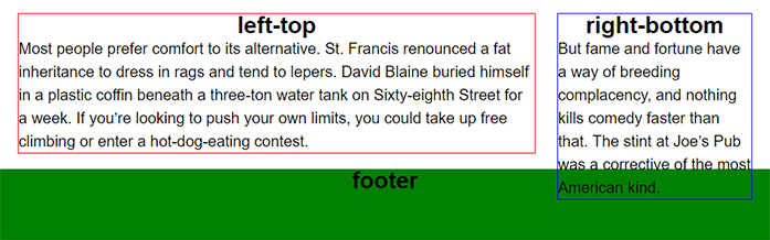
2.4 第四种方案(正确方案)
前三种方案都有问题,那么,这个问题应该怎么解决呢?请看下列代码。
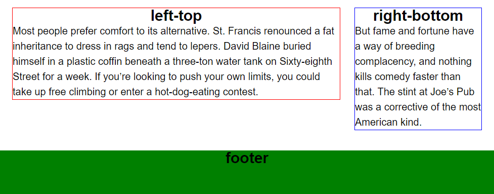
left-top
Most people prefer comfort to its alternative. St. Francis renounced a fat inheritance to dress in rags and tend to lepers. David Blaine buried himself in a plastic coffin beneath a three-ton water tank on Sixty-eighth Street for a week. If you’re looking to push your own limits, you could take up free climbing or enter a hot-dog-eating contest.
right-bottom
But fame and fortune have a way of breeding complacency, and nothing kills comedy faster than that. The stint at Joe’s Pub was a corrective of the most American kind.
@media (min-width: 700px) {
.section {
zoom: 1; /* 清浮动 */
}
.section:after { /* 清浮动 */
content: '';
display: block;
clear: both;
}
.left-top-wrapper {
width: 100%; /* 若无此句,width 则为 100% + 280px ,超出窗口宽度 */
float: left; /* 浮动,脱离标准文档流,使 div.right-bottom-wrapper 的顶端与之平齐 */
margin-right: -280px; /* 右侧让出 280px,放置 div.right-bottom */
}
.left-top {
margin-right: 280px; /* 让出280px,以免文字与 div.right-bottom重叠 */
}
.right-bottom {
float: right;
width: 250px;
}
}
实现效果如下:
尤其注意在窗口宽度大于700px条件下,调整窗口宽度大小,当div.left-top高度小于div.right-bottom时的效果:
参考


 扫一扫
扫一扫


 被折叠的 条评论
为什么被折叠?
被折叠的 条评论
为什么被折叠?
 到【灌水乐园】发言


