


原文:
WPF利用radiobutton制作菜单按钮
版权声明:欢迎转载。转载请注明出处,谢谢 https://blog.csdn.net/wzcool273509239/article/details/56480631
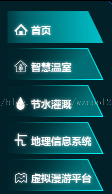
实现功能:鼠标移入和选中高亮显示,话不多说,直接上样式。
样式:
   <!--========================================================RadioButton 样式 通用====================================-->
    <Style x:Key="Tong_Yong_RadioButtonStyle" TargetType="{x:Type RadioButton}">
        <Setter Property="Foreground" Value="{DynamicResource {x:Static SystemColors.ControlTextBrushKey}}"/>
        <!--<Setter Property="Background" Value="#F4F4F4"/>
        <Setter Property="BorderBrush" Value="{StaticResource CheckBoxStroke}"/>-->
        <Setter Property="BorderThickness" Value="0"/>
        <Setter Property="HorizontalContentAlignment" Value="Center"/>
        <Setter Property="VerticalContentAlignment" Value="Center"/>
        <Setter Property="Padding" Value="0"/>
        <Setter Property="Margin" Value="10,10,0,0"></Setter>
        <Setter Property="Cursor" Value="Hand" />
        <Setter Property="Height" Value="{Binding Height}"></Setter>
        <Setter Property="Width" Value="{Binding Width}"></Setter>
        <Setter Property="Cursor" Value="Hand"></Setter>
        <Setter Property="Template">
            <Setter.Value>
                <ControlTemplate TargetType="{x:Type RadioButton}">
                    <Grid>
                        <!--选中或者鼠标移入颜色-->
                        <Grid x:Name="B" Visibility="Collapsed" Background="{TemplateBinding BorderBrush}"/>
                        <!--默认颜色-->
                        <Grid x:Name="A" Background="{TemplateBinding Background}"/>
                        <ContentPresenter x:Name="contentPresenter" RecognizesAccessKey="True" Visibility="Collapsed"/>
                    </Grid>
                    <ControlTemplate.Triggers>
                        <Trigger Property="IsChecked" Value="True">
                            <Setter Property="Visibility" TargetName="A" Value="Collapsed"/>
                            <Setter Property="Visibility" TargetName="B" Value="Visible"/>
                        </Trigger>
                        <Trigger Property="IsMouseOver" Value="True">
                            <!--<Setter Property="Visibility" TargetName="contentPresenter" Value="Visible"/>-->
                            <Setter Property="Visibility" TargetName="A" Value="Collapsed"/>
                            <Setter Property="Visibility" TargetName="B" Value="Visible"/>
                        </Trigger>
                    </ControlTemplate.Triggers>
                </ControlTemplate>
            </Setter.Value>
        </Setter>
    </Style>
    <!--========================================================RadioButton 样式 通用====================================-->
  <!--首页-->
            <RadioButton Name="rbHome" Style="{DynamicResource Tong_Yong_RadioButtonStyle}" Width="192" Height="63" IsChecked="True" Checked="RadioButton_Checked">
                <RadioButton.Background>
                    <ImageBrush ImageSource="/Agriculture.CommonUserControl;component/Images/MenuImages/home-.png"/>
                </RadioButton.Background>
                <RadioButton.BorderBrush>
                    <ImageBrush ImageSource="/Agriculture.CommonUserControl;component/Images/MenuImages/home.png"/>
                </RadioButton.BorderBrush>
                <Grid>
                    <Grid.Background>
                        <ImageBrush ImageSource="/Agriculture.CommonUserControl;component/Images/MenuImages/home.png"/>
                    </Grid.Background>
                </Grid>
            </RadioButton>


 973
973


 被折叠的 条评论
为什么被折叠?
被折叠的 条评论
为什么被折叠?
 到【灌水乐园】发言


