


用Matplotlib绘制二维图像的最简单方法是:
1. 导入模块
导入matplotlib的子模块
import matplotlib.pyplot as plt
import numpy as np
2. 获取数据对象
给出x,y两个数组[Python列表],注意两个列表的元素个数必须相同,否则会报错
x=np.array([1,2,3,4,])
y=x*2
3. 调用画图方法
调用pyplot模块的绘图方法画出图像,基本的画图方法有:plot(将各个点连成曲线图)、scatter(画散点图),bar(画条形图)还有更多方法。
1) 新建图画板对象
# 使用figure()函数重新申请一个figure对象
# 注意,每次调用figure的时候都会重新申请一个figure对象
# 第一个参数表示的是编号,第二个表示的是图表的长宽
plt.figure(num = 2, figsize=(8, 5))
2) 调用画图种类模式的方法
#color='red'表示线颜色,inewidth=1.0表示线宽,linestyle='--'表示线样式
L1 , =plt.plot(x,y,color="r",linewidth=1.0, linestyle='--', label=”曲线图”)
# s表示点的大小,默认rcParams['lines.markersize']**2
L2 , =plt.scatter(x,y,color="r",s=12,linewidth=1.0,linestyle='--',lable=”散点图”)
L3 , =plt.bar(x,y, color='green')
3) 设置图标签
# 使用legend绘制多条曲线
plt.legend(handles=[L1,L2], labels=[”曲线图”, ”散点图”], loc=”best”)
或者:
plt.plot(x,y,lable=”label”)
plt.lengend()
4) 设置轴线的lable(标签)
plt.xlabel('longitude')#说明x轴表示经度
plt.ylabel('latitude')#说明y轴表示纬度
5) 设置轴线取值参数范围
plt.axis([-1,2,1,3]) # x和y参数范围
plt.xlim((-1, 2)) # x参数范围
plt.ylim((1, 3)) # y参数范围
6) 设置轴线点位置的提示
# 设置点的位置
# 为点的位置设置对应的文字。
# 第一个参数是点的位置,第二个参数是点的文字提示。
plt.xticks(x,[r"one",r"two",r"three",r"four"])
plt.yticks(y,[r"first",r"second",r"thrid",r"fourth"])
7) 设置边框颜色
# gca = 'get current axis'
ax = plt.gca()
# 将右边和上边的边框(脊)的颜色去掉
ax.spines['right'].set_color('none')
ax.spines['top'].set_color('none')
8) 绑定x轴和y轴
ax.xaxis.set_ticks_position('bottom')
ax.yaxis.set_ticks_position('left')
9) 定义x轴和y轴的位置
ax.spines['bottom'].set_position(('data', 0))
ax.spines['left'].set_position(('data', 0))
10) 设置关键位置的提示信息
annotate语法说明 :annotate(s='str' ,xy=(x,y) ,xytext=(l1,l2) ,..)
s 为注释文本内容
xy 为被注释的坐标点
xytext 为注释文字的坐标位置
xycoords 参数如下:
figure points points from the lower left of the figure 点在图左下方
figure pixels pixels from the lower left of the figure 图左下角的像素
figure fraction fraction of figure from lower left 左下角数字部分
axes points points from lower left corner of axes 从左下角点的坐标
axes pixels pixels from lower left corner of axes 从左下角的像素坐标
axes fraction fraction of axes from lower left 左下角部分
data use the coordinate system of the object being annotated(default) 使用的坐标系统被注释的对象(默认)
polar(theta,r) if not native ‘data’ coordinates t
extcoords 设置注释文字偏移量
参数 | 坐标系 |
| 'figure points' | 距离图形左下角的点数量 |
| 'figure pixels' | 距离图形左下角的像素数量 |
| 'figure fraction' | 0,0 是图形左下角,1,1 是右上角 |
| 'axes points' | 距离轴域左下角的点数量 |
| 'axes pixels' | 距离轴域左下角的像素数量 |
| 'axes fraction' | 0,0 是轴域左下角,1,1 是右上角 |
| 'data' | 使用轴域数据坐标系 |
arrowprops #箭头参数,参数类型为字典dict
width the width of the arrow in points 点箭头的宽度
headwidth the width of the base of the arrow head in points 在点的箭头底座的宽度
headlength the length of the arrow head in points 点箭头的长度
shrink fraction of total length to ‘shrink’ from both ends 总长度为分数“缩水”从两端
facecolor 箭头颜色
bbox给标题增加外框 ,常用参数如下:
boxstyle方框外形
facecolor(简写fc)背景颜色
edgecolor(简写ec)边框线条颜色
edgewidth边框线条大小
bbox=dict(boxstyle='round,pad=0.5', fc='yellow', ec='k',lw=1 ,alpha=0.5) #fc为facecolor,ec为edgecolor,lw为lineweight
例子:
for xy in zip(x, y):
plt.annotate("(%s,%s)" % xy, xy=xy, xytext=(-20, 10), textcoords='offset points')
11) 设置图的标题
title常用参数:
fontsize设置字体大小,默认12,可选参数 ['xx-small', 'x-small', 'small', 'medium', 'large','x-large', 'xx-large']
fontweight设置字体粗细,可选参数 ['light', 'normal', 'medium', 'semibold', 'bold', 'heavy', 'black']
fontstyle设置字体类型,可选参数[ 'normal' | 'italic' | 'oblique' ],italic斜体,oblique倾斜
verticalalignment设置水平对齐方式 ,可选参数 : 'center' , 'top' , 'bottom' ,'baseline'
horizontalalignment设置垂直对齐方式,可选参数:left,right,center
rotation(旋转角度)可选参数为:vertical,horizontal 也可以为数字
alpha透明度,参数值0至1之间
backgroundcolor标题背景颜色
bbox给标题增加外框 ,常用参数如下:
boxstyle方框外形
facecolor(简写fc)背景颜色
edgecolor(简写ec)边框线条颜色
edgewidth边框线条大小
title例子:
plt.title('Interesting Graph',fontsize='large',fontweight='bold') 设置字体大小与格式
plt.title('Interesting Graph',color='blue') 设置字体颜色
plt.title('Interesting Graph',loc ='left') 设置字体位置
plt.title('Interesting Graph',verticalalignment='bottom') 设置垂直对齐方式
plt.title('Interesting Graph',rotation=45) 设置字体旋转角度
plt.title('Interesting',bbox=dict(facecolor='g', edgecolor='blue', alpha=0.65 )) 标题边框
plt.title('Title')
12) 设置图的文本
text语法说明
text(x,y,string,fontsize=15,verticalalignment="top",horizontalalignment="right")
x,y:表示坐标值上的值
string:表示说明文字
fontsize:表示字体大小
verticalalignment:垂直对齐方式 ,参数:[ ‘center’ | ‘top’ | ‘bottom’ | ‘baseline’ ]
horizontalalignment:水平对齐方式 ,参数:[ ‘center’ | ‘right’ | ‘left’ ]
xycoords选择指定的坐标轴系统:
figure points points from the lower left of the figure 点在图左下方
figure pixels pixels from the lower left of the figure 图左下角的像素
figure fraction fraction of figure from lower left 左下角数字部分
axes points points from lower left corner of axes 从左下角点的坐标
axes pixels pixels from lower left corner of axes 从左下角的像素坐标
axes fraction fraction of axes from lower left 左下角部分
data use the coordinate system of the object being annotated(default) 使用的坐标系统被注释的对象(默认)
polar(theta,r) if not native ‘data’ coordinates t
arrowprops #箭头参数,参数类型为字典dict
width the width of the arrow in points 点箭头的宽度
headwidth the width of the base of the arrow head in points 在点的箭头底座的宽度
headlength the length of the arrow head in points 点箭头的长度
shrink fraction of total length to ‘shrink’ from both ends 总长度为分数“缩水”从两端
facecolor 箭头颜色
bbox给标题增加外框 ,常用参数如下:
boxstyle方框外形
facecolor(简写fc)背景颜色
edgecolor(简写ec)边框线条颜色
edgewidth边框线条大小
bbox=dict(boxstyle='round,pad=0.5', fc='yellow', ec='k',lw=1 ,alpha=0.5) #fc为facecolor,ec为edgecolor,lw为lineweight
例子:
plt.text(5, 10, t, fontsize=18, style='oblique', ha='center',va='top',wrap=True)
plt.text(3, 4, t, family='serif', style='italic', ha='right', wrap=True)
13) 展现结果图
调用pyplot的show方法,显示结果。
plt.show()
4. 解析
Matplotlib 里的常用类的包含关系为 Figure -> Axes -> (Line2D, Text, etc.)一个Figure对象可以包含多个子图(Axes),在matplotlib中用Axes对象表示一个绘图区域,可以理解为子图。
可以使用subplot()快速绘制包含多个子图的图表,它的调用形式如下:
subplot(numRows, numCols, plotNum)
subplot将整个绘图区域等分为numRows行* numCols列个子区域,然后按照从左到右,
从上到下的顺序对每个子区域进行编号,左上的子区域的编号为1。如果numRows,numCols和plotNum这三个数都小于10的话,可以把它们缩写为一个整数,例如subplot(323)和subplot(3,2,3)是相同的。subplot在plotNum指定的区域中创建一个轴对象。如果新创建的轴和之前创建的轴重叠的话,之前的轴将被删除。
subplot()返回它所创建的Axes对象,我们可以将它用变量保存起来,然后用sca()交替让它们成为当前Axes对象,并调用plot()在其中绘图。
#coding=utf-8
import numpy as np
import matplotlib.pyplot as plt
plt.figure(1) # 创建图表1
plt.figure(2) # 创建图表2
ax1 = plt.subplot(211) # 在图表2中创建子图1
ax2 = plt.subplot(212) # 在图表2中创建子图2
x = np.linspace(0, 3, 100)
for i in xrange(5):
plt.figure(1) #选择图表1
plt.plot(x, np.exp(i*x/3))
plt.sca(ax1) #选择图表2的子图1
plt.plot(x, np.sin(i*x))
plt.sca(ax2) # 选择图表2的子图2
plt.plot(x, np.cos(i*x))
plt.show()
在图表中显示中文
matplotlib的缺省配置文件中所使用的字体无法正确显示中文。为了让图表能正确显示中文,可以有几种解决方案。
在程序中直接指定字体。
在程序开头修改配置字典rcParams。
修改配置文件。
面向对象画图
matplotlib API包含有三层,Artist层处理所有的高层结构,例如处理图表、文字和曲线等的绘制和布局。通常我们只和Artist打交道,而不需要关心底层的绘制细节。
直接使用Artists创建图表的标准流程如下:
创建Figure对象
用Figure对象创建一个或者多个Axes或者Subplot对象
调用Axies等对象的方法创建各种简单类型的Artists
import matplotlib.pyplot as plt
X1 = range(0, 50)
Y1 = [num**2 for num in X1] # y = x^2
X2 = [0, 1]
Y2 = [0, 1] # y = x
Fig = plt.figure(figsize=(8,4)) # Create a `figure' instance
Ax = Fig.add_subplot(111) # Create a `axes' instance in the figure
Ax.plot(X1, Y1, X2, Y2) # Create a Line2D instance in the axes
Fig.show()
Fig.savefig("test.pdf")
1) figure语法及操作
figure(num=None, figsize=None, dpi=None, facecolor=None, edgecolor=None, frameon=True)
num:图像编号或名称,数字为编号 ,字符串为名称,可以通过该参数激活不同的画布
figsize:指定figure的宽和高,单位为英寸;
dpi参数指定绘图对象的分辨率,即每英寸多少个像素,缺省值为80。相同的figsize,dpi越大画布越大
facecolor:背景颜色
edgecolor:边框颜色
frameon:是否显示边框,默认值True为绘制边框,如果为False则不绘制边框
import matplotlib.pyplot as plt
创建自定义图像
fig=plt.figure(figsize=(4,3),facecolor='blue')
plt.show()
2) subplot创建单个子图
subplot(nrows,ncols,sharex,sharey,subplot_kw,**fig_kw)
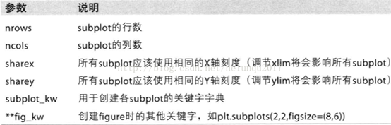
subplot可以规划figure划分为n个子图,但每条subplot命令只会创建一个子图 ,参考下面例子。
import numpy as np
import matplotlib.pyplot as plt
x = np.arange(0, 100)
#子图1
plt.subplot(221)
plt.plot(x, x)
#子图2
plt.subplot(222)
plt.plot(x, -x)
#子图3
plt.subplot(223)
plt.plot(x, x ** 2)
plt.grid(color='r', linestyle='--', linewidth=1,alpha=0.3)
#子图4
plt.subplot(224)
plt.plot(x, np.log(x))
plt.show()

3) subplots创建多个子图
subplots参数与subplots相似
import numpy as np
import matplotlib.pyplot as plt
x = np.arange(0, 100)
#划分子图
fig,axes=plt.subplots(2,2)
ax1=axes[0,0]
ax2=axes[0,1]
ax3=axes[1,0]
ax4=axes[1,1]
#子图1
ax1.plot(x, x)
#子图2
ax2.plot(x, -x)
#子图3
ax3.plot(x, x ** 2)
ax3.grid(color='r', linestyle='--', linewidth=1,alpha=0.3)
#子图4
ax4.plot(x, np.log(x))
plt.show()
4) add_subplot新增子图
add_subplot是面对象figure类api,pyplot api中没有此命令
add_subplot的参数与subplots的相似
import numpy as np
import matplotlib.pyplot as plt
x = np.arange(0, 100)
#新建figure对象
fig=plt.figure()
#新建子图1
ax1=fig.add_subplot(2,2,1)
ax1.plot(x, x)
#新建子图3
ax3=fig.add_subplot(2,2,3)
ax3.plot(x, x ** 2)
ax3.grid(color='r', linestyle='--', linewidth=1,alpha=0.3)
#新建子图4
ax4=fig.add_subplot(2,2,4)
ax4.plot(x, np.log(x))
plt.show()

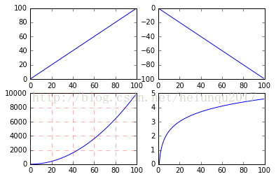
5) add_axes新增子区域
add_axes为新增子区域,该区域可以座落在figure内任意位置,且该区域可任意设置大小
add_axes参数可参考官方文档:
http://matplotlib.org/api/_as_gen/matplotlib.figure.Figure.html#matplotlib.figure.Figure
import numpy as np
import matplotlib.pyplot as plt
#新建figure
fig = plt.figure()
# 定义数据
x = [1, 2, 3, 4, 5, 6, 7]
y = [1, 3, 4, 2, 5, 8, 6]
#新建区域ax1
#figure的百分比,从figure 10%的位置开始绘制, 宽高是figure的80%
left, bottom, width, height = 0.1, 0.1, 0.8, 0.8
# 获得绘制的句柄
ax1 = fig.add_axes([left, bottom, width, height])
ax1.plot(x, y, 'r')
ax1.set_title('area1')
#新增区域ax2,嵌套在ax1内
left, bottom, width, height = 0.2, 0.6, 0.25, 0.25
# 获得绘制的句柄
ax2 = fig.add_axes([left, bottom, width, height])
ax2.plot(x, y, 'b')
ax2.set_title('area2')
plt.show()
5. Matplotlib.pyplot和matplotlib.pylab的区别
pylab结合了pyplot和numpy,对交互式使用来说比较方便,既可以画图又可以进行简单的计算。但是,对于一个项目来说,建议分别倒入使用
6. matplotlib中文显示
import matplotlib.pyplot as plt
a) FontProperties方法
#coding=utf-8
import matplotlib.pyplot as plt
from matplotlib.font_manager import FontProperties
fig = plt.figure()
font = FontProperties(fname=r"c:\windows\fonts\simsun.ttc", size=14)
plt.xlabel(u"x轴", fontproperties=font)
plt.show()
b) fontproperties方法
#coding=utf-8
import matplotlib.pyplot as plt
from matplotlib.font_manager import FontProperties
fig = plt.figure()
plt.ylabel(u"y轴", fontproperties="SimHei")
plt.show()
c) rcParams方法
#coding=utf-8
import matplotlib.pyplot as plt
from matplotlib.font_manager import FontProperties
fig = plt.figure()
plt.rcParams['font.sans-serif'] = ['SimHei']
plt.rcParams['axes.unicode_minus'] = False
plt.xlabel(u"x轴")
plt.show()
d) rc方法
#coding=utf-8
import matplotlib.pyplot as plt
from matplotlib.font_manager import FontProperties
fig = plt.figure()
font = {'family' : 'SimHei','weight' : 'bold','size' : '16'}
plt.rc('font', **font)
plt.rc('axes', unicode_minus=False)
plt.xlabel(u"x轴")
plt.show()
方式二用时才设置,且不会污染全局字体设置,更灵活
方式三、方式四不需要对字体路径硬编码,而且一次设置,多次使用,更方便。
【附录】
一些中文字体的英文名
宋体 SimSun
黑体 SimHei
微软雅黑 Microsoft YaHei
微软正黑体 Microsoft JhengHei
新宋体 NSimSun
新细明体 PMingLiU
细明体 MingLiU
标楷体 DFKai-SB
仿宋 FangSong
楷体 KaiTi
隶书:LiSu
幼圆:YouYuan
华文细黑:STXihei
华文楷体:STKaiti
华文宋体:STSong
华文中宋:STZhongsong
华文仿宋:STFangsong
方正舒体:FZShuTi
方正姚体:FZYaoti
华文彩云:STCaiyun
华文琥珀:STHupo
华文隶书:STLiti
华文行楷:STXingkai
华文新魏:STXinwei
6) Pyplot绘图结构
Aritists
matplotlib API包含有三层:
backend_bases.FigureCanvas : 图表的绘制领域
backend_bases.Renderer : 知道如何在FigureCanvas上如何绘图
artist.Artist : 知道如何使用Renderer在FigureCanvas上绘图
FigureCanvas和Renderer需要处理底层的绘图操作,例如使用wxPython在界面上绘图,或者使用PostScript绘制PDF。Artist则处理所有的高层结构,例如处理图表、文字和曲线等的绘制和布局。通常我们只和Artist打交道,而不需要关心底层的绘制细节。
Artists分为简单类型和容器类型两种。简单类型的Artists为标准的绘图元件,例如Line2D、 Rectangle、 Text、AxesImage 等等。而容器类型则可以包含许多简单类型的Artists,使它们组织成一个整体,例如Axis、 Axes、Figure等。
直接使用Artists创建图表的标准流程如下:
l 创建Figure对象;
l 用Figure对象创建一个或者多个Axes或者Subplot对象;
l 调用Axies等对象的方法创建各种简单类型的Artists。
a) Figure
Figure代表一个绘制面板,其中可以包涵多个Axes(即多个图表)。
b) Axes
Axes表示一个图表
一个Axes包涵:titlek, xaxis, yaxis
c) Axis
坐标轴
7) Pyplot绘图结构的Artist的属性
下面是Artist对象都具有的一些属性:
alpha : 透明度,值在0到1之间,0为完全透明,1为完全不透明
animated : 布尔值,在绘制动画效果时使用
axes : 此Artist对象所在的Axes对象,可能为None
clip_box : 对象的裁剪框
clip_on : 是否裁剪
clip_path : 裁剪的路径
contains : 判断指定点是否在对象上的函数
figure : 所在的Figure对象,可能为None
label : 文本标签
picker : 控制Artist对象选取
transform : 控制偏移旋转
visible : 是否可见
zorder : 控制绘图顺序
Artist对象的所有属性都通过相应的 get_* 和 set_* 函数进行读写
fig.set_alpha(0.5*fig.get_alpha())
如果你想用一条语句设置多个属性的话,可以使用set函数:
fig.set(alpha=0.5, zorder=2)
使用 matplotlib.pyplot.getp 函数可以方便地输出Artist对象的所有属性名和值。
>>> plt.getp(fig.patch)
aa = True
alpha = 1.0
animated = False
antialiased or aa = True
a) Figure
如前所述,Figure是最大的一个Aritist,它包括整幅图像的所有元素,背景是一个Rectangle对象,用Figure.patch属性表示。
通过调用add_subplot或者add_axes方法往图表中添加Axes(子图)。
PS:这两个方法返回值类型不同
>>> fig = plt.figure()
>>> ax1 = fig.add_subplot(211)
>>> ax2 = fig.add_axes([0.1, 0.1, 0.7, 0.3])
>>> ax1
<matplotlib.axes.AxesSubplot object at 0x056BCA90>
>>> ax2
<matplotlib.axes.Axes object at 0x056BC910>
>>> fig.axes
[<matplotlib.axes.AxesSubplot object at 0x056BCA90>,
<matplotlib.axes.Axes object at 0x056BC910>]
为了支持pylab中的gca()等函数,Figure对象内部保存有当前轴的信息,因此不建议直接对Figure.axes属性进行列表操作,而应该使用add_subplot, add_axes, delaxes等方法进行添加和删除操作。
fig = plt.figure()
ax1 = fig.add_axes([0.1, 0.45, 0.8, 0.5])
ax2 = fig.add_axes([0.1, 0.1, 0.8, 0.2])
plt.show()
Figure对象可以拥有自己的文字、线条以及图像等简单类型的Artist。缺省的坐标系统为像素点,但是可以通过设置Artist对象的transform属性修改坐标系的转换方式。最常用的Figure对象的坐标系是以左下角为坐标原点(0,0),右上角为坐标(1,1)。下面的程序创建并添加两条直线到fig中:
>>> from matplotlib.lines import Line2D
>>> fig = plt.figure()
>>> line1 = Line2D([0,1],[0,1], transform=fig.transFigure, figure=fig, color="r")
>>> line2 = Line2D([0,1],[1,0], transform=fig.transFigure, figure=fig, color="g")
>>> fig.lines.extend([line1, line2])
>>> fig.show()
---------------------

在Figure对象中手工绘制直线
注意为了让所创建的Line2D对象使用fig的坐标,我们将fig.TransFigure赋给Line2D对象的transform属性;为了让Line2D对象知道它是在fig对象中,我们还设置其figure属性为fig;最后还需要将创建的两个Line2D对象添加到fig.lines属性中去。
Figure对象有如下属性包含其它的Artist对象:
axes : Axes对象列表
patch : 作为背景的Rectangle对象
images : FigureImage对象列表,用来显示图片
legends : Legend对象列表
lines : Line2D对象列表
patches : patch对象列表
texts : Text对象列表,用来显示文字
b) Axes
Axes容器是整个matplotlib库的核心,它包含了组成图表的众多Artist对象,并且有许多方法函数帮助我们创建、修改这些对象。和Figure一样,它有一个patch属性作为背景,
当它是笛卡尔坐标时,patch属性是一个Rectangle对象;
当它是极坐标时,patch属性则是Circle对象。
当你调用Axes的绘图方法(例如plot),它将创建一组Line2D对象,并将所有的关键字参数传递给这些Line2D对象,并将它们添加进Axes.lines属性中,最后返回所创建的Line2D对象列表:
x1 = np.linspace(0.0, 5.0)
x2 = np.linspace(0.0, 3.0)
y1 = np.cos(2 * np.pi * x1) * np.exp(-x1)
y2 = np.cos(2 * np.pi * x2)
ax1.patch.set_facecolor("green")
ax1.grid(True)
line1 = ax1.plot(x1, y1, 'yo-', label="Test1")
print type(line1)
print line1
line2 = ax2.plot(x2, y2, 'r.-', label='Test2')
-----
<type 'list'>
[<matplotlib.lines.Line2D object at 0x7fa3ac96e8d0>]
注意:
plot返回的是一个Line2D对象的列表,因为我们可以传递多组X,Y轴的数据,一次绘制多条曲线。

与plot方法类似,绘制直方图的方法bar和绘制柱状统计图的方法hist将创建一个Patch对象的列表,每个元素实际上都是Patch的子类Rectangle,并且将所创建的Patch对象都添加进Axes.patches属性中:
>>> ax = fig.add_subplot(111)
>>> n, bins, rects = ax.hist(np.random.randn(1000), 50, facecolor="blue")
>>> rects
<a list of 50 Patch objects>
>>> rects[0]
<matplotlib.patches.Rectangle object at 0x05BC2350>
>>> ax.patches[0]
<matplotlib.patches.Rectangle object at 0x05BC2350>
一般我们不会直接对Axes.lines或者Axes.patches属性进行操作,而是调用add_line或者add_patch等方法,这些方法帮助我们完成许多属性设置工作:
>>> fig = plt.figure()
>>> ax = fig.add_subplot(111)
>>> rect = matplotlib.patches.Rectangle((1,1), width=5, height=12)
>>> print rect.get_axes() # rect的axes属性为空
None
>>> rect.get_transform() # rect的transform属性为缺省值
BboxTransformTo(Bbox(array([[ 1., 1.],
[ 6., 13.]])))
>>> ax.add_patch(rect) # 将rect添加进ax
<matplotlib.patches.Rectangle object at 0x05C34E50>
>>> rect.get_axes() # 于是rect的axes属性就是ax
<matplotlib.axes.AxesSubplot object at 0x05C09CB0>
>>> # rect的transform属性和ax的transData相同
>>> rect.get_transform()
... # 太长,省略
>>> ax.transData
... # 太长,省略
>>> ax.get_xlim() # ax的X轴范围为0到1,无法显示完整的rect
(0.0, 1.0)
>>> ax.dataLim._get_bounds() # 数据的范围和rect的大小一致
(1.0, 1.0, 5.0, 12.0)
>>> ax.autoscale_view() # 自动调整坐标轴范围
>>> ax.get_xlim() # 于是X轴可以完整显示rect
(1.0, 6.0)
>>> plt.show()
通过上面的例子我们可以看出,add_patch方法帮助我们设置了rect的axes和transform属性。
下面详细列出Axes包含各种Artist对象的属性:
artists : Artist对象列表
patch : 作为Axes背景的Patch对象,可以是Rectangle或者Circle
collections : Collection对象列表
images : AxesImage对象列表
legends : Legend对象列表
lines : Line2D对象列表
patches : Patch对象列表
texts : Text对象列表
xaxis : XAxis对象
yaxis : YAxis对象
下面列出Axes的创建Artist对象的方法:
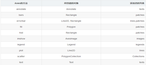
c) Axis
Axis容器包括坐标轴上的刻度线、刻度文本、坐标网格以及坐标轴标题等内容。刻度包括主刻度和副刻度,分别通过Axis.get_major_ticks和Axis.get_minor_ticks方法获得。每个刻度线都是一个XTick或者YTick对象,它包括实际的刻度线和刻度文本。为了方便访问刻度线和文本,Axis对象提供了get_ticklabels和get_ticklines方法分别直接获得刻度线和刻度文本
>>> axis.get_ticklocs() # 获得刻度的位置列表
array([ 1. , 1.5, 2. , 2.5, 3. ])
>>> axis.get_ticklabels() # 获得刻度标签列表
<a list of 5 Text major ticklabel objects>
>>> [x.get_text() for x in axis.get_ticklabels()] # 获得刻度的文本字符串
[u'1.0', u'1.5', u'2.0', u'2.5', u'3.0']
>>> axis.get_ticklines() # 获得主刻度线列表,图的上下刻度线共10条
<a list of 10 Line2D ticklines objects>
>>> axis.get_ticklines(minor=True) # 获得副刻度线列表
<a list of 0 Line2D ticklines objects>
7. 绘制图形类型
1) 点线图
#color='red'表示线颜色,inewidth=1.0表示线宽,linestyle='--'表示线样式
L1 , =plt.plot(x,y,color="r",marker='+', linestyle='--',linewidth=1.0, label=”曲线图”)
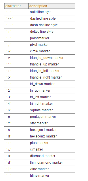
对于标注和线条的样式,可以通过简单的字符来表示:
以及标注和线条的颜色:
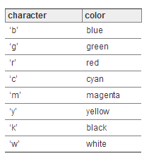
当然线条的颜色可以以其他方式定制。比如16进制的字符串('#008000')或者是RGB、RGBA元组的方式RGB or RGBA ((0,1,0,1)) 来实现不同的颜色。
2) 散点图
# s表示点的大小,默认rcParams['lines.markersize']**2
L2 , =plt.scatter(x,y,color="r",s=12,linewidth=1.0,linestyle='--',lable=”散点图”)
3) 条形图
matplotlib.pyplot.bar(x, height, width=0.8, bottom=None, *, align='center', data=None, **kwargs)
参数解析
a) width :
scalar or array-like, optional。The width(s) of the bars (default: 0.8)
b) bottom :
scalar or array-like, optional。The y coordinate(s) of the bars bases (default: 0).
c) align :
{'center', 'edge'}, optional, default: 'center'
Alignment of the bars to the x coordinates:
'center': Center the base on the x positions.
'edge': Align the left edges of the bars with the x positions.
To align the bars on the right edge pass a negative width and align='edge'.
d) color :
scalar or array-like, optional
The colors of the bar faces.
e) edgecolor :
scalar or array-like, optional
The colors of the bar edges.
f) linewidth :
scalar or array-like, optional
Width of the bar edge(s). If 0, don't draw edges.
g) tick_label :
string or array-like, optional
The tick labels of the bars. Default: None (Use default numeric labels.)
h) xerr, yerr :
scalar or array-like of shape(N,) or shape(2,N), optional
If not None, add horizontal / vertical errorbars to the bar tips. The values are +/- sizes relative to the data:
scalar:
symmetric +/- values for all bars
shape(N,): symmetric +/- values for each bar
shape(2,N): Separate - and + values for each bar. First row
contains the lower errors, the second row contains the upper errors.
None: No errorbar. (Default)
See Different ways of specifying error bars for an example on the usage of xerr and yerr.
i) ecolor :
scalar or array-like, optional, default: 'black'
The line color of the errorbars.
j) capsize :
scalar, optional
The length of the error bar caps in points. Default: None, which will take the value from rcParams["errorbar.capsize"].
k) error_kw :
dict, optional
Dictionary of kwargs to be passed to the errorbar method. Values of ecolor or capsize defined here take precedence over the independent kwargs.
l) log :
bool, optional, default: False
If True, set the y-axis to be log scale.
m) orientation :
{'vertical', 'horizontal'}, optional
This is for internal use only. Please use barh for horizontal bar plots. Default: 'vertical'.
4) 水平条形图
plt. Barh()
5) 直方图
matplotlib.pyplot.hist(x, bins=None, range=None, density=None, weights=None, cumulative=False, bottom=None, histtype='bar', align='mid', orientation='vertical', rwidth=None, log=False, color=None, label=None, stacked=False, normed=None, *, data=None, **kwargs)
6) 堆叠图
plt.stackplot()
7) 饼图
plt.pie(x, explode=None, labels=None, colors=None, pctdistance=0.6, shadow=False, labeldistance=1.1, startangle=None, radius=None, counterclock=True, wedgeprops=None, textprops=None, center=(0,0), frame=False)
x: 指定绘图的数据
explode:指定饼图某些部分的突出显示,即呈现爆炸式
labels:为饼图添加标签说明,类似于图例说明
colors:指定饼图的填充色
autopct:设置百分比格式,如'%.1f%%'为保留一位小数
shadow:是否添加饼图的阴影效果
pctdistance:设置百分比标签与圆心的距离
labeldistance:设置各扇形标签(图例)与圆心的距离;
startangle:设置饼图的初始摆放角度, 180为水平;
radius:设置饼图的半径大小;
counterclock:是否让饼图按逆时针顺序呈现, True / False;
wedgeprops:设置饼图内外边界的属性,如边界线的粗细、颜色等, 如wedgeprops = {'linewidth': 1.5, 'edgecolor':'green'}
textprops:设置饼图中文本的属性,如字体大小、颜色等;
center:指定饼图的中心点位置,默认为原点
frame:是否要显示饼图背后的图框,如果设置为True的话,需要同时控制图框x轴、y轴的范围和饼图的中心位置;
8) 箱线图
plt.boxplot(x, notch=None, sym=None, vert=None, whis=None, positions=None, widths=None, patch_artist=None, meanline=None, showmeans=None, showcaps=None, showbox=None, showfliers=None, boxprops=None, labels=None, flierprops=None, medianprops=None, meanprops=None, capprops=None, whiskerprops=None)
x:指定要绘制箱线图的数据;
notch:是否是凹口的形式展现箱线图,默认非凹口;
sym:指定异常点的形状,默认为+号显示;
vert:是否需要将箱线图垂直摆放,默认垂直摆放;
whis:指定上下须与上下四分位的距离,默认为1.5倍的四分位差;
positions:指定箱线图的位置,默认为[0,1,2…];
widths:指定箱线图的宽度,默认为0.5;
patch_artist:是否填充箱体的颜色;
meanline:是否用线的形式表示均值,默认用点来表示;
showmeans:是否显示均值,默认不显示;
showcaps:是否显示箱线图顶端和末端的两条线,默认显示;
showbox:是否显示箱线图的箱体,默认显示;
showfliers:是否显示异常值,默认显示;
boxprops:设置箱体的属性,如边框色,填充色等;
labels:为箱线图添加标签,类似于图例的作用;
filerprops:设置异常值的属性,如异常点的形状、大小、填充色等;
medianprops:设置中位数的属性,如线的类型、粗细等;
meanprops:设置均值的属性,如点的大小、颜色等;
capprops:设置箱线图顶端和末端线条的属性,如颜色、粗细等;
whiskerprops:设置须的属性,如颜色、粗细、线的类型等;
9) 等高线图
plt. Clabel()
10) 颜色和填充
11) 边框和水平线条
8. 绘制动态图
1) 范例
import numpy as np
import matplotlib.pyplot as plt
from matplotlib.animation import FuncAnimation
fig, ax = plt.subplots()
xdata, ydata = [], []
ln, = ax.plot([], [], 'r-', animated=False)
def init():
ax.set_xlim(0, 2*np.pi)
ax.set_ylim(-1, 1)
return ln,
def update(frame):
xdata.append(frame)
ydata.append(np.sin(frame))
ln.set_data(xdata, ydata)
return ln,
ani = FuncAnimation(fig, update, frames=np.linspace(0, 2*np.pi, 128),
init_func=init, blit=True)
plt.show()
ani.save('test_animation.gif',writer='imagemagick')
2) 构造函数
我们先来看看 FuncAnimation 的构造方法。
def __init__(self, fig, func, frames=None, init_func=None, fargs=None,
save_count=None, **kwargs):
fig 自然是 matplotlib 中的 figure 对象。
func 是每一次更新时所调用的方法,它是回调函数。因此,我们可以在这个方法中更新 figure 当中的 axes 中的 line2d 对象,它是动态更新 figure 的根本。
frames 代表了整个动画过程中帧的取值范围,而本质上是一个数据发生器。我将在后面重点讲解它。
init_func 是初始函数,用来初始 figure 的画面。
fargs 是每次附加给 func 回调函数的参数,可以为 None
save_count 是缓存的数量
除此之外,还有一些可选的参数,它们分别是
interval 是每 2 个 frame 发生的时间间隔,单位是 ms,默认值是 200.
repeat_delay 取值是数值,如果 animation 是重复播放的话,这个值就是每次播放之间的延迟时间,单位是 ms。
repeat bool 型可选参数,默认为 True,代表动画是否会重复执行
blit bool 型可选参数,控制绘制的优化。默认是 False。
3) 着重参数分析
animation 的核心参数是 frames 和 func
frames 可以取值:iterable,int,generator 生成器函数 或者是 None。
但有个前提是,生成器要符合下面的签名格式。
def gen_function() -> obj
func 是回调函数,它会在每次更新的时候被调用,所以我们只需要在这个函数中更新 figure 中的数值就可以了。
实际上,frames 决定了整个动画 frame 的取值范围,它会在 interval 时间内迭代一次,然后将值传递给 func,直到整个 frames 迭代完毕。
4) 保存动画
ani.save('test_animation.gif',writer='imagemagick')
需要注意到的是,如果要保存 gif 图像,这要求开发者电脑已经安装了 ImageMagicK。
动画可以保存为 gif 图像,自然也能保存为 mp4 视频格式。
但这要求开发者计算机已经安装好 ffmpeg 库,并且 save 方法中指定 writer 为 ffmpeg。


 4万+
4万+


 被折叠的 条评论
为什么被折叠?
被折叠的 条评论
为什么被折叠?
 到【灌水乐园】发言


