


效果图:
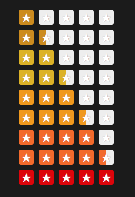
    <div class="rating rating-3-half">
      <i class="star-1">★</i>
      <i class="star-2">★</i>
      <i class="star-3">★</i>
      <i class="star-4">★</i>
      <i class="star-5">★</i>
    </div>
.rating {
  margin: 10px 0;
}
.rating-3-half .star-4 {
  border-left-color: #f0991e;
}
.rating i {
  display: inline-block;
  width: 0;
  height: 1.5em;
  border-width: 0 0.75em;
  border-style: solid;
  border-color: #eee;
  border-radius: .22em;
  color: white;
  background: #eee;
  font-style: normal;
  line-height: 1.6em;
  text-indent: -0.5em;
  text-shadow: 1px 0 1px #b3b3b3;
}
实现原理:设置包含星星的I元素高度后,然后设置其边框上下宽度为0,然后左右宽度为I元素高度的一半,需要实现半个星星时就使用border-left-color:属性。其他则设置一般的边框即可。IE6下不兼容


 1097
1097

 被折叠的 条评论
为什么被折叠?
被折叠的 条评论
为什么被折叠?
 到【灌水乐园】发言


