


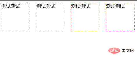
我们先来看一下效果:
实现代码如下:
HTML
测试测试
Easy-way
通过背景图片实现。.box {
width: 100px;
height: 100px;
position: relative;
background: url(https://www.zhangxinxu.com/study/image/selection.gif);
p {
position: absolute;
left: 0;
top: 0;
right: 0;
bottom: 0;
margin: auto;
height: calc(100% - 2px);
width: calc(100% - 2px);
background-color: #fff;
}
}
(视频教程推荐:css视频教程)
repeating-linear-gradient
 最低0.47元/天 解锁文章


 8626
8626


 被折叠的 条评论
为什么被折叠?
被折叠的 条评论
为什么被折叠?
 到【灌水乐园】发言


