


这里权当一个matplotlib的用法小结,主要用于记录,以防忘记。
需要安装一下Anaconda,这里推荐清华大学的镜像:https://mirrors.tuna.tsinghua.edu.cn/help/anaconda/
matplotlib能将数据进行可视化,更直观地呈现。使数据更加客观,更具说服力。
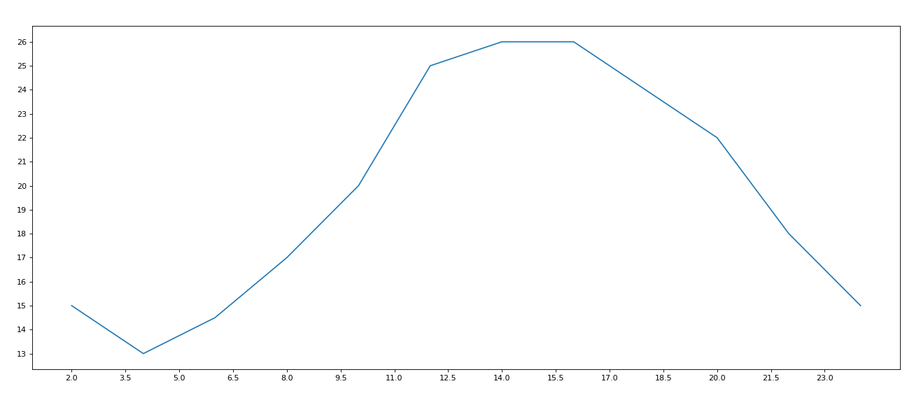
1. 折线图
from matplotlib import pyplot as plt

# E:\Anaconda3\Library\bin添加到环境变量
x = range(2, 26, 2)
y = [15, 13, 14.5, 17, 20, 25, 26, 26, 24, 22, 18, 15]

# 设置图片大小,宽20,高8,像素80
plt.figure(figsize=(20, 8), dpi=80)

# 设置x轴的刻度
_xtick_labels = [i / 2 for i in range(4, 49)]
plt.xticks(_xtick_labels[::3]) #步长取3

plt.yticks(range(min(y), max(y) + 1))

# 绘图
plt.plot(x, y)

# 保存,svg矢量图格式,放大不会有锯齿
plt.savefig('./t1.svg')

# 展示图形
plt.show()
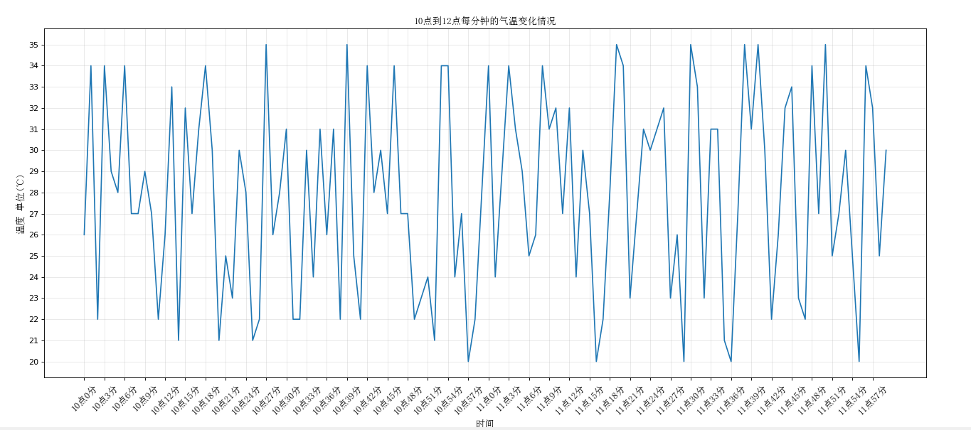
2. 设置中文

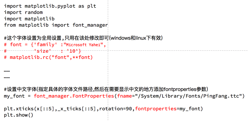
import random

from matplotlib import pyplot as plt, font_manager

#设置字体(这样可以显示中文字体)
my_font = font_manager.FontProperties(fname='C:\Windows\Fonts\simsun.ttc', size=12)

x = range(120)
y = [random.randint(20, 35) for i in range(120)]

plt.figure(figsize=(20, 8), dpi=80)

# 调整x轴的刻度
# _x = list(x)[::10]
# _xtick_labels = ['hello,{}'.format(i) for i in _x]
# plt.xticks(_x, _xtick_labels)

_x = list(x)
_xtick_labels = ['10点{}分'.format(i) for i in range(60)]
_xtick_labels += ['11点{}分'.format(i) for i in range(60)]
#rotation是逆时针旋转角度
# plt.xticks(_x[::3], _xtick_labels[::3], rotation = 45, fontproperties = 'SimHei') #这样是可以的
plt.xticks(_x[::3], _xtick_labels[::3], rotation = 45, fontproperties = my_font)

plt.yticks(range(min(y), max(y) + 1))


#添加描述信息
plt.xlabel('时间', fontproperties = my_font)
plt.ylabel('温度 单位(℃)', fontproperties = my_font)
plt.title('10点到12点每分钟的气温变化情况', fontproperties = my_font)
#网格
#alpha是透明度,0最透明,1最明显
plt.grid(alpha = 0.3)


plt.plot(x, y)
plt.show()
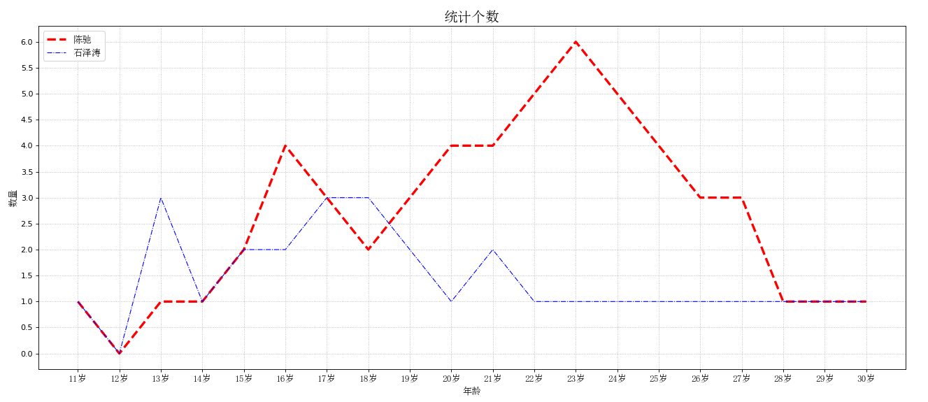
3. 多个折线图
图例的位置loc:
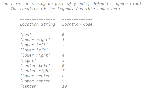
from matplotlib import pyplot as plt, font_manager

plt.figure(figsize=(20, 8), dpi=80)
x = range(11, 31)
y1 = [1,0,1,1,2,4,3,2,3,4,4,5,6,5,4,3,3,1,1,1]
y2 = [1,0,3,1,2,2,3,3,2,1,2,1,1,1,1,1,1,1,1,1]

#设置字体(这样可以显示中文字体)
my_font = font_manager.FontProperties(fname='C:\Windows\Fonts\simsun.ttc', size=12)


plt.xticks(x, ['{}岁'.format(i) for i in list(x)], fontproperties = my_font)
plt.yticks([i / 2 for i in range(2 * min(y1), 2 * max(y1) + 1)])

#描述信息
plt.xlabel('年龄', fontproperties = my_font)
plt.ylabel('数量', fontproperties = my_font)
plt.title('统计个数', fontproperties = my_font, size = 18)

#网格
#alpha是透明度
#linestyle -是实线 :是点虚线 --是线虚线 -.是点线虚线
plt.grid(alpha = 0.9, linestyle = ':')

#两个都画
plt.plot(x, y1, label = '陈驰', color = 'red', linestyle = '--', linewidth = 3)
plt.plot(x, y2, label = '石泽涛', color = 'blue', linestyle = '-.', linewidth = 1)

#添加图例
#这里显示中文需要注意一下
plt.legend(prop=my_font, loc=2)

plt.show()
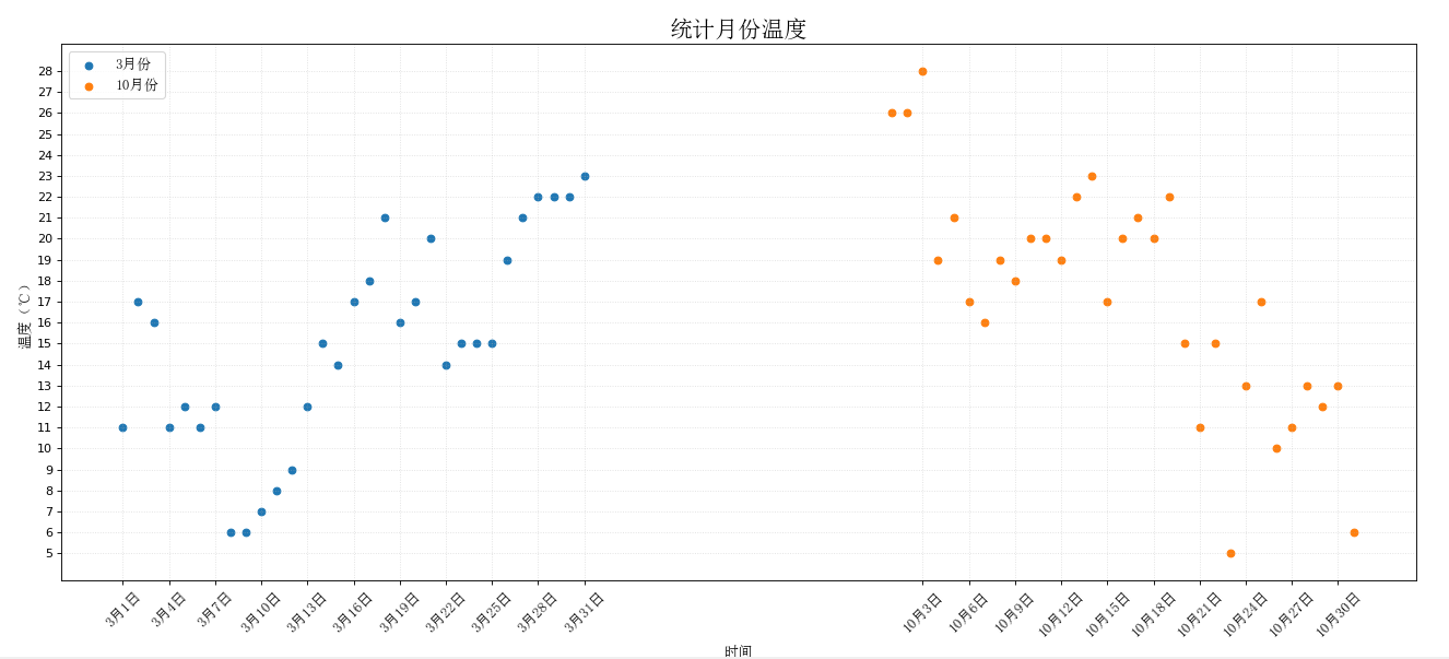
4. 散点图
from matplotlib import pyplot as plt, font_manager

y_3 = [11,17,16,11,12,11,12,6,6,7,8,9,12,15,14,17,18,21,16,17,20,14,15,15,15,19,21,22,22,22,23]
y_10 = [26,26,28,19,21,17,16,19,18,20,20,19,22,23,17,20,21,20,22,15,11,15,5,13,17,10,11,13,12,13,6]

x_3 = range(1, 32)
x_10 = range(51, 82)

plt.figure(figsize=(20, 8), dpi=80)

#设置字体(这样可以显示中文字体)
my_font = font_manager.FontProperties(fname='C:\Windows\Fonts\simsun.ttc', size=12)

#画散点图
plt.scatter(x_3, y_3, label = '3月份')
plt.scatter(x_10, y_10, label = '10月份')

_x = list(x_3) + list(x_10)
_xtick_labels = ['3月{}日'.format(i) for i in x_3]
_xtick_labels += ['10月{}日'.format(i - 50) for i in x_10]

plt.xticks(_x[::3], _xtick_labels[::3], fontproperties = my_font, rotation = 45)
plt.yticks(range(min(y_3 + y_10), max(y_3 + y_10) + 1))

#添加图例
plt.legend(prop = my_font, loc = 2)

#设置描述信息
plt.xlabel('时间', fontproperties = my_font)
plt.ylabel('温度(℃)', fontproperties = my_font)
plt.title('统计月份温度', fontproperties = my_font, size = 19)


plt.grid(alpha = 0.4, linestyle = ':')

plt.show()
5. 柱状图
from matplotlib import pyplot as plt, font_manager

a = ["战狼2", "速度与激情8", "功夫瑜伽", "西游伏妖篇", "变形金刚5:最后的骑士", "摔跤吧!爸爸", "加勒比海盗5:死无对证", "金刚:骷髅岛", "极限特工:终极回归", "生化危机6:终章",
     "乘风破浪", "神偷奶爸3", "智取威虎山", "大闹天竺", "金刚狼3:殊死一战", "蜘蛛侠:英雄归来", "悟空传", "银河护卫队2", "情圣", "新木乃伊", ]

b = [56.01, 26.94, 17.53, 16.49, 15.45, 12.96, 11.8, 11.61, 11.28, 11.12, 10.49, 10.3, 8.75, 7.55, 7.32, 6.99, 6.88,
     6.86, 6.58, 6.23]

#设置字体(这样可以显示中文字体)
my_font = font_manager.FontProperties(fname='C:\Windows\Fonts\simsun.ttc', size=12)

plt.figure(figsize=(20, 8), dpi=80)

plt.yticks(range(len(a)), a, fontproperties = my_font)
plt.xticks(list(range(int(min(b)), int(max(b)) + 1))[::2])

plt.ylabel('电影', fontproperties = my_font)
plt.xlabel('票房(亿元)', fontproperties = my_font)
plt.title('2017电影票房统计', fontproperties = my_font, size = 19)

#width是条形图宽度
#bar是竖着的(width属性),barh是横着的(height属性)
plt.barh(range(len(a)), b, height = 0.3, color = 'orange')

plt.grid(alpha = 0.3, linestyle = ':')

plt.show()

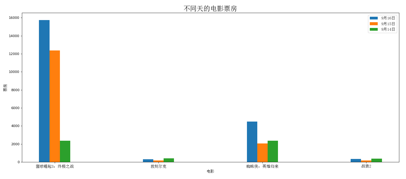
6. 直方图
from matplotlib import pyplot as plt, font_manager

#设置字体(这样可以显示中文字体)
my_font = font_manager.FontProperties(fname='C:\Windows\Fonts\simsun.ttc', size=12)

a = ["猩球崛起3:终极之战","敦刻尔克","蜘蛛侠:英雄归来","战狼2"]
b_16 = [15746,312,4497,319]
b_15 = [12357,156,2045,168]
b_14 = [2358,399,2358,362]

plt.figure(figsize=(20, 8), dpi=80)

_x = list(range(len(a)))
_bar_width = 0.1

plt.xticks([i + _bar_width for i in _x], a, fontproperties = my_font)

plt.xlabel('电影', fontproperties = my_font)
plt.ylabel('票房', fontproperties = my_font)
plt.title('不同天的电影票房', fontproperties = my_font, size = 20)

plt.bar(_x, b_16, width = _bar_width, label = '9月16日')
plt.bar([i + _bar_width for i in _x], b_15, width = _bar_width, label = '9月15日')
plt.bar([i + _bar_width * 2 for i in _x], b_14, width = _bar_width, label = '9月14日')

plt.legend(prop = my_font, loc = 0)

plt.show()
要想进一步学习,参考:
https://matplotlib.org/gallery/index.html
或者选用:


 1513
1513


 被折叠的 条评论
为什么被折叠?
被折叠的 条评论
为什么被折叠?
 到【灌水乐园】发言


