


flex基本用法是给父容器设置: display: flex;
参考:http://www.ruanyifeng.com/blog/2015/07/flex-grammar.html
那么它下面的所有子元素,自动成为flex的item项。
父容器可以设置很多属性:
1. flex-direction: row/row-reverse/column/column-reverse;
如果不设置该属性,系统默认flex-direction: row;
2. flex-wrap: nowarp(不换行)/wrap(换行)/wrap-reverse
如果不设置该属性,默认flex-wrap: nowrap;
在flex-direction: row的情况下,所有的Item会在一行排开。
3. flex-flow: row/row-reverse/column/column-reverse nowarp(不换行)/wrap(换行)/wrap-reverse;
这个属性是上面?两个属性的合体简写。
实际情况中可能碰到的应用如下:
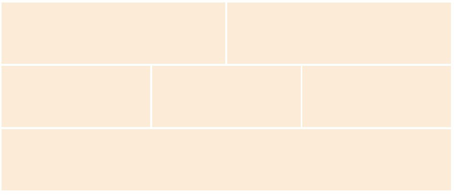
<!DOCTYPE html>
<html lang="en">
<head>
    <meta charset="UTF-8">
    <meta name="viewport" content="width=device-width, initial-scale=1.0">
    <meta http-equiv="X-UA-Compatible" content="ie=edge">
    <title>Document</title>
    <style>
        .parent {
            width: 100%;
            height: 500px;
            display: flex;
            flex-flow: row wrap;
        }

        .item {
            background-color: antiquewhite;
            margin-right: 5px;
            margin-bottom: 5px;
        }
        .item1 {
            flex-basis: calc(50% - 5px);
        }
        .item2 {
            flex-basis: calc(33% - 5px);
        }
        .item3 {
            flex-basis: 100%;
        }
    </style>
</head>
<body>
        <div class="parent">
            <div class="item item1"></div>
            <div class="item item1"></div>
            <div class="item item2"></div>
            <div class="item item2"></div>
            <div class="item item2"></div>
            <div class="item item3"></div>
        </div>
</body>
</html>
展示效果如图:(可以实现表单排列,列表排列等)
父容器中的子项目的属性如下:
1.flex-shrink
<div id="content">
  <div class="box" style="background-color:red;">A</div>
  <div class="box" style="background-color:lightblue;">B</div>
  <div class="box" style="background-color:yellow;">C</div>
  <div class="box1" style="background-color:brown;">D</div>
  <div class="box1" style="background-color:lightgreen;">E</div>
</div>
#content {
  display: flex;
  width: 500px;
}
#content div {
  flex-basis: 120px;
}
.box {
  flex-shrink: 1;
}
.box1 {
  flex-shrink: 2;
}
分析: 最外层容器500;每个子容器120;则子容器总长600;box收缩比例为1,box1的收缩比例为2;则所有子元素的总收缩比为7;
则,box的收缩长度为原厂的1/7;剩余长度为原来的6/7;即120*(6/7);box1为(120*(5/7))
参考:https://codepen.io/pen/?editors=1100
2.flex
1)flex: auto;---->flex: 1 1 auto;
相当于:flex-grow:1;flex-shrink:1;flex-basis:auto
2)flex: none --->flex: 0 0 auto;
3)flex: initial --->flex: 0 1 auto;
4)flex: 正数(无单位) -->flex: <positive-number> 1 0;
5)flex: 正数(有单位) --> flex: 1 1 有单位正数;
6)flex: 正数 无单位正数 --> flex:正数 无单位正数 0;
7)flex: 正数 有单位正数 --> flex: 正数 1 有单位正数;
实际应用:
1)如果想要一个容器中的所有子元素宽度均分。
可以在子元素使用flex: 1;
2)如果一个容器中有N个子元素,想要每行有M个元素均分,可以对子元素使用: flex: 0 0 1/M;
<!DOCTYPE html>
<html lang="en">
<head>
    <meta charset="UTF-8">
    <meta name="viewport" content="width=device-width, initial-scale=1.0">
    <meta http-equiv="X-UA-Compatible" content="ie=edge">
    <title>Document</title>
    <style>
        .parent {
            width: 100%;
            height: 500px;
            display: flex;
        }
        .item {
            flex: 1;
            background-color: antiquewhite;
        }
        .item:not(:last-child) {
            margin-right: 20px;
        }
    </style>
</head>
<body>
        <div class="parent">
            <div class="item"></div>
            <div class="item"></div>
            <div class="item"></div>
        </div>
</body>
</html>


 84
84


 被折叠的 条评论
为什么被折叠?
被折叠的 条评论
为什么被折叠?
 到【灌水乐园】发言


