


一、单列布局
1. 水平居中
1.1 使用inline-block和text-align
  .parent{text-align:center;}
  .child{display:inline-block;}
1.2 使用margin:0 auto实现
.child{width:200px;margin:0 auto;}
1.3 使用绝对定位实现
  .parent{position:relative;}
  .child{position:absolute;left:50%;margin-left:-100px;width:200px;}  /*margin-left的负值为盒子宽度的一半*/
1.4 使用flex布局实现
.parent{display:flex;justify-content:center;}
2. 垂直居中
2.1 使用vertical-align
  .parent{line-height:100px}
  .child{display:inline-block;vertical-align:middle;}
2.2 使用绝对定位实现
  .parent{position:relative;}
  .child{position:absolute;top:50%;margin-top:-100px;height:200px;}  /*margin-top的负值为盒子高度的一半*/
2.3 使用flex实现
.parent{display:flex;align-items:center;}
3. 水平垂直居中
3.1 使用inline-block,text-align和vertical-align
  .parent{line-height:100px;text-align:center;}
  .child{display:inline-block;vertical-align:middle}
3.2 使用绝对定位实现
  .parent{position:relative;}
  .child{position:absolute;top:50%;left:50%;margin-top:-100px;margin-left:-100px;width:200px;height:200px;}  /*margin-top的负值为盒子高度的一半,margin-left的负值为盒子宽度的一半*/
3.3 使用flex实现
.parent{display:flex;justify-content:center;align-items:center;}
二、多列布局
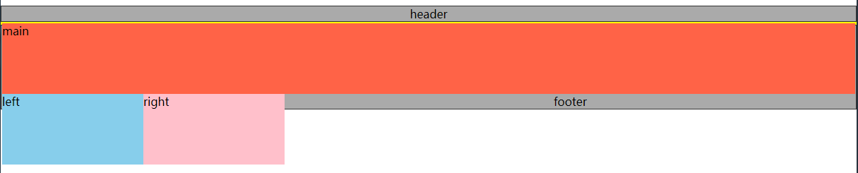
1. 圣杯布局:三列布局,左右定宽,中间宽度自适应;中间栏要在浏览器中优先展示渲染;允许任意列的高度最高。
HTML:
 <div class="header">header</div>
 <div class="container">
    <div class="main">main</div>    <!--中间栏优先展示渲染,放在前面-->
    <div class="left">left</div>
    <div class="right">right</div>
 </div>
 <div class="footer">footer</div>
(1) 基础样式
*{margin:0;padding:0}
body{min-width:800px;}
.header,.footer{
   border: 1px solid #333;
   background: #aaa;
   text-align: center;
}
.container{
   border:2px solid yellow;
}
.left{
   width:200px;
   background:skyblue;
 }
 .right{
   width:200px;
   background:pink;
 }
 .main{
   width:100%;
   background:tomato;
 }
.main,.left,.right{
   min-height:100px;
 }

(2) 三列均设置左浮动
.left,.main,.right{
    float:left;
}
(3) 清除浮动
.container{
   zoom:1;
}
.container:after{
   content:"";
   display:block;
   clear:both;
}
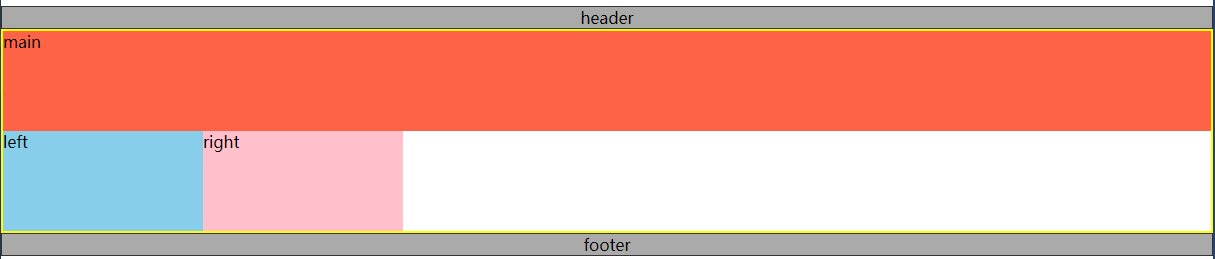
(4) 让left和right上移
.left{
     margin-left:-100%;   /*利用margin-left的负值,将left列移动到上一行的开头*/
     width:200px;
     background:skyblue;
}
.right{
     margin-left:-200px;  /*利用margin-left的负值,将right列移动到上一行的末尾*/
     width:200px;
     background:pink;
}

left列和right列已经上移,但是可以看见,此时main已被遮盖。
(5) 解决遮盖问题
给.containter左右内边距,大小分别为left列的宽和right列的宽。
.container{
   padding:0px 200px;
   border:2px solid yellow;
   zoom:1;
}
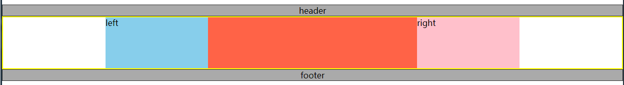
然后利用相对定位,将left列和right列定位到两侧空白处。
.left{
    position:relative;
    left:-200px;
    margin-left:-100%;
    width:200px;
    background:skyblue;
}
.right{
    position:relative;
    right:-200px;
    margin-left:-200px;
    width:200px;
    background:pink;
}

遮挡问题已解决,main可见啦。
至此,圣杯布局已完成,中间列宽度自适应。
2. 双飞翼布局:三列布局,左右定宽,中间宽度自适应;中间栏要在浏览器中优先展示渲染;允许任意列的高度最高。
双飞翼布局和圣杯布局基本一样,不同之处在于解决遮盖问题的方式不同。
双飞翼布局在main元素中添加了一个子元素content,并给这个子元素设置margin-left和margin-right,以至于content里的内容不被遮盖。
HTML:
<div class="header">header</div>
<div class="container">
   <div class="main">
      <div class="content">content</div>
   </div>
   <div class="left">left</div>
   <div class="right">right</div>
</div>
<div class="footer">footer</div>
CSS:
.content{margin:0 200px}
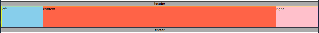
双飞翼布局也完成了,个人感觉比圣杯布局更简洁;完整代码就不上了,很简单的,不熟悉的可以动手试试哦。


 694
694


 被折叠的 条评论
为什么被折叠?
被折叠的 条评论
为什么被折叠?
 到【灌水乐园】发言


