


这几天做一个忘记密码的功能,vue的项目,因为涉及到弹框组件,所以用vue封装了一个弹框组件,在需要的地方去引入,下面是组件的代码:
<!--
isShow type : object
key : 父组件中控制弹框显示和隐藏的属性名
value : 父组件中控制弹框显示和隐藏的属性值
title  type : string 弹框的title
titleImgSrc type : string url 弹框顶部的图片
width type : number||string 弹框的宽度 支持百分比
closeClickModel : boolean 点击遮罩层是否关闭弹框 默认true 关闭
showCloseBtn : boolean 是否显示关闭弹框按钮,默认不显示
-->
<template>
    <div v-show="isShow.value" class="vkd-dialog-box" @click.self="clickModelClose" >
        <div class="dialog" :style="style">
            <div @click="closeDialog" class="close-btn" v-if="showCloseBtn"></div>
            <div class="dialog-img" v-show="titleImgSrc">
                <img :src="titleImgSrc" alt="title image">
            </div>
            <div class="dialog-content">
                <h4 class="dialog-title">{{title}}</h4>
                <div class="dialog-body">
                    <slot></slot>
                </div>
                <div class="dialog-footer">
                    <slot name='footer'></slot>
                </div>
            </div>
        </div>
    </div>
</template>
<script>
  export default {
    name:'vkd-Dialog',
    props:{
      'isShow':{
        type:Object,
        default:()=>{
          return{
            key:'key',
            value:false
          }
        }
      },
      'title':{
        type:String,
        default:''
      },
      'titleImgSrc':{
        type:String
      },
      'width':{
        type:[Number,String],
        default:300
      },
      'closeClickModel':{
        type:Boolean,
        default:true
      },
      'showCloseBtn':{
        type:Boolean,
        default:false
      }
    },
    methods:{
      clickModelClose(){
        this.closeClickModel&&(this.$parent[this.isShow.key]=!this.$parent[this.isShow.key]);
      },
      closeDialog(){
        this.$parent[this.isShow.key]=!this.$parent[this.isShow.key];
      }
    },
    computed:{
      style(){
        return {
          width:/^-?\d+%$/.test(this.width)?this.width:this.width+'px'
        }
      }
    }
  }
</script>
<style lang="scss" scoped>
    .vkd-dialog-box{
        position: absolute;
        z-index: 10000;
        width:100%;
        height:100%;
        top:0;
        left:0;
        background:rgba(0,0,0,0.5);
        .dialog{
            position: fixed;
            top: 50%;
            left: 50%;
            transform: translate(-50%, -50%);
            background: #fff;
            width:300px;
            .close-btn{
                width:24px;
                height:24px;
                background: url('../assets/closeBtn.png') no-repeat;
                position: absolute;
                right:15px;
                top:15px;
                cursor: pointer;
            }
            .dialog-img{
                img{
                    width: 100%;
                }
            }
            .dialog-content{
                padding:12px 30px 30px 30px;
                text-align: left;
                .dialog-title{
                    margin:0;
                    line-height: 26px;
                    font-size: 24px;
                }
                .dialog-body{
                    padding-top:12px;
                    font-size: 14px;
                    color: #767676;
                    line-height:18px;
                }
                /*.email-icon{*/
                /*display: inline-block;*/
                /*margin-right:10px;*/
                /*width:15px;*/
                /*height:10px;*/
                /*background: url("../../assets/img/login/email.png") no-repeat 0 0;*/
                /*background-size: 100% 100%;*/
                /*}*/
                /*.email{*/
                /*color:#03a9f4*/
                /*}*/
                /*.text{*/
                /*padding-top:12px;*/
                /*line-height:18px;*/
                /*color: #767676;*/
                /*}*/
                .dialog-footer{
                    margin-top:30px;
                    overflow: hidden;
                    text-align: right;
                    button{
                        text-align: center;
                        width: 65px;
                        height: 20px;
                        border-radius: 3px;
                        background-color: #fdb62b;
                        color:#fff;
                        border: none;
                        margin-left:10px;
                        font-size:14px;
                        cursor: pointer;
                    }
                    span{
                        color: #767676;
                        font-size:14px;
                    }
                }
            }
        }
    }
</style>
在需要的组件中引入弹框组件,然后需要修改一些个性化的样式,比如title的字体颜色,发现无论怎样增加权限都没办法覆盖子组件中的样式,后来发现了问题,因为子组件和父组件的style中都使用了scope属性,浏览器渲染后,给每个组件中的元素增加了自定义属性,如图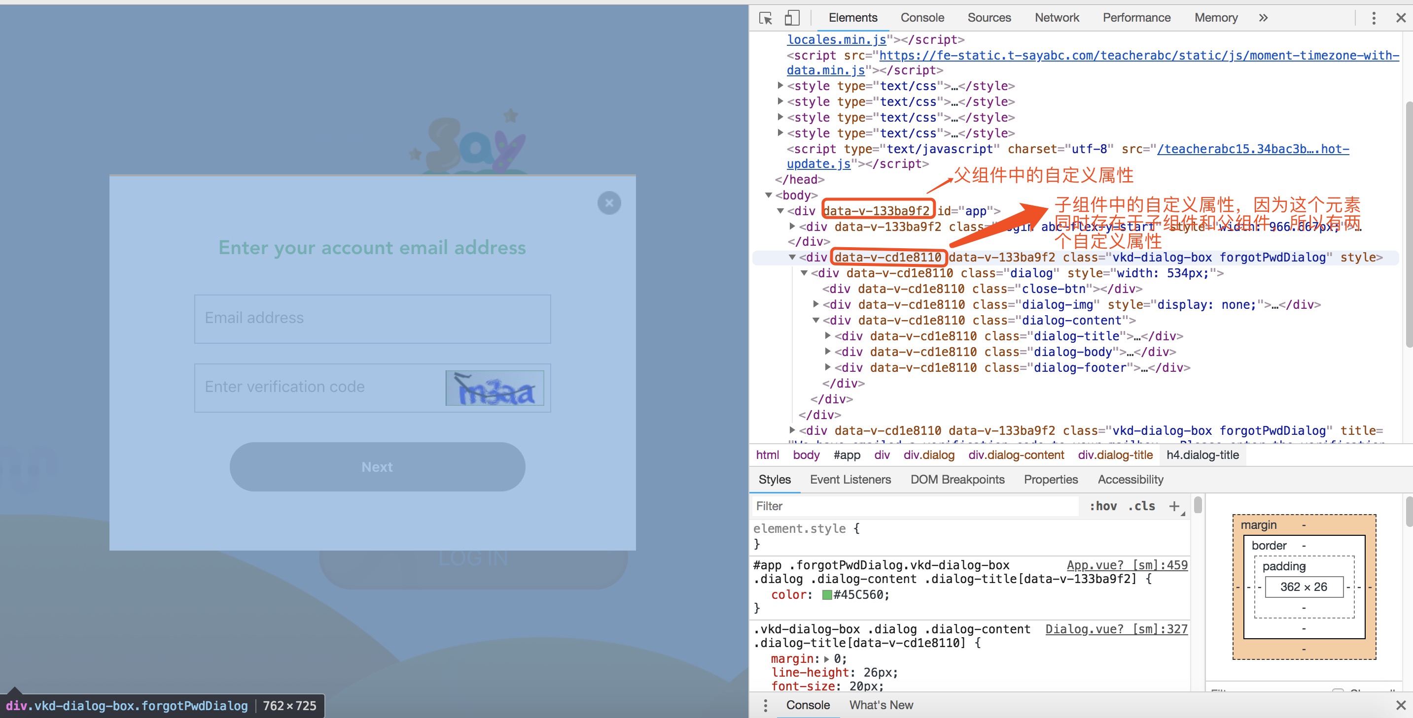
而浏览器渲染样式的时是这样的
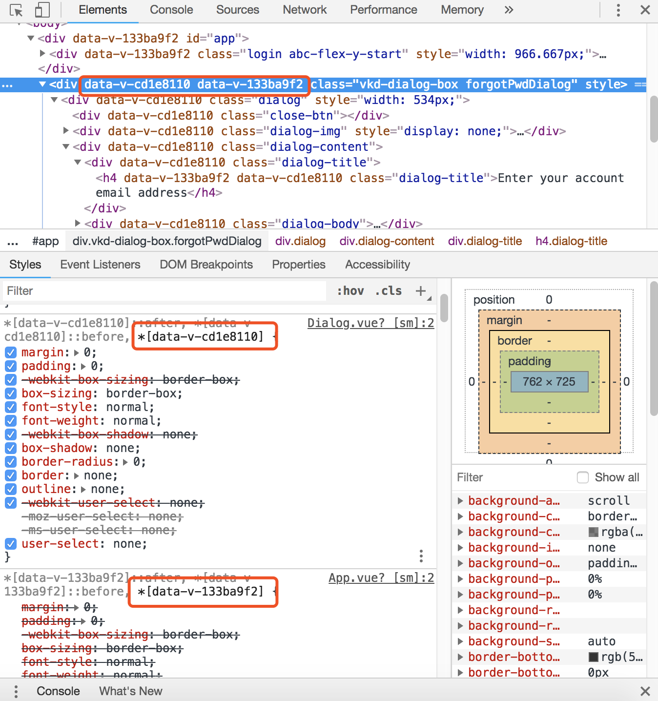
这也是scoped的工作原理,所以在子组件中写的元素,只有子组件中的自定义属性,而父组件中加的样式,最终浏览器渲染时是找不到对应的元素的,(因为父组件中样式给出的自定义属性是不一致的),所以子组件中.dialog-title的样式没办法在父组件中修改,而.dialog-footer中的button的样式是可以修改的,因为button是写在父组件中,以slot的方式插入在子组件中的,而dialog-title是通过设置props属性传递给子组件的。明白了原因后,对子组件做出了修改

如此,弹框中的header,body,footer都可以愉快地个性化样式了,但是弹框整体的风格还是需要公共组件控制的,这也是公共组件的用处吧。
另外查了下原生的scope属性,已经不支持了,所以现在只能在这些.vue的模版文件中使用,等等
完了,有点啰嗦。


 619
619


 被折叠的 条评论
为什么被折叠?
被折叠的 条评论
为什么被折叠?
 到【灌水乐园】发言


