


HTML Layouts
Advanced website layouts can be achieved using a combination of HTML and CSS. Here's an overview.
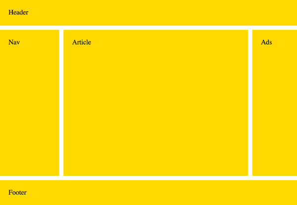
Most modern websites and blogs consist of a header, footer, navbar, perhaps another sidebar, and let's not forget, the main content area. Something like this:
Example of the most common sections of a website layout.
HTML has a number of elements that can be used to define each of these areas. These include the main, header, footer,
nav, aside and article elements. Also, the div element is a generic block level element that can be used for grouping HTML elements.
So the above layout could be marked up as follows:
Header
Article
Nav
Footer
But those elements merely provide the document's structure. They don't deal with presentation. So we'll end up with this:
Run
Stack editor
Unstack editor
My ExampleHeader
Article
Nav
Footer
As mentioned earlier in this tutorial, CSS is what we need for defining the presentation of our HTML documents.
CSS Grid Layout
CSS grid layout was purpose built for website layouts. It works on a two-dimensional grid system, where you specify which elements go to which parts of the grid.
So we could take the above HTML code, then use CSS grid to position each element:
Run
Stack editor
Unstack editor
My Examplebody {
display: grid;
grid-template-areas:
"header header header"
"nav article ads"
"footer footer footer";
grid-template-rows: 60px 1fr 60px;
grid-template-columns: 20% 1fr 15%;
grid-gap: 10px;
height: 100vh;
margin: 0;
}
#pageHeader {
grid-area: header;
}
#pageFooter {
grid-area: footer;
}
#mainArticle {
grid-area: article;
}
#mainNav {
grid-area: nav;
}
#siteAds {
grid-area: ads;
}
header, footer, article, nav, div {
padding: 20px;
background: gold;
}
Header
Article
Nav
Footer
If your browser supports grid layout, that example should look like the example at the top of this page. Here it is again:
In this example, we use the grid-template-areas property with a kind of "ASCII art" syntax to specify where each element goes. That's the bit that looks like this:
grid-template-areas:
"header header header"
"nav article ads"
"footer footer footer";
Then we tie each element to each of those grid areas using the grid-area property.
#pageHeader {
grid-area: header;
}
#pageFooter {
grid-area: footer;
}
#mainArticle {
grid-area: article;
}
#mainNav {
grid-area: nav;
}
#siteAds {
grid-area: ads;
}
The rest of the code deals with sizing, gutters, general aesthetics, etc.
In this case we did actually change the markup slightly by adding IDs to the elements. We didn't need to do this, but it's good practice. By doing this, we ensure that the grid areas will be occupied only by the elements with the correct ID. If we didn't do this, we could run into major problems if we ever add another element of the same name (for example, another header element) to the page.
Responsive Layouts
Responsive layouts adjust according to the screen size being used to view the website. This means that your website will probably look different on a mobile phone vs a tablet vs a desktop computer. The website adjusts itself to provide the best layout for the screen size.
We can modify the above example so that it uses a different layout on small devices such as mobile phones.
To do this, we add a media query to test for the size of the screen. If it's smaller than a certain width, we show them the new layout.
Run
Stack editor
Unstack editor
My Examplebody {
display: grid;
grid-template-areas:
"header header header"
"nav article ads"
"footer footer footer";
grid-template-rows: 60px 1fr 60px;
grid-template-columns: 20% 1fr 15%;
grid-gap: 10px;
height: 100vh;
margin: 0;
}
/* Stack the layout on small devices/viewports. */
@media all and (max-width: 575px) {
body {
grid-template-areas:
"header"
"article"
"ads"
"nav"
"footer";
grid-template-rows: 80px 1fr 70px 1fr 70px;
grid-template-columns: 1fr;
}
}
#pageHeader {
grid-area: header;
}
#pageFooter {
grid-area: footer;
}
#mainArticle {
grid-area: article;
}
#mainNav {
grid-area: nav;
}
#siteAds {
grid-area: ads;
}
header, footer, article, nav, div {
padding: 20px;
background: gold;
}
Header
Article
Nav
Footer
The above example will have all the elements stacked upon each other (unless you're viewing this example on a very wide screen). Stacking the elements like this is ideal for small devices such as mobile phones. Click the Preview button to view it in a new window (which should display the original layout — unless you're already viewing this on a small device).
Here's the media query we used for that example:
@media all and (max-width: 575px) {
body {
grid-template-areas:
"header"
"article"
"ads"
"nav"
"footer";
grid-template-rows: 80px 1fr 70px 1fr 70px;
grid-template-columns: 1fr;
}
}
We simply change the ASCII art to reflect our new layout, which in this case, is simply stacking each element on top of each other (but in the order we specify). We also change the values of the rows and columns as required.
Check out the grid tutorial if you're interested in learning more about working with the grid.
Non-Grid Browsers
Grid layout is still very new, and as such, browser support is limited. The good news is that most major browsers started supporting grid from March 2017, so the wheels are definitely in motion. But there are still a lot of web users using non-grid browsers.
So until grid has widespread browser support, in order to support non-grid browsers, you will need to use other methods for your website layouts, such as CSS floats (with the float property) and/or flexbox (with flex and related properties).
If this feels a bit overwhelming, don't despair! You can download any of these HTML templates for your own use. You can open up the files and see how each one is built. And you can modify them as you wish.
The Evolution of Website Layouts
Web technologies have changed since the early days of the web. HTML tables were once the only way to create advanced two or three column layouts, where the whole website was nested inside a big table. But tables weren't designed for layout purposes — they were designed to hold tabular data. And HTML wasn't designed for presentation — it was designed for mark up the document's structure.
CSS was designed for presentation. So once browsers finally had (reasonably) consistent support for CSS, CSS floats became the norm, where the CSS float property would be applied to block elements that needed to sit next to each other. This enabled developers to continue with their three-column layouts while keeping the presentation separate to the content.
But floats weren't really designed for two-dimensional layouts, and it was often challenging to get all page elements to line up properly, with everything at the correct height, and nothing being inadvertently pushed down to the next line, etc.
The introduction of flexbox eased a lot of pain, as it provided a better way to line up elements side by side, without many of the problems inherent in floats. However, flexbox is a one-dimensional system. It's perfect for lining up elements beside each other, or piled up on top of each other, but not both.
This is where CSS grid layout comes in. Grid layout was designed specifically for creating two-dimensional layouts. Using grid, the website's entire layout is build using a two-dimensional grid system. Every element can be precisely positioned, and it can shrink or stretch as required. And best of all, grid is extremely easy to use.


 7363
7363


 被折叠的 条评论
为什么被折叠?
被折叠的 条评论
为什么被折叠?
 到【灌水乐园】发言


