


transform 和 translate
transform的中文翻译是变换、变形,是css3的一个属性,和其他width,height属性一样
translate 是transform的属性值,是指元素进行2D变换,2D变换就是指,元素以当前位置(0,0)按照x轴的方向移动多少,按照y轴的方向移动多少
例如:
transform:translate(0,100%) 表示从元素的当前位置延y轴方向,向下移动整个元素高度的距离
transform:translate(-20px,0) 表示从元素的当前位置延x轴方向,向左移动20px
transform 有很多其它属性值,translate3D(3D变换),scale(2D缩放)等其他的变换方式
transition
transition 在一定时间之内,一组css属性变换到另一组属性的动画展示过程。可以用来实现动态效果,css3的属性
语法 transition:需要变换的属性 变换需要的时间 控制动画速度变化 延期多少时间后开始执行
transition属性写在最初的样式里,而不是放在结束的样式里,即定义动画开始之前的元素外观的样式。只需要给元素设置一次transition,浏览器就会负责以动画展示从一个样式到另一个样式。
例如:
transition:width 2s;
transition:translate 2s;
transtion:all 2s;
实例1:

<html>
    <head>
        <title></title>
        <style>
            .bg{
              background:red;
              width:200px;
              height:300px;
              position:relative;
              overflow:hidden;
            }

            .top{
              color:white;
              text-align:center;
              padding:10px;
            }

            #bottomDiv{
              background:yellow;
              width:100%;
              position:absolute;
              bottom:0;top:50px;
              transition:transform .3s;
            }

        </style>
        <script>
        function clickM(){
            window.flag = !window.flag;
            if(window.flag){
                document.getElementById('bottomDiv').style.cssText='transform:translate(0,100%)';
            }else{
                document.getElementById('bottomDiv').style.cssText='';
            }

        }
        </script>
    </head>
    <body>
        <div class="bg">
            <div class="top" οnclick="clickM()">click me</div>
            <div id="bottomDiv"></div>
        </div>

    </body>
</html>
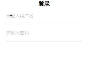
实例2:
<html>
    <head>
        <title></title>
        <style>
            h3{
                margin:0;
                text-align:center;
            }
            .box{
                width:250px;
                margin: auto;
            }
            .item{
                border-style: solid;
                border-color: #d4d4d9;
                -o-border-image: url(data:image/png;base64,iVBORw0KGgoAAAANSUhEUgAAAAUAAAAFAQMAAAC3obSmAAAABlBMV…k1vE5IAAAAAXRSTlMAQObYZgAAAA5JREFUCNdj+MHQAYY/ABGyA4nEIg1TAAAAAElFTkSuQmCC) 2 stretch;
                border-image: url(data:image/png;base64,iVBORw0KGgoAAAANSUhEUgAAAAUAAAAFAQMAAAC3obSmAAAABlBMV…k1vE5IAAAAAXRSTlMAQObYZgAAAA5JREFUCNdj+MHQAYY/ABGyA4nEIg1TAAAAAElFTkSuQmCC) 2 stretch;
                border-width: 0 0 1px;
                display: flex;
                align-items: center;
                position: relative;
            }
            .item input{
                    width: 100%;
                    height: 55px;
                    padding: 18px 0 0;
                    font-size: 15px;
                    box-sizing: border-box;
                    display: block;
                    position: relative;
                    z-index: 2;
                    background-color: transparent; //如果一个元素覆盖在另外一个元素之上,而你想显示下面的元素,这时你就需要把上面这个元素的background设置为transparent
                    border: 0;
                    outline:0;
            }
            .item .placeholder{
                width: 100%;
                color: #ccc;
                font-size: 15px;
                position: absolute;
                left: 0;
                top: 50%;
                transform: translateY(-50%) scale(1);
                transition: transform .2s linear;
                transform-origin: left;
            }

        </style>
        <script>
            function xx(e){
                e.nextElementSibling.style.cssText='transform:translateY(-110%) scale(.75);';
            }
            function yy(e){
                e.nextElementSibling.style.cssText='';
            }
        </script>
    </head>
    <body>
        <div class="box">
            <h3>登录</h3>
            <div class="item">
                <input type="text" οnfοcus="xx(this)" οnblur="yy(this)"/>
                <span class="placeholder">请输入用户名</span>
            </div>
            <div class="item">
                <input type="text" οnfοcus="xx(this)" οnblur="yy(this)"/>
                <span class="placeholder">请输入密码</span>
            </div>
        </div>

    </body>
</html>


 853
853


 被折叠的 条评论
为什么被折叠?
被折叠的 条评论
为什么被折叠?
 到【灌水乐园】发言


