


 本文详细介绍了如何使用CSS的定位属性(如position、top、left)来创建响应式和动态布局,通过实例展示了如何调整元素的位置以适应不同屏幕尺寸,确保网页设计的灵活性和用户体验。
效果:
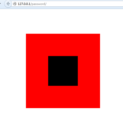
实现代码1:
<!DOCTYPE html>
<html lang="en">
<head>
    <meta charset="UTF-8">
    <title>Document</title>
    <style type="text/css">
        body{margin: 0; padding: 0;}
        #div1{
            margin-top: 100px;
            margin-left: 150px;
            width: 300px;
            height: 300px;
            background-color: red;
            position: relative;
        }
        #div2{
            width: 120px;
            height: 120px;
            background-color: black;
            position: absolute;
            /*(300-120)/2/300*/
            top: 30%;
            left: 30%;
        }
    </style>
</head>
<body>
    <div id="div1" class="classname">
        <div id="div2" class="classname">
        </div>
    </div>
</body>
</html>
实现代码2:
<!DOCTYPE html>
<html lang="en">
<head>
    <meta charset="UTF-8">
    <title>Document</title>
    <style type="text/css">
        body{margin: 0; padding: 0;}
        #div1{
            margin-top: 100px;
            margin-left: 150px;
            width: 300px;
            height: 300px;
            background-color: red;
        }
        #div2{
            width: 120px;
            height: 120px;
            background-color: black;
            /*(300-120)/2/300=30%*/
            position: relative;
            top: 30%;
            left: 30%;
        }
    </style>
</head>
<body>
    <div id="div1" class="classname">
        <div id="div2" class="classname">
        </div>
    </div>
</body>
</html>
实现代码3:


 扫一扫
扫一扫


 1999
1999

 被折叠的 条评论
为什么被折叠?
被折叠的 条评论
为什么被折叠?
 到【灌水乐园】发言


