


首先了,先把我上篇文章的demo准备好,不过我上次写的被我删除了,这次就重新写了一个,上代码
import QtQuick 2.5
import QtQuick.Controls 1.4
import QtQuick.Controls.Styles 1.4
ApplicationWindow {
    visible: true
    width: 1366
    height: 768
    title: qsTr("DLSlider")
    Slider
    {
        width: 600
        height: 20
        x: (parent.width - width)/2
        y: (parent.height - height)/2
        value: 0.1
        stepSize: 0.01
        onValueChanged:
        {
            console.log(value)
        }

        style: SliderStyle
        {
            handle: Rectangle

            {
                anchors.centerIn: parent;
                color:control.pressed ? "white":"lightgray";
                border.color: "gray";
                border.width: 2;
                width: 34;
                height: 34;
                radius: 12;
                Text{

                    anchors.centerIn: parent;
                    text: control.value;
                    color: "red";
                }

            }
            groove:Rectangle
            {
                implicitHeight:8
                color:"gray"
                radius:8
            }
        }

    }


}
详细解释大家可以看上一篇博客
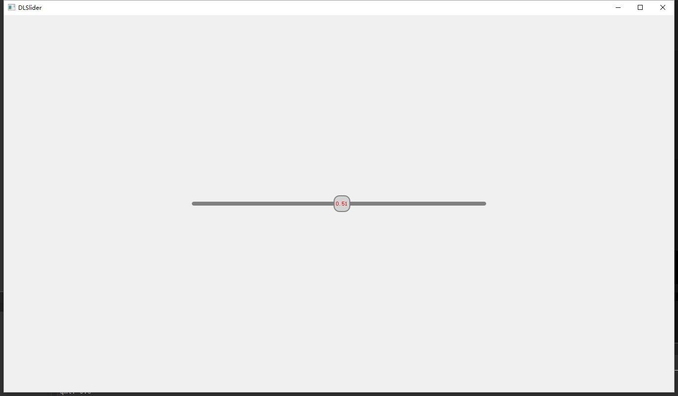
这是目前的样式,和上一篇中基本一样,但是不是我要的样式
这里将说下升级版

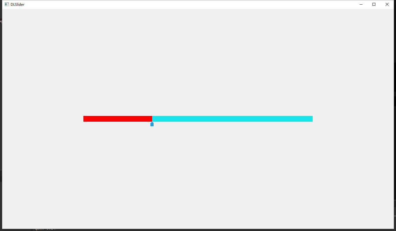
这样的效果是我想要的效果,上面是进度条,下面是可以拖动的指针,不过呢,能力有限,没有通过编写style实现成功,我用了一个投机取巧的办法来实现。
下面先上我最后的效果截图
上源代码
import QtQuick 2.5
import QtQuick.Controls 1.4
import QtQuick.Controls.Styles 1.4
ApplicationWindow {
    visible: true
    width: 1366
    height: 768
    title: qsTr("DLSlider")

    Rectangle
    {
        id:line_parent
        width: 800
        height: 20
        x: (parent.width - width)/2
        y: (parent.height - height)/2
        color: "#1ae5ec"
        Rectangle
        {
            id:line_child
            height: line_parent.height
            anchors.top:parent.top
            anchors.left: parent.left
            width: parent.width*m_Slider.value
            color: "red"

        }
    }

    Slider
    {
        id:m_Slider
        anchors.top: line_parent.top
        anchors.left: line_parent.left
        anchors.leftMargin: -5.5
        height: line_parent.height*2
        width: line_parent.width+11
        value: 0.1
        stepSize: 0.01
        onValueChanged:
        {
            console.log(value)
        }

        style: SliderStyle
        {
            handle: Rectangle
            {
                anchors.horizontalCenter:parent.horizontalCenter
                anchors.bottom:parent.bottom
                width:11
                height:16
                color:"transparent"
                Image {
                    width: 11
                    height: 16
                    anchors.horizontalCenter: parent.horizontalCenter
                    anchors.bottom: parent.bottom
                    anchors.bottomMargin: -8
                    source: "qrc:/Images/ppointer.png"
                }


            }
            groove:Rectangle
            {
                color:"transparent"
            }
        }

    }


}
剩下的需要大家自行对比了,困了,要睡觉了


 8042
8042


 被折叠的 条评论
为什么被折叠?
被折叠的 条评论
为什么被折叠?
 到【灌水乐园】发言


