


 本文详细介绍了如何使用CSS3的线性、径向渐变、旋转、缩放及动画效果来创建王者荣耀匹配人员加载页面。通过背景制作、玩家加载动画、背景镂空旋转正方形、文字放大动画和文字按钮的制作,逐步展示了实现这一特效的全过程。
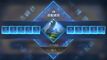
玩过王者的应该都熟悉,这个页面的效果。为什么要实现这个效果了?
第一:王者这么火,电竞这么火。
第二:主要还是来学习 css3 的线性、径向渐变、旋转、缩放以及动画。
图形解析
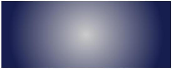
1、背景(径向渐变)
2、玩家(player)加载动画(线性渐变)
3、背景镂空旋转正方形
4、正方形文字放大动画
5、文字按钮制作
下面我们按上述步骤实现
背景制作
background: radial-gradient(center, shape size, start-color, …, last-color);
shape 参数定义了形状。它可以是值 circle 或 ellipse。其中,circle 表示圆形,ellipse 表示椭圆形。默认值是 ellipse
.king{
position: relative;
height: 25rem;
width: 100%;
background:
radial-gradient(circle, #ccc, #161d4f 85%);
}
css3线性、径向渐变、旋转、缩放、动画实现王者荣耀匹配人员加载动画
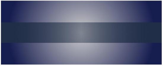
玩家加载
模块整体垂直居中,线性渐变。
background: linear-gradient(direction/angle, color-stop1, color-stop2, …);
direction/angle控制渐变方向/角度。
...
.player-layout{
position: relative;
height: 8rem;
width: 100%;
background:
linear-gradient(to right, #212f46, #212f4670, #212f46);
top: 50%;
transform: translate(0,-50%);
z-index: 10;
}
css3线性、径向渐变、旋转、缩放、动画实现王者荣耀匹配人员加载动画
添加峡谷图片,背景线性渐变,旋转。添加边框,然后用 box-shadow 看起来发光效果。
...
.center{
position: absolute;
height: 8rem;
width: 8rem;
top: 50%;
left: 50%;
transform:
translate(-50%, -50%) rotate(45deg);
background:
linear-gradient(90deg, #212f46, #5b99ff);
border: .3rem sol
 最低0.47元/天 解锁文章


 扫一扫
扫一扫


 被折叠的 条评论
为什么被折叠?
被折叠的 条评论
为什么被折叠?
 到【灌水乐园】发言


