


简介:
BottomNavigationBar 是自定义的一个实现App应用底部导航栏功能的View,可以实现底部 2-5 个导航菜单(一般不会有更多),可以实现某一个菜单凸起的效果,如,有5个菜单,可以选择让第三个菜单凸起(floating),这是很多App都有的功能; 可以根据编写的颜色变化的资源文件来更改图标和文字选中时和未选中时的颜色,可以自由控制是否需要选中(checkable),选择开启时,可变换为选中颜色,选择关闭时,不能更改为选择颜色;可以控制默认选中哪一项;可以设置某一个导航菜单的未读消息数(数字或者小红点)。
先看一组效果图
五个菜单,没有凸起的,都是可选中的

图1
中间有凸起,并且中间的不能选中,但点击事件可以响应
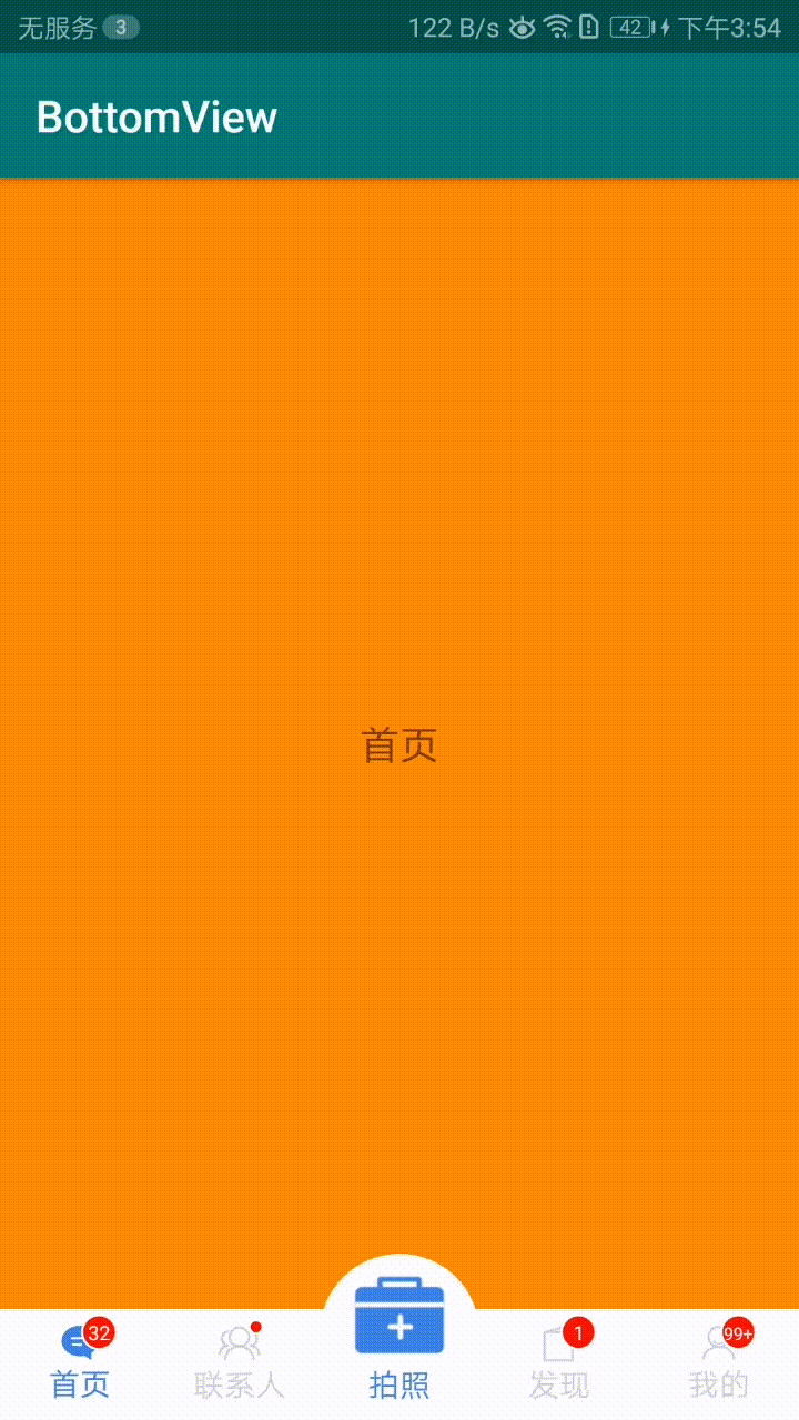
图2
引入方法
TAG:
gradle
在项目中的根目录下的 build.gradle (与model同级的) 中增加如下配置
allprojects {
repositories {
...
maven { url 'https://jitpack.io' }
}
}
在model 中的build.gradle 中增加依赖
dependencies {
implementation 'com.github.onestravel:BottomNavigationBar:TAG'
}
maven
在pom.xml文件中加入下面配置
jitpack.io
https://jitpack.io
添加maven依赖
com.github.onestravel
BottomNavigationBar
TAG
属性说明
BottomNavigationBar 属性说明
属性
参考值
说明
app:itemIconTint
@drawable/tab_selecter
整体的tab菜单的图片选中和未选中的颜色变化,传入一个资源drawable文件
app:itemTextColor
@drawable/tab_selecter
@drawable/tab_selecter@drawable/tab_selecter整体的tab菜单的图片选中和未选中的颜色变化,传入一个资源drawable文件
app:floatingEnable
true/false
是否开启浮动,默认为false,设置为true是,可以实现中间凸起
app:floatingUp
20dp
设置Tab的上浮尺寸,比如:上浮20dp,上浮尺寸不可超过整个菜单高度的1/2
app:menu
@menu/botom_menu
BottomNavigationBar导航栏的关键,设置导航栏的tab菜单
app:itemTextSize
15sp
设置导航栏文字的大小
app:itemIconWidth
30dp
设置导航栏Icon的宽度
app:temIconHeight
30dp
设置导航栏Icon的高度
app:itemTextTopMargin
5dp
置导航栏文字和Icon的间隔高度
示例1:不需要浮动(凸起)的菜单,图1效果
android:id="@+id/BottomLayout"
android:layout_width="match_parent"
android:layout_height="50dp"
android:layout_alignParentBottom="true"
android:background="@android:color/white"
android:paddingTop="5dp"
android:paddingBottom="5dp"
app:menu="@menu/navigation_menu">
示例2:需要浮动(凸起)的菜单,图2效果
android:id="@+id/BottomLayout"
android:layout_width="match_parent"
android:layout_height="50dp"
android:layout_alignParentBottom="true"
android:background="@android:color/white"
android:paddingTop="5dp"
android:paddingBottom="5dp"
app:floatingEnable="true"
app:floatingUp="25dp"
app:menu="@menu/navigation_menu">
menu 菜单属性值说明
属性
参考值
说明
android:id
@+id/tab1
导航菜单 Item 的ID;
android:icon
@drawable/bar_news
导航菜单 Item 的图标,可以是图标选择器(selector),也可以是默认图标,根据BottomNavigationBar的属性 app:itemIconTint 更改选中与不选中的颜色变化,默认为蓝色和灰色;
android:title
首页
导航菜单 Item 的文字,可以默认为空字符串,表示不设置;
android:checkable
true/false
设置导航菜单 Item 是否可以选择,值影响选择与不选中效果,不影响点击事件;
android:checked
true/false
设置导航菜单 Item 是否默认选中,默认为第一个选中,请不要在多个Item上设置改;
app:floating
true/false
设置该导航菜单 Item 是否浮动,与BottomNavigationBar 的app:floatingEnable和 app:floatingUp属性配合使用,默认为false,即不浮动(不凸起);
示例1:不需要浮动(凸起)的菜单,图1效果
xmlns:app="http://schemas.android.com/apk/res-auto">
android:id="@+id/tab1"
android:icon="@drawable/bar_news"
android:title="首页">
android:id="@+id/tab2"
android:icon="@drawable/bar_constact"
android:title="联系人">
android:id="@+id/tab5"
android:icon="@drawable/tab_manage_selected"
android:title="拍照">
android:id="@+id/tab3"
android:icon="@drawable/bar_invite"
android:title="发现">
android:id="@+id/tab4"
android:icon="@drawable/bar_my"
android:title="我的">
示例2:需要浮动(凸起)的菜单,图2效果
xmlns:app="http://schemas.android.com/apk/res-auto">
android:id="@+id/tab1"
android:icon="@drawable/bar_news"
android:title="首页">
android:id="@+id/tab2"
android:icon="@drawable/bar_constact"
android:title="联系人">
android:id="@+id/tab5"
android:icon="@drawable/tab_manage_selected"
android:title="拍照"
app:floating="true"
android:checkable="false">
android:id="@+id/tab3"
android:icon="@drawable/bar_invite"
android:title="发现">
android:id="@+id/tab4"
android:icon="@drawable/bar_my"
android:title="我的">
设置点击切换监听
在NavigationBar的Tab进行切换时,会回调改方法,可进行相应处理,如:未读消息数设置
bottomView.setOnItemSelectedListener(new BottomNavigationBar.OnItemSelectedListener() {
@Override
public void onItemSelected(BottomNavigationBar.Item item, int position) {
if(position==2){
bottomView.setFloatingEnable(true);
}else {
bottomView.setFloatingEnable(false);
}
}
});
添加Fragment进行管理,点击自动切换
需要先设置FragmentManager管理器和加载Fragment的ViewGroup,一般为FrameLayout ,需要设置id;之后调用addFragment,为对应的Tab添加Fragment,
bottomView.setFragmentManager(getFragmentManager(),mainFragment);
bottomView.addFragment(R.id.tab1,new FirstFragment());
bottomView.addFragment(R.id.tab2,new SecondFragment());
bottomView.addFragment(R.id.tab3,new ThirdFragment());
bottomView.addFragment(R.id.tab4,new FourFragment());
bottomView.addFragment(R.id.tab5,new FiveFragment());
版本更新说明
1.0.2
初版实现自定义底部导航栏
1.0.3
在原基础上对封装进行优化,支持代码实现导航栏
1.0.4
优化选中突出效果,支持选中放大,支持导航栏背景圆角
1.0.5
可以自定义导航栏文字大小
可以自定义图标的宽度和高度
自定义图标和文字间隔高度
1.0.6
可以Java Api 设置导航栏文字大小
可以Java Api 设置图标的宽度和高度
Java Api 设置图标和文字间隔高度
支持管理Fragment ,实现Fragment点击自动切换
温馨提示:
在使用过程中,如遇到任何问题,可发送邮件至server@onestravel.cn说明相关问题,我在看到邮件第一时间,会针对相应问题进行沟通解决,谢谢支持!#


 305
305


 被折叠的 条评论
为什么被折叠?
被折叠的 条评论
为什么被折叠?
 到【灌水乐园】发言


