


最简洁的代码美化复选框、单选框和滑动按钮
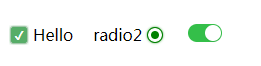
效果预览
1. 复选框
.switch {
margin: 20px 20px 0 0;
display: flex;
align-items: center;
width: auto;
}
.checkbox-input {
display: none
}
.checkbox {
-webkit-transition: background-color 0.3s;
transition: background-color 0.3s;
background-color: #fff;
border: 1px solid #d7d7d7;
border-radius: 3px;
width: 16px;
height: 16px;
vertical-align:middle;
margin: 0 5px;
}
.checkbox-input:checked+.checkbox {
background-color: #57ad68;
}
.checkbox-input:checked+.checkbox:after {
content: "\2714";
display: inline-block;
height: 100%;
width: 100%;
color: #fff;
text-align: center;
line-height: 16px;
font-size: 12px;
box-shadow: 0 0 4px #57ad68;
}
Hello
2. 单选框
.switch {
display: flex;
align-items: center;
width: auto;
float: left;
}
.radio-beauty-container .radio-beauty {
width: 16px;
height: 16px;
box-sizing: border-box;
display: inline-block;
border: 1px solid #d7d7d7;
margin: 0 5px;
border-radius: 50%;
transition: 0.2s;
}
.radio-beauty-container input[type="radio"]:checked+.radio-beauty {
border: solid 1px green;
padding: 3px;
background-color: green;
background-clip: content-box;
box-shadow: inset 0 0 1px rgba(0,128,0, 0.2), 0 0 3px green;
}
radio2
radio3
3. 滑动按钮
.switch-slide-label {
display: block;
width: 34px;
height: 18px;
background: #ccc;
border-radius: 30px;
cursor: pointer;
position: relative;
-webkit-transition: 0.3s ease;
transition: 0.3s ease;
}
.switch-slide-label:after {
content: '';
display: block;
width: 16px;
height: 16px;
border-radius: 100%;
background: #fff;
box-shadow: 0 1px 1px rgba(0, 0, 0, .1);
position: absolute;
left: 1px;
top: 1px;
-webkit-transform: translateZ(0);
transform: translateZ(0);
-webkit-transition:0.3s ease;
transition:0.3s ease;
}
.switch-slide input:checked+label {
background: #34bf49;
transition: 0.3s ease;
}
.switch-slide input:checked+label:after {
left: 17px;
}


 837
837


 被折叠的 条评论
为什么被折叠?
被折叠的 条评论
为什么被折叠?
 到【灌水乐园】发言


