


描述:用5个div写成imgs/奥运五环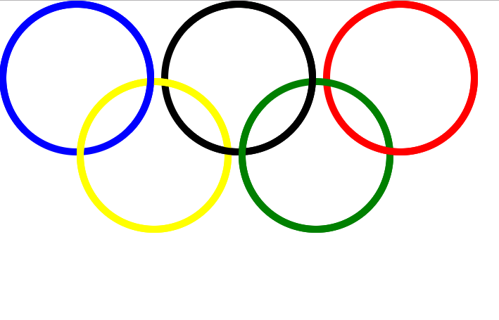
思路:
- (1)将五个div的边框设置为50%,成为圆形;
- 再使用绝对定位将元素设置到不同的位置,(注意:设置定位的元素的left/top/right/bottom默认值是auto,不是0)
- 再将每个元素下使用伪类添加一个相同属性的圆形
- 再利用z-index属性对元素中间夹实现五环(注意:定位的元素z-index才有效)
<!DOCTYPE html>
<html lang="en">
<head>
    <meta charset="UTF-8">
    <title>circle</title>
    <style>
        *{
            margin: 0px;
            padding: 0px;
        }
        .circle,.circle::after{
            width: 200px;
            height:200px;
            border: 10px solid #0000ff;
            -webkit-border-radius: 50%;
            -moz-border-radius: 50%;
            border-radius: 50%;
            position: absolute;
        }
        .circle::after{
            content: "";
            top:-10px;
            left:-10px;
        }

        .circle1{
           top:0px;
           left:0px;

        }
        .circle1::after{
            z-index: 1;
            border-bottom-color: transparent;

        }
        .circle2{
            border-color: #000000;
            top:0;
            left:230px;
        }
        .circle2::after{
            border-color: #000000;
            z-index: 1;
            border-left-color: transparent;

        }
        .circle3{
            border-color: #ff0000;
            top:0;
            left:460px;
        }
        .circle3::after{
            border-color: #ff0000;
            z-index: 1;
            border-left-color: transparent;

        }
        .circle4{
            border-color: #ffff00;
            left:110px;
            top: 110px;
        }
        .circle4::after{
            border-color: #ffff00;


        }
        .circle5{
            border-color: #00ff00;
            top: 110px;
            left:340px;
        }
        .circle5::after{
            border-color: #00ff00;
            z-index: 2;
            border-top-color: transparent;
            border-right-color: transparent;


        }

    </style>
</head>
<body>
<div class="circle circle1"></div>
<div class="circle circle2"></div>
<div class="circle circle3"></div>
<div class="circle circle4"></div>
<div class="circle circle5"></div>

</body>
</html>


 676
676


 被折叠的 条评论
为什么被折叠?
被折叠的 条评论
为什么被折叠?
 到【灌水乐园】发言


