


完全灵活且响应迅速
没有硬编码或任意高度,不涉及JS.
基本上,
>将标题转换为-100%,悬停动画为0
>将标题和内容都包装到DIV中(即:.anim)
>将.anim转换为100%,然后悬停将其动画为0
全页打开示例以查看发生的情况及其工作方式:
/*QuickReset*/*{margin:0;Box-sizing:border-Box;}
.thumb {
width: 140px;
background: #eee;
}
.anim {
transition: 0.5s;
transform: translateY(100%);
}
.title {
color: red;
transition: 0.5s;
transform: translateY(-100%);
}
.author {
color: blue;
}
/* ANIMATE */
.thumb:hover .anim,.thumb:hover .title {
transform: translateY(0);
}
Text lenghts of Title and Author or even Description do not matter. They will all perfectly accommodate into .thumb on hover
FlexBox网格!
概念的真实案例示例:
/*QuickReset*/
* {
margin: 0;
Box-sizing: border-Box;
}
html {
height: 100%
}
body {
min-height: 100%;
font: 14px/1.4 sans-serif;
}
.grid-3 {
display: flex;
flex-flow: row wrap;
}
.thumb {
display: flex;
flex-flow: column nowrap;
position: relative;
overflow: hidden;
width: 33.333%;
color: #fff;
}
.thumb-gradient,.thumb-img {
position: absolute;
top: 0;
left: 0;
width: 100%;
height: 100%;
object-fit: cover;
}
.thumb-gradient {
background: linear-gradient(to bottom,rgba(0,0.24) 0%,0.56) 100%);
}
.thumb-anim {
margin-top: auto; /* pushes all content to bottom */
position: relative;
transition: 0.5s;
transform: translateY(100%);
}
.thumb-title {
text-transform: uppercase;
padding: 20px;
transition: 0.5s;
transform: translateY(-100%);
}
.thumb-description {
padding: 10px 20px;
transition: 0.5s;
opacity: 0;
flex: 1;
}
.thumb-author {
padding: 20px;
position: relative;
}
/* ANIMATE */
.thumb:hover .thumb-anim {
transform: translateY(0);
}
.thumb:hover .thumb-title {
transform: translateY(0%);
}
.thumb:hover .thumb-description {
opacity: 1;
}

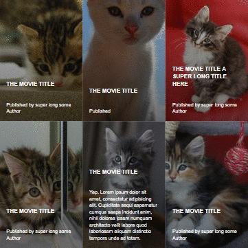
The movie title
Text lenghts of Title and Author or even Description do not matter. They will all perfectly accommodate into .thumb on hover

The movie title
The row heights are dictated by the tallest in the horizontal group

The movie title a super long title here
Lorem ipsum dolor sit amet,consectetur adipisicing elit. Repellendus facilis beatae,numquam aliquam eveniet. Iure porro provident itaque hic quae tempora. Quaerat doloribus dolore facilis similique,soluta asperiores quas sapiente.

The movie title
Text lenghts of Title and Author or even Description do not matter. They will all perfectly accommodate into .thumb on hover

The movie title
Text lenghts of Title and Author or even Description do not matter. They will all perfectly accommodate into .thumb on hover

The movie title
Text lenghts of Title and Author or even Description do not matter. They will all perfectly accommodate into .thumb on hover


 被折叠的 条评论
为什么被折叠?
被折叠的 条评论
为什么被折叠?
 到【灌水乐园】发言


