


选择器
基本规则
h1 { color: red; background: yellow; }1. h1为选择器, color/background为属性, red/yellow为值.
分组:
h2, p { color: gray; }1. 使用逗号","进行分组, 而分组的元素具有相同的css样式.
2. 可使用通配选择器"*", 下例代码的含义为: 文档中的每一个元素都设为红色:
* { color: red; }类选择器:
.warning { font-weight: bold; }
p.warning { font-weight: bold; }
.warning.urgent { font-weight: silver; }
1. 点号"."代表类选择器: ".warning"代表所有具有warning类的元素.
2. "p.warning"代表所有具有warning类的p元素.
3. ".warning.urgent"代表同时具有warning类和urgent类的元素.
ID选择器:
#lead-para { font-weight: bold; }1. 井号"#"代表ID选择器.
属性选择器:
h1[class] { color: silver; }
a[href][title] { font-weight: bold; }
1. "h1[class]"代表具有class属性的h1元素. "a[href][title]"代表同时具有href和title属性的h1元素.
span[moons='1'] { font-weight: bold; }

<span moons='0' class="barren rocky">Mercury</span>
<span moons='1' class="cloudy barren">Venus</span>
<span moons='2' class="lift-bearing cloudy">Earth</span>
1. 根据具体属性值进行匹配, 而且值必须完全匹配.
span[class~='barren'] { font-weight: bold; }

<span moons='0' class="barren rocky">Mercury</span>
<span moons='1' class="cloudy barren">Venus</span>
<span moons='2' class="lift-bearing cloudy">Earth</span>
1. 如果想选择class属性中包含barren的元素, 可以使用"~="来达到效果.
| 类型 | 描述 |
| [foo^="bar"] | 选择foo属性值以"bar"开头的所有元素 |
| [foo$="bar"] | 选择foo属性值以"bar"结尾的所有元素 |
| [foo*="bar"] | 选择foo属性值中包含子串"bar"的所有元素 |
使用文档结构
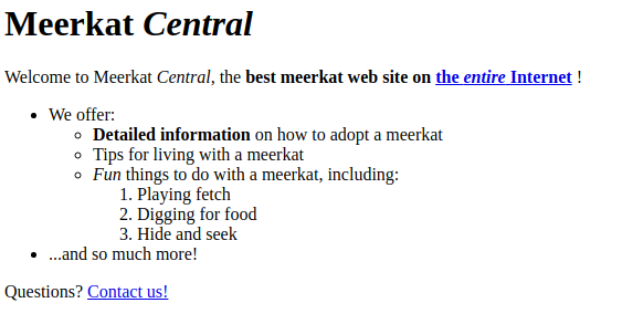
html代码如下:
<html>
    <head>
        <base href="http://www.meerkat.web/">
        <title>Meerkat Central</title>
    </head>
    <body>
        <h1>Meerkat <em>Central</em></h1>
        <p>
            Welcome to Meerkat <em>Central</em>, the <strong>best meerkat web site
                on <a href="inet.html">the <em>entire</em> Internet</a>
            </strong>!
        </p>
        <ul>
            <li>We offer:
                <ul>
                    <li><strong>Detailed information</strong> on how to adopt a meerkat</li>
                    <li>Tips for living with a meerkat</li>
                    <li><em>Fun</em> things to do with a meerkat, including:
                        <ol>
                            <li>Playing fetch</li>
                            <li>Digging for food</li>
                            <li>Hide and seek</li>
                        </ol>
                    </li>
                </ul>
            </li>
            <li>...and so much more!</li>
        </ul>
        <p>
            Questions? <a href="mailto:suricate@meerkat.web">Contact us!</a>
        </p>
    </body>
</html>
效果图如下:
后代选择器:
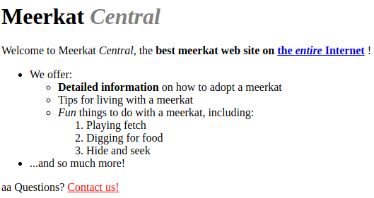
h1 em { color: gray; }1. h1后代中所有的em元素均设置为灰色.
p > a { color: red; }1. 代码中有两处p后面有a, 但第一处中a并不属于p的子元素, 关系为: p > strong > a. 第二处中p > a, 所以渲染的页面为:
相邻兄弟元素:
h1 + p { color: green; }1. h1和p必须相邻, 使用加号"+"来表示.
伪类选择器:
| 伪类名 | 描述 |
| :link | 指示作为超链接(即有一个href属性)并指向一个未访问地址的所有锚. |
| :visited | 指示作为已访问地址超链接的所有锚 |
| :focus | 指示当前拥有输入焦点的元素 |
| :hover | 指示鼠标指针停留在哪个元素上 |
| :active | 指示被用户激活的元素. |
1. 伪类的顺序为: link-visited-focus-hover-active.
a:link { color: blue; }
a:visited { color: red; }
input:focus { background: silver; }
a:hover { color: green; }
a:active { color: yellow; }
2. 选择第一个子元素, 可使用first-child:
<html>
    <head>
        <title>Meerkat Central</title>
<style type="text/css">
p:first-child { font-weight: bold; }
li:first-child { text-transform: uppercase; }
</style>
    </head>
    <body>
        <div>
            <p>These are the necessary steps:</p>
            <ul>
                <li>Insert key</li>
                <li>Turn key <strong>clockwise</strong></li>
                <li>Push accelerator</li>
            </ul>
            <p>Do <em>not</em> push the brake at the same time as the accelerator.</p>
        </div>
    </body>
</html>
页面如下:
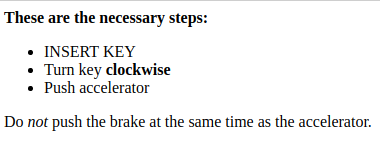
这里, 将第一个p和li设置为对应的样式, 而非p/li元素的第一个子元素.
结构和层叠
特殊性
考虑一种情况:
p em { color: purple; }
em.dark { color: maroon; }
如果一个em元素都匹配上述两条规则, 那么元素是purple还是maroon? 这里得引入选择器的特殊性:
- 对于选择器中给定的各个ID属性值, 加0,1,0,0
- 对于选择器中给定的各个类属性值,属性选择或伪类, 加0,0,1,0
- 对于选择器中给定的各个元素和伪元素, 加0,0,0,1.
- 结合符和通配选择器对特殊性没有任何贡献.
h1 { color: red; }  /* 0,0,0,1 */
p em { color: purple; } /* 0,0,0,2 */
.grape { color: purple; }   /* 0,0,1,0 */
*.bright { color: yellow; } /* 0,0,1,0 */
p.bright em.dark { color: maroon; }  /* 0,0,2,2 */
#id216 { color: blue; } /* 0,1,0,0 */
div#sidebar *[href] { color: silver; }  /* 0,1,1,1 */
如果我们将id作为属性选择器, 则它的特殊性为0,0,1,0:
#meadow { color: green; } /* 0,1,0,0 */
*[li="meadow"] { color: red; } /* 0,0,1,0 */
但什么样式为"1,0,0,0", 答案是内联:
<h1 style="color: green;">The Meadow Party</h1>如果某个声明非常重要, 超过了所有其他声明, 则可使用"!important"字段:
p.dark { color: #333 !important; background: white; }
继承
基于继承机制, 样式不仅应用到指定的元素, 还会应用到它的后代元素. 但有两个例外:
- body元素的样式会应用到html元素.
- 边框(border)不可继承.
继承的值没有特殊性, 甚至连0特殊性都没有. 考虑以下代码:
* { color: gray; }
h1#page-title { color: black; }

<h1 id='page-title'>Meerkat <em>Central</em></h1>
<p>Welcome to the pest place.</p>
页面效果如下:
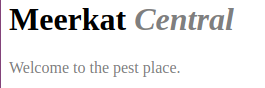
因为通配选择器适用于所有元素, 而且有0特殊性, 其颜色声明指定的值gray要优先于继承值(black), 因为继承值根本没有特殊性. 所以em元素会显示灰色而不是黑色.
更好的做法是避免使用通配选择器. 我们考虑一个例子: 工具条的文本都是黑底白字:
#toolbar { color: white; background: black; }但如果工具条包含了一个超链接(a元素), 则超链接的样式会占上风(即可能显示蓝色, a:link {color: blue; }), 为了克服这种情况, 我们还需要如下编写代码:
#toolbar { color: white; background: black; }
#toolbar a:link { color: white; }
层叠
如果特殊性相等的两个规则同时应用到同一个元素, 则可根据以下规则进行排序:
按权重和来源排序
p { color: gray !important }

<p style="color: black;">Well, <em>hello</em> there!</p>
由于存在"!important", 则p的颜色会设置为gray.
按特殊性排序
p#bright { color: silver; }
p { color: black; }
这里, p#bright为(0,1,0,1), 而p为(0,0,0,1), 所以p#bright会胜出.
按顺序排序
h1 { color: red; }
h1 { color: blue; }
则h1的颜色设置为blue.
值和单位
颜色
一般我们更倾向于使用十六进制方法来表示颜色:
h1 { color: #ff0000; }长度单位
绝对长度单位(in, cm, mm, pt, pc)基本不会被使用.
相对长度单位
em: 1个"em"定义为一种给定字体的font-size值. 如果一个元素的font-size为14像素, 那么对于该元素, 1em就等于14像素.
px: 像素单位, 更为常用.
字体
font-family: 用于指定通用字体. 如果字体包含空格,%,$等特殊字符, 需要使用引号包含起来.
h1 { font-family: Arial, sans-serif; }这里h1优先使用Arial字体, 如果没有则使用sans-serif字体.
font-weight: 用于加粗字体, 常用为: normal(正常), bold(粗体), bolder(比父元素更粗), lighter(比父元素更细), 100, 200,..., 800, 900.
font-size: 字体大小:
- 绝对大小: xx-samll, x-small, small, medium, large, x-large, xx-large.
- 相对大小: smaller, larger.
- 像素大小和百分比大小: 12px; 120%.
- 继承大小: inherit
font-style: 字体风格, 只推荐使用: normal(默认正常), italic(斜体).
文本属性
缩进和水平对齐
text-indent: 应用于块级元素, 可指定长度值, 为数字或百分数.
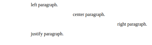
p {text-indent: 36px; }text-align: 应用于块级元素, 用于文本水平对齐. left, center, right, justify.
p.left { text-align: left; }
p.center { text-align: center; }
p.right { text-align: right; }
p.justify { text-align: justify; }

<div style="width: 400px; margin-left: 100px;">
    <p class="left">left paragraph.</p>
    <p class="center">center paragraph.</p>
    <p class="right">right paragraph.</p>
    <p class="justify">justify paragraph.</p>
</div>
页面效果如下:
垂直对齐
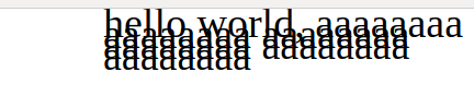
line-height: 行高, 用于设定每行文本的高度.
body { font-size: 10px; }
div { line-height: 1em; }
p { font-size: 38px; }

<div style="width: 400px; margin-left: 100px;">
    <p>hello world,
        aaaaaaaa
        aaaaaaaa
        aaaaaaaa
        aaaaaaaa
        aaaaaaaa
        aaaaaaaa
    </p>
</div>
由于行高是可继承的, 所以上诉代码中, div的行高为1em == 10px; 导致了页面效果如下:
解决方案为: 指定一个数字, 设置为缩放因子:
body { font-size: 10px; }
div { line-height: 1; }
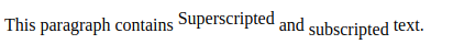
p { font-size: 38px; }vertical-align: 垂直对齐文本.
- 基线对齐: baseline, 要求一个元素的基线与其父元素的基线对齐. 这是默认值.
- 上标(super), 下标(sub): 使子元素的基线上升和下降:
span.raise { vertical-align: super; }
span.lower { vertical-align: sub; }

<p>This paragraph contains <span class="raise">Superscripted</span> and <span class="lower">subscripted</span> text.</p>
页面显示效果如下:
3. bottom: 将元素行内框的底端和行框的底端对齐.
4. text-bottom: 行内文本的底端和行框的底端对齐.
5. top/text-top: 和bottom/text-bottom相反.
6. 长度对齐: 使用百分值或者具体的数值:
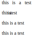
span.raise { vertical-align: 5px; }字间隔和字母间隔
word-spacing: 接受一个正长度或负长度值, 这个长度会增加字之间的标准间隔.
p.spread { word-spacing: 0.5em; }
p.tight { word-spacing: -0.5em; }
p.base { word-spacing: normal; }
p.norm { word-spacing: 0; }

<p class="spread">this is a test</p>
<p class="tight">this is a test</p>
<p class="base">this is a test</p>
<p class="norm">this is a test</p>
页面效果如下:
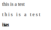
letter-spacing: 接受一个正长度或负长度值, 这个长度会增加字母之间的标准间隔.
p { letter-spacing: 0; }
p.spacious { letter-spacing: 0.25em; }
p.tight { letter-spacing: -0.25em; }

<p>this is a test</p>
<p class="spacious">this is a test</p>
<p class="tight">this is a test</p>
页面效果如下:
文本转换
text-transform: 将文本设为大写(uppercase), 小写(lowercase), 单词首字母大写(capitalize), 不做修改(none).
h1 { text-transform: uppercase; }
h2 { text-transform: lowercase; }
h3 { text-transform: capitalize; }

<h1>this is a TEST</h1>
<h2>this is a TEST</h2>
<h3>this is a TEST</h3>
文本装饰
text-decoration: none(正常), underline(加下划线), overline(加上划线), line-through(加贯穿线), blink(文本闪烁, 有些浏览器不支持, 少用).
p.none { text-decoration: none; }
p.underline { text-decoration: underline; }
p.overline { text-decoration: overline; }
p.line-through { text-decoration: line-through; }

<p class="none">this is a test</p>
<p class="underline">this is a test</p>
<p class="overline">this is a test</p>
<p class="line-through">this is a test</p>
处理空白符
white-space: 用于处理空白字符, 浏览器的默认行为: 丢掉多余的空白字符.
| 值 | 空白符 | 换行符 | 自动换行 |
| pre-line | 合并 | 保留 | 允许 |
| normal | 合并 | 忽略 | 允许 |
| nowrap | 合并 | 忽略 | 不允许 |
| pre | 保留 | 保留 | 不允许 |
| pre-wrap | 保留 | 保留 | 允许 |


 扫一扫
扫一扫
 1804
1804

 被折叠的 条评论
为什么被折叠?
被折叠的 条评论
为什么被折叠?
 到【灌水乐园】发言


