


一直想把 Android 的 APIDEMO 里面的DEMO 写出来,一来可以方便自己查看,二来方便大家能够早一点切入,从基础的控件到界面布局乃至到OPEN GL 等深入知识。不过惰性使然,一直迟迟未动手,今天外面下着大雨,没心思出去,听说外面还有人拍到深圳的“双龙戏水”呵呵,跑题了。
 ApiDemos src 代码
package com.example.android.apis.view;
import com.example.android.apis.R;
import android.app.Activity;
import android.os.Bundle;
public class Buttons1 extends Activity {
@Override
protected void onCreate(Bundle savedInstanceState) {
super .onCreate(savedInstanceState);
setContentView(R.layout.buttons_1);
}
}
 1、如何在 布局中找到 View 即你要的按钮
代码如下:
好了,从头开始吧,看了一下 APIDEMO 觉得先从Button 讲起然后逐步深入,对于新手或者初学的童鞋帮助会大一点,那么我们开始吧,讲解大纲。
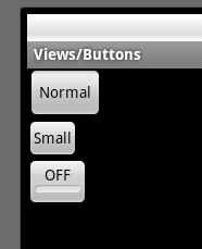
ApiDemos 中运行的效果
- 1、本篇讲述点在 ApiDemos 位置。
- 2、为Button 添加系统样式。
- 3、额外扩展。
1、本篇讲述点在 ApiDemos 位置
- src文件
com.example.android.apis.view 下的 Buttons1.java文件 源码为:
ApiDemos src 代码
package com.example.android.apis.view;
import com.example.android.apis.R;
import android.app.Activity;
import android.os.Bundle;
public class Buttons1 extends Activity {
@Override
protected void onCreate(Bundle savedInstanceState) {
super .onCreate(savedInstanceState);
setContentView(R.layout.buttons_1);
}
}
- res 文件
layout 下的 buttons_1.xml 文件, 源码为:
<?
xml version="1.0" encoding="utf-8"
?>
< ScrollView xmlns:android ="http://schemas.android.com/apk/res/android"
android:layout_width ="fill_parent"
android:layout_height ="fill_parent" >
< LinearLayout
android:layout_width ="wrap_content"
android:layout_height ="wrap_content"
android:orientation ="vertical" >
<!-- Regular sized buttons -->
< Button android:id ="@+id/button_normal"
android:text ="@string/buttons_1_normal"
android:layout_width ="wrap_content"
android:layout_height ="wrap_content" />
<!-- Small buttons -->
< Button android:id ="@+id/button_small"
style ="?android:attr/buttonStyleSmall"
android:text ="@string/buttons_1_small"
android:layout_width ="wrap_content"
android:layout_height ="wrap_content" />
< ToggleButton android:id ="@+id/button_toggle"
android:text ="@string/buttons_1_toggle"
android:layout_width ="wrap_content"
android:layout_height ="wrap_content" />
</ LinearLayout >
</ ScrollView >
2、为Button 添加系统样式
从
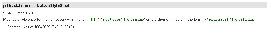
ApiDemos 中看到第二个Button 为一个 style 的样式属性,此属性为通过调用系统的内置样式文件设置 Button 的大小。
格式为:“?[package:][type:]name” ,Constant Value 为 16842825 (0x01010049) 。docs 文件解释为:
上面的XML中,定义了三个 Button 。依次往下看,第一个为普通 Button ,第二个是一个加了 Style 的 Button ,第三个为 ToggleButton 看名字可以看出来,是一个做开关作用的按钮,作用为在两种状态中来回切换。
3、额外扩展
由于 ApiDemos 中对 Button 的介绍较少,在这里我将加一些内容进来,以便开始学的朋友能够较早的使用 Button 做一些你想做的事情,当然我所说的就是交互。内容如下:
- 1、如何在 布局中找到 View 即你要的按钮
- 2、为 Button 添加事件监听
- 3、为 Button 添加按上按下切换图片效果
- 4、为 ToggleButton 添加状态改变事件监听
代码如下:
void
findView() {
normal = (Button) findViewById(R.id.button_normal);
small = (Button) findViewById(R.id.button_small);
btn = (ToggleButton) findViewById(R.id.button_toggle);
}
normal = (Button) findViewById(R.id.button_normal);
small = (Button) findViewById(R.id.button_small);
btn = (ToggleButton) findViewById(R.id.button_toggle);
}
Tip: 所查找的 VIEW 必须 是当前setConteView 方法的布局文件下的VIEW ,如果查找的另外一个XML布局的VIEW 将会报空指针。这点对于新手来说要记住,如果你要在当前布局中查找另外XML的VIEW 将会在后续的文章一一揭晓。
2、为 Button 添加事件监听代码如下:
void
setOnclick(Button btn) {
btn.setOnClickListener( new OnClickListener() {
public void onClick(View v) {
// TODO Auto-generated method stub
switch (v.getId()) {
case R.id.button_normal:
setTitle( " 点击了普通按钮 " );
break ;
case R.id.button_small:
setTitle( " 点击小按钮 " );
break ;
default :
break ;
}
}
});
}
btn.setOnClickListener( new OnClickListener() {
public void onClick(View v) {
// TODO Auto-generated method stub
switch (v.getId()) {
case R.id.button_normal:
setTitle( " 点击了普通按钮 " );
break ;
case R.id.button_small:
setTitle( " 点击小按钮 " );
break ;
default :
break ;
}
}
});
}
Tip:在这里用了一个方法,通过点击的view 来判断我点击是哪个按钮,当然你也可以直接获取button 然后通过button的 一个监听也可以,写法有很多种。
为 Button 添加按上按下切换图片效果
代码如下:
代码如下:
void
setOnTouch(
final
Button btn) {
btn.setOnTouchListener( new OnTouchListener() {
public boolean onTouch(View v, MotionEvent event) {
// TODO Auto-generated method stub
switch (event.getAction()) {
case MotionEvent.ACTION_UP:
btn.setBackgroundResource(R.drawable.add);
break ;
case MotionEvent.ACTION_DOWN:
btn.setBackgroundResource(R.drawable.add_user);
break ;
default :
break ;
}
return false ;
}
});
}
Tip:记住在 Android 中你如果想要为 诸如 LinearLayout 等布局文件设置onTouch事件貌似不会激发MotionEvent.ACTION_UP 事件,在Button 和ImageButton是可以实现的,此功能可以为按钮做按上换图片换下换图片的交互效果。
为 ToggleButton 添加状态改变事件监听
代码如下:
代码如下:
btn.setOnCheckedChangeListener(
new
OnCheckedChangeListener() {
public void onCheckedChanged(CompoundButton buttonView,
boolean isChecked) {
// TODO Auto-generated method stub
if (isChecked) {
setTitle( " 选中 " );
} else {
setTitle( " 反选 " );
}
}
});
public void onCheckedChanged(CompoundButton buttonView,
boolean isChecked) {
// TODO Auto-generated method stub
if (isChecked) {
setTitle( " 选中 " );
} else {
setTitle( " 反选 " );
}
}
});

本文转自 terry_龙 51CTO博客,原文链接:http://blog.51cto.com/terryblog/362178,如需转载请自行联系原作者


 扫一扫
扫一扫
 722
722

 被折叠的 条评论
为什么被折叠?
被折叠的 条评论
为什么被折叠?
 到【灌水乐园】发言


