调整元素的大小是一个重要的技能,CSS 提供了多种方法来控制和调整元素的尺寸,以适应不同的设计需求和屏幕尺寸。


一、原始尺寸(或固有尺寸)

原始尺寸,通常称为固有尺寸,是指元素在未进行任何 CSS 样式调整时的默认大小。这种尺寸由元素的内容、内边距、边框和外边距等因素决定。例如,一个图片元素的固有尺寸由图片本身的实际像素决定,而一个文本块的固有尺寸则由文本内容和字体大小决定。

示例 : 图片的固有尺寸

<!DOCTYPE html>
<html lang="en">
<head>
    <meta charset="UTF-8">
    <meta name="viewport" content="width=device-width, initial-scale=1.0">
    <title>原始尺寸示例</title>
    <style>
        .image-container {
            border: 2px solid #000;
            display: inline-block;
        }

        .image-container img {
            display: block;
        }
    </style>
</head>
<body>
    <div class="image-container">
        <img src="example.jpg" alt="Example Image">
    </div>
</body>
</html>
  • 1.
  • 2.
  • 3.
  • 4.
  • 5.
  • 6.
  • 7.
  • 8.
  • 9.
  • 10.
  • 11.
  • 12.
  • 13.
  • 14.
  • 15.
  • 16.
  • 17.
  • 18.
  • 19.
  • 20.
  • 21.
  • 22.
  • 23.

在 CSS 中调整大小——WEB开发系列22_前端

图片的固有尺寸决定了其显示大小。即使没有指定任何宽度或高度,图片会显示其实际尺寸。


二、设置具体的尺寸

CSS 允许我们设置元素的具体尺寸,通过使用固定单位(如像素、点等)来精确控制元素的宽度和高度。这种方法适用于需要精确尺寸控制的场景。

示例 : 使用固定单位设置尺寸

<!DOCTYPE html>
<html lang="en">
<head>
    <meta charset="UTF-8">
    <meta name="viewport" content="width=device-width, initial-scale=1.0">
    <title>固定尺寸示例</title>
    <style>
        .fixed-size-box {
            width: 300px; /* 固定宽度 */
            height: 200px; /* 固定高度 */
            background-color: #3498db;
            color: #fff;
            text-align: center;
            line-height: 200px; /* 垂直居中 */
        }
    </style>
</head>
<body>
    <div class="fixed-size-box">固定尺寸</div>
</body>
</html>
  • 1.
  • 2.
  • 3.
  • 4.
  • 5.
  • 6.
  • 7.
  • 8.
  • 9.
  • 10.
  • 11.
  • 12.
  • 13.
  • 14.
  • 15.
  • 16.
  • 17.
  • 18.
  • 19.
  • 20.
  • 21.

在 CSS 中调整大小——WEB开发系列22_css3_02

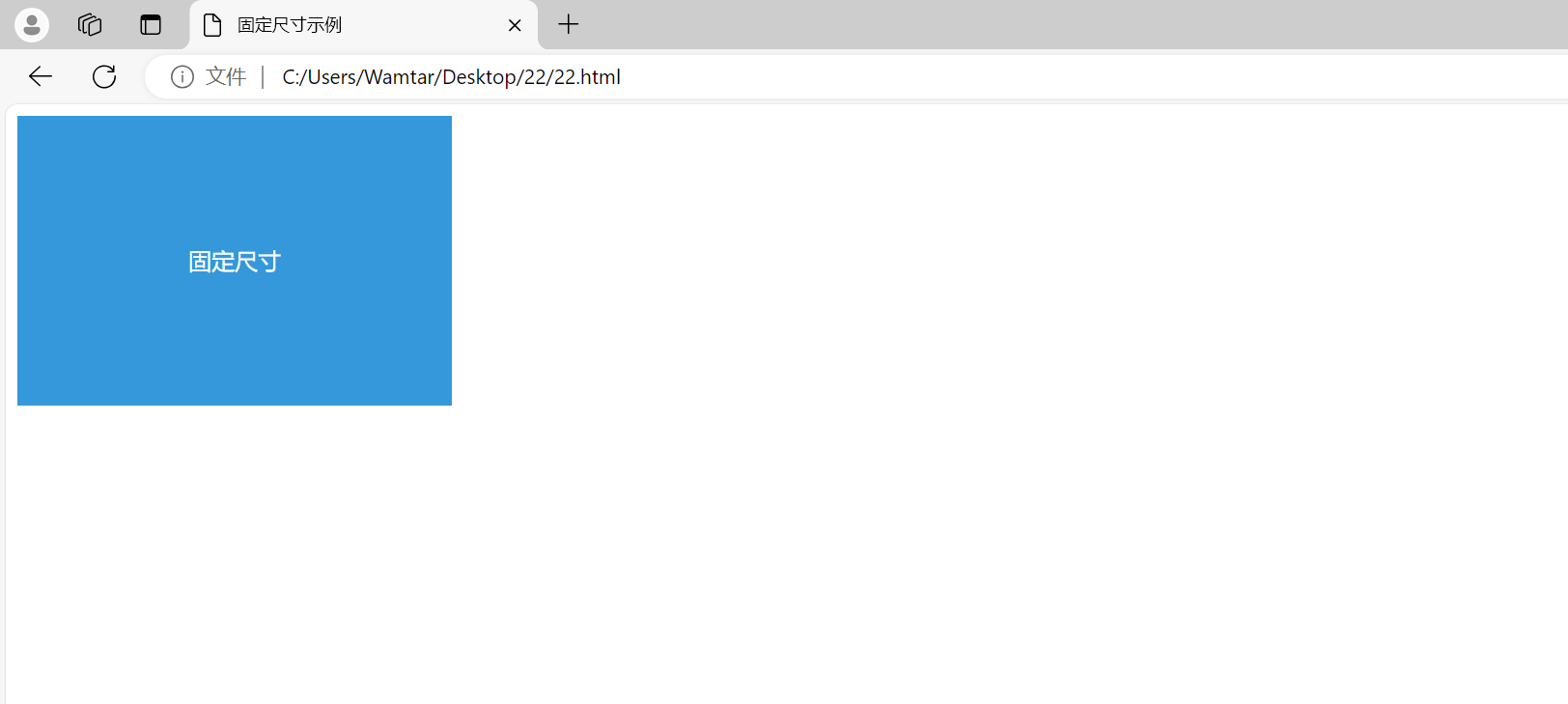
.fixed-size-box 的宽度和高度被设置为固定的像素值,这确保了元素在所有屏幕和视口尺寸下保持一致的尺寸。


三、使用百分比

百分比是另一种灵活的尺寸设置方法,它使元素的尺寸相对于其父元素的尺寸进行调整。这种方法非常适合响应式设计。

示例 : 使用百分比设置尺寸

<!DOCTYPE html>
<html lang="en">
<head>
    <meta charset="UTF-8">
    <meta name="viewport" content="width=device-width, initial-scale=1.0">
    <title>百分比尺寸示例</title>
    <style>
        .container {
            width: 80%; /* 容器宽度为视口宽度的 80% */
            margin: 0 auto;
            background-color: #ecf0f1;
        }

        .responsive-box {
            width: 50%; /* 内部盒子的宽度为容器宽度的 50% */
            height: 100px;
            background-color: #e74c3c;
            color: #fff;
            text-align: center;
            line-height: 100px; /* 垂直居中 */
        }
    </style>
</head>
<body>
    <div class="container">
        <div class="responsive-box">响应式盒子</div>
    </div>
</body>
</html>
  • 1.
  • 2.
  • 3.
  • 4.
  • 5.
  • 6.
  • 7.
  • 8.
  • 9.
  • 10.
  • 11.
  • 12.
  • 13.
  • 14.
  • 15.
  • 16.
  • 17.
  • 18.
  • 19.
  • 20.
  • 21.
  • 22.
  • 23.
  • 24.
  • 25.
  • 26.
  • 27.
  • 28.
  • 29.

在 CSS 中调整大小——WEB开发系列22_css3_03

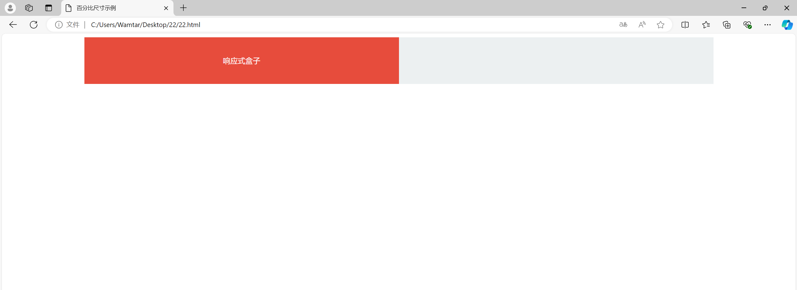
.responsive-box 的宽度设置为其父容器 .container 宽度的 50%。这使得 .responsive-box 的尺寸会根据其父容器的尺寸动态调整。


四、把百分比作为内外边距

使用百分比设置内外边距(padding 和 margin)可以使元素的间距根据其父元素的尺寸进行调整。这在设计响应式布局时非常有用。

示例 : 使用百分比设置内外边距

<!DOCTYPE html>
<html lang="en">
<head>
    <meta charset="UTF-8">
    <meta name="viewport" content="width=device-width, initial-scale=1.0">
    <title>百分比边距示例</title>
    <style>
        .container {
            width: 60%;
            margin: 0 auto;
            background-color: #f1c40f;
        }

        .box {
            width: 80%;
            padding: 10%; /* 内边距为宽度的 10% */
            background-color: #2ecc71;
            color: #fff;
            text-align: center;
        }
    </style>
</head>
<body>
    <div class="container">
        <div class="box">百分比边距</div>
    </div>
</body>
</html>
  • 1.
  • 2.
  • 3.
  • 4.
  • 5.
  • 6.
  • 7.
  • 8.
  • 9.
  • 10.
  • 11.
  • 12.
  • 13.
  • 14.
  • 15.
  • 16.
  • 17.
  • 18.
  • 19.
  • 20.
  • 21.
  • 22.
  • 23.
  • 24.
  • 25.
  • 26.
  • 27.
  • 28.

在 CSS 中调整大小——WEB开发系列22_html_04

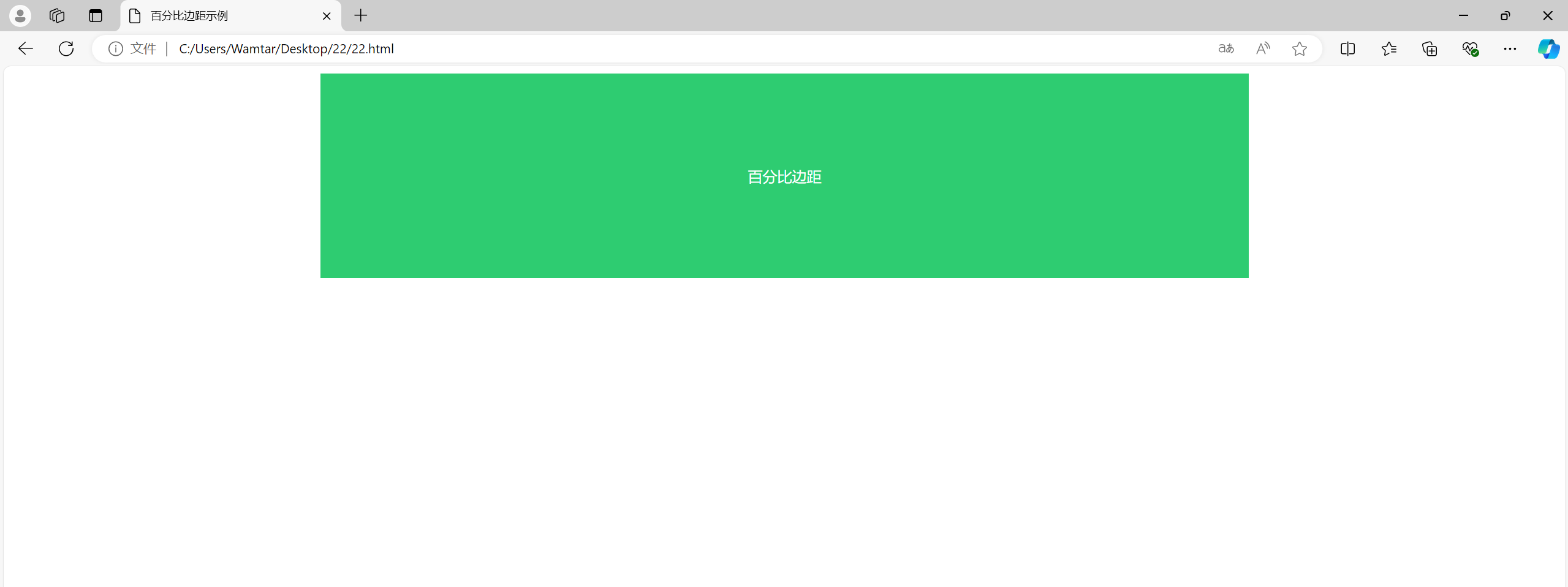
.box 的内边距设置为其宽度的 10%,这使得 .box 在不同的屏幕宽度下,内边距会根据其实际宽度进行调整。


五、min- 和 max- 尺寸

CSS 的 min-widthmax-widthmin-height 和 max-height 属性用于设置元素的最小和最大尺寸。这些属性在设计响应式布局时非常重要,可以确保元素在不同的屏幕尺寸下不会变得过小或过大。

示例 : 使用 min- 和 max- 尺寸

<!DOCTYPE html>
<html lang="en">
<head>
    <meta charset="UTF-8">
    <meta name="viewport" content="width=device-width, initial-scale=1.0">
    <title>min-max 尺寸示例</title>
    <style>
        .box {
            width: 100%;
            max-width: 600px; /* 最大宽度 */
            min-width: 300px; /* 最小宽度 */
            height: 200px;
            background-color: #9b59b6;
            color: #fff;
            text-align: center;
            line-height: 200px; /* 垂直居中 */
        }
    </style>
</head>
<body>
    <div class="box">最小最大宽度</div>
</body>
</html>
  • 1.
  • 2.
  • 3.
  • 4.
  • 5.
  • 6.
  • 7.
  • 8.
  • 9.
  • 10.
  • 11.
  • 12.
  • 13.
  • 14.
  • 15.
  • 16.
  • 17.
  • 18.
  • 19.
  • 20.
  • 21.
  • 22.
  • 23.

在 CSS 中调整大小——WEB开发系列22_css_05

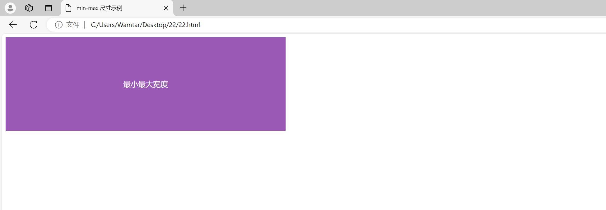
.box 的宽度设置为 100%,但最大宽度为 600px,最小宽度为 300px。这样,无论视口宽度如何变化,.box 的宽度都在这两个值之间调整。


六、视口单位

视口单位(vw 和 vh)用于根据视口的尺寸来设置元素的尺寸。vw 表示视口宽度的百分比,vh 表示视口高度的百分比。这种方法非常适合创建全屏背景或响应式布局。

示例 : 使用视口单位

<!DOCTYPE html>
<html lang="en">
<head>
    <meta charset="UTF-8">
    <meta name="viewport" content="width=device-width, initial-scale=1.0">
    <title>视口单位示例</title>
    <style>
        .full-screen {
            width: 100vw; /* 视口宽度的 100% */
            height: 100vh; /* 视口高度的 100% */
            background-color: #34495e;
            color: #fff;
            display: flex;
            align-items: center;
            justify-content: center;
            text-align: center;
        }
    </style>
</head>
<body>
    <div class="full-screen">
        视口单位
    </div>
</body>
</html>
  • 1.
  • 2.
  • 3.
  • 4.
  • 5.
  • 6.
  • 7.
  • 8.
  • 9.
  • 10.
  • 11.
  • 12.
  • 13.
  • 14.
  • 15.
  • 16.
  • 17.
  • 18.
  • 19.
  • 20.
  • 21.
  • 22.
  • 23.
  • 24.
  • 25.

在 CSS 中调整大小——WEB开发系列22_前端_06

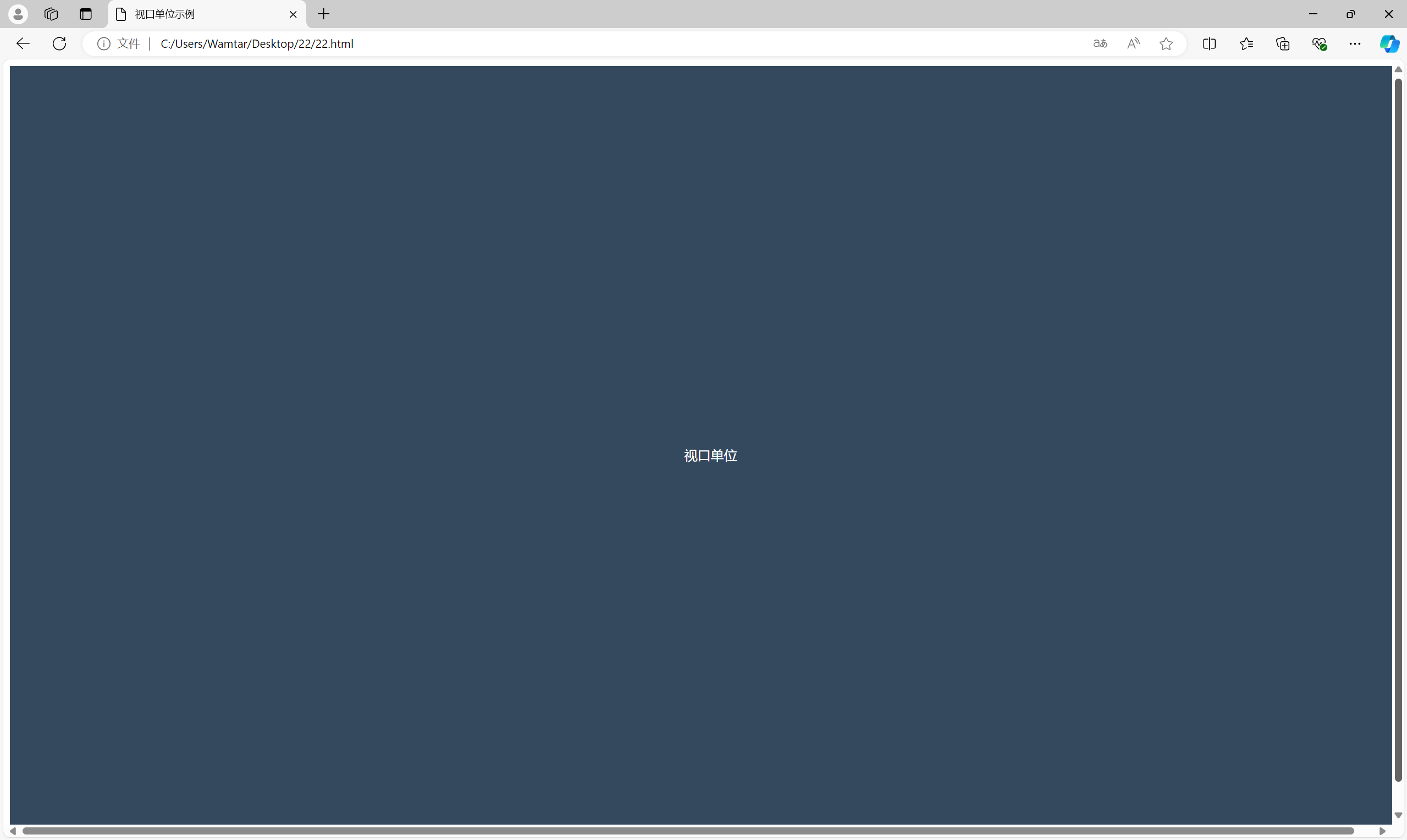
.full-screen 元素的宽度和高度都设置为视口的 100%。这样,.full-screen 元素会填满整个浏览器窗口,无论窗口的尺寸如何变化。


如有表述错误及欠缺之处敬请批评指正。