


实际项目开发过程中我们经常会遇到页面div左右布局的需求:左侧 div 固定宽度,右侧 div 自适应宽度,填充满剩余页面,下面整理几种常用的方案
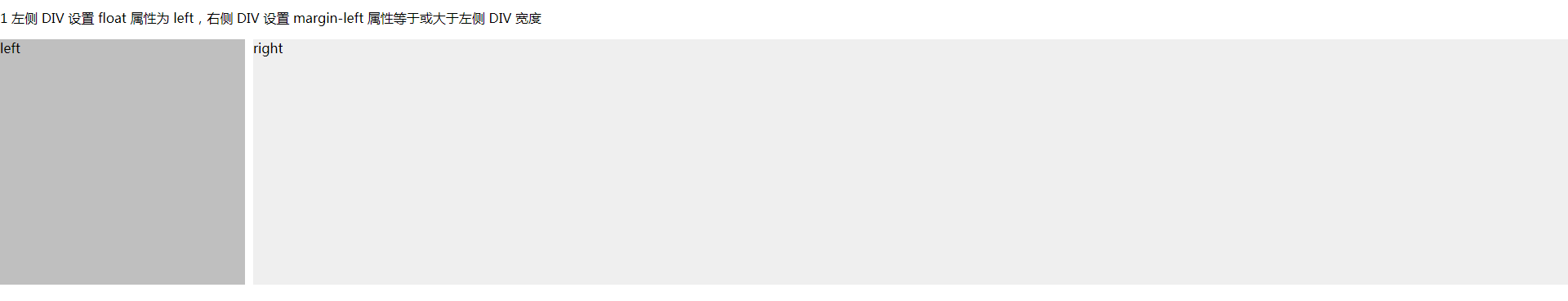
1 左侧 div 设置 float 属性为 left,右侧 div 设置 margin-left 属性等于或大于左侧 div 宽度
<!DOCTYPE html>
<html lang="en">
<head>
  <meta charset="UTF-8">
  <title>左右布局</title>
  <style>
    html, body {
      margin: 0;
      padding: 0;
    }

    .left {
      float: left;
      width: 300px;
      height: 300px;
      background: #bfbfbf;
    }

    .right {
      margin-left: 310px;
      height: 300px;
      background: #efefef;
    }
  </style>
</head>
<body>
<p>1 左侧 DIV 设置 float 属性为 left,右侧 DIV 设置 margin-left 属性等于或大于左侧 DIV 宽度</p>
<div class="left">left</div>
<div class="right">right</div>

</body>
</html>
实际效果:
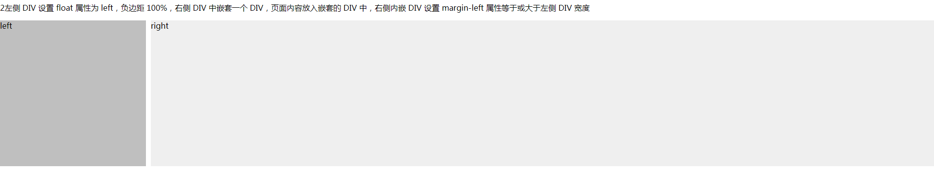
2 左侧 div 设置 float 属性为 left,负边距 100%,右侧 div中嵌套一个 div,页面内容放入嵌套的 div 中,右侧内嵌 div 设置 margin-left 属性等于或大于左侧 div 宽度
<!DOCTYPE html>
<html lang="en">
<head>
  <meta charset="UTF-8">
  <title>左右布局</title>
  <style>
    html, body {
      margin: 0;
      padding: 0;
    }

    .left {
      float: left;
      width: 300px;
      height: 300px;
      background: #bfbfbf;
      margin-right: -100%;
    }

    .right {
      float: left;
      width: 100%;
    }

    .right-content {
      height: 300px;
      margin-left: 310px;
      background: #efefef;
    }

  </style>
</head>
<body>
<p>2左侧 DIV 设置 float 属性为 left,负边距 100%,右侧 DIV 中嵌套一个 DIV,页面内容放入嵌套的 DIV 中,右侧内嵌 DIV 设置 margin-left 属性等于或大于左侧 DIV 宽度</p>

<div class="left">left</div>
<div class="right">
  <div class="right-content">right</div>
</div>

</body>
</html>
实际效果:
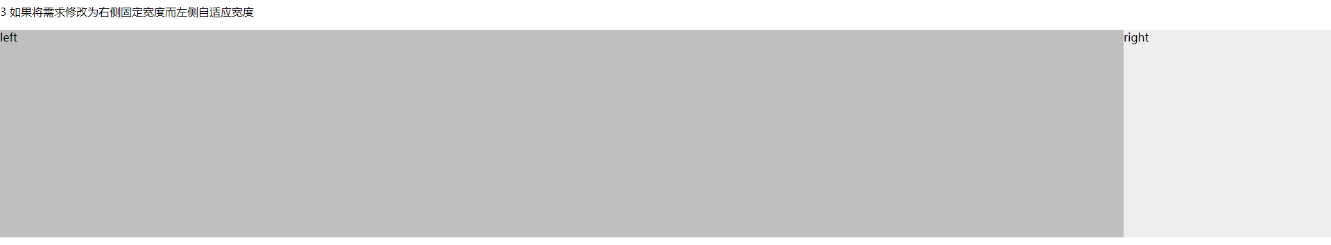
3 如果将需求修改为右侧固定宽度而左侧自适应宽度
<!DOCTYPE html>
<html lang="en">
<head>
  <meta charset="UTF-8">
  <title>左右布局</title>
  <style>
    html, body {
      margin: 0;
      padding: 0;
    }

    .left {
      float: left;
      width: 100%;
      height: 300px;
      background: #bfbfbf;
      margin-right: -300px;
    }
    .right {
      float: right;
      width: 300px;
      height: 300px;
      background: #efefef;
    }

  </style>
</head>
<body>
<p>3 如果将需求修改为右侧固定宽度而左侧自适应宽度</p>

<div class="left">left</div>
<div class="right">right</div>

</body>
</html>
实际效果:
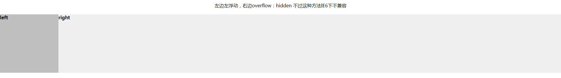
4 左边左浮动,右边overflow:hidden 不过这种方法IE6下不兼容
<!DOCTYPE html>
<html lang="en">
<head>
  <meta charset="UTF-8">
  <title>左边左浮动,右边overflow:hidden 不过这种方法IE6下不兼容</title>
  <style type="text/css">
    * {
      margin: 0;
      padding: 0;
    }
    p{
      margin: 20px 0;
      text-align: center;
    }

    .left {
      float: left;
      width: 200px;
      height: 200px;
      background: #bfbfbf;
    }

    .right {
      overflow: hidden;
      height: 200px;
      background: #efefef;
    }
  </style>

</head>
<body>

<p>左边左浮动,右边overflow:hidden 不过这种方法IE6下不兼容</p>

<div class="left">
  <h4>left</h4>
</div>
<div class="right">
  <h4>right</h4>
</div>
</body>
</html>
实际效果:
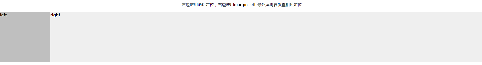
5 左边使用绝对定位,右边使用margin-left
<!DOCTYPE html>
<html lang="en">
<head>
  <meta charset="UTF-8">
  <title>左边使用绝对定位,右边使用margin-left</title>
  <style type="text/css">
    * {
      margin: 0;
      padding: 0;
    }
    p{
      margin: 20px 0;
      text-align: center;
    }
    .content{
      position: relative;
    }

    .left {
      position: absolute;
      top: 0;
      left: 0;
      width: 200px;
      height: 200px;
      background: #bfbfbf;
    }

    .right {
      margin-left: 200px;
      height: 200px;
      background: #efefef;
    }
  </style>
</head>
<body>

<p>左边使用绝对定位,右边使用margin-left-最外层需要设置相对定位</p>

<div class="content">
  <div class="left">
    <h4>left</h4>
  </div>
  <div class="right">
    <h4>right</h4>
  </div>
</div>

</body>
</html>
实际效果:
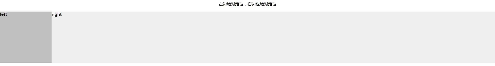
6 左边绝对定位,右边也绝对定位
<!DOCTYPE html>
<html lang="en">
<head>
  <meta charset="UTF-8">
  <title>左边绝对定位,右边也绝对定位</title>
  <style type="text/css">
    * {
      margin: 0;
      padding: 0;
    }

    p {
      margin: 20px 0;
      text-align: center;
    }

    .content {
      position: relative;
    }

    .left {
      position: absolute;
      top: 0;
      left: 0;
      width: 200px;
      height: 200px;
      background: #bfbfbf;
    }

    .right {
      position: absolute;
      left: 200px;
      top: 0;
      right: 0;
      height: 200px;
      background: #efefef;
    }
  </style>
</head>
<body>

<p>左边绝对定位,右边也绝对定位</p>

<div class="content">
  <div class="left">
    <h4>left</h4>
  </div>
  <div class="right">
    <h4>right</h4>
  </div>
</div>

</body>
</html>
实际效果:


 2790
2790


 被折叠的 条评论
为什么被折叠?
被折叠的 条评论
为什么被折叠?
 到【灌水乐园】发言


