


网址:http://v3.bootcss.com/javascript/#js-overview
这里只说几个常用的插件,其它在网址看
一、模态框
》》》》注意:不支持同时打开多个模态框,而且模态框的代码必须写在body的直接子元素,也就是儿子辈
》》》》如何弹出模态框:
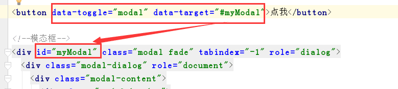
(1)利用data属性:data-toggle="modal" data-target="#myModal" target是弹出的模态框的id值,通常我们把class值赋给一个button
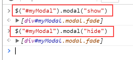
(2)通过JS代码:
- $("#myModal").modal("show") --> 显示出来
- $("#myModal").modal("hide) --> 隐藏
其它参数:传多个参数时要用字典形式去传
backdrop: true/false/'static' --> 遮罩层的参数,static代表有遮罩层,但是点击遮罩层模态框不会消失
keyboard: true/false --> 键盘上的ESC按键,true就代表按下ESC按键时模态框会消失
1、静态实例
2、动态实例
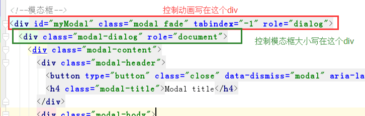
3、可选尺寸:.modal-lg .modal-sm
4、禁止动画效果:fade
》》》》》》》注意尺寸和动画效果的添加位置:::::
5、事件:
show.bs.modal 模态框显示之前触发
shown.bs.modal 模态框显示之后触发
hide.bs.modal 模态框隐藏之前触发
hidden.bs.modal 模态框隐藏之后触发

$('#myModal').on('hidden.bs.modal', function (e) {
  // do something...
})
6、模态框的组成
1. .modal-header
2. .modal-body
3. .modal-footer
二、轮播图 Carousel
1、实例
(1)基本的实例
<div id="carousel-example-generic" class="carousel slide" data-ride="carousel">
  <!-- Indicators -->
  <ol class="carousel-indicators">
    <li data-target="#carousel-example-generic" data-slide-to="0" class="active"></li>
    <li data-target="#carousel-example-generic" data-slide-to="1"></li>
    <li data-target="#carousel-example-generic" data-slide-to="2"></li>
  </ol>

  <!-- Wrapper for slides -->
  <div class="carousel-inner" role="listbox">
    <div class="item active">
      <img src="..." alt="...">
      <div class="carousel-caption">
        ...
      </div>
    </div>
    <div class="item">
      <img src="..." alt="...">
      <div class="carousel-caption">
        ...
      </div>
    </div>
    ...
  </div>

  <!-- Controls -->
  <a class="left carousel-control" href="#carousel-example-generic" role="button" data-slide="prev">
    <span class="glyphicon glyphicon-chevron-left" aria-hidden="true"></span>
    <span class="sr-only">Previous</span>
  </a>
  <a class="right carousel-control" href="#carousel-example-generic" role="button" data-slide="next">
    <span class="glyphicon glyphicon-chevron-right" aria-hidden="true"></span>
    <span class="sr-only">Next</span>
  </a>
</div>
(2)在图片中插入文字
<div class="item">
  <img src="..." alt="...">
  <div class="carousel-caption">
    <h3>...</h3>
    <p>...</p>
  </div>
</div>
2、用法:可以设置
$('.carousel').carousel()
参数:
》》》interval:3000 设置时间,单位是毫秒
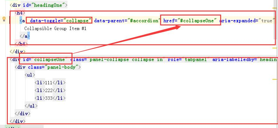
三、菜单 Collapse
1、实例:就是像左侧菜单那样的样式,直接拿来用就可以,还有很多的样式这里步一一列举,在网址看
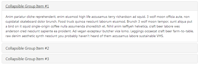
<div class="panel-group" id="accordion" role="tablist" aria-multiselectable="true">
  <div class="panel panel-default">
    <div class="panel-heading" role="tab" id="headingOne">
      <h4 class="panel-title">
        <a role="button" data-toggle="collapse" data-parent="#accordion" href="#collapseOne" aria-expanded="true" aria-controls="collapseOne">
          Collapsible Group Item #1
        </a>
      </h4>
    </div>
    <div id="collapseOne" class="panel-collapse collapse in" role="tabpanel" aria-labelledby="headingOne">
      <div class="panel-body">
        Anim pariatur cliche reprehenderit, enim eiusmod high life accusamus terry richardson ad squid. 3 wolf moon officia aute, non cupidatat skateboard dolor brunch. Food truck quinoa nesciunt laborum eiusmod. Brunch 3 wolf moon tempor, sunt aliqua put a bird on it squid single-origin coffee nulla assumenda shoreditch et. Nihil anim keffiyeh helvetica, craft beer labore wes anderson cred nesciunt sapiente ea proident. Ad vegan excepteur butcher vice lomo. Leggings occaecat craft beer farm-to-table, raw denim aesthetic synth nesciunt you probably haven't heard of them accusamus labore sustainable VHS.
      </div>
    </div>
  </div>
  <div class="panel panel-default">
    <div class="panel-heading" role="tab" id="headingTwo">
      <h4 class="panel-title">
        <a class="collapsed" role="button" data-toggle="collapse" data-parent="#accordion" href="#collapseTwo" aria-expanded="false" aria-controls="collapseTwo">
          Collapsible Group Item #2
        </a>
      </h4>
    </div>
    <div id="collapseTwo" class="panel-collapse collapse" role="tabpanel" aria-labelledby="headingTwo">
      <div class="panel-body">
        Anim pariatur cliche reprehenderit, enim eiusmod high life accusamus terry richardson ad squid. 3 wolf moon officia aute, non cupidatat skateboard dolor brunch. Food truck quinoa nesciunt laborum eiusmod. Brunch 3 wolf moon tempor, sunt aliqua put a bird on it squid single-origin coffee nulla assumenda shoreditch et. Nihil anim keffiyeh helvetica, craft beer labore wes anderson cred nesciunt sapiente ea proident. Ad vegan excepteur butcher vice lomo. Leggings occaecat craft beer farm-to-table, raw denim aesthetic synth nesciunt you probably haven't heard of them accusamus labore sustainable VHS.
      </div>
    </div>
  </div>
  <div class="panel panel-default">
    <div class="panel-heading" role="tab" id="headingThree">
      <h4 class="panel-title">
        <a class="collapsed" role="button" data-toggle="collapse" data-parent="#accordion" href="#collapseThree" aria-expanded="false" aria-controls="collapseThree">
          Collapsible Group Item #3
        </a>
      </h4>
    </div>
    <div id="collapseThree" class="panel-collapse collapse" role="tabpanel" aria-labelledby="headingThree">
      <div class="panel-body">
        Anim pariatur cliche reprehenderit, enim eiusmod high life accusamus terry richardson ad squid. 3 wolf moon officia aute, non cupidatat skateboard dolor brunch. Food truck quinoa nesciunt laborum eiusmod. Brunch 3 wolf moon tempor, sunt aliqua put a bird on it squid single-origin coffee nulla assumenda shoreditch et. Nihil anim keffiyeh helvetica, craft beer labore wes anderson cred nesciunt sapiente ea proident. Ad vegan excepteur butcher vice lomo. Leggings occaecat craft beer farm-to-table, raw denim aesthetic synth nesciunt you probably haven't heard of them accusamus labore sustainable VHS.
      </div>
    </div>
  </div>
</div>
2、用data属性去引用
data-toggle="collapse" href="#collapseOne" href指向的是显示内容的id值
第二部分:一些其它的前端插件
一、FontAwesome字体
网址:::http://fontawesome.io/
》》》图标比较多
显示图标用i 标签 区别于Bootstrap自带图标的span标签
fa fa-开头,fa-2x fa-lg 这是指大小
<i class="fa fa-camera-retro fa-lg"></i>
<i class="fa fa-camera-retro fa-2x"></i>
<i class="fa fa-camera-retro fa-3x"></i>
<i class="fa fa-camera-retro fa-4x"></i>
<i class="fa fa-camera-retro fa-5x"></i>
还有别的效果,有动态图标,还能让图标有重叠的效果
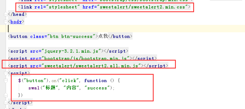
二、SweetAlert系列
》》》》弹出框的种类比较多
网址:::https://limonte.github.io/sweetalert2/
1、基本使用
swal("标题", "内容", "success");
使用SweetAlert在Ajax提交成功(done)或失败(error)时分别提示不用的内容。
function deleteRecord(recordID) {
    swal({
        title: "确定要删除这个产品吗?",
        text: "删除后可就无法恢复了。",
        type: "warning",
        showCancelButton: true,
        closeOnConfirm: false,
        confirmButtonText: "是的,我要删除!",
        confirmButtonColor: "#ec6c62",
        cancelButtonText: "容我三思"
    }, function (isConfirm) {
        if (!isConfirm) return;
        $.ajax({
            type: "post",
            url: "/delete/",
            data: {"id": recordID},
            success: function (data) {
                var d_obj = $.parseJSON(data);
                if (d_obj.code === "success") { //后端删除成功
                    swal("删除成功", d_obj.info, "success");
                    $("#p-" + recordID).remove()  //删除页面中那一行数据
                } else {
                    swal("出错啦。。。", d_obj.info, "error");  //后端删除失败
                }
            },
            error: function () {  // ajax请求失败
                swal("啊哦。。。", "服务器走丢了。。。", "error");
            }
        })
    });
}
三、Toastr
网址::::http://codeseven.github.io/toastr/
可以查看简单示例:::http://codeseven.github.io/toastr/
》》》》》就是可以弹出各种样式的通知栏
toastr["success"]("你已经成功被绿!")
四、jQueryLazyload懒加载
》》》》就是图片的加载效果不一样
<!DOCTYPE html>
<html lang="zh-CN">
<head>
  <meta charset="UTF-8">
  <meta http-equiv="x-ua-compatible" content="IE=edge">
  <meta name="viewport" content="width=device-width, initial-scale=1">
  <title>懒加载示例</title>
</head>
<body>
<div>
  <div><img src="img/0.jpg" alt="" class="lazy" data-original="img/5.jpg" width="600px" height="400px"></div>
  ...
  <div><img src="img/0.jpg" alt="" class="lazy" data-original="img/6.jpg" width="600px" height="400px"></div>
</div>
<script src="https://cdn.bootcss.com/jquery/3.2.1/jquery.min.js"></script>
<script src="jquery.lazyload.min.js"></script>
<script>
  $("img.lazy").lazyload({
    effect: "fadeIn",
    event: "click"
  })
</script>
</body>
</html>


 153
153


 被折叠的 条评论
为什么被折叠?
被折叠的 条评论
为什么被折叠?
 到【灌水乐园】发言


