
ScrollBar parts CSS information
In the above picture there are four main part of ScrollBar .
- increment
- thumb
- track
- decrement
Now in this post we are going to just play with only these four style class and at the right of the image above there are some of the events like hover(focus), pressed(mouse pressed) , horizontal(Horizontal specific ScrollBar CSS class) and vertical (Vertical specific ScrollBar CSS class) .
Firstly we are making one demo Application which contain ListView and one Stylesheet .
| 01 | <?xml version="1.0" encoding="UTF-8"?> |
| 03 | <?import java.lang.*?> |
| 05 | <?import java.util.*?> |
| 06 | <?import javafx.scene.control.*?> |
| 07 | <?import javafx.scene.layout.*?> |
| 08 | <?import javafx.scene.paint.*?> |
| 10 | <AnchorPane id="AnchorPane" maxHeight="-Infinity" maxWidth="-Infinity" minHeight="-Infinity" minWidth="-Infinity" prefHeight="400.0" prefWidth="600.0" xmlns:fx="http://javafx.com/fxml"> |
| 12 | <ListView id="listView1" layoutX="47.0" layoutY="38.0" prefHeight="200.0" prefWidth="200.0"styleClass="mylistview" /> |
| 13 | <ListView id="listView2" layoutX="281.0" layoutY="39.0" orientation="HORIZONTAL" prefHeight="200.0"prefWidth="200.0" styleClass="mylistview" /> |
| 16 | <URL value="file:/C:/style.css" /> |
In above FXML we have created two listview with style class naming mylistview. Now we will be using same style class on all over our stylesheets (style.css) Let’s make the scrollbar like below:
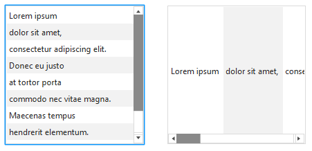
Css file (style.css)
| 03 | -fx-border-color:derive(gray,80%); |
| 06 | /* The main scrollbar CSS class of ListView */ |
| 07 | .mylistview .scroll-bar:horizontal , |
| 08 | .mylistview .scroll-bar:vertical{ |
| 09 | -fx-background-color:transparent; |
| 13 | /* The increment and decrement button CSS class of scrollbar */ |
| 14 | .mylistview .increment-button ,.mylistview .decrement-button { |
| 15 | -fx-background-color:transparent; |
| 16 | -fx-border-color:derive(gray,80%); |
| 19 | /* The main scrollbar **track** CSS class */ |
| 20 | .mylistview .scroll-bar:horizontal .track , |
| 21 | .mylistview .scroll-bar:vertical .track{ |
| 22 | -fx-background-color: transparent; |
| 23 | -fx-border-color:derive(gray,80%); |
| 24 | -fx-background-radius: 0em; |
| 27 | /* The main scrollbar **thumb** CSS class which we drag every time (movable) */ |
| 28 | .mylistview .scroll-bar:horizontal .thumb, |
| 29 | .mylistview .scroll-bar:vertical .thumb { |
| 30 | -fx-background-color:derive(black,90%); |
| 31 | -fx-background-insets: 0, 0, 0; |
| 32 | -fx-background-radius: 0em; |
| 36 | /* ------------------------------------------------------------------------------------- */ |
| 38 | /* ------------------------------------------------------------------------------------- */ |
| 40 | /* The main scrollbar **track** CSS class on event of "hover" and "pressed" */ |
| 42 | .mylistview .scroll-bar:horizontal:hover .track , |
| 43 | .mylistview .scroll-bar:horizontal:pressed .track , |
| 44 | .mylistview .scroll-bar:vertical:hover .track, |
| 45 | .mylistview .scroll-bar:vertical:pressed .track{ |
| 46 | -fx-background-color: derive(#434343,20%); |
| 49 | -fx-background-radius: 0em; |
| 53 | /* The main scrollbar **thumb** CSS class on event of "hover" and "pressed" */ |
| 54 | .mylistview .scroll-bar .thumb:hover, |
| 55 | .mylistview .scroll-bar .thumb:pressed{ |
| 56 | -fx-background-color: derive(black,50%); |
| 59 | .mylistview .increment-button:hover ,.mylistview .decrement-button:hover { |
| 60 | -fx-background-color:derive(gray,100%); |
| 61 | -fx-border-color:derive(gray,80%); |
Here we have used following property:
- -fx-padding: for giving padding space in between the class block
- -fx-border-color: this give the color for the border of the class
- -fx-background-radius: makes the background fill radius
- -fx-background-color: fills the background with the color like red,gree, blue etc.
- -fx-opacity: the opacity of the class between [0.0-1.0]
- -fx-background-inset: it’s the insets spaces of specific class.
Now how would you like if you want your scrollbar little bit wider and bigger than it’s default size (like of below image) . To make them wider you can just add -fx-padding property like as below CSS code.
Just override your existing CSS (style.css) codes with this few lines of codes
| 1 | /* The increment and decrement button CSS class of scrollbar */ |
| 2 | .mylistview .increment-button ,.mylistview .decrement-button { |
| 3 | -fx-background-color:transparent; |
| 4 | -fx-border-color:derive(gray,80%); |
To make the scrollbar little bit small and curvy as well as the arrow button available which is given below can be done by overriding your existing
style.css
with below codes .

| 01 | /* The increment and decrement button CSS class of scrollbar */ |
| 02 | .mylistview .increment-button ,.mylistview .decrement-button { |
| 03 | -fx-background-color:transparent; |
| 04 | -fx-background-radius: 2em; |
| 08 | /* The main scrollbar **track** CSS class */ |
| 09 | .mylistview .scroll-bar:horizontal .track, |
| 10 | .mylistview .scroll-bar:vertical .track{ |
| 11 | -fx-background-color: transparent; |
| 12 | -fx-border-color:derive(gray,80%); |
| 14 | -fx-background-radius: 2em; |
| 15 | -fx-border-radius:2em; |
| 18 | /* The main scrollbar **thumb** CSS class which we drag every time (movable) */ |
| 19 | .mylistview .scroll-bar:horizontal .thumb, |
| 20 | .mylistview .scroll-bar:vertical .thumb { |
| 21 | -fx-background-color:derive(black,90%); |
| 22 | -fx-background-insets: 2, 0, 0; |
| 23 | -fx-background-radius: 2em; |
How about removing all those arrows, buttons of increment and decrement i.e only thumb in scrollbar. To accomplish this logic you need to add CSS codes in existing
style.css.
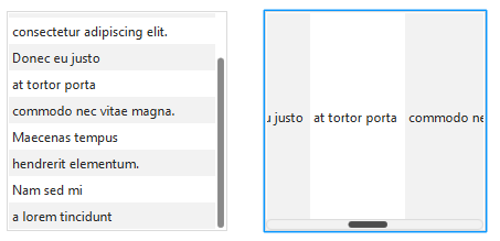
| 01 | /* The main scrollbar **track** CSS class */ |
| 02 | .mylistview .scroll-bar:horizontal .track, |
| 03 | .mylistview .scroll-bar:vertical .track{ |
| 04 | -fx-background-color:transparent; |
| 05 | -fx-border-color:transparent; |
| 06 | -fx-background-radius: 0em; |
| 07 | -fx-border-radius:2em; |
| 10 | /* The increment and decrement button CSS class of scrollbar */ |
| 11 | .mylistview .scroll-bar:horizontal .increment-button , |
| 12 | .mylistview .scroll-bar:horizontal .decrement-button { |
| 13 | -fx-background-color:transparent; |
| 14 | -fx-background-radius: 0em; |
| 19 | /* The increment and decrement button CSS class of scrollbar */ |
| 21 | .mylistview .scroll-bar:vertical .increment-button , |
| 22 | .mylistview .scroll-bar:vertical .decrement-button { |
| 24 | -fx-background-color:transparent; |
| 25 | -fx-background-radius: 0em; |
| 30 | .mylistview .scroll-bar .increment-arrow, |
| 31 | .mylistview .scroll-bar .decrement-arrow, |
| 37 | /* The main scrollbar **thumb** CSS class which we drag every time (movable) */ |
| 38 | .mylistview .scroll-bar:horizontal .thumb, |
| 39 | .mylistview .scroll-bar:vertical .thumb { |
| 40 | -fx-background-color:derive(black,90%); |
| 41 | -fx-background-insets: 2, 0, 0; |
| 42 | -fx-background-radius: 2em; |
Here we are using one more new property of CSS:
- -fx-shape : In this property we can keep the SVG shape code inside a String . CSS can take those SVG path
Other More Stylable ScrollBars
This the another CSS styled Scrollbar where I’ve used my own custom Shapes on scrollbar
thumb
class
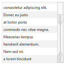
And this final one Listview contains the image in the scrollbar which looks lot more fancier than ever. Also I’ve used the gradient color at the middle of the scrollbar’s thumb. It looks lot more easier to customize as you like.

It’s really amazing to play with CSS there are even more things to do with CSS in javafx. For more information of the CSS reference there is a link given below
All the source codes of the CSS is available in below zip file with screenshots as well.


 451
451


 被折叠的 条评论
为什么被折叠?


