


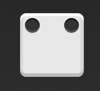
单项目
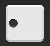
1、首先,只有左上角1个点的情况。Flex布局默认就是首行左对齐,所以一行代码就够了。

.box {
display: flex;
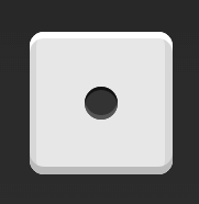
}2、居中对齐。

.box {
  display: flex;
  justify-content: center;
}
3、右对齐

.box {
display: flex;
justify-content: flex-end;
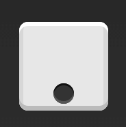
}4、设置交叉轴对齐方式,可以垂直移动主轴。垂直居中
.box {
  display: flex;
  align-items: center;
}
5、完全居中
.box {
  display: flex;
  justify-content: center;
  align-items: center;
}
6、水平居中,垂直居下
.box {
  display: flex;
  justify-content: center;
  align-items: flex-end;
}
7、居右居下
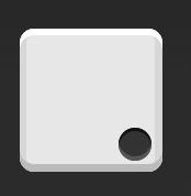
.box {
  display: flex;
  justify-content: flex-end;
  align-items: flex-end;
}
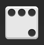
双项目
1、两边分开
.box {
  display: flex;
  justify-content: space-between;
}
2、垂直两边分开
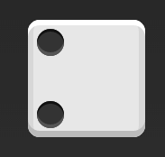
.box {
  display: flex;
  flex-direction: column;
  justify-content: space-between;
}
3、水平居中,垂直两边分开
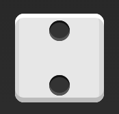
.box {
  display: flex;
  flex-direction: column;
  justify-content: space-between;
  align-items: center;
}
4、居右,垂直两边分开
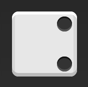
.box {
  display: flex;
  flex-direction: column;
  justify-content: space-between;
  align-items: flex-end;
}
5、斜对角
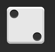
.box {
  display: flex;
  justify-content: space-between;
}

.item:nth-child(2) {
  align-self: flex-end;
}
三项目
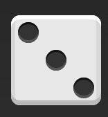
.box {
  display: flex;
}

.item:nth-child(2) {
  align-self: center;
}

.item:nth-child(3) {
  align-self: flex-end;
}
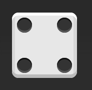
四项目
1、
.box {
  display: flex;
  flex-wrap: wrap;
  justify-content: flex-end;
  align-content: space-between;
}
2、
<div class="box">
  <div class="column">
    <span class="item"></span>
    <span class="item"></span>
  </div>
  <div class="column">
    <span class="item"></span>
    <span class="item"></span>
  </div>
</div>
.box {
display: flex;
flex-wrap: wrap;
align-content: space-between;
}
.column {
flex-basis: 100%;
display: flex;
justify-content: space-between;
}九项目
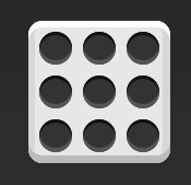
.box {
  display: flex;
  flex-wrap: wrap;
}


 214
214

 被折叠的 条评论
为什么被折叠?
被折叠的 条评论
为什么被折叠?
 到【灌水乐园】发言


