


实现RadioButton由两部分组成,也就是RadioButton和RadioGroup配合使用.RadioGroup是单选组合框,可以容纳多个RadioButton的容器.在没有RadioGroup的情况下,RadioButton可以全部都选中;当多个RadioButton被RadioGroup包含的情况下,RadioButton只可以选择一个。并用setOnCheckedChangeListener来对单选按钮进行监听
RadioGroup相关属性:

RadioGroup.getCheckedRadioButtonId ();--获取选中按钮的id

RadioGroup.clearCheck ();//---清除选中状态

RadioGroup.check (int id);//---通过参入选项id来设置该选项为选中状态如果传递-1作为指定的选择标识符来清除单选按钮组的勾选状态,相当于调用clearCheck()操作

setOnCheckedChangeListener (RadioGroup.OnCheckedChangeListener listener); //--一个当该单选按钮组中的单选按钮勾选状态发生改变时所要调用的回调函数

addView (View child, int index, ViewGroup.LayoutParams params);//---使用指定的布局参数添加一个子视图

//参数 child 所要添加的子视图    index 将要添加子视图的位置  params 所要添加的子视图的布局参数

RadioButton.getText();//获取单选框的值

//此外,RadioButton的checked属性设置为true,代码里调用RadioButton的check(id)方法,不会触发onCheckedChanged事件
RadioButton和RadioGroup的关系:
1、RadioButton表示单个圆形单选框,而RadioGroup是可以容纳多个RadioButton的容器
2、每个RadioGroup中的RadioButton同时只能有一个被选中
3、不同的RadioGroup中的RadioButton互不相干,即如果组A中有一个选中了,组B中依然可以有一个被选中
4、大部分场合下,一个RadioGroup中至少有2个RadioButton
5、大部分场合下,一个RadioGroup中的RadioButton默认会有一个被选中,并建议您将它放在RadioGroup中的起始位置
看案例:
1.定义布局文件:
<?xml version="1.0" encoding="utf-8"?>
<ScrollView xmlns:android="http://schemas.android.com/apk/res/android"
    android:layout_width="match_parent"
    android:layout_height="match_parent" >
 <LinearLayout
        android:orientation="vertical"
        android:layout_width="match_parent"
        android:layout_height="wrap_content"
        android:layout_marginRight="5dp" >

           <TextView
		android:id="@+id/radiogroup_info_id"
		android:layout_width="228px"
		android:layout_height="wrap_content"
		android:text="我选择的是...?"
		android:textSize="30sp"
		 />

          <RadioGroup
            android:id="@+id/radioGroup_sex_id"
            android:layout_width="match_parent"
            android:layout_height="match_parent"
              >
              <RadioButton
                android:id="@+id/boy_id"
                android:layout_width="match_parent"
                android:layout_height="match_parent"
                android:text="Boy"
                  />
              <RadioButton
                android:id="@+id/girl_id"
                android:layout_width="match_parent"
                android:layout_height="match_parent"
                android:text="Girl"
                  />

          </RadioGroup>
          <Button
               android:id="@+id/radio_clear"
               android:layout_width="match_parent"
               android:layout_height="match_parent"
               android:text="清除选中按钮"
              />

          <Button
               android:id="@+id/radio_add_child"
               android:layout_width="match_parent"
               android:layout_height="match_parent"
               android:text="添加单选项"
              />

       </LinearLayout>
 </ScrollView>
2.java代码文件
package com.dream.app.start.first.radiobutton;

import com.dream.app.start.R;
import com.dream.app.start.R.id;
import com.dream.app.start.R.layout;
import com.dream.app.start.three.utils.PublicClass;

import android.app.Activity;
import android.os.Bundle;
import android.view.View;
import android.view.View.OnClickListener;
import android.view.ViewGroup.LayoutParams;
import android.widget.Button;
import android.widget.RadioButton;
import android.widget.RadioGroup;
import android.widget.RadioGroup.OnCheckedChangeListener;
import android.widget.TextView;
import android.widget.ToggleButton;

public class RadioButtonDemo extends PublicClass {
	private  TextView   textView=null;
	private  RadioGroup  radioGroup=null;
	private  RadioButton  radioButton_boy,radioButton_girl;
	private Button   radio_clear,child;
	/* (non-Javadoc)
	 * @see  android.app.Activity#onCreate(android.os.Bundle)
	 */
	@Override
	protected void onCreate(Bundle savedInstanceState) {
		// TODO Auto-generated method stub
		super.onCreate(savedInstanceState);

		setContentView(R.layout.layout_frist_radiobuton);

		textView = (TextView)findViewById(R.id.radiogroup_info_id);

		//radioGroup
		radioGroup=(RadioGroup)findViewById(R.id.radioGroup_sex_id);
		radioButton_boy=(RadioButton)findViewById(R.id.boy_id);
		radioButton_girl=(RadioButton)findViewById(R.id.girl_id);
		child=(Button)findViewById(R.id.radio_add_child);
		//---
		radioGroup.setOnCheckedChangeListener(listen);
		radio_clear=(Button)findViewById(R.id.radio_clear);
		radio_clear.setOnClickListener(onClick);
		child.setOnClickListener(onClick);
	}

	private OnCheckedChangeListener  listen=new OnCheckedChangeListener() {

		@Override
		public void onCheckedChanged(RadioGroup group, int checkedId) {
		int id=	group.getCheckedRadioButtonId();
			switch (group.getCheckedRadioButtonId()) {
			case R.id.girl_id:
				textView.setText("我选择的是:"+radioButton_girl.getText());
				break;
			case R.id.boy_id:
				textView.setText("我选择的是:"+radioButton_boy.getText());
				break;
            default:
            	textView.setText("我选择的是:新增");
				break;
			}

		}
	};
	private OnClickListener  onClick=new OnClickListener() {

		@Override
		public void onClick(View v) {
			radio_clear=(Button)v;
			switch (radio_clear.getId()) {
			case R.id.radio_clear:
				radioGroup.check(-1);//清除选项
//				radioGroup.clearCheck(); //清除选项
				textView.setText("我选择的是...?");
				break;
			case R.id.radio_add_child:
                               //新增子
				RadioButton  newRadio =new RadioButton(getApplicationContext());
				newRadio.setText("新增");
				radioGroup.addView(newRadio, radioGroup.getChildCount());
				break;
				//

           default:
				break;
			}
		}
	};

}
运行效果:


3.

4:可以通过设置如下属性可以使单选按钮在显示文本的右边
android:button="@null"
android:drawableRight="@android:drawable/btn_radio"
效果: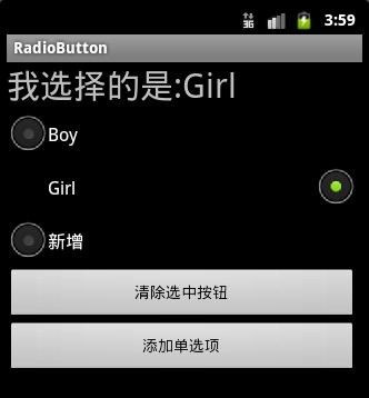
RadioButton和CheckBox的区别:
1、单个RadioButton在选中后,通过点击无法变为未选中
单个CheckBox在选中后,通过点击可以变为未选中
2、一组RadioButton,只能同时选中一个
一组CheckBox,能同时选中多个
3、RadioButton在大部分UI框架中默认都以圆形表示
CheckBox在大部分UI框架中默认都以矩形表示
==================================================
☆定制RadioButton样式
RadioButton长成什么样子是由其Background、Button等属性决定的,Android系统使用style定义了默认的属性,在android源码
android/frameworks/base/core/res/res/values/styles.xml中可以看到默认的定义:
<style name="Widget.CompoundButton.RadioButton">
        <item name="android:background">@android:drawable/btn_radio_label_background</item>
        <item name="android:button">@android:drawable/btn_radio</item>
</style>
即其背景图是btn_radio_label_background,其button的样子是btn_radio
btn_radio_label_background是什么?
其路径是android/frameworks/base/core/res/res/drawable-mdpi/btn_radio_label_background.9.png
可以看到是一个NinePatch图片,用来做背景,可以拉伸填充。
btn_radio是什么?
其路径是android/frameworks/base/core/res/res/drawable/btn_radio.xml
是个xml定义的drawable,打开看其内容:
<selector xmlns:android="http://schemas.android.com/apk/res/android">
    <item android:state_checked="true" android:state_window_focused="false"
          android:drawable="@drawable/btn_radio_on" />
    <item android:state_checked="false" android:state_window_focused="false"
          android:drawable="@drawable/btn_radio_off" />

    <item android:state_checked="true" android:state_pressed="true"
          android:drawable="@drawable/btn_radio_on_pressed" />
    <item android:state_checked="false" android:state_pressed="true"
          android:drawable="@drawable/btn_radio_off_pressed" />

    <item android:state_checked="true" android:state_focused="true"
          android:drawable="@drawable/btn_radio_on_selected" />
    <item android:state_checked="false" android:state_focused="true"
          android:drawable="@drawable/btn_radio_off_selected" />

    <item android:state_checked="false" android:drawable="@drawable/btn_radio_off" />
    <item android:state_checked="true" android:drawable="@drawable/btn_radio_on" />
</selector>
<item android:state_checked="true" android:state_pressed="true"
android:drawable="@drawable/btn_radio_on_pressed" />
意思即为当radiobutton被选中时,并且被按下时,其Button应该长成btn_radio_on_pressed这个样子。

文件是android/frameworks/base/core/res/res/drawable-mdpi/btn_radio_on_pressed.png
drawable的item中可以有以下属性:
android:drawable="@[package:]drawable/drawable_resource"
android:state_pressed=["true" | "false"]
android:state_focused=["true" | "false"]
android:state_selected=["true" | "false"]
android:state_active=["true" | "false"]
android:state_checkable=["true" | "false"]
android:state_checked=["true" | "false"]
android:state_enabled=["true" | "false"]
android:state_window_focused=["true" | "false"]
当按钮的状态和某个item匹配后,就会使用此item定义的drawable作为按钮图片。
从上面分析我们如果要修改RadioButton的外观,
自定义有三种方式:
1.方式一:
<?xml version="1.0" encoding="utf-8"?>
<selector xmlns:android="http://schemas.android.com/apk/res/android">
<!-- 未选中->
    <item
         android:state_checked="false"
         android:drawable="@drawable/tabswitcher_long" />
<!--选中->
    <item
        android:state_checked="true"
        android:drawable="@drawable/tabswitcher_short" />
</selector>
在布局文件中使用
<RadioGroup
  ...
>
<RadioButton
  ...
android:button="@null"
android:background="@drawable/radio"
/>
</RadioGroup>
android:button="@null" 去除RadioButton前面的圆点
2.方式二:在JAVA代码中定义
@Override
public boolean onTouchEvent(MotionEvent event) {
  if(event.getActionMasked() == MotionEvent.ACTION_DOWN){
    this.setBackgroundResource(com.wxg.tab.R.drawable.main_bg);
  }else if(event.getActionMasked()== MotionEvent.ACTION_DOWN) {
    this.setBackgroundResource(com.wxg.tab.R.drawable.hui);
  }
  return super.onTouchEvent(event);
}
去除RadioButton前面的圆点adioButton.setButtonDrawable(android.R.color.transparent);
3. 方式三
使用XML文件定义,在JAVA代码中使用 radioButton.setBackgroundResource(R.drawable.radio);调用
==============================================================
设置RadioButton在文字的右边
<RadioButton
            android:id="@+id/button2"
            android:layout_width="fill_parent"
            android:layout_height="50dip"
            android:button="@null"
            android:drawableRight="@android:drawable/btn_radio"  //在右边
            android:paddingLeft="30dip"
            android:text="Android高手"
            android:textSize="20dip" />
================================================================
自定义 radiobutton 文字颜色随选中状态而改变
<?xml version="1.0" encoding="utf-8"?>
<selector xmlns:android="http://schemas.android.com/apk/res/android">

     <item android:state_checked="true"
     android:color="@color/color_text_selected"/>
     <!-- not selected -->
     <item android:color="@color/color_text_normal"/>
</selector>
布局文件定义控件:
<RadioButton
            android:id="@+id/radiobutton_1"
            android:layout_width="wrap_content"
            android:layout_height="wrap_content"
            android:background="@drawable/selector_radio"
            android:button="@null"
            android:checked="true"
             android:gravity="center"
             android:text="目录"
            <!--自定义文本颜色  -->
            android:textColor="@color/color_radiobutton"
            android:textSize="@dimen/font_size"
            android:textStyle="bold" />
使用XML文件很简单就可以实现,但是有时必须要使用java code 的方式动态实现,这就有些复杂了,这需要继承RadioButton并覆盖其中的onDraw方法。
在代码中的image是Bitmap对象。
@Override

protected void onDraw(Canvas canvas) {

  super.onDraw(canvas);

   if(image!=null){

    Paint pt = new Paint();

    pt.setARGB(255,66,66,66);

    //消除锯齿

    pt.setAntiAlias(true);

    //居中显示图片

    int imageX=(int)(this.getWidth()-image.getWidth())/2;

    canvas.drawBitmap(image,imageX,5,pt);

    pt.setARGB(255,255,255,255);

    //居中显示字符串

    int strX=(int)(this.getWidth()-name.getBytes().length*5.5)/2;

    canvas.drawText(name,strX,(image.getHeight()+15),pt);
    }
 }


 2516
2516

 被折叠的 条评论
为什么被折叠?
被折叠的 条评论
为什么被折叠?
 到【灌水乐园】发言


