


<!DOCTYPE html>
<html lang="en">
<head>
<meta charset="UTF-8">
<title>模板</title>
<style>
body, ul, li, dl, dt, dd, h1, h2, h3, h4, h5 {
margin: 0;
padding: 0;
}
body {
font-weight:bold;">#F7F7F7;
}
.wrapper {
width: 1000px;
margin: 0 auto;
padding: 20px;
box-sizing: border-box;
}
header {
padding: 20px 0;
margin-bottom: 20px;
text-align: center;
}
header h3 {
line-height: 1;
font-weight: normal;
font-size: 28px;
}
.main {
/*overflow: hidden;*/
}
.main:after {
content: '';
clear: both;
display: block;
}
.main .item {
width: 210px;
height: 210px;
margin: 0 30px 30px 0;
display: flex;
position: relative;
font-weight:bold;">#FFF;
float: left;
box-shadow: 2px 2px 5px #CCC;
}
.main .item:after {
content: attr(data-brief);
display: block;
width: 100%;
height: 100%;
text-align: center;
line-height: 210px;
position: absolute;
top: 0;
left: 0;
color: #FFF;
font-family: '微软雅黑';
font-size: 18px;
font-weight:bold;">rgba(170, 170, 170, 0);
z-index: -1;
transition: all 0.3s ease-in;
}
.main .item:hover:after {
font-weight:bold;">rgba(170, 170, 170, 0.6);
z-index: 100;
}
.main .item:nth-child(4n) {
margin-right: 0;
}
/*.main .item:nth-last-child(-n+5) {
margin-bottom: 0;
}*/
/* 以上是骨架样式 */
.border-radius {
width: 180px;
height: 180px;
border: 1px solid #ff4da5;
margin: auto;
}
/* 整圆 */
.item:nth-child(1) .border-radius {
border-radius: 90px;
}
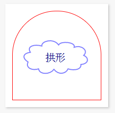
/* 拱形 */
.item:nth-child(2) .border-radius {
border-radius: 90px 90px 0 0;
}
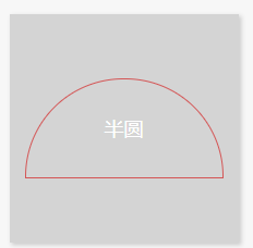
      /* 半圆 */
      .item:nth-child(3) .border-radius {
         height: 90px;
         border-radius: 90px 90px 0 0;
      }
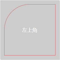
      /* 左上角 */
      .item:nth-child(4) .border-radius {
         border-radius: 90px 0 0 0;
      }
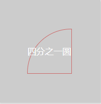
      /* 四分之一圆 */
      .item:nth-child(5) .border-radius {
         width: 90px;
         height: 90px;
         border-radius: 90px 0 0 0;
      }
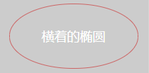
      /* 横着的椭圆 */
      .item:nth-child(6) .border-radius {
         height: 90px;
         border-radius: 90px / 45px;
      }
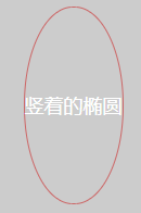
      /* 竖着的椭圆 */
      .item:nth-child(7) .border-radius {
         width: 90px;
         border-radius: 45px / 90px;
      }
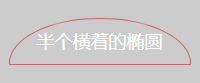
      /* 横着的半椭圆 */
      .item:nth-child(8) .border-radius {
         height: 45px;
         border-radius: 90px 90px 0 0 / 45px 45px 0 0;
      }
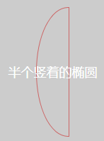
      /* 竖着的半椭圆 */
      .item:nth-child(9) .border-radius {
         width: 45px;
         border-radius: 45px 0 0 45px / 90px 0 0 90px;
      }
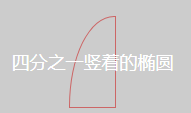
      /* 四分之一竖着的半椭圆 */
      .item:nth-child(10) .border-radius {
         width: 45px;
         height: 90px;
         border-radius: 45px 0 0 0 / 90px 0 0 0;
      }
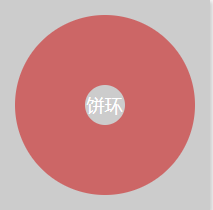
      /* 饼环 */
      .item:nth-child(11) .border-radius {
         width: 70px;
         height: 70px;
         border-width: 55px;
         border-radius: 90px;
      }
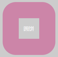
      /* 圆饼 */
      .item:nth-child(12) .border-radius {
         width: 70px;
         height: 70px;
         border-width: 55px;
         border-radius: 45px;
      }
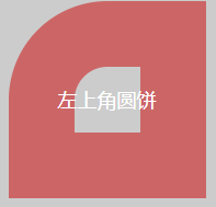
      /* 左上角圆饼 */
      .item:nth-child(13) .border-radius {
         width: 70px;
         height: 70px;
         border-width: 55px;
         border-radius: 90px 0 0 0;
      }
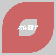
      /* 对角圆饼 */
      .item:nth-child(14) .border-radius {
         width: 70px;
         height: 70px;
         border-width: 55px;
         border-radius: 90px 0 90px 0;
      }
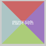
      /* 四边不同色 */
      .item:nth-child(15) .border-radius {
         width: 0;
         height: 0;
         border-width: 90px;
         border-color: red blueviolet greenyellow paleturquoise;
      }
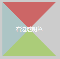
      /* 右边透明色 */
      .item:nth-child(16) .border-radius {
         width: 0;
         height: 0;
         border-width: 90px;
         border-color: red blueviolet greenyellow paleturquoise;
         border-right-color: transparent;
      }
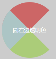
      /* 圆右透明色 */
      .item:nth-child(17) .border-radius {
         width: 0;
         height: 0;
         border-width: 90px;
         border-color: red blueviolet greenyellow paleturquoise;
         border-right-color: transparent;
         border-radius: 90px;
      }
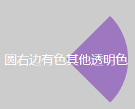
      /* 圆右有色其他透明色 */
      .item:nth-child(18) .border-radius {
         width: 0;
         height: 0;
         border-width: 90px;
         border-color: transparent;
         border-right-color: blueviolet;
         border-radius: 90px;
      }
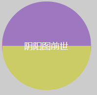
      /* 阴阳图前世 */
      .item:nth-child(19) .border-radius {
         width: 180px;
         height: 0;
         border-top-width: 90px;
         border-bottom-width: 90px;
         border-top-color: blueviolet;
         border-bottom-color: yellow;
         border-radius: 90px;
      }
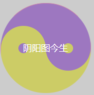
      /* 阴阳图今生 */
      .item:nth-child(20) .border-radius {
         width: 180px;
         height: 90px;
         border-bottom-width: 90px;
         border-bottom-color: yellow;
         font-weight:bold;">blueviolet;
         border-radius: 90px;
         position: relative;
      }
      .item:nth-child(20) .border-radius::after,
      .item:nth-child(20) .border-radius::before {
         content: '';
         position: absolute;
         top: 50%;
         width: 20px;
         height: 20px;
         /*margin: -10px 0 0 0;*/
         border-width: 35px;
         border-style: solid;
         /*border-radius: 45px;*/
         border-radius: 45px;
      }

      /*左阴阳*/
      .item:nth-child(20) .border-radius::after {
         font-weight:bold;">blueviolet;
         border-color: yellow;
      }
      /*右阴阳*/
      .item:nth-child(20) .border-radius::before {
         font-weight:bold;">yellow;
         border-color: blueviolet;
         right: 0;
      }
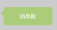
      /* 消息框 */
      .item:nth-child(21) .border-radius {
         width: 160px;
         height: 60px;
         border-color: greenyellow;
         font-weight:bold;">greenyellow;
         border-radius: 10px;
         position: relative;
      }
      .item:nth-child(21) .border-radius::before {
         content: '';
         width: 0px;
         height: 0px;
         border-width: 10px;
         border-style: solid;
         border-color: transparent;
         border-right-color: greenyellow;
         top: 10px;
         left: -20px;
         position: absolute;
      }
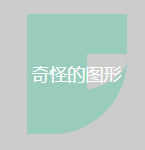
      /* 奇怪的图形 */
      .item:nth-child(22) .border-radius {
         width: 40px;
         height: 40px;
         border-width: 40px 0 40px 60px;
         border-style: solid;
         border-color: aquamarine;
         border-radius: 0 0 75px 0;
      }
      /* qq消息框 */
      .item:nth-child(23) .border-radius {
         width: 160px;
         height: 60px;
         border-color: greenyellow;
         font-weight:bold;">greenyellow;
         border-radius: 10px;
         position: relative;
      }
      .item:nth-child(23) .border-radius::after {
         content: '';
         width: 30px;
         height: 30px;
         border-width: 0 0 30px 30px;
         border-style: solid;
         border-color: transparent;
         border-bottom-color: greenyellow;
         border-radius: 0 0 75px 0;
         position: absolute;
         top: -10px;
         right: -20px;
      }
   </style>
</head>
<body>
   <div class="wrapper">
      <header>
         <h3>模板</h3>
      </header>
      <div class="main">
         <div class="item" data-brief="整圆">
            <div class="border-radius"></div>
         </div>
         <div class="item" data-brief="拱形">
            <div class="border-radius"></div>
         </div>
         <div class="item" data-brief="半圆">
            <div class="border-radius"></div>
         </div>
         <div class="item" data-brief="左上角">
            <div class="border-radius"></div>
         </div>
         <div class="item" data-brief="四分之一圆">
            <div class="border-radius"></div>
         </div>
         <div class="item" data-brief="横着的椭圆">
            <div class="border-radius"></div>
         </div>
         <div class="item" data-brief="竖着的椭圆">
            <div class="border-radius"></div>
         </div>
         <div class="item" data-brief="横着的半椭圆">
            <div class="border-radius"></div>
         </div>
         <div class="item" data-brief="竖着的半椭圆">
            <div class="border-radius"></div>
         </div>
         <div class="item" data-brief="四分之一竖着的椭圆">
            <div class="border-radius"></div>
         </div>
         <div class="item" data-brief="饼环">
            <div class="border-radius"></div>
         </div>
         <div class="item" data-brief="圆饼">
            <div class="border-radius"></div>
         </div>
         <div class="item" data-brief="左上角圆饼">
            <div class="border-radius"></div>
         </div>
         <div class="item" data-brief="对角圆饼">
            <div class="border-radius"></div>
         </div>
         <div class="item" data-brief="四边不同色">
            <div class="border-radius"></div>
         </div>
         <div class="item" data-brief="右边透明色">
            <div class="border-radius"></div>
         </div>
         <div class="item" data-brief="圆右边透明色">
            <div class="border-radius"></div>
         </div>
         <div class="item" data-brief="圆右边有色其他透明色">
            <div class="border-radius"></div>
         </div>
         <div class="item" data-brief="阴阳图前世">
            <div class="border-radius"></div>
         </div>
         <div class="item" data-brief="阴阳图今生">
            <div class="border-radius"></div>
         </div>
         <div class="item" data-brief="消息框">
            <div class="border-radius"></div>
         </div>
         <div class="item" data-brief="奇怪的图形">
            <div class="border-radius"></div>
         </div>
         <div class="item" data-brief="qq消息框">
            <div class="border-radius"></div>
         </div>
      </div>
   </div>
</body>
</html>


 271
271


 被折叠的 条评论
为什么被折叠?
被折叠的 条评论
为什么被折叠?
 到【灌水乐园】发言


