


在学习DatePicker控件时,我们发现网上有好多不同版本的界面。如下图所示:
Android4.0以前的版本显示的效果图:

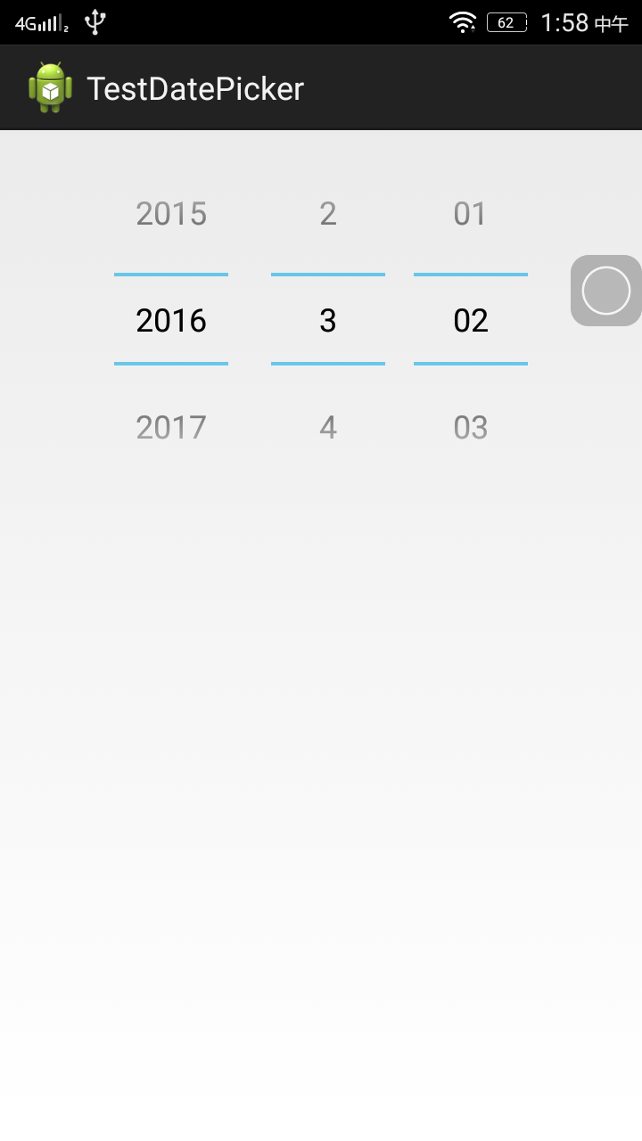
Android4.0版本以后的显示效果:

为此有的码友希望能够显示以前的效果,那么有两种解决方法:
第一种解决方法是修改主题,但是主题修改后会影响整个应用的主题,所以建议使用第二种方法。
第二种解决方法为:修改布局或通过代码修改。但是要求是必须支持的最小版本是API11。
修改布局的方法:只需要加上一句android:calendarViewShown="false",即可。
<RelativeLayout xmlns:android="http://schemas.android.com/apk/res/android"
    xmlns:tools="http://schemas.android.com/tools"
    android:layout_width="match_parent"
    android:layout_height="match_parent"
    tools:context=".MainActivity" >

    <DatePicker
        android:id="@+id/datePicker"
        android:layout_width="wrap_content"
        android:layout_height="wrap_content"
        android:calendarViewShown="false" />

</RelativeLayout>
通过代码修改:datePicker.setCalendarViewShown(false);
public class MainActivity extends Activity {

	@Override
	protected void onCreate(Bundle savedInstanceState) {
		super.onCreate(savedInstanceState);
		setContentView(R.layout.activity_main);
		DatePicker datePicker = (DatePicker) (findViewById(R.id.datePicker));
		datePicker.setCalendarViewShown(false);
	}
}
最后呈现上最后的效果图,是不是很满意!
深度阅读:
setCalendarViewShown那么setCalendarViewShown()这个方法的意思是什么?
意思是:
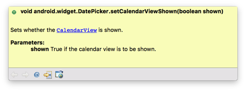
1. 【Sets whether the CalendarView is shown】否显示CalendarView控件。
备注:CalendarView是在API11之后才出现的日历控件。
2. 【Note: Calling this method has no effect when the DatePicker_datePickerMode attribute is set to calendar.】当calendar被DatePicker_datePickerMode属性设置的时候,调用这个方法是无效的。
3. 【shown true to show the calendar view,false to hide it】当shown为true时显示日历控件,当shown为false时隐藏日历控件。
源码深度学习:
DatePicker控件定义源码:
  private static final int MODE_SPINNER = 1;
  private static final int MODE_CALENDAR = 2; ①

  private final DatePickerDelegate mDelegate;
public DatePicker(Context context, AttributeSet attrs, int defStyleAttr, int defStyleRes) {
super(context, attrs, defStyleAttr, defStyleRes);
final TypedArray a = context.obtainStyledAttributes(attrs, R.styleable.DatePicker,
defStyleAttr, defStyleRes);
final int mode = a.getInt(R.styleable.DatePicker_datePickerMode, MODE_SPINNER); ②
final int firstDayOfWeek = a.getInt(R.styleable.DatePicker_firstDayOfWeek, 0);
a.recycle();
switch (mode) {
case MODE_CALENDAR:③
mDelegate = createCalendarUIDelegate(context, attrs, defStyleAttr, defStyleRes);
break;
case MODE_SPINNER:④
default:
mDelegate = createSpinnerUIDelegate(context, attrs, defStyleAttr, defStyleRes);
break;
}
if (firstDayOfWeek != 0) {
setFirstDayOfWeek(firstDayOfWeek);
}
}从源码可以看出DatePicke有两种风格:①MODE_CALENDAR和MODE_SPINNER,②如果不设置风格的话,默认风格为MODE_SPINNER风格。③如果是MODE_CALENDAR风格的画则调用createCalendarUIDelegate方法,④否则调用createSpinnerUIDelegate方法。
创建CalendarUI源码分析:
private DatePickerDelegate createCalendarUIDelegate(Context context, AttributeSet attrs,
            int defStyleAttr, int defStyleRes) {
        return new DatePickerCalendarDelegate(this, context, attrs, defStyleAttr,
                defStyleRes);
}
创建SpinnerUI源码分析:
  private DatePickerDelegate createSpinnerUIDelegate(Context context, AttributeSet attrs,
            int defStyleAttr, int defStyleRes) {
        return new DatePickerSpinnerDelegate(this, context, attrs, defStyleAttr, defStyleRes);
  }
final TypedArray attributesArray = context.obtainStyledAttributes(attrs,
                    R.styleable.DatePicker, defStyleAttr, defStyleRes);
boolean spinnersShown = attributesArray.getBoolean(R.styleable.DatePicker_spinnersShown,
                    DEFAULT_SPINNERS_SHOWN);
boolean calendarViewShown = attributesArray.getBoolean(
                    R.styleable.DatePicker_calendarViewShown, DEFAULT_CALENDAR_VIEW_SHOWN);
int startYear = attributesArray.getInt(R.styleable.DatePicker_startYear,DEFAULT_START_YEAR);
int endYear = attributesArray.getInt(R.styleable.DatePicker_endYear, DEFAULT_END_YEAR);
String minDate = attributesArray.getString(R.styleable.DatePicker_minDate);
String maxDate = attributesArray.getString(R.styleable.DatePicker_maxDate);
int layoutResourceId = attributesArray.getResourceId(
                    R.styleable.DatePicker_legacyLayout, R.layout.date_picker_legacy);
attributesArray.recycle();
通过源码可以看出,默认spinner和calendarView都是显示的。
DatePicker的属性定义源码:
<declare-styleable name="DatePicker">
        <!-- The first year (inclusive), for example "1940".
             {@deprecated Use minDate instead.} -->
        <attr name="startYear" format="integer" />
        <!-- The last year (inclusive), for example "2010".
             {@deprecated Use maxDate instead.} -->
        <attr name="endYear" format="integer" />
        <!-- Whether the spinners are shown. -->
        <attr name="spinnersShown" format="boolean" />
        <!-- Whether the calendar view is shown. -->
        <attr name="calendarViewShown" format="boolean" />
        <!-- The minimal date shown by this calendar view in mm/dd/yyyy format. -->
        <attr name="minDate" format="string" />
        <!-- The maximal date shown by this calendar view in mm/dd/yyyy format. -->
        <attr name="maxDate" format="string" />
        <!-- The first day of week according to {@link java.util.Calendar}. -->
        <attr name="firstDayOfWeek" />
        <!-- @hide The layout of the date picker. -->
        <attr name="internalLayout" format="reference"  />
        <!-- @hide The layout of the legacy DatePicker. -->
        <attr name="legacyLayout" />
        <!-- The background color for the date selector 's day of week. -->
        <attr name="dayOfWeekBackground" format="color|reference" />
        <!-- The text color for the date selector's day of week. -->
        <attr name="dayOfWeekTextAppearance" format="reference" />
        <!-- The month's text appearance in the date selector. -->
        <attr name="headerMonthTextAppearance" format="reference" />
        <!-- The day of month's text appearance in the date selector. -->
        <attr name="headerDayOfMonthTextAppearance" format="reference" />
        <!-- The year's text appearance in the date selector. -->
        <attr name="headerYearTextAppearance" format="reference" />
        <!-- The background for the date selector. -->
        <attr name="headerBackground" />
        <!-- @hide The selected text color for the date selector. Used as a
             backup if the text appearance does not explicitly have a color
             set for the selected state. -->
        <attr name="headerSelectedTextColor" />
        <!-- The list year's text appearance in the list. -->
        <attr name="yearListItemTextAppearance" format="reference" />
        <!-- The list year's selected circle color in the list. -->
        <attr name="yearListSelectorColor" format="color" />
        <!-- The text color list of the calendar. -->
        <attr name="calendarTextColor" format="color" />
        <!-- @hide The selected text color for the calendar. Used as a backup
             if the text color does not explicitly have a color set for the
             selected state. -->
        <attr name="calendarSelectedTextColor" format="color" />
        <!-- Defines the look of the widget. Prior to the L release, the only choice was
             spinner. As of L, with the Material theme selected, the default layout is calendar,
             but this attribute can be used to force spinner to be used instead. -->
        <attr name="datePickerMode">
            <!-- Date picker with spinner controls to select the date. -->
            <enum name="spinner" value="1" />
            <!-- Date picker with calendar to select the date. -->
            <enum name="calendar" value="2" />
        </attr>
</declare-styleable>
同样的查看源码还有以下方法:
        @Override
        public CalendarView getCalendarView() {
            return mCalendarView;
        }

        @Override
        public void setCalendarViewShown(boolean shown) {
            mCalendarView.setVisibility(shown ? VISIBLE : GONE);
        }

        @Override
        public boolean getCalendarViewShown() {
            return (mCalendarView.getVisibility() == View.VISIBLE);
        }

        @Override
        public void setSpinnersShown(boolean shown) {
            mSpinners.setVisibility(shown ? VISIBLE : GONE);
        }

        @Override
        public boolean getSpinnersShown() {
            return mSpinners.isShown();
        }


 扫一扫
扫一扫
 5510
5510

 被折叠的 条评论
为什么被折叠?
被折叠的 条评论
为什么被折叠?
 到【灌水乐园】发言


