


在Android中偶尔会用到开关,Switch就是一个简单易使用的不错的控件。
首先,在布局中添加上Switch控件:
android:id="@+id/s_v"
android:layout_width="wrap_content"
android:layout_height="wrap_content"
android:switchMinWidth="20dp"
android:textOn="on"
android:textOff="off"
android:thumb="@drawable/thumb"
android:track="@drawable/track" />
以下是该控件的常用属性:
textOn:控件打开时显示的文字
textOff:控件关闭时显示的文字
thumb:控件开关的图片
track:控件开关的轨迹图片
typeface:设置字体类型
switchMinWidth:开关最小宽度
switchPadding:设置开关 与文字的空白距离
switchTextAppearance:设置文本的风格
checked:设置初始选中状态
splitTrack:是否设置一个间隙,让滑块与底部图片分隔(API 21及以上)
showText:设置是否显示开关上的文字(API 21及以上)
我们一般不会用该控件原本的样式,那么我们就需要自己修改样式了:
gray_thumb.xml:
android:shape="rectangle" >
android:endColor="#ffffff"
android:startColor="#ffffff" />
android:color="#9e9e9e"/>
green_thumb.xml:
android:shape="rectangle" >
android:endColor="#ffffff"
android:startColor="#ffffff" />
android:color="#33da33"/>
gray_track.xml:
android:shape="rectangle" >
android:endColor="#9e9e9e"
android:startColor="#9e9e9e" />
green_track.xml:
android:endColor="#33da33"
android:startColor="#33da33" />
thumb.xml:
track.xml:
在styles.xml中添加如下style:
#33da33
#9b9b9b
最后,只需要将控件实例化出来进行相应操作就可以了:
MainActivity.class:
public class MainActivity extends Activity{
@Override
protected void onCreate(Bundle savedInstanceState) {
super.onCreate(savedInstanceState);
setContentView(R.layout.activity_main);
final Switch aSwitch = (Switch) findViewById(R.id.s_v);
aSwitch.setChecked(false);
aSwitch.setSwitchTextAppearance(MainActivity.this,R.style.x1);
aSwitch.setOnCheckedChangeListener(new CompoundButton.OnCheckedChangeListener() {
@Override
public void onCheckedChanged(CompoundButton compoundButton, boolean b) {
//控制开关字体颜色
if (b) {
aSwitch.setSwitchTextAppearance(MainActivity.this,R.style.s_true);
}else {
aSwitch.setSwitchTextAppearance(MainActivity.this,R.style.x1);
}
}
});
}
}
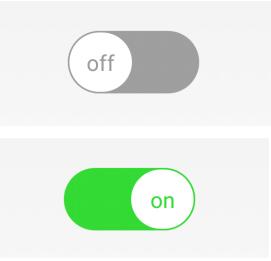
最终效果如下图:
以上就是本文的全部内容,希望对大家的学习有所帮助,也希望大家多多支持脚本之家。


 1万+
1万+


 被折叠的 条评论
为什么被折叠?
被折叠的 条评论
为什么被折叠?
 到【灌水乐园】发言


