


Android最常用的布局应该是LinearLayout(线性布局)和RelativeLayout(相对布局)了,相对布局可以非常灵活地将控件进行定位。但我的经验是,在控件之间不存在叠加、错位的情况下,使用LinearLayout往往更便于UI后续的修改。下面是一种很常见的表单的视图:
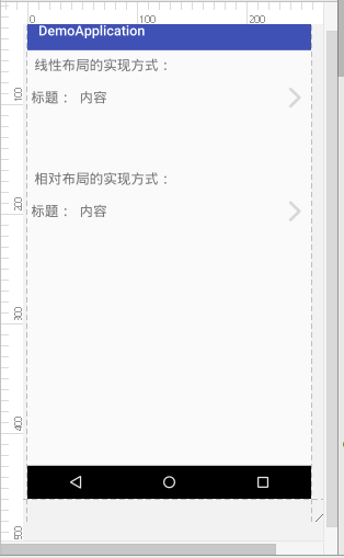
主要对红框部分的样式进行编写。可以看到分为“标题图片”、“具体内容”、“箭头图片”三部分。我们可以用两种方式对其进行实现。
<?xml version="1.0" encoding="utf-8"?>
<LinearLayout xmlns:android="http://schemas.android.com/apk/res/android"
    xmlns:tools="http://schemas.android.com/tools"
    android:id="@+id/activity_example"
    android:layout_width="match_parent"
    android:layout_height="match_parent"
    android:orientation="vertical"
    tools:context="example.chumi.demoapplication.ExampleActivity">
    <TextView
        android:layout_width="wrap_content"
        android:layout_height="wrap_content"
        android:text="线性布局的实现方式:"
        android:textSize="20sp"
        android:padding="10dp"/>
    <LinearLayout
        android:layout_width="match_parent"
        android:layout_height="50dp"
        android:orientation="horizontal">
        <TextView
            android:layout_width="wrap_content"
            android:layout_height="match_parent"
            android:gravity="center_vertical"
            android:padding="5dp"
            android:text="标题:"
            android:textSize="20sp"/>
        <TextView
            android:layout_width="0dp"
            android:layout_height="match_parent"
            android:layout_weight="1"
            android:text="内容"
            android:padding="5dp"
            android:textSize="20sp"
            android:gravity="center_vertical"/>
        <ImageView
            android:layout_width="wrap_content"
            android:layout_height="match_parent"
            android:gravity="center_vertical"
            android:src="@mipmap/goforward"
            android:scaleType="fitCenter"
            android:padding="10dp"/>
    </LinearLayout>
    <TextView
        android:layout_width="wrap_content"
        android:layout_height="wrap_content"
        android:text="\n\n\n相对布局的实现方式:"
        android:textSize="20sp"
        android:padding="10dp"/>
    <RelativeLayout
        android:layout_width="wrap_content"
        android:layout_height="50dp"
        android:orientation="horizontal">
        <TextView
            android:layout_width="wrap_content"
            android:layout_height="match_parent"
            android:gravity="center_vertical"
            android:padding="5dp"
            android:text="标题:"
            android:textSize="20sp"
            android:id="@+id/txt_title"/>
        <TextView
            android:layout_width="wrap_content"
            android:layout_height="match_parent"
            android:text="内容"
            android:padding="5dp"
            android:textSize="20sp"
            android:gravity="center_vertical"
            android:layout_toRightOf="@id/txt_title"
            android:layout_toEndOf="@id/txt_title"/>
        <ImageView
            android:layout_width="wrap_content"
            android:layout_height="wrap_content"
            android:gravity="center_vertical"
            android:src="@mipmap/goforward"
            android:scaleType="fitCenter"
            android:padding="10dp"
            android:layout_alignParentEnd="true"
            android:layout_alignParentRight="true" />
    </RelativeLayout>

</LinearLayout>
效果图如下:
可以看到效果几乎一样,我们可以使用Android 2.2的新功能查看两种布局的结构:
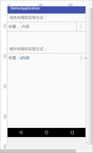
可以看到,相对布局中内容需要相对标题进行位置设置,这时需要为标题设置id,这样一来就比较繁琐。而使用线性布局来设计时,最大的问题是箭头图片如何靠右,这个问题我们可以利用线性布局子控件的weight属性,将空余空间用显示内容的控件填充满,箭头就自然被挤到最后面了。
另外,在需要拓展视图时(例如在标题和内容间增加控件、在内容和箭头间增加控件),线性布局所需要做出的修改要比相对布局少一些;当内容过长时,线性布局可以简单设置单行显示就可以了,而相对布局中仅设置单行显示的话,内容的文字还有可能与箭头重叠。
总而言之,我觉得能使用简单的线性布局x


 2559
2559


 被折叠的 条评论
为什么被折叠?
被折叠的 条评论
为什么被折叠?
 到【灌水乐园】发言


