


=== 折线图 - 头文件 ===
解决:
1、中文显示问题
2、图像行内外显示
3、处理闪退问题
import matplotlib.pyplot as plt
import numpy as np
import pandas as pd

# 解决中文显示问题
import matplotlib as mpl
mpl.rcParams['font.sans-serif'] = ['SimHei']
mpl.rcParams['axes.unicode_minus'] = False
# 使用自己的字体 - 定义字体
songTi = mpl.font_manager.FontProperties(fname='C:\Windows\Fonts\STHUPO.TTF')

# inline 在行内显示
# plt.show() 在行内显示
%matplotlib inline

# tk 在图形化界面显示,但是有可能会出现闪退的问题
# 解决方法 plt.ion() plt.pause(10) plt.close()
#%matplotlib tk
=== 正常显示和闪退处理 ===
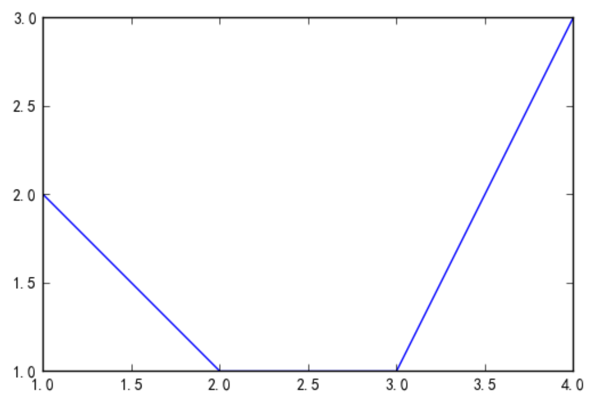
# plot([x轴坐标,y轴左边])
plt.plot([1,2,3,4],[2,1,1,3])

# 正常显示
plt.show()

# 解决闪退
#plt.ion()
# 10秒后自动关闭
#plt.pause(10)
#plt.close()
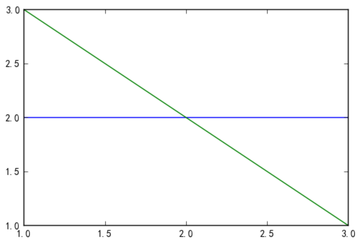
=== figure 图形(画板) ===
plt.figure()
plt.plot([1,2,3],[2,2,2])

# 新创建画板后,绘图会在新画板中显示
#plt.figure()
plt.plot([1,2,3],[3,2,1])
=== 绘图属性 1 ===
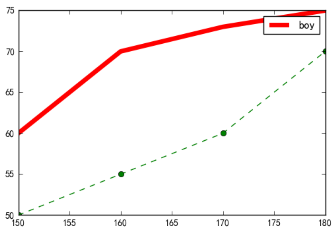
# 绘制男女身高和体重的关系图 np.array
plt.figure()
boy_tall = np.array([150,160,170,180])
boy_weight = np.array([60,70,73,75])

girl_tall = np.array([150,160,170,180])
girl_weight = np.array([50,55,60,70])
1、color
========== ========
character color
========== ========
'b' blue
'g' green
'r' red
'c' cyan
'm' magenta
'y' yellow
'k' black
'w' white
========== ========
2、linewidth宽度
3、linestyle线类型 marker标记点
================ ===============================
character description
================ ==============================='-' solid line style'--' dashed line style'-.' dash-dot line style':' dotted line style'.' point marker',' pixel marker'o' circle marker'v' triangle_down marker'^' triangle_up marker'<' triangle_left marker'>' triangle_right marker'1' tri_down marker'2' tri_up marker'3' tri_left marker'4' tri_right marker's' square marker'p' pentagon marker'*' star marker'h' hexagon1 marker'H' hexagon2 marker'+' plus marker'x' x marker'D' diamond marker'd' thin_diamond marker'|' vline marker'_' hline marker
================ ===============================
4、makersize 标记点大小
5、label 图例,用lplt.legend()显示
# 绘图参数 color linewidth宽度 linestyle线类型
# marker标记点 makersize 标记点大小
# label 图例 - 这一条线段表示什么 要用lplt.legend()显示
plt.plot(boy_tall,boy_weight,color='red',linewidth=5,label='boy')
plt.plot(girl_tall,girl_weight,color='green',linestyle='--',marker='o')

# 显示图例 即label
plt.legend()
plt.show()
=== 绘图属性 2 ===
1、简写:颜色b 线条 -. 标记o
2、设置标题 xlabel、ylabel
3、设置x轴、y轴范围 xlim、ylim
4、图例修改位置
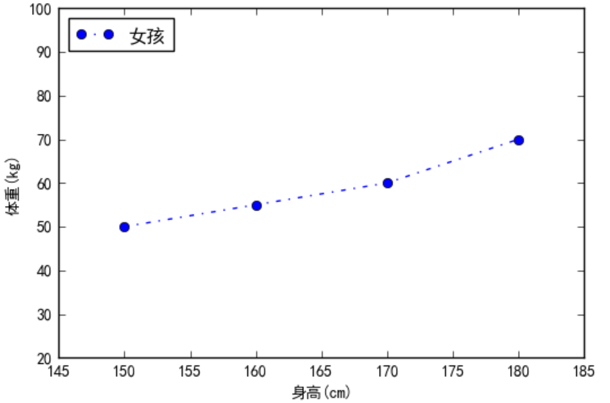
plt.plot(girl_tall,girl_weight,'b-.o',label='女孩')
# 设置标题
plt.xlabel('身高(cm)')
plt.ylabel('体重(kg)')

# 设置x轴、y轴范围
plt.xlim(145,185)
plt.ylim(20,100)

# 图例修改位置 upper lower left right
plt.legend(loc ='upper left') #左上角
plt.show()
=== Web安全色 ===
如果使用编码设定颜色,颜色可以从该网址上查阅
http://www.bootcss.com/p/websafecolors/
=== 绘图属性 3 ===
1、刻度控制
2、大标题
3、改变字体
4、背景色
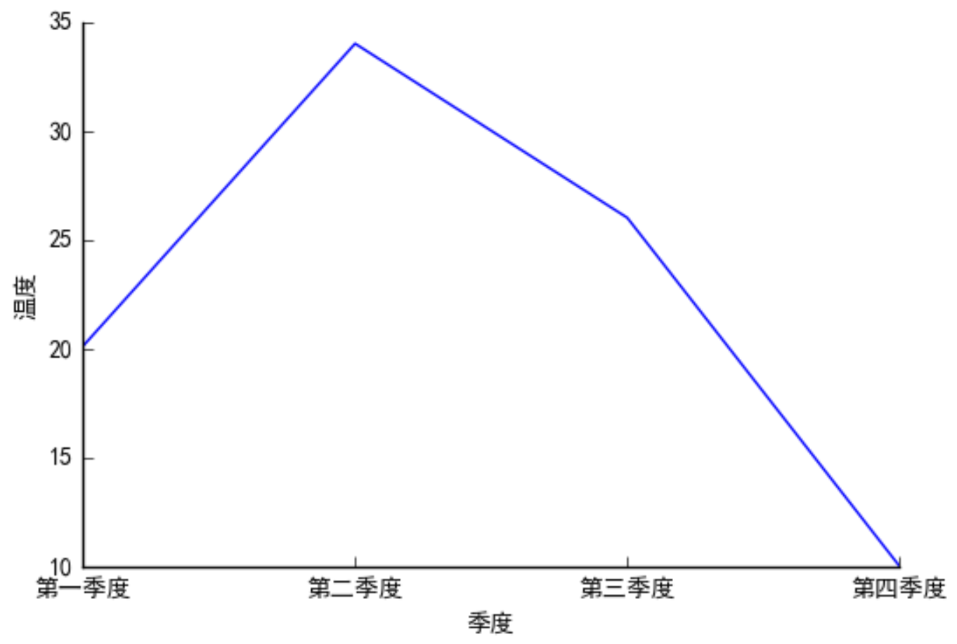
# 一年内每个季度的平均温度
# plt.figure(facecolor='red') #背景色
tem = np.array([20.1,34,26,10]) # 温度
quarter = np.arange(1,5) # 季度
plt.xlabel('季度')
plt.ylabel('温度')

# 直接画图会出现季度坐标会出现小数刻度
# xticks 控制刻度
# plt.xticks(quarter) # 小数点消失
plt.xticks(quarter,['第一季度','第二季度','第三季度','第四季度'])

# 大标题 - 改变字体 fontproperties
plt.title('季度的温度表',fontproperties=songTi)
plt.plot(quarter,tem)

=== 坐标轴与刻度可见度 ===
# 一年内每个季度的平均温度
tem = np.array([20.1,34,26,10]) # 温度
quarter = np.arange(1,5) # 季度
plt.xlabel('季度')
plt.ylabel('温度')
plt.xticks(quarter,['第一季度','第二季度','第三季度','第四季度'])
ax = plt.gca() #获取坐标轴
去除坐标轴 方法一
ax.spines['right'].set_color("none")
ax.spines['top'].set_color("none")
刻度只留左边 方法二
ax.spines['top'].set_visible(False)
ax.spines['right'].set_visible(False)
ax.spines['bottom'].set_visible(False)
ax.spines['left'].set_visible(False)
x轴 刻度只留底部
y轴 刻度只留左边
ax.xaxis.set_ticks_position('bottom')
ax.yaxis.set_ticks_position('left')
plt.plot(quarter,tem)
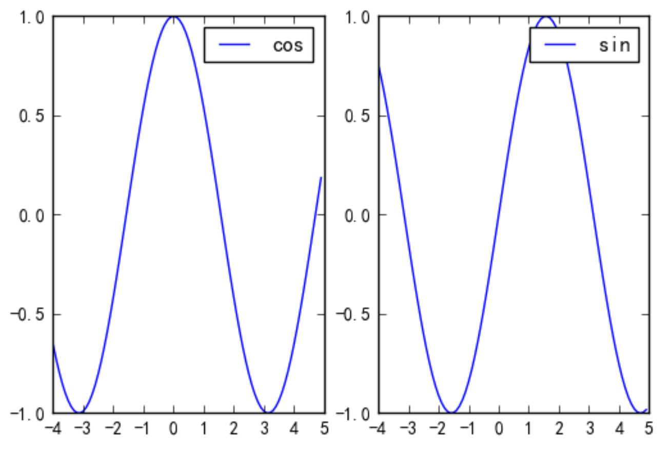
=== subplot 子图 ===
在一个画板上画多个子图
1、直接设置子图
plt.figure()
# 成-4,5步长为0.1的数组
x = np.arange(-4,5,0.1)

# subplot(1,2,1):画在1行,2列,第1个位置
plt.subplot(1,2,1)
plt.plot(x,np.cos(x),label='cos')
plt.legend()

# subplot(1,2,2): 画在1行,2列,第2个位置
plt.subplot(1,2,2)
plt.plot(x,np.sin(x),label='sin')
plt.legend()

plt.show()
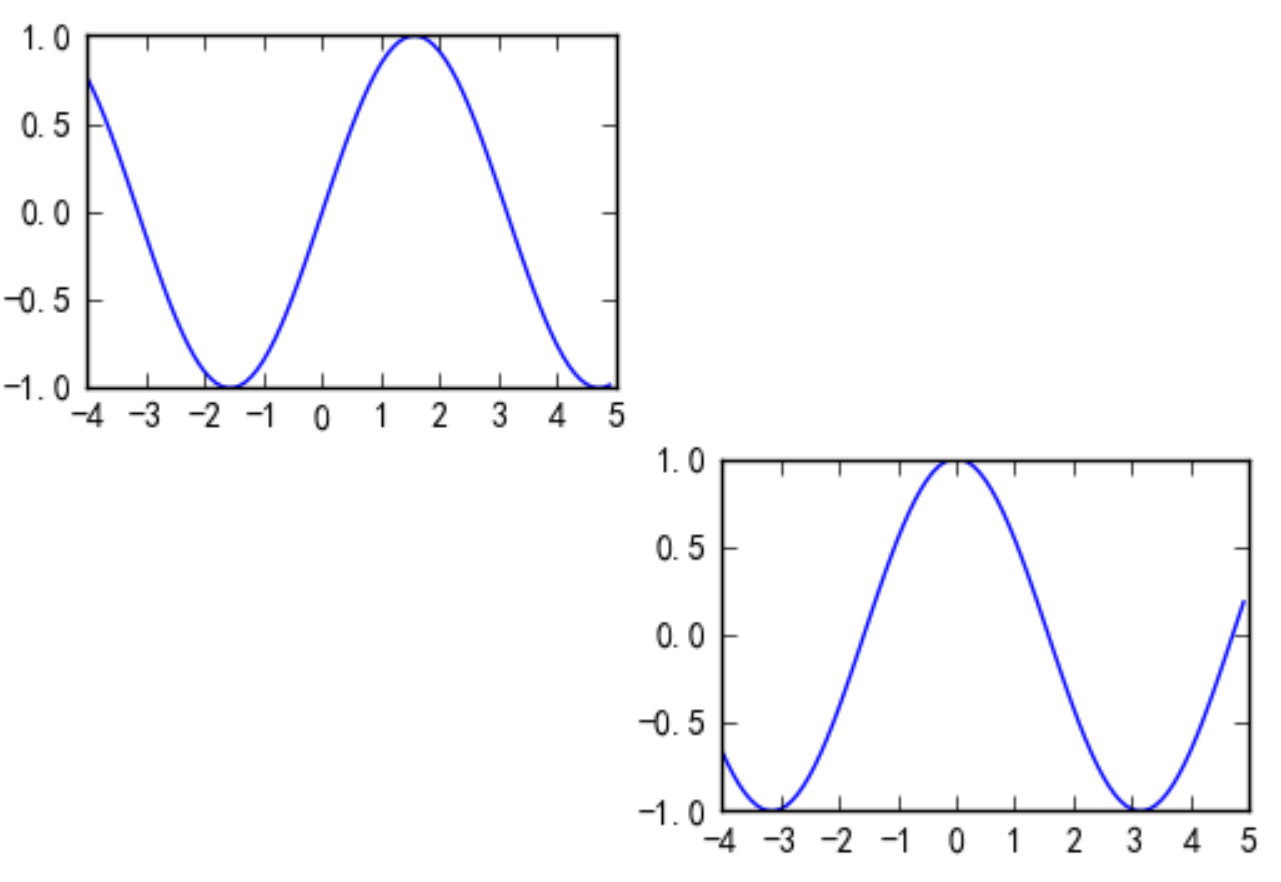
2、面向对象写法来创建子图
fig=plt.figure()
# 成-4,5步长为0.1的数组
x=np.arange(-4,5,0.1)
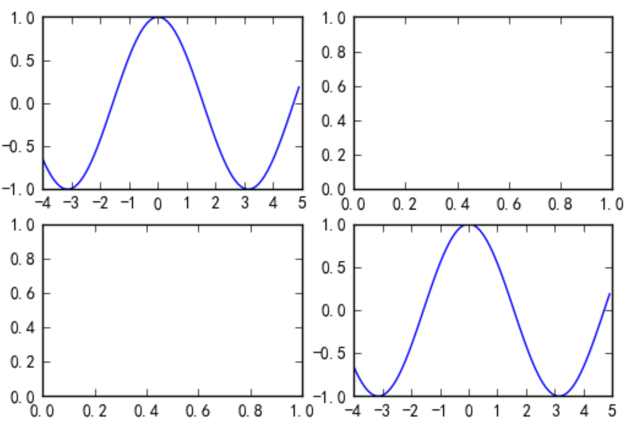
分别返回两个画布进行绘制ax1 ax2
fig=plt.figure()
ax1=fig.add_subplot(221)
ax2=fig.add_subplot(224)
ax1.plot(x,np.sin(x))
ax2.plot(x,np.cos(x))
3、先设置好图,再绘制
返回:一维数组
fig,ax = plt.subplots(4,1)
ax[0].plot(x,np.cos(x))
ax[2].plot(x,np.cos(x))
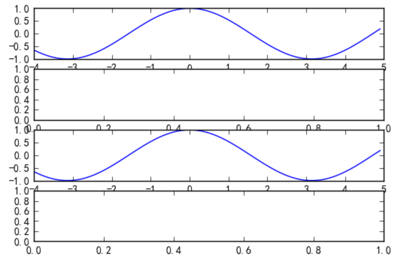
返回:二维数组
fig,ax = plt.subplots(2,2)
ax[0][0].plot(x,np.cos(x))
ax[1][1].plot(x,np.cos(x))
思考: 使用subplot返回的ax维度为何会有变化?
(4行1列) 一维 目字型
(2行2列) 二维 田字形
=== 保存画板 ===
plt.savefig('a.png')


 被折叠的 条评论
为什么被折叠?
被折叠的 条评论
为什么被折叠?
 到【灌水乐园】发言


