


1.transition属性:
transition-duration: transition效果需要指定多少秒或毫秒才能完成
transition-timing-function: 指定transition效果的转速曲线
transition-delay: 定义transition效果开始的时候
例子:
div
{
    width:100px;
    height:100px;
    background:red;
    transition:transform 1s ease 1s;
    -webkit-transition:transform 2s ease 1s;
}

div:hover
{
    transform:translate(200px, 0px);
}
当鼠标移在div上,1s延迟后,div向右以ease方式,在2s内,移动200px。
还有transition属性的分解写法:
<style>
div
{
    width:100px;
    height:100px;
    background:red;
    transition-property:width;
    transition-duration:2s;
    transition-delay:2s;
    transition-timing-function: ease;

/* Safari/Chrome */
-webkit-transition-property:width;
-webkit-transition-duration:2s;
-webkit-transition-delay:2s;
-webkit-transition-timing-function: ease;
}

div:hover
{
    width:300px;
}
</style>
注意:
该属性不兼容IE9以及更早版本的浏览器;
该过度效果开始前会停顿2s;
| 值 | 描述 |
|---|---|
| linear | 规定以相同速度开始至结束的过渡效果(等于 cubic-bezier(0,0,1,1))。 |
| ease | 规定慢速开始,然后变快,然后慢速结束的过渡效果(cubic-bezier(0.25,0.1,0.25,1))。 |
| ease-in | 规定以慢速开始的过渡效果(等于 cubic-bezier(0.42,0,1,1))。 |
| ease-out | 规定以慢速结束的过渡效果(等于 cubic-bezier(0,0,0.58,1))。 |
| ease-in-out | 规定以慢速开始和结束的过渡效果(等于 cubic-bezier(0.42,0,0.58,1))。 |
| cubic-bezier(n,n,n,n) | 在 cubic-bezier 函数中定义自己的值。可能的值是 0 至 1 之间的数值。 |
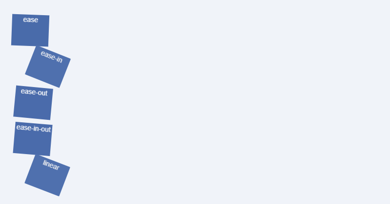
关于这几个速度的例子,看下面:
<!doctype html>
<html>
<head>
<meta charset="utf-8">
<title>transaction</title>
<link rel="stylesheet" type="text/css" href="bootstrap/bootstrap.min.css">
<style type="text/css">
.trans_box {
    padding: 20px;
    background-color: #f0f3f9;
    width: 800px;
}
.trans_list {
    width: 10%;
    height: 64px;
    margin:10px 0;
    background-color:#486AAA;
    color:#fff;
    text-align:center;
}
.ease {
    -webkit-transition: all 4s ease;
    -moz-transition: all 4s ease;
    -o-transition: all 4s ease;
    transition: all 4s ease;
}
.ease_in {
    -webkit-transition: all 4s ease-in;
    -moz-transition: all 4s ease-in;
    -o-transition: all 4s ease-in;
    transition: all 4s ease-in;
}
.ease_out {
    -webkit-transition: all 4s ease-out;
    -moz-transition: all 4s ease-out;
    -o-transition: all 4s ease-out;
    transition: all 4s ease-out;
}
.ease_in_out {
    -webkit-transition: all 4s ease-in-out;
    -moz-transition: all 4s ease-in-out;
    -o-transition: all 4s ease-in-out;
    transition: all 4s ease-in-out;
}
.linear {
    -webkit-transition: all 4s linear;
    -moz-transition: all 4s linear;
    -o-transition: all 4s linear;
    transition: all 4s linear;
}
.trans_box:hover .trans_list{
    margin-left: 89%;
    background-color: #beceeb;
    color: #333;
    -webkit-border-radius: 25px;
    -moz-border-radius: 25px;
    -o-border-radius: 25px;
    border-radius: 25px;
    -webkit-transform: rotate(360deg);
    -moz-transform: rotate(360deg);
    -o-transform: rotate(360deg);
    transform: rotate(360deg);
}

</style>
</head>
<body>
<div id="transBox" class="trans_box">
    <div class="trans_list ease">ease</div>
    <div class="trans_list ease_in">ease-in</div>
    <div class="trans_list ease_out">ease-out</div>
    <div class="trans_list ease_in_out">ease-in-out</div>
    <div class="trans_list linear">linear</div>
</div>

</body>
<script src="jquery/jquery.min.js"></script>
<script src="bootstrap/bootstrap.min.js"></script>
<script type="text/javascript">

</script>
</html>
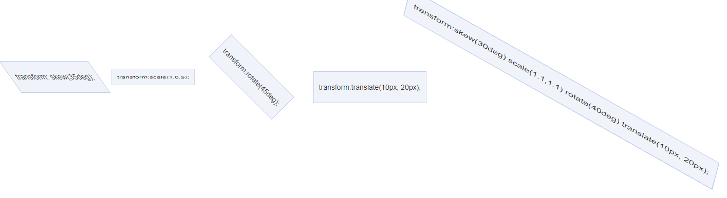
<!doctype html>
<html>
<head>
<meta charset="utf-8">
<title>transform</title>
<link rel="stylesheet" type="text/css" href="bootstrap/bootstrap.min.css">
<style type="text/css">
.demo {
    padding: 10px;
    margin-top: 100px;
}
.trans_box {
    display: inline-block;
    margin: 10px;
    padding: 20px 10px;
    border: 1px solid #beceeb;
    background-color: #f0f3f9;
}
.trans_skew {
    -moz-transform: skew(35deg);
    -webkit-transform: skew(35deg);
    -o-transform: skew(35deg);
    transform: skew(35deg);
}
.trans_scale {
    -moz-transform: scale(1,0.5);
    -webkit-transform: scale(1,0.5);
    -o-transform: scale(1,0.5);
    transform: scale(1,0.5);
}
.trans_rotate {
    -moz-transform: rotate(45deg);
    -webkit-transform: rotate(45deg);
    -o-transform: rotate(45deg);
    transform: rotate(45deg);
}
.trans_translate {
    -moz-transform: translate(10px, 20px);
    -webkit-transform: translate(10px, 20px);
    -o-transform: translate(10px, 20px);
    transform: translate(10px, 20px);
}
.trans_rotate_skew_scale_translate {
    -moz-transform: skew(30deg) scale(1.1,1.1) rotate(40deg) translate(10px, 20px);
    -webkit-transform: skew(30deg) scale(1.1,1.1) rotate(40deg) translate(10px, 20px);
    -o-transform: skew(30deg) scale(1.1,1.1) rotate(40deg) translate(10px, 20px);
    transform: skew(30deg) scale(1.1,1.1) rotate(40deg) translate(10px, 20px);
}
</style>
</head>
<body>
<div class="demo">
    <span class="trans_box trans_skew">transform: skew(35deg);</span>
    <span class="trans_box trans_scale">transform:scale(1,0.5);</span>
    <span class="trans_box trans_rotate">transform:rotate(45deg);</span>
    <span class="trans_box trans_translate">transform:translate(10px, 20px);</span>
    <span class="trans_box trans_rotate_skew_scale_translate">transform:skew(30deg) scale(1.1,1.1) rotate(40deg) translate(10px, 20px);</span>
</div>

</body>
<script src="jquery/jquery.min.js"></script>
<script src="bootstrap/bootstrap.min.js"></script>
<script type="text/javascript">

</script>
</html>
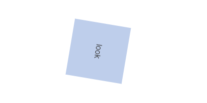
<!doctype html>
<html>
<head>
<meta charset="utf-8">
<title>transform</title>
<link rel="stylesheet" type="text/css" href="bootstrap/bootstrap.min.css">
<style type="text/css">
.demo {
    padding: 10px;
    margin-top: 100px;
}
.trans_effect {
    display: block;
    line-height: 100px;
    width: 100px;
    background: #beceeb;
    margin: 30px auto;
    text-align: center;
    -webkit-transition: all 2s ease-in-out;
    -moz-transition: all 2s ease-in-out;
    -o-transition: all 2s ease-in-out;
    -ms-transition: all 2s ease-in-out;
    transition: transform 2s ease-in-out;
}
.trans_effect:hover {
    -webkit-transform: rotate(720deg) scale(2,2);
    -moz-transform: rotate(720deg) scale(2,2);
    -o-transform: rotate(720deg) scale(2,2);
    -ms-transform: rotate(720deg) scale(2,2);
    transform: rotate(720deg) scale(2,2);
}
</style>
</head>
<body>
<div class="demo">
    <div class="trans_effect">look</div>
</body>
<script src="jquery/jquery.min.js"></script>
<script src="bootstrap/bootstrap.min.js"></script>
<script type="text/javascript">

</script>
</html>
三、animation
- animation-name
- animation-duration
- animation-timing-function
- animation-delay
- animation-iteration-count
- animation-direction
animation: name duration timing-function delay iteration-count direction;
animation-name: 规定需要绑定到选择器的 keyframe 名称。
animation-duration: 规定完成动画所花费的时间,以秒或毫秒计。
animation-timing-function: 规定动画的速度曲线。
animation-delay: 规定在动画开始之前的延迟。
animation-iteration-count: 规定动画应该播放的次数。
animation-direction: 规定是否应该轮流反向播放动画。
CSS3 @keyframes 规则
浏览器支持情况:
Internet Explorer 10、Firefox 以及 Opera 支持 @keyframes 规则和 animation 属性。
Chrome 和 Safari 需要前缀 -webkit-。
注释:Internet Explorer 9,以及更早的版本,不支持 @keyframe 规则或 animation 属性。
下面的表格列出了 @keyframes 规则和所有动画属性:
| 属性 | 描述 | CSS |
|---|---|---|
| @keyframes | 规定动画。 | 3 |
| animation | 所有动画属性的简写属性,除了 animation-play-state 属性。 | 3 |
| animation-name | 规定 @keyframes 动画的名称。 | 3 |
| animation-duration | 规定动画完成一个周期所花费的秒或毫秒。默认是 0。 | 3 |
| animation-timing-function | 规定动画的速度曲线。默认是 "ease"。 | 3 |
| animation-delay | 规定动画何时开始。默认是 0。 | 3 |
| animation-iteration-count | 规定动画被播放的次数。默认是 1。 infinite 无限; | 3 |
| animation-direction | 规定动画是否在下一周期逆向地播放。默认是 "normal"。
alternate 反向播放;
| 3 |
| animation-play-state | 规定动画是否正在运行或暂停。默认是 "running"。 | 3 |
| animation-fill-mode | 规定对象动画时间之外的状态。 | 3 |
下面是例子使用:
<!doctype html>
<html>
<head>
<meta charset="utf-8">
<title>transform</title>
<link rel="stylesheet" type="text/css" href="bootstrap/bootstrap.min.css">
<style type="text/css">
.demo {
    padding: 10px;
    margin-top: 100px;
}
#animated_div {
    width: 80px;
    height: 60px;
    background: #92B901;
    color: #ffffff;
    position: relative;
    font-weight: bold;
    font-size: 12px;
    padding: 20px 10px 0px 10px;
    animation: animated_div 5s infinite alternate;
    -moz-animation: animated_div 5s infinite alternate;
    -webkit-animation: animated_div 5s infinite alternate;
    -o-animation: animated_div 5s infinite alternate;
    border-radius: 5px;
    -webkit-border-radius: 5px;
}
@keyframes animated_div{
    0% {transform: rotate(0deg);left: 0px;}
    25% {transform: rotate(20deg);left: 0px;}
    50% {transform: rotate(0deg);left: 500px;}
    55% {transform: rotate(0deg);left: 500px;}
    70% {transform: rotate(0deg);left: 500px;background: #1ec7e6;}
    100% {transform: rotate(-360deg);left: 0px;}
}
@-moz-keyframes animated_div{        /* Firefox */
    0% {transform: rotate(0deg);left: 0px;}
    25% {transform: rotate(20deg);left: 0px;}
    50% {transform: rotate(0deg);left: 500px;}
    55% {transform: rotate(0deg);left: 500px;}
    70% {transform: rotate(0deg);left: 500px;background: #1ec7e6;}
    100% {transform: rotate(-360deg);left: 0px;}
}
@-webkit-keyframes animated_div{        /* Safari and Chrome */
    0% {transform: rotate(0deg);left: 0px;}
    25% {transform: rotate(20deg);left: 0px;}
    50% {transform: rotate(0deg);left: 500px;}
    55% {transform: rotate(0deg);left: 500px;}
    70% {transform: rotate(0deg);left: 500px;background: #1ec7e6;}
    100% {transform: rotate(-360deg);left: 0px;}
}
@-o-keyframes animated_div{            /* Opera */
    0% {transform: rotate(0deg);left: 0px;}
    25% {transform: rotate(20deg);left: 0px;}
    50% {transform: rotate(0deg);left: 500px;}
    55% {transform: rotate(0deg);left: 500px;}
    70% {transform: rotate(0deg);left: 500px;background: #1ec7e6;}
    100% {transform: rotate(-360deg);left: 0px;}
}
</style>
</head>
<body>
<div class="demo">
   <p id="animated_div">CSS3 动画</p>
</div>

</body>
<script src="jquery/jquery.min.js"></script>
<script src="bootstrap/bootstrap.min.js"></script>
<script type="text/javascript">

</script>
</html>

=====================================下面是例子 有些是摘抄的================================================
例子1:头像照片发光:
animations不仅适用于CSS2中的属性,CSS3也是支持的,例如box-shadow盒阴影效果,所以,我们可以实现外发光效果的。使用过web qq的人应该有印象,当鼠标移到聊天对象脑袋上的时候会有蓝色外发光的动画,但是那是gif动画图片实现的(现在自动跳转到web qq 2.0已看不到效果)。但是gif的重用性有限而且制作破费功夫,如果简单几行CSS代码就可以实现高性能高扩展的效果岂不更加,现在animations就可以搞定这一些。
例子:
<!doctype html>
<html>
<head>
<meta charset="utf-8">
<title>照片外发光动画demo</title>
<link rel="stylesheet" type="text/css" href="bootstrap/bootstrap.min.css">
<style type="text/css">
.demo {
    padding: 10px;
    margin: 100px 0 0 100px;
}
.anim_image {
    padding: 3px;
    border: 1px solid #beceeb;
    background-color: white;
    -moz-box-shadow: 0 0 8px rgba(72, 106, 170, 0.5);
    -webkit-box-shadow: 0 0 8px rgba(72, 106, 170, 0.5);
    box-shadow: 0 0 8px rgba(72, 106, 170, 0.5);
}
.anim_image:hover {
    background-color: #f0f3f9;
    -webkit-animation-name: glow;
    -webkit-animation-duration: 1s;
    -webkit-animation-iteration-count: infinite;
    -webkit-animation-direction: alternate;
    -webkit-animation-timing-function: ease-in-out;
}
@-webkit-keyframes glow {
    0% {
        -webkit-box-shadow: 0 0 12px rgba(72, 106, 170, 0.5);
        border-color: rgba(160, 179, 214, 0.5);
    }
    100% {
        -webkit-box-shadow: 0 0 12px rgba(72, 106, 170, 1.0), 0 0 18px rgba(0, 140, 255, 1.0);
        border-color: rgba(160, 179, 214, 1.0);
    }
}
</style>
</head>
<body>
<div class="demo">
   <img class="anim_image" src="images/head14.jpg">
</div>

</body>
<script src="jquery/jquery.min.js"></script>
<script src="bootstrap/bootstrap.min.js"></script>
<script type="text/javascript">

</script>
</html>

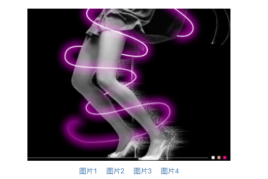
例子2:图片轮转缩放显示动画demo
下面这个实例是与图片位置,比例尺寸挂钩的,聪明的你是不是想到了transform属性呢。对的,transform+tranisition,双剑合璧,天下无敌。下面这个效果是很酷很酷的,以前基本上只能在Flash中可以看到。
<!doctype html>
<html>
<head>
<meta charset="utf-8">
<title>图片轮转缩放显示动画demo</title>
<link rel="stylesheet" type="text/css" href="bootstrap/bootstrap.min.css">
<style type="text/css">
.demo {
    padding: 10px;
    margin: 100px 0 0 100px;
}
.anim_box {
    width: 200px;
    cursor: pointer;
}
.anim_image {
    -webkit-transition: all 1s ease-in-out;
    -moz-transition: all 1s ease-in-out;
    -o-transition: all 1s ease-in-out;
    transition: all 1s ease-in-out;
    cursor:pointer;
}
.anim_image_top {
    position: absolute;
    -webkit-transform: scale(0, 0);
    opacity: 0;
    filter: Alpha(opacity=0);
}
.anim_box:hover .anim_image_top{
    opacity: 1;
    filter: Alpha(opacity=100);
    -webkit-transform: scale(1, 1);
    -webkit-transform-origin: top right;
}
.anim_box:hover .anim_image_bottom{
    -webkit-transform: scale(0, 0);
    -webkit-transform-origin: bottom left;
}
</style>
</head>
<body>
<div class="demo">
   <div id="testBox" class="demo anim_box">
        <img class="anim_image anim_image_top" src="images/ps6.jpg">
        <img class="anim_image anim_image_bottom" src="images/ps4.jpg">
    </div>
</div>

</body>
<script src="jquery/jquery.min.js"></script>
<script src="bootstrap/bootstrap.min.js"></script>
<script type="text/javascript">

</script>
</html>

transform-origin: x-axis y-axis z-axis;
- left
- center
- right
- length
- %
- top
- center
- bottom
- length
- %
- length
例子3:选项卡切换
我们平时的选项卡切换基本上都是很生硬的,直接啪啪啪,切换过来了,没有点过渡啊什么的(毕竟写JavaScript动画成本较高),现在,有了transitions,实现过渡效果就是几行CSS代码的事情,不多说了,直接上实例。
<!doctype html>
<html>
<head>
<meta charset="utf-8">
<title>平滑选项卡切换demo</title>
<link rel="stylesheet" type="text/css" href="bootstrap/bootstrap.min.css">
<style type="text/css">
.demo {
    padding: 10px;
    margin: 100px 0 0 100px;
}
.trans_image_box {
    width: 1600px;
    height: 300px;
    -webkit-transition: all 1s ease-in-out;
    -moz-transition: all 1s ease-in-out;
    -o-transition: all 1s ease-in-out;
    transition: all 1s ease-in-out;
}
.trans_box {
    width: 400px;
    margin: 20px;
    overflow: hidden;
}
.trans_image {
    width: 400px;
    float: left;
}
.trans_image_trigger {
    padding-top: 10px;
    text-align: center;
}
</style>
</head>
<body>
<div class="demo">

        <div class="trans_box">
            <div id="transImageBox" class="trans_image_box">
                <img class="trans_image" src="images/ps1.jpg">
                <img class="trans_image" src="images/ps2.jpg">
                <img class="trans_image" src="images/ps3.jpg">
                <img class="trans_image" src="images/ps4.jpg">
            </div>
            <div id="transImageTrigger" class="trans_image_trigger">
                <a href="#1">图片1</a>
                <a href="#2">图片2</a>
                <a href="#3">图片3</a>
                <a href="#4">图片4</a>
            </div>
        </div>

</div>
</body>
<script src="jquery/jquery.min.js"></script>
<script src="bootstrap/bootstrap.min.js"></script>
<script type="text/javascript">
(function() {
    var $ = function(id) {
        return document.getElementById(id);
    };
    var oBox = $("transImageBox"),
        oTrigger = $("transImageTrigger").getElementsByTagName("a"),
        lTrigger = oTrigger.length;

    if (oBox && lTrigger) {
        for (var i = 0; i<lTrigger; i+=1) {
            oTrigger[i].onclick = function() {
                var index = Number(this.href.replace(/.*#/g, "")) || 1;
                oBox.style.marginLeft = (1 - index) * 400 + "px";
                return false;
            };
        }
    }
})();
</script>
</html>
CSS其作用的就是那个值以all开头的transition属性;
这里点击控制transImageBox的margin-left,而由于transition对all都有效果,所以改变margin-left也是有动画效果的;
只要是CSS值变换的,只要是额外有transition属性设置的,都是平滑效果,都是动画。
-------------


 64
64


 被折叠的 条评论
为什么被折叠?
被折叠的 条评论
为什么被折叠?
 到【灌水乐园】发言


