


————————————————————————————
| 本文链接:http://my.oschina.net/lifj/blog/153569 |
| (防止盗链) |
————————————————————————————
网上讲自定义SeekBar的文章很多,这里摘抄一段比较详细的文章
(原链接:http://www.android100.org/html/201306/13/3110.html)
案例使用的图片如下:


1.在res/drawable目录下新增一个xml风格文件,seekbar_define_style.xml
<?xml version="1.0" encoding="utf-8"?>
<layer-list
	xmlns:android="http://schemas.android.com/apk/res/android">
	<!-- 未选中 -->
	<item
		android:id="@android:id/background"
		android:drawable="@drawable/hou"/>
	<!-- 中 -->
	<item
		android:id="@android:id/progress"
		android:drawable="@drawable/qian"/>
	<item
		android:id="@android:id/secondaryProgress"
		android:drawable="@drawable/qian"/>
</layer-list>
2.在res/drawable下定义个seekbar_thumb.xml文件
<?xml version="1.0" encoding="utf-8"?>
<selector xmlns:android="http://schemas.android.com/apk/res/android">

    <!-- 按下状态-->
    <item
        android:state_focused="true"
        android:state_pressed="true"
        android:drawable="@drawable/ic_launcher" />
    <!-- 普通无焦点状态 -拖动按钮-->
    <item
        android:state_focused="false"
        android:state_pressed="false"
        android:drawable="@drawable/orbino_icon_pack_006" />
    <!-- 有焦点状态-->
    <item
        android:state_focused="true"
        android:state_pressed="false"
        android:drawable="@drawable/ios" />
    <!-- 有焦点 -->
    <item
        android:state_focused="true"
        android:drawable="@drawable/ios"/>
</selector>
3.在res/layut下定义布局资源文件seekbar_define.xml
<?xml version="1.0" encoding="utf-8"?>
<ScrollView xmlns:android="http://schemas.android.com/apk/res/android"
    android:layout_width="fill_parent"
    android:layout_height="fill_parent"
    >
    <LinearLayout
        android:layout_width="fill_parent"
        android:layout_height="fill_parent"
         android:orientation="vertical"
        >
    <TextView
	android:id="@+id/seekbar_tetview_one"
	android:layout_width="wrap_content"
	android:layout_height="wrap_content"
	android:text="SeekBar自定义"
	/>
    <TextView
	android:id="@+id/seekbar_tetview_two"
	android:layout_width="wrap_content"
	android:layout_height="wrap_content"
	android:text="SeekBar拖动时信息提示"
	/>
    <SeekBar
    android:layout_width="321px"
    android:layout_height="wrap_content"
    android:layout_centerInParent="true"
    android:maxHeight="20px"
    android:minHeight="20px"
    android:paddingLeft="18px"
    android:paddingRight="18px"
    android:max="100"
    android:progressDrawable="@drawable/seekbar_define_style"
    android:thumb="@drawable/seekbar_thumb"
    android:id="@+id/seekBar"/>
 </LinearLayout>
</ScrollView>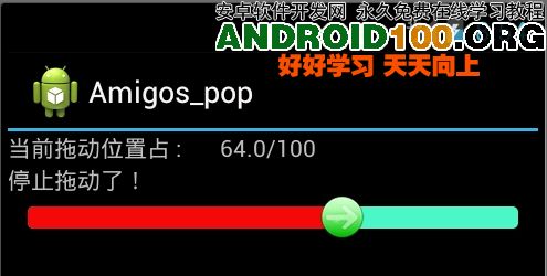
二。使用颜色显示,和尚面是一样的,只有我们定义颜色资源来替代图片资源文件seekbar_define_color_style.xml:如下:
<?xml version="1.0" encoding="UTF-8"?>
<layer-list xmlns:android="http://schemas.android.com/apk/res/android">

   <item android:id="@android:id/background"
            android:paddingTop="3px"
         android:paddingBottom="3px">
      <shape>
         <corners android:radius="10dip" />
         <gradient
             android:startColor="#ffffffff"
             android:centerColor="#ff000000"
             android:endColor="#ff808A87"
             android:centerY="0.45"
             android:angle="270"/>
      </shape>
   </item>

   <item android:id="@android:id/progress"
            android:paddingTop="3px"
         android:paddingBottom="3px" >
       <clip>
          <shape>
              <corners android:radius="10dip" />
              <gradient
                  android:startColor="#ffffffff"
                  android:centerColor="#ffFFFF00"
                  android:endColor="#ffAABD00"
                  android:centerY="0.45"
                  android:angle="270"/>
          </shape>
       </clip>
   </item>
 </layer-list>
之后再SeekBar标签使用如下属性进行引入:其他保持不变
android:progressDrawable="@drawable/seekbar_define_color_style"执行效果:

这些都不是本文的核心。本文的核心是:如何动态的设置进度条的颜色?
关于这个问题,网上的解答几乎没有。这里,我照抄一段谷歌官方的回答:
(原链接:https://groups.google.com/forum/#!topic/android-developers/vPAxGwiSM-o)
When using the progress drawable provided by the Android platform it
should not be possible to change the color dynamically as you cannot
access the GradientDrawable. The resource ID for the GradientDrawable
used as progress indication is defined in com.android.internal.R and
you do not have access to it from your application. Changing colors
dynamically should be possible if you use your own drawable as
progress drawable.
The platform's (horizontal) progress drawable is a clipped
GradientDrawable inside a LayerDrawable (see
http://android.git.kernel.org/?p=platform/frameworks/base.git;a=blob_plain;f=core/res/res/drawable/progress_horizontal.xml;hb=HEAD).
You can use it in your application and replace the progress drawable
with it. However, to get access to the GradientDrawable from Java you
should package the GradientDrawable inside a ScaleDrawable (instead of
packaging it inside of a ClipDrawable). Then you can get access to it
via ScaleDrawable.getDrawable().
---------------------------------------------------------------------
I meant something like the following:In progress_horizontal replace ClipDrawable with id 'progress' by a
ScaleDrawable:
<item android:id="@+id/progress">
        <scale android:scaleGravity="left" android:scaleWidth="100%" >
            <shape>
                <corners android:radius="5dip" />
                <gradient
                        android:startColor="#ffffd300"
                        android:centerColor="#ffffb600"
                        android:centerY="0.75"
                        android:endColor="#ffffcb00"
                        android:angle="270"
                />
            </shape>
     </scale>
    </item>
From Java you can access the GradientDrawable inside the ScaleDrawable
as follows:
ProgressBar progBar;
ScaleDrawable sd = (ScaleDrawable) ((LayerDrawable)
progBar.getProgressDrawable()).findDrawableByLayerId(R.id.progress);

GradientDrawable gd = (GradientDrawable) sd.getDrawable();
gd.setColor(Color.BLUE);
=============================================================
Setting own ProgressDrawable from xml works. You only need to tell
Android that you want to use your own drawable by specifying your own
drawable as android:progressDrawable:
<ProgressBar
                android:id="@+id/ProgressBar01"
                android:layout_width="fill_parent"
                android:layout_height="wrap_content"
                style="?android:attr/progressBarStyleHorizontal"
                android:progressDrawable="@drawable/progress_horizontal"
/> 注意到上面紫色的那段英文:但是,要获得访问到GradientDrawable从Java
应该打包GradientDrawable的的一个ScaleDrawable内(而不是
它打包里面一个ClipDrawable)。
回头看看大家通用的方法:都是<clip>里面包一个<shape>。谷歌的建议是用<scale>包起来。这样就可以动态的设置颜色了。
好不好使呢,代码写起来:代码在上面的摘录中都有。自己写一段,果然好使!


 扫一扫
扫一扫
 926
926

 被折叠的 条评论
为什么被折叠?
被折叠的 条评论
为什么被折叠?
 到【灌水乐园】发言


